Microsoft Surface Pro 3 review
Has Microsoft cracked the hybrid nut at the third attempt? Why yes, yes it has
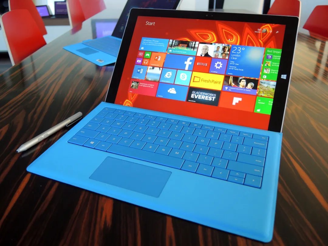
Microsoft’s new Surface Pro 3 alone may not wreck its maker if it fails. But if it succeeds, it could be a welcome turning point for a company that’s struggled for too long to out-innovate Apple and Google.
While on paper the Pro 3 is a humble range-filler (it takes the vacant slot at the super-size end of the Surface spectrum, just above the Surface Pro 2), it has enjoyed the hype usually reserved for entirely new, game-changing products.
This is perhaps because its ‘refinements’ over the Pro 2 redefine the usability of the whole Surface hybrid concept. But before we get too excited, the SP3 does have a big job to do.
For the Pro 3 to win, it must be usable in all the places that you’re likely to use a laptop or tablet – and that’s a brief that the Surface 2 and Surface Pro 2 fail to meet (stick a Surface 2 on your lap while sitting on a sofa with your legs crossed – silly, isn’t it?).
Next, the Surface Pro 3 must be a serious alternative to a Macbook Air or Lenovo Yoga 2 Pro. Again, the Surface Pro 2 fails on both fronts today, thanks to its poor trackpad experience and less-than-ideal screen size and aspect ratio.
Lastly, the SP3 must be a good enough tablet to tempt away the masses heading for an iPad or Android 10-incher (ironically, this is the one area where the Surface 2 and Pro 2 have made some headway, thanks to the value they offer as powerful laptops).
No pressure here, then.
But despite the tough brief, the Pro 3 claims to meet each of those challenges in one, carefully honed package.
The Surface Pro 3 goes on sale in the UK on 28th August, and you can pre-order now at the Microsoft Store. We couldn’t wait, so we picked one up in the US as soon as we could. Having now spent four weeks living with it we feel the time is right to answer the question that’s now on your lips: is it time to cancel that Macbook Air or iPad order?
DESIGN: WHY DIDN’T THEY DO THIS IN THE FIRST PLACE?
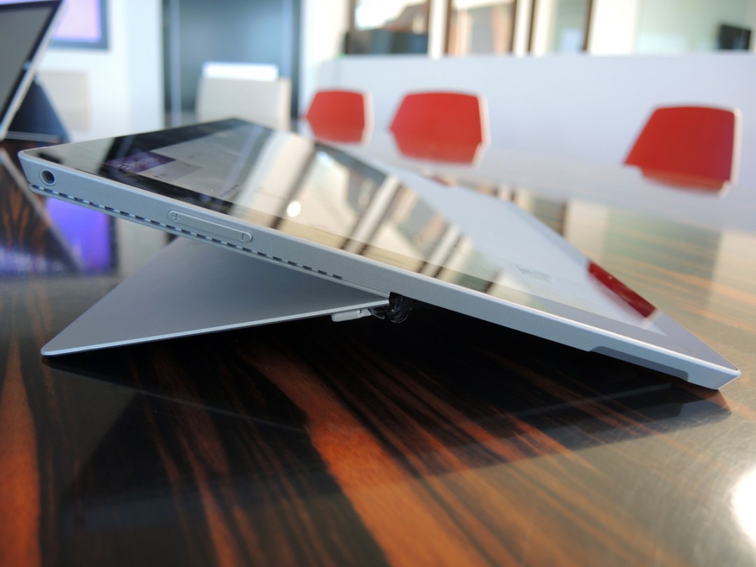
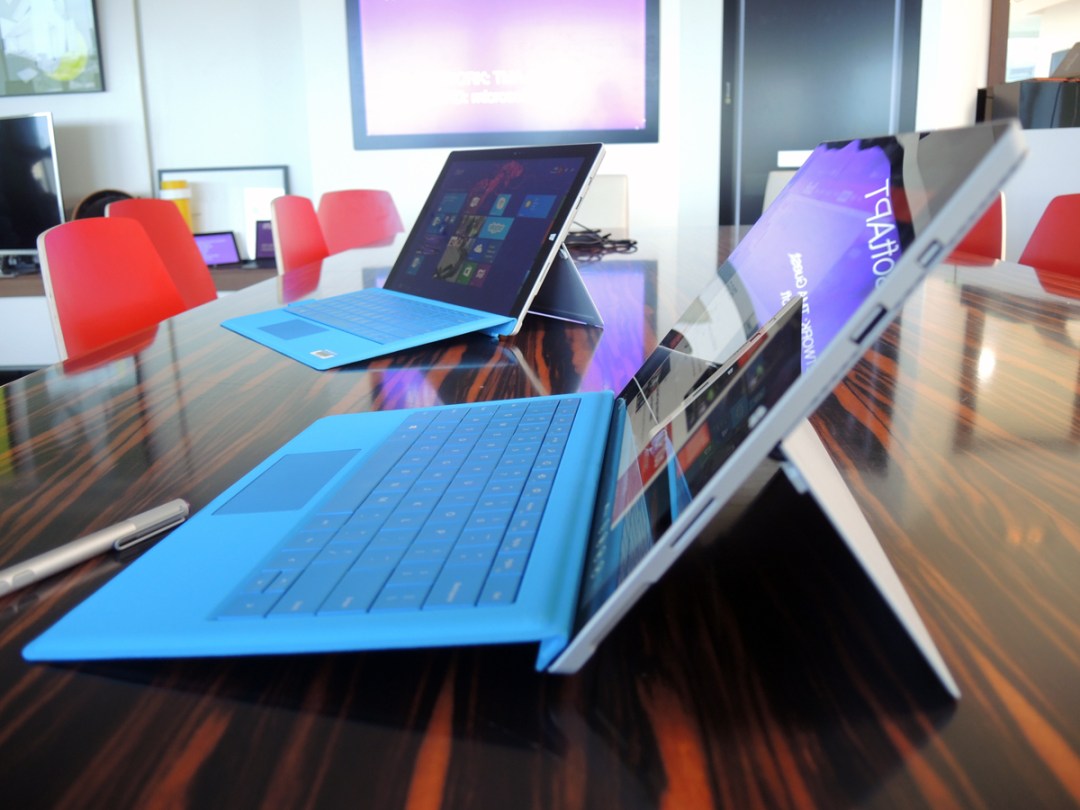
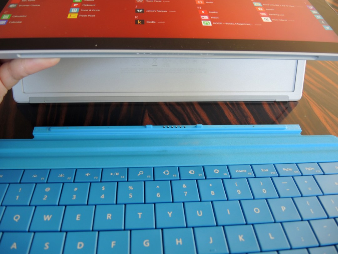
After just a week with the Surface Pro 3, the Type Cover 3 and flexible kickstand had left us furious with Microsoft. But only because the changes they bring from the first and second generation Surface are so obvious that you wonder why they didn’t happen earlier (don’t worry if you own an earlier Surface – we’re sure Microsoft has a letter of apology in the post…).
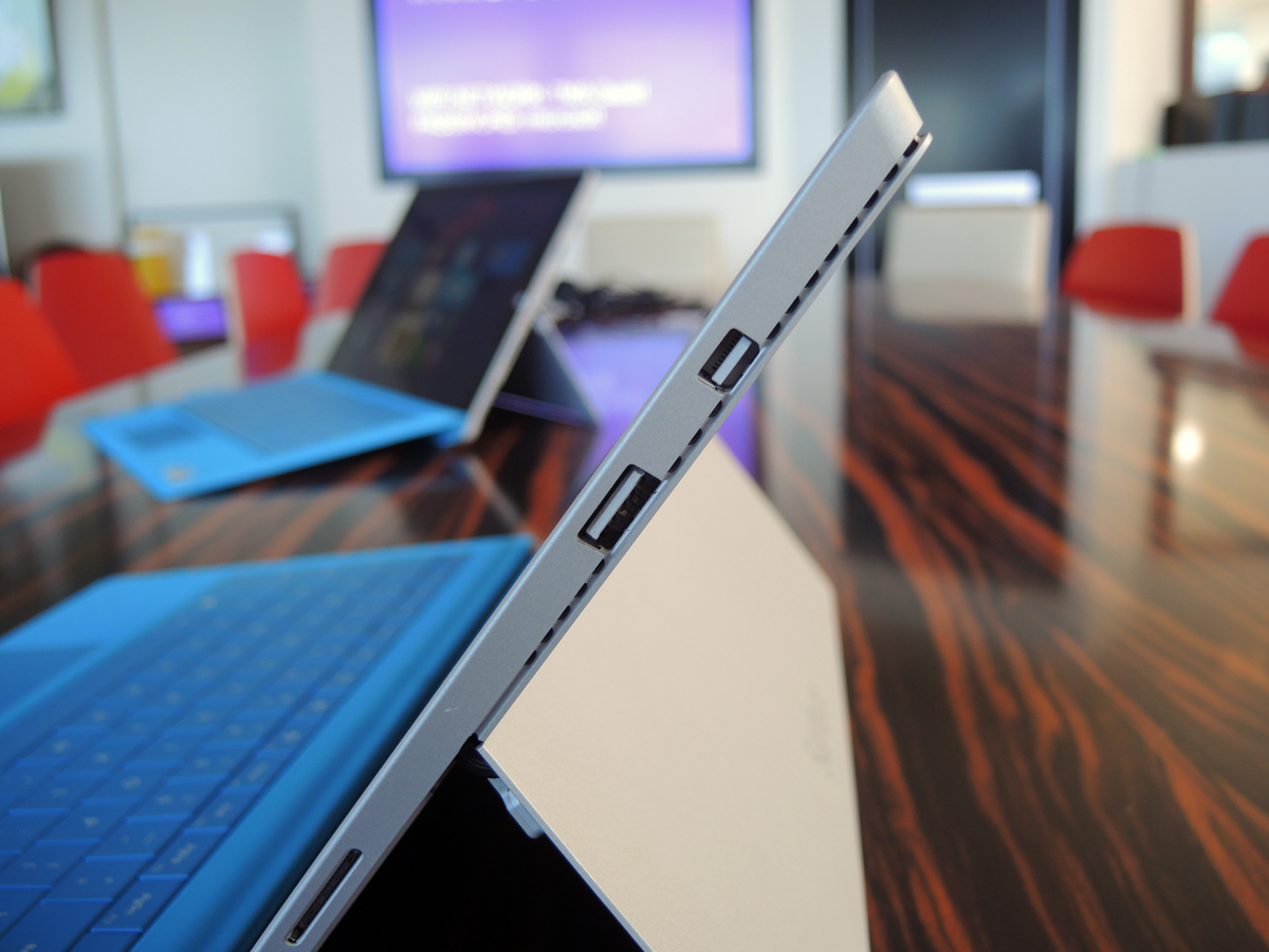
In place of the two-stage kickstand debuted by the Surface 2, the SP3 support now bends almost all the way back, using a brand new hinge design.
The Type Cover keyboard, meanwhile, can now be latched at its upper edge magnetically to the bottom of the SP3’s screen, creating a rigid platform in place of the wobbly board that haunted previous Surfaces.
Those two changes transform the Surface into a good laptop that will work almost everywhere. With the kickstand bent back to 120-130 degrees and the keyboard attached, it works as well as any conventional laptop if you spend your life with your legs crossed on the sofa.
Tilt the kickstand back further to 140-150 degrees, and it’s a perfectly-angled writing surface for use on a desk if you’re taking notes. In fact, we couldn’t find a scenario where the Surface Pro 3 borked: it now works, really well.
The kickstand, in particular, is a minor engineering marvel. It retains the first two stages from the Surface 2; pull it away from the body, and there are two distinct locking points.
But push gently beyond the second lock point, and it will bend back to almost 150 degrees. We’re not irresponsible enough to give any view on the hinge’s long-term durability, but we will say that it feels beautifully made, and operates with the same well-damped smoothness after a hard month of use as it did on the day of opening the box.
The Type Cover 3, meanwhile, is a dramatic improvement over the Type Cover 2. The keyboard’s now spacious enough for big, clumsy fingers, and at last the trackpad is of a size and sensitivity that make it a pleasure to use. One thing, though: the keys clack if you’re typing in anger – but even then, the cheap-ish clack doesn’t infer shoddy build.
The kickstand and keyboard aren’t the only changes for the better. Many (including us) found text too small on the 1920 x 1080 10in screen of the Surface 2 or Pro 2. So the switch to a 12in display at a rather unusual 2160 x 1440 resolution for the SP3 is welcome, as is the shift to a 3:2 aspect ratio. Somehow, the Pro 3 just looks and feels the right size (whatever that is), while its predecessors were too small to be taken that seriously.
The SP3’s now natural to use in portrait mode (a claim you could never make for the Surface 2), making it a great (albeit large) ebook reader (which was one of Microsoft’s stated intents with the 3: make it feel as much as possible like a good paper notebook).
PERFORMANCE: A GOOD LAPTOP, A BRILLIANT TABLET
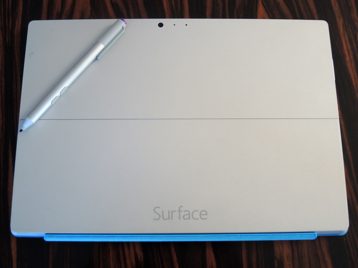
The Surface Pro 3 will be available with a choice of Intel i3, i5 and i7 chips, 4GB, 8GB or 12GB of RAM, and 64GB, 128GB, 256GB or 512GB of SSD storage.
Whatever combo you go for, you’re buying a ridiculously powerful tablet, and a decently meaty mid-range laptop – and you can be confident that even the lowliest spec won’t be a slouch. Our Intel i5 / 4GB / 128GB model belted through just about every task we could hurl at it – Office, browsing, email, music and movies.
That said, let’s be clear on one thing – the SP3’s no gaming rig. It will happily chomp through the lighter games you’ll find in the Windows Store. But with only an Intel 4400 HD graphics chip on hand to push the pixels, it’ll stammer to a halt if you fire up Crysis at max settings (at which point, you’ll also discover how hot the top right hand edge of the unit can get).
Avoid giving it that kind of abuse, and the SP3 will run quiet and cool. We did find that the top right of the tablet (or top left, if you’re holding it in portrait mode) is always slightly warm (we’ll assume that’s where the i5 is housed), but it’s barely enough to register in normal use.
So which spec should you go for? After a month with the 128GB i5, we wished we’d chosen 8GB of RAM and the 256GB SSD.
While 4GB of RAM will keep Windows 8.1 running happily enough, the OS is happier with 6-8GB under the hood (and since the memory is soldered to the SP3’s motherboard, you can’t upgrade at a later date).
As for wishing that we’d gone for the 256GB hard drive, the Pro 3 has convinced us that it’s more than a toy – it’s easily flexible enough to be used day in, day out, with the result that we’ve half filled the 128GB with our usual digital detritus.
There’s a well-hidden microSD slot tucked into the back of the Surface’s casing, enabling you to add up to 128GB of extra storage.
That’s all very well, but as of now, you cannot install Windows Store games to an external drive – and with some of those games weighing in at over 1GB (Halo: Spartan Assault is 1.6GB, for example), we’d still spend the extra for the comfort of 256GB of onboard space.
Microsoft Surface Pro 3 Tech Specs
THE SCREEN: BEAUTIFUL ENOUGH – AND THE RIGHT RATIO, AT LAST

The Pro 3’s screen is stunning. Although it has fewer pixels per inch than the iPad Air (216ppi vs 264ppi), you’d need comically good eyesight to find flaws with the 2160 x 1440 display. Everything’s pin sharp.
The 12in screen is also commendably natural in the way it renders colours: it’s neither neutral to the point of being washed out, nor vivid in a way that’ll give you a headache after an hour. It’s just right.
And Microsoft has picked a display that will go bright enough to ensure that your Surface will stay usable even in pretty bright daylight (just as well – the screen has a glossy coating that’s quite reflective).
Be aware that the driver for the Surface screen will only allow two resolutions – the native 2150 x1440, and a laughably old school 1024 x 768. Couple that with Windows 8.1’s, er, ‘interesting’ approach to DPI scaling, and be prepared to tweak before everything’s to your liking.
You should also be warned that quirks in that same DPI scaling can make life with an external monitor a bore.
Our SP3 hooks up every day to the HDMI input of a 23in Philips 1080p desktop monitor, via the Pro 3’s mini display port. As regular as clockwork, we lose five minutes every morning to logging out and then in again once the Philips is connected, just to re-scale the icons on the desktop. Annoying, and surely not that difficult for Microsoft to fix? Especially when our Macbook Air gets it right every time.
THE PEN AND ONENOTE: THE PARTNERSHIP THAT MAKES THE PRODUCT?
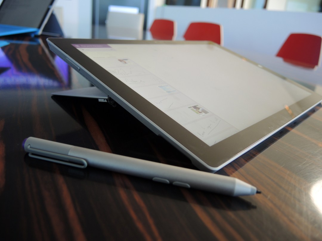
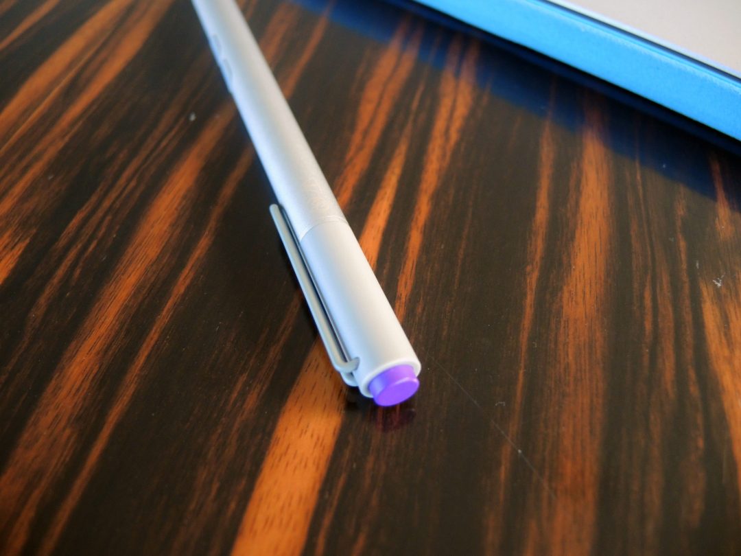
Thanks to the Surface Pro 3’s new pen, Microsoft’s note-taking, file-storing rival to Evernote gets a whole new lease of life.
Prod the pen’s purple top button once, and your Pro 3 will launch a full-screen note, regardless of whether the machine’s asleep or awake. It’s intended to allow you to get sudden ideas down quickly, and that’s precisely what it does. Double-tap the same purple button, and it will give you the option to lasso a section of the screen for storing away into OneNote. Smart, and genuinely useful.
Live with the SP3 for a bit, and the combination of the pen and OneNote feel as much a part of the everyday experience as the keyboard and kickstand. And you begin to appreciate that OneNote 2013 isn’t that shoddy an application. It’s great for taking and organising just about anything you throw at it, and the keyword search works a treat.
OneNote’s only hitch, in our humble opinion, is its tight integration with Outlook 2013 for task management. If Microsoft really wants to own the productivity game (and it does), it needs a task manager that can sync to the cloud and every other mobile platform.
If you’re still a desktop Outlook addict (there are some still out there… right?), you’ll adore OneNote. But if you spend your days in one of the thousands of Android or iOS task managers, you’ll find OneNote a bind. There are Microsoft-made OneNote apps for Android and iOS, sure, but they’re no match for their Evernote equivalents.
Out of the box, your Surface Pro 3 will come with a small pen holder that’s meant to attach to the Type Cover. Bluntly, it doesn’t work.
After three or four days, we almost lost the pen after the tab holder detached itself without our noticing; the sticky part just isn’t sticky enough to stay attached to the Type Cover, and a normal knock will send it flying.
We’ve taken to carrying the Surface pen around in a laptop case or shirt pocket. That guarantees that it will eventually go missing. Given how important the pen is to life with an SP3, Microsoft needs to come up with a more permanent, attractive solution – and fast (especially when a replacement from the UK Microsoft Store is £44.99).
We’d also advise that you find a reliable local stockist of AAAA batteries before you invest in an SP3; the Surface pen is powered by a single AAAA, and we chewed through the power of the battery that came in the box in about four weeks (so let’s make that 12 batteries a year).
BATTERY LIFE: GREAT – AS LONG AS YOU’RE US…
Budget laptops are forgiven if they suffer from poor battery life. You know that you’re compromising by spending the bare minimum, and most cheap 15in lappies aren’t really built for an entire day away from a charging point.
The Surface Pro 3 has no such excuses. Its entire appeal rests on its flexibility – one minute hammering through a PhotoShop file at your desk, the next reading a Nook book on the morning commute. For the whole concept to stack up, you mustn’t feel nervous when taking it out for a day on the road.
Microsoft claims up to nine hours from the Pro 3’s lithium-ion battery ‘while browsing the web’, with careful warnings that your mileage may vary depending on your habits (and it’s fair for Microsoft to hedge its bets here: a device as powerful as the Surface can indulge in some heavyweight, juice-sapping work).
Our i5, 128GB model is good for a working day, although we confess that we’ve yet to deliberately run it to red line.
In one day last week, it was unplugged from charge at 7am, then pounded at a conference from 9.30am to 4pm, before taking care of email and transcription duties on the 30-minute train ride home. By the time we re-attached it to a charger at 5.30pm, it was showing 30%. We’d call that good, by any standards.
But then, we’ve read enough forum posts from users suffering from disappointing SP3 battery life to feel blessed. What a forum post can’t tell you, of course, is what use the poster is putting the Surface to. What we can say is that heavy use – particularly video streaming – has a very visible effect on the SP3’s battery drain.
By the way, brownie points go to Microsoft for the design of the power supply. Too many 11-13in laptops come with leads and blocks that weigh more than the thing they power – the Pro 3’s is compact and light, and even includes a USB charging port in the power block.
PROBLEMS: YEP, THERE ARE SOME
Since its launch in the US in late June, users began reporting problems with their Pro 3s waking from sleep, staying awake and suddenly freezing. There have been several firmware releases aimed at squishing the bugs (one of which takes a nail-gnawing 15-20 minutes to install).
But we’ve experienced none of the sleep or wake issues (bar one freeze that forced a hard shutdown – an update shortly after appears to have fixed it).
However, we did fall foul of one of the other commonly reported issues: flaky wireless. The latest update (July 16) claims to have sorted it for good. That claim looks to be accurate: our SP3 will now happily tether to our HTC One M8 (impossible before the update), and connect to the 2.4GHz wireless in Stuff Towers without constantly dropping.
There’s one other SP3 problem that Microsoft cannot fix alone (although with Windows 8.1 Update 2 coming down the tracks, they could sure as hell help).
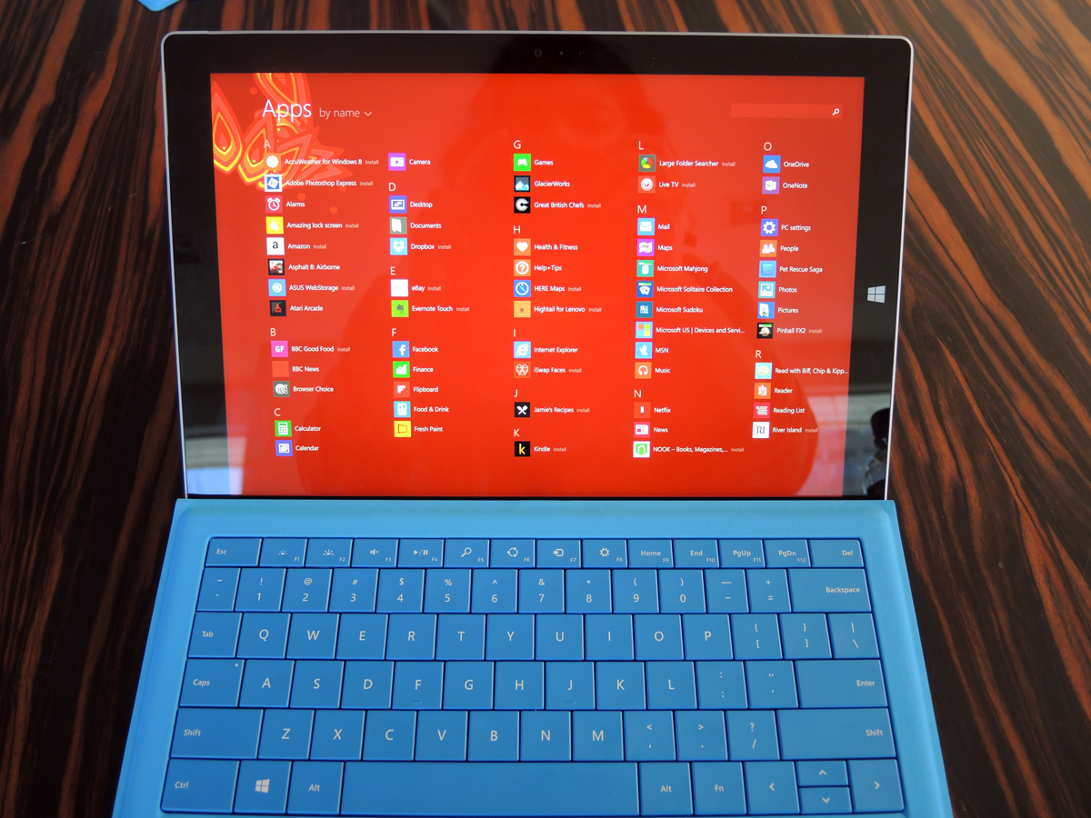
The high dpi screen demands that developers update their software so that it renders correctly – and as it stands today, some significant developers have yet to catch up.
Until very recently, even Google Chrome looked awful at hi-dpi (the latest Chrome beta solves most of the issues). Dashlane, a popular password manager, displays as a boil-washed version of itself. Evernote desktop is usable, but ruined by miniature icons and smaller-than-needs-be text.
Developers are getting there, but we understand the Catch 22 from their point of view – it takes time and effort to make the software work well with high dpi displays, but the market for high-end PCs with displays that go beyond Full HD is hardly thriving.
Microsoft Surface Pro 3 Verdict
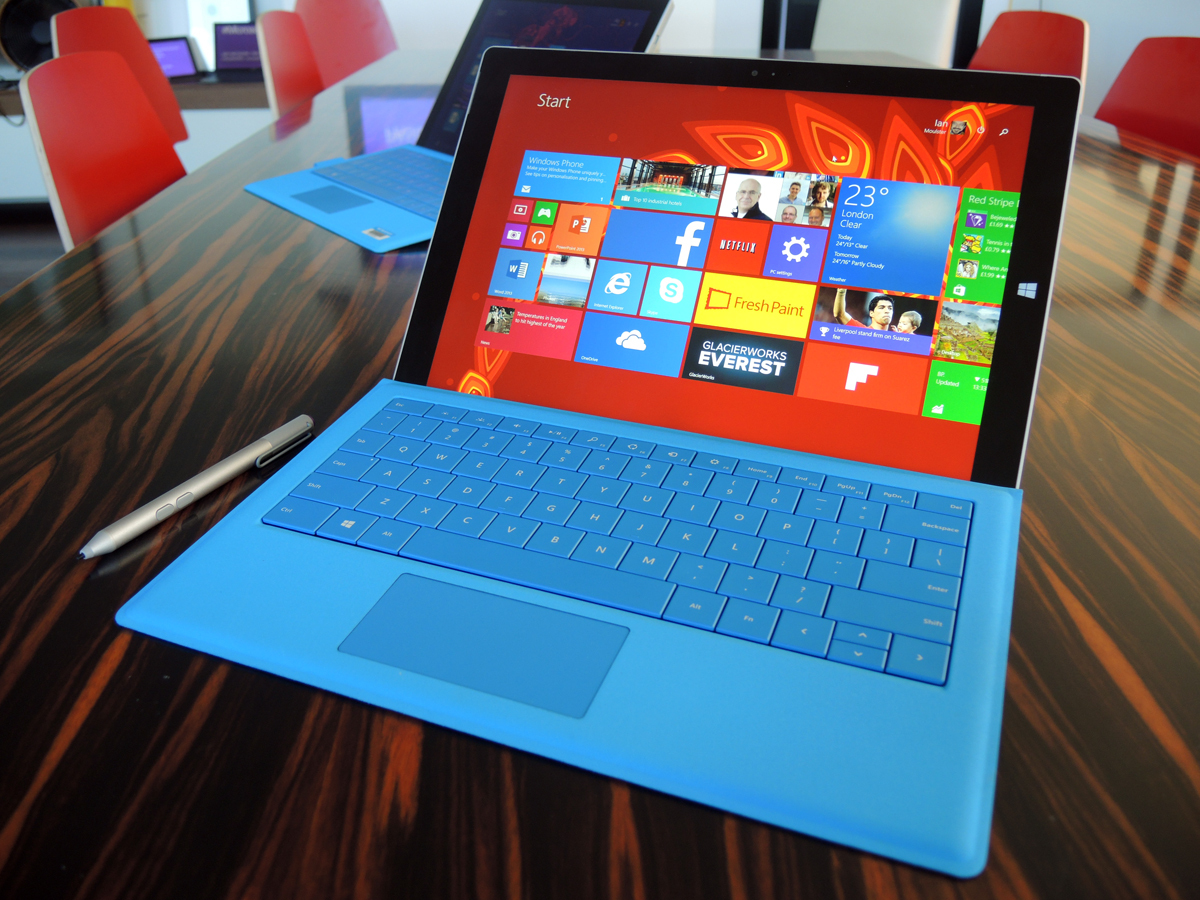
The Surface Pro 3 is excellent.
There, we said it. And with a straight face.
At last, Microsoft has delivered on the promise of the tablet-cum-laptop hybrid. It proves Microsoft’s argument that there’s space in the world for a design that’s more productive than an iPad or Galaxy Note, but easier to hump around than a traditional laptop.
Would we buy one? Yes. We’d avoid the 64GB and 512GB models (you’ll either have no space left in a week, or regret paying the high price after a month). But put a 128GB or 256GB on the counter, and we’d tap in a PIN code without a moment’s hesitation.
It would be daft not to point to the fact that the Windows Store still hasn’t reached the heights of the Play Store or iTunes, but that’s an issue that’s at least somewhat mitigated by the fast that Pro lets you install practically any piece of PC software on the desktop side of the two-faced OS.
Price still has to come into it. The i5 / 128GB SP3 £1000 asking price (with the Type Cover included) would buy an awful lot of Windows laptop, or a similarly-specced 13in Macbook Air with £100 change to spare.
But the Pro 3’s different enough to undermine absolutist comparisons: a chunk of that £1000 is going on ‘unusual’, and we think that for many it will justify itself on that basis. And if you insist on like-for-likes, the fact is that the Pro 3 is as quick and capable as either a Lenovo Yoga Pro 2 or a Macbook Air.
At last, there’s a Surface that’s right.
READ MORE: The 10 Best Laptops in the World right now
READ MORE: The 10 Best Tablets in the World right now
Buying one? › Order your Microsoft Surface Pro 3 from Currys here
Stuff Says…
Third times the charm – the Surface Pro 3 is a hybrid device that’s right
Good Stuff
Kickstand and Type Cover now work a treat
More powerful than a tablet, more flexible than a laptop
The Surface Pen is superb
Lovely screen
Bad Stuff
Many apps scale badly for the screen
Looks pricey next to a laptop or tablet
Battery will drain fast if pushed very hard
