Samsung Galaxy Note 10.1 (2014) review
A do-it-all tablet with a gloriously hi-res screen, the Note 10.1 is Samsung’s best tablet yet [updated with video]
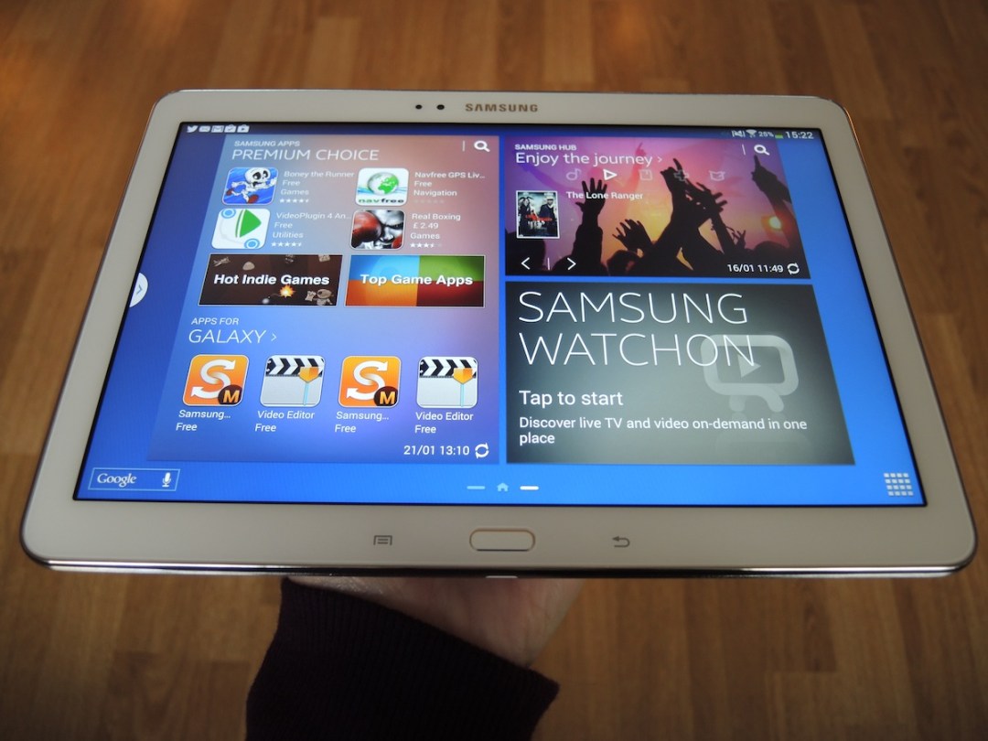
Android fans are still waiting for a tablet to take on the full-sized iPad and win.
It’s an order that’s always getting taller – developers still favour the iPad when making and optimising gorgeous tablet apps, and a skinny, near-perfect iPad Air is convincing existing Apple tab users to upgrade. So is it even possible?
Samsung thinks so, and it’s hoping to answer the question “If not iPad, then what?” with the Galaxy Note 10.1 2014 edition.
The new Note 10.1 is in many ways much more clever than Apple’s iPad, and it’s on brains, not beauty, that Samsung’s competing. This 10in tablet comes with the S Pen, just like the superb Galaxy Note 3 phablet. And even though Samsung announced a 12in NotePro whopper at CES, the Note 10.1 is staying put in the line-up.
So what does the Note 10.1 have that the iPad Air doesn’t?
More Pixels
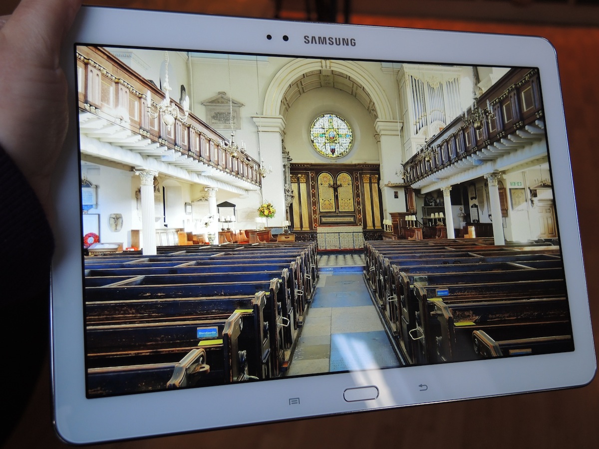
The Note 10.1 2014 edition’s battle cry goes a bit like this: I have four times the number of pixels as my predecessor – hear me roar!
That’s thanks to an upgraded 2560 x 1600 screen, which is an even higher resolution than the holiest of holies, the iPad Air, and one of the highest Droid pixel counts in existence, equalling Asus’ latest Transformer.
READ MORE: all of the latest Stuff.tv tablet news and reviews
If tablet battles were decided on displays alone, the Note 10.1 2014 edition would be puffing its chest out with confidence by now.
The fonts on Stuff.tv appear as pin-sharp as the witty prose (what do you mean you’ve never heard of it?), and colours don’t stray too far off-hue when viewed off-axis. The beamtastic, blink-inducing 10.1in screen can’t be faulted on brightness either. This is a great choice for loading up your tab with hi-res DSLR shots as it picks up slightly more detail than the iPad.
For everything else, make sure to get to know the ‘screen modes’ section of the settings menu. Movie mode is best for movies (who would’ve thought?) with a similarly natural colour palette to iDevices – but in this mode webpages look like fancy, cream-coloured letters next to the stock, pure white printing paper of the iPad. Switch back to Standard mode for browsing and contrast improves with bold black text popping as it should.
The iPad just about has the edge when playing back 1080p footage, both in terms of smoothness of playback and sharpness of picture. The fact that you don’t need to change screen mode to get the most of it is a big bonus, too, but overall the Note 10.1 still has a cracker of a screen – one of the best we’ve ever seen on a 10in tablet.
The S Pen
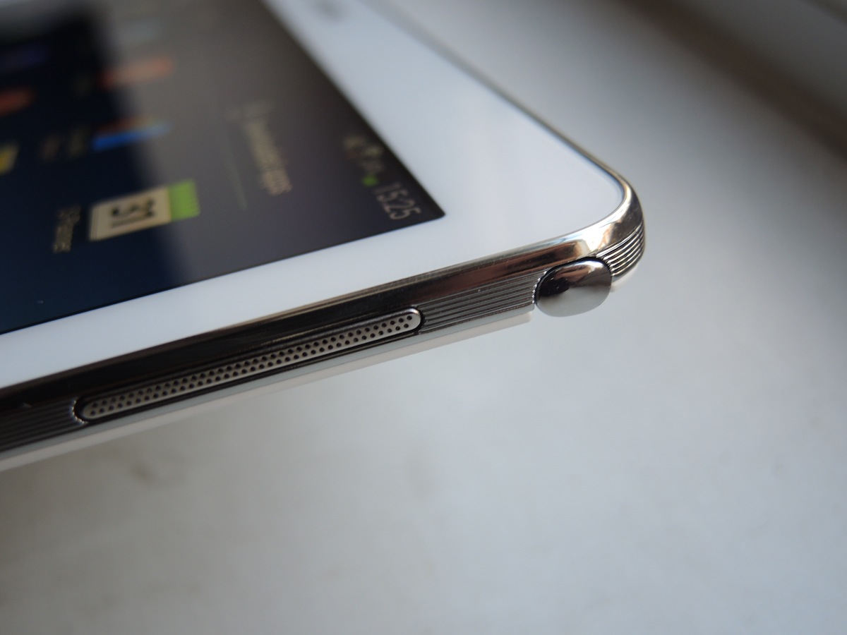
The screen is undoubtedly the 2014 Note 10.1’s biggest upgrade over last year’s model, but the S Pen should not be forgotten. A pull-out pen located in the top right-hand corner of the tab, it’s more responsive than the first iteration and the Note 10.1 has borrowed plenty of clever new tricks from the Note 3.
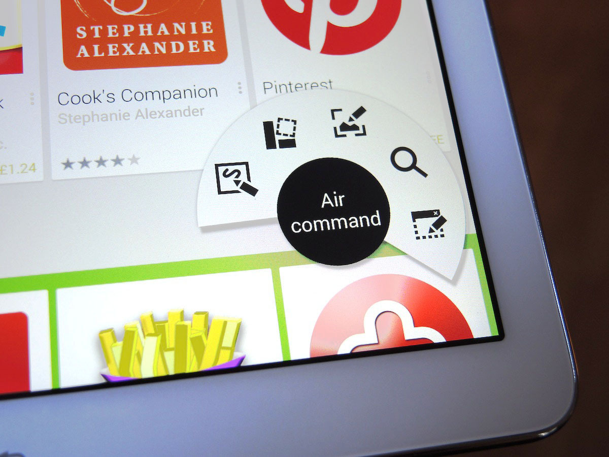
Air Command menus (which are accessed by dragging the stylus in a circle) can be a bit confusing at first, but stick with the S Pen and the rewards are vast.
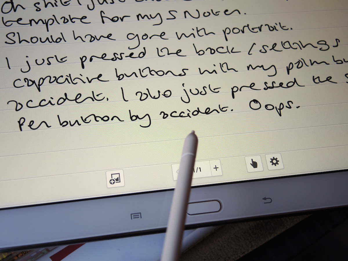
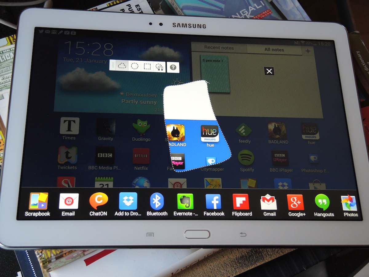
Circling web bits and bobs with the S Pen to send to the Scrapbook is more satisfying than using apps such as Pocket. And saving hand-scrawled numbers to contacts saves time via Action Memo’s nifty menu of places to send your scribbles. It’s also mighty impressive that handwritten notes are included in the Note 10.1’s universal search.
The S Note app has a clean new interface, too, and although 10in is a little on the large side for a meeting companion, resting the Note 10.1 on a knee and jotting away with the stylus works well. It beats typing on a 10in tablet virtual keyboard, that’s for sure.
Samsung Extras
There are plenty of Samsung features and freebies on the Note 10.1 and the new UI takes glancing at your tablet for a quick hit of social or news updates to whole new levels.
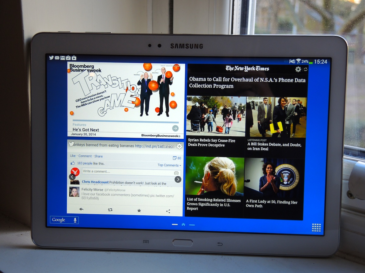
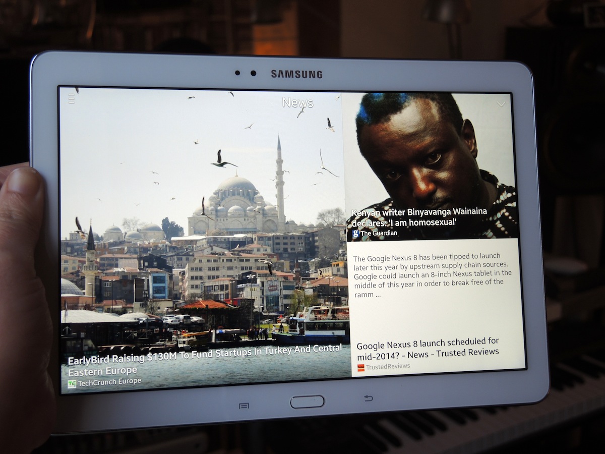
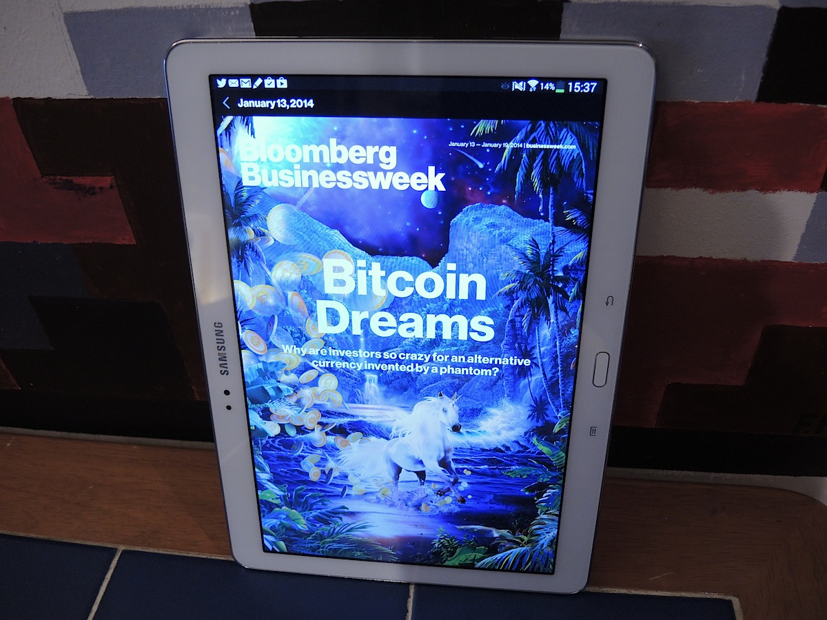
Its Magazine UX – laid over Android 4.3 Jelly Bean and expanded on the new NotePro at CES – is seriously lovely, with a big, bold version of Flipboard to swipe through. It’s all very lively – there are scrollable widgets on the homescreen, including a specially modified version of Twitter and the digital edition of Bloomberg’s Businessweek+, free for a year.
The other star attraction here is still Multi Window for splitscreen apps. Your iPad can’t do that. It works much better this time around – the old Note 10.1 was simply too hiccupy to forgive. It’s still restricted to mostly Samsung and Google apps but the likes of email, maps and the browser are what you’re most likely to want to run side-by-side anyway.
Sadly, it still feels somewhat cluttered thanks to too much duplication – Samsung Hub and Samsung Apps widgets on top of the Play Store, Play Music and other Google options. There are doubled-up apps for email and photos, too. We’d recommend that tablet newbies stick to Google’s services where possible. Still, without downloading a single app you’ve got the most glanceable, all-singing, all-dancing homescreen around.
Big Resolution, Big Battery
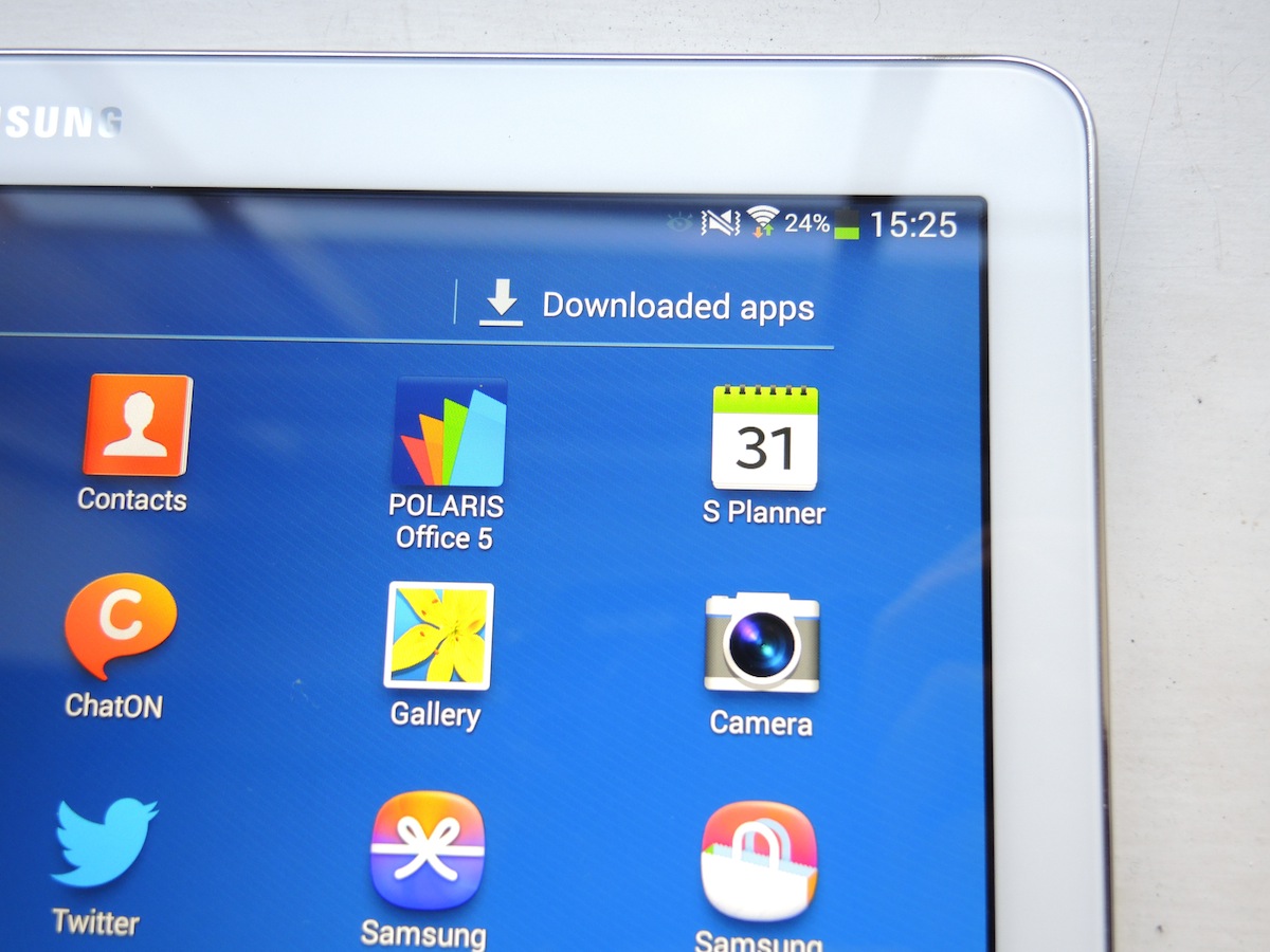
Our usual battery rundown test takes a 720p video on a loop, but we thought we’d test the Note 10.1 2014 with a 1080p clip since it has that 2560×1600 resolution and, er, we were curious.
The Samsung lasted a decent 4hrs45mins on half-brightness and with Wi-Fi on. That’s two whole Full HD movies with juice to spare, and we also got 9 to 10 hours of regular browsing out of the Note 10.1. Bravo, chaps.
The 10in Android App Question
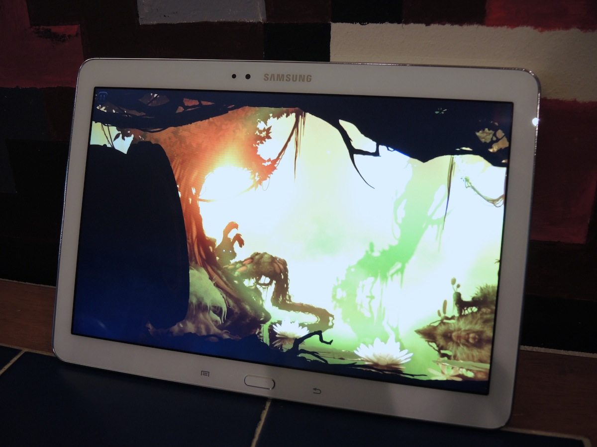
The good news is that 10in Android tablets now fare much better in terms of essential apps than they did this time last year. Apps such as Citymapper, DuoLingo, Sky Go and Philips Hue all look great and run well, and BBC iPlayer now supports downloads on Android. The Note 10.1 isn’t compatible yet but most Samsung devices already are so it should only be a matter of time.
Games are much more evenly spread across the App Store and Google Play now, too, from big names such as Asphalt and GTA to more unusual indie fare such as adorable endless-flapper Badland, which landed on Android in December.
READ MORE: all the latest essential Android apps
But there’s bad news, too. When it comes to optimised creative apps it’s still very much the iPad’s game. Innovative music, photography and moviemaking apps all tend to head to the iPad first and that doesn’t look set to change any time soon. From our 2013 Awards’ Creative App of the Year shortlist, Traktor DJ, TuneTrace, Vyclone and Dubble are all still iOS-only. Console yourself with the pre-installed Autodesk Sketchbook.
Wanted – a 10in Galaxy Note 3
Another problem for otherwise glorious devices such as the Note 10.1 2014 is that Samsung’s tablets still don’t perform as well as its smartphones. That’s not to say the 1.9GHz Exynos silicon does a bad job, we just expected more.
More than once we ended up jabbing at icons or buttons, expecting them to open instantly as on a Galaxy Note 3 smartphone, but with no luck. And as we set a tonne of Android apps downloading to the tab at once, the shiny widgets on the main homescreen flickered and entered a reload loop meltdown just short of a full crash.
In terms of benchmarks, Geekbench 3 gives it 2871, which, while high, is beaten by Samsung’s own phones. And on AnTuTu it trails the Note 3’s score of 34652 with a still impressive 31974, but after performing well, the Note 10.1 promptly crashed as we closed the benchmarking app – an experience that paints a picture of software hobbling hardware.
The Note 10.1 experience can be fluid. Hiccups are far from constant and intensive tasks are actually the least of the tab’s worries. It chews through demanding games like a croc through soft fudge. But there’s room for improvement and we hope software updates will provide this.
Hell For Fake Leather
We said the Samsung competes with the iPad on brains, not beauty. And no surprises here – this Samsung’s not a patch on a Cupertino build. It’s not quite as solid as an iPad, in that it creaks a little in the middle, and the iPad Air is both skinnier and lighter to boot.
That said, the bezels help to make the Note 10.1 2014 look less odd than most 16:9 tablets in portrait mode. Combined with the new UI, this makes it feel more like reading a magazine – it’s a lovely size and shape for lazily swiping through web stories.
CHECK OUT OUR FULL SAMSUNG GALAXY NOTE 10.1 (2014) GALLERY HERE
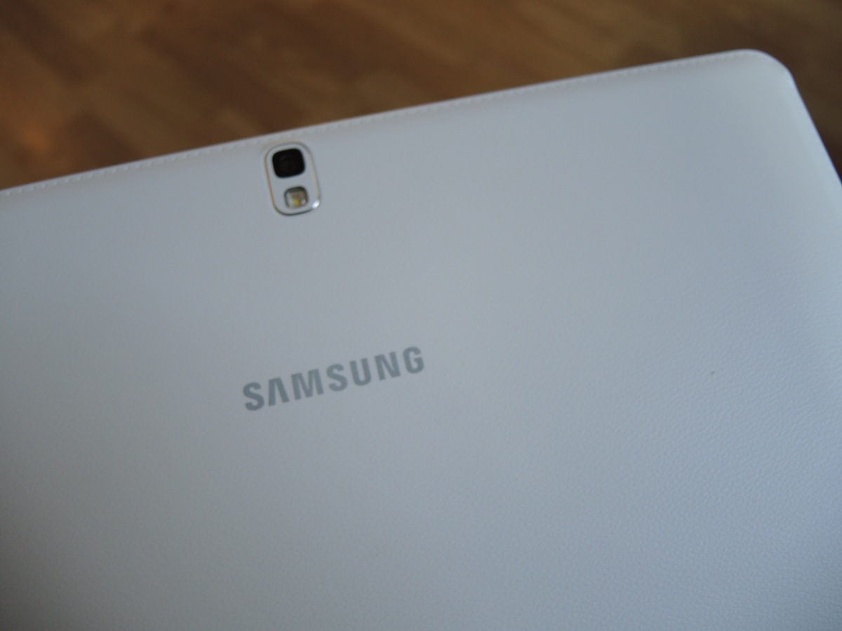
From the front the Note 10.1 2014 looks like any other Samsung tablet – glossy, white and plastic. Round the back, there’s a ‘treat’ in the form of the fake leather and stitching rear panel, most recently found on the Note 3. In white it looks tacky, in black more forgiveable, but it adds nothing to make the Note 10.1 feel more like a £400 device. When resting the tablet on your lap or knee it does feel more like a cover or case-clad tablet so it’s slightly more comfortable.
On each side of the tablet you’ll find lenses, and they’re actually fairly capable by tablet standards. The 8MP rear camera, with AF and an LED flash, takes detailed, well-exposed shots when needed (hopefully not often), while the 2MP front-facer is perfectly suitable for clear Skype chats.
Verdict
The Note 10.1 2014 can do everything you want a tablet to do – plus ten other impossible things you’re not sure you needed it to.
More clever than an iPad, with a better screen than nearly every other Android tablet and with microSD expandability, this is a lean, mean full-sized tablet from Samsung. S Pen notation, a Flipboard invasion, Multi Window – all big wins that will be copied by many a rival in the months ahead.
And in six months time, this could be a five-star tab. Improvements to the day-to-day performance are vital, and those could be implemented through firmware. A stampede of creative tablet apps onto Google Play would help a great deal, too.
Of course, it could be too late by then, as the inexorable tablet tide continues to wash dreamy Droid devices onto our shores with blink-and-you’ll-miss-it regularity, but the potential is there. In fact, we’d say this is Samsung’s best tablet yet. It’s just a shame that that’s still not quite good enough to dethrone the mighty iPad.
READ MORE: The 10 Best Tablets in the World right now
Stuff Says…
A clever, feature-packed slate with a gorgeous screen, the Note 10.1 is Samsung’s best ever tablet, but niggles keep it behind the iPad
Good Stuff
Dynamite display
S Pen tricks are genuinely useful, as is Multi Window
Magazine UX is a beaut
Bad Stuff
Not as nice an object as the iPad
Google Play lags behind App Store for creative apps
Day-to-day performance disappoints
