Windows Phone 8.1 review
Android and iOS users, take note: Windows Phone is a real contender
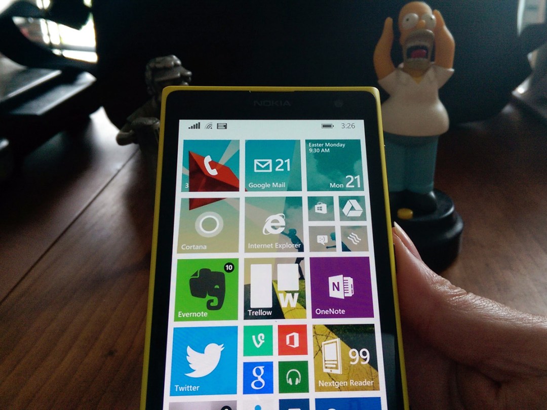
Only a year ago, buying a Windows phone was a declaration of insanity.
You were throwing cash at a platform that imposed too many compromises – in the user experience, in the choice of available apps, and in the platform’s laggardly disregard for the cloud. In the process, you were rejecting two rivals that were demonstrably superior.
But that was 12 long months ago.
In a few weeks, Microsoft releases Windows Phone 8.1, an update that essentially contains little but tweaks – but tweaks that are intensive enough to add up to much more than a meagre point release. In our week with the Developer Preview, we’ve realised that this update may yet rescue Windows Phone from its fate as a repent-at-leisure mistake, turning it into a credible alternative to its Google and Apple rivals.
READ MORE: Windows 8.1 review
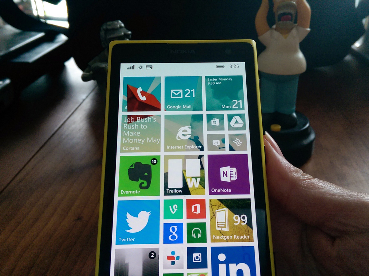
SAY HELLO TO A PRETTIER, MORE FLEXIBLE START SCREEN
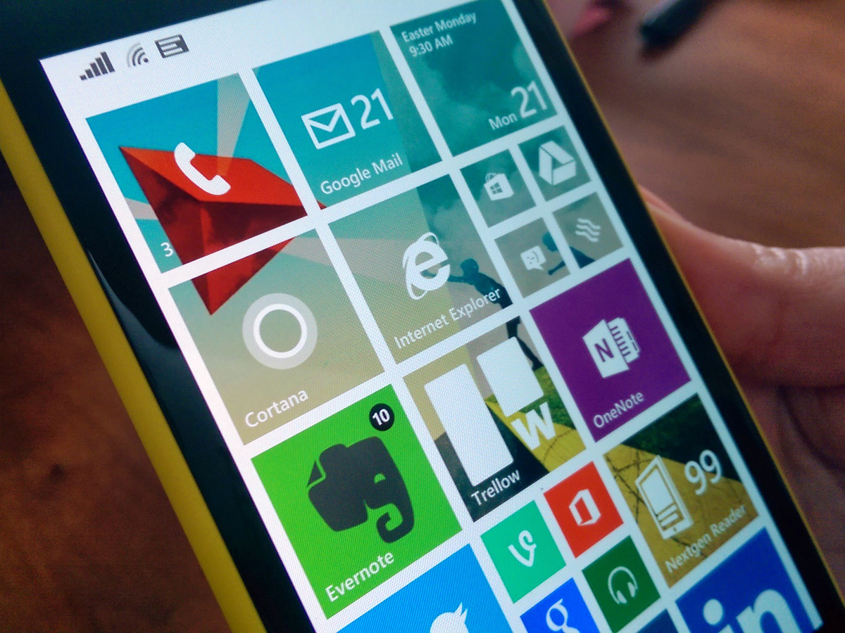
Back in the early days of Windows Phone 8, the fly-in Live Tiles that are the signature of the OS drew praise and criticism in equal measure – praise for their novelty and potential, and criticism for their inflexibility and occasionally sluggish performance.
In one update, WP8.1 remedies both flaws. The animations are now lightning fast and ultra-smooth, and you can customise the Live Tile interface to your heart’s content.
In fact, we reckon the new features may even seduce Android aficionados, renowned for their addiction to fiddling. Although Windows Phone has only two ‘home’ screens (Start and All Apps), you can now lose hours of your life to re-sizing and arranging the Start tiles to precisely fit your daily needs.
And if you want to take things to a logical extreme, there’s a new option to fit another column of tiles on the Start screen (you’ll need to activate it first in Settings – it’s set to Off by default), and the tiles themselves have new re-sizing options (so you can fit six across the width of a Lumia 1020’s screen).
And if that wasn’t thrilling enough, Microsoft’s native app tiles are now transparent, with your chosen wallpaper showing in the background. Couple that with the long-standing ability to change the accent colour and switch between dark and light backgrounds (the latter of which will chew through battery faster), and the options are enough to keep all but the most ardent tweaker happy.
The only thing that has us slightly baffled is why the Nokia apps bundled into Windows Phone (Here Maps, Here Drive+, MixRadio etc) lack the transparency of the native Microsoft apps – we’ll hope that’s sorted by the time of the full and final release in the summer.
CORTANA: THE PA THAT READS YOUR MIND
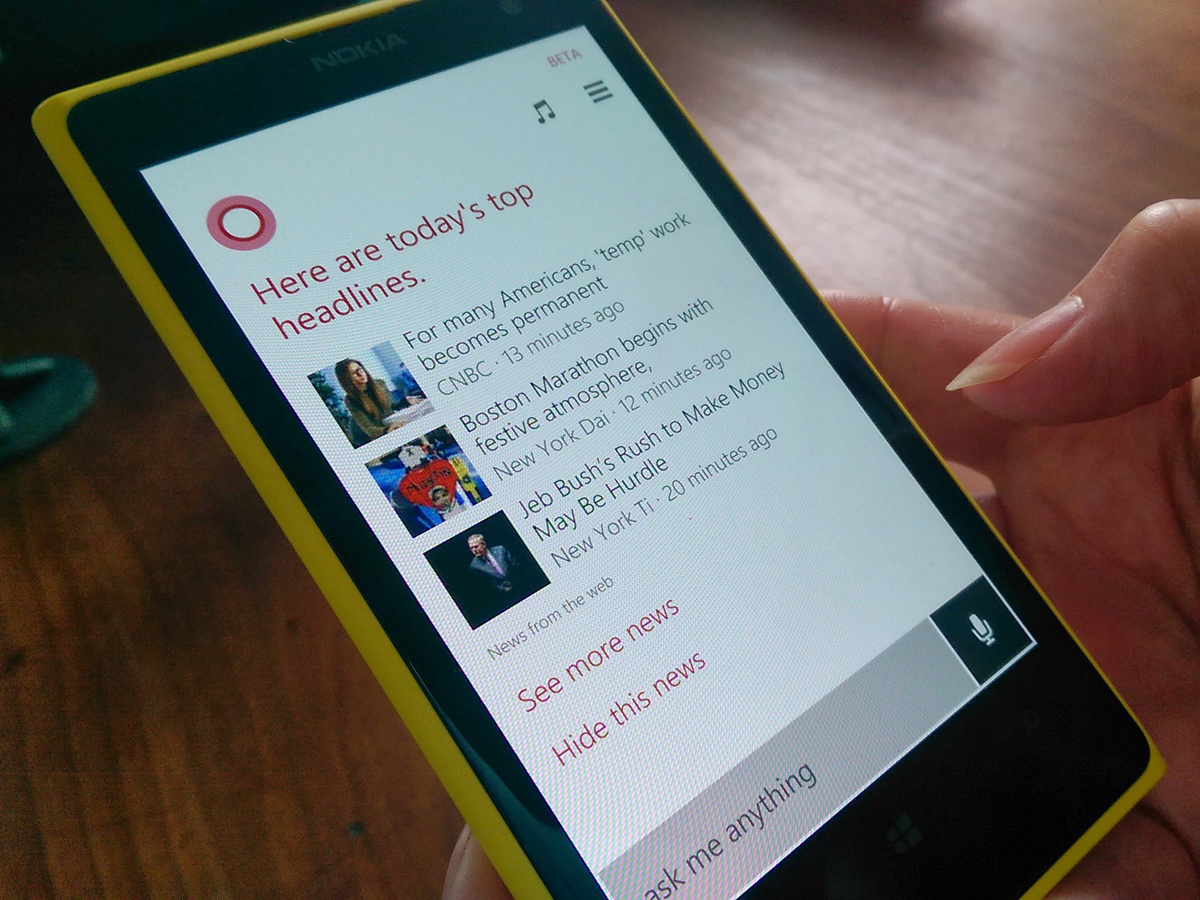
The Big New Feature in 8.1 is a merger of the best features from iOS and Android. Cortana is a personal assistant that aims to learn about you and your habits, and adapt its answers accordingly, with results improving over time. Microsoft claims that Cortana is the result of a research effort that began back in 2009, and makes use on the company’s rich well of enterprise and search data (not to mention the Halo license).
And on the whole, it works well – at least it does, once you discover how to activate it. We had to change our Lumia 1020’s Region and Language settings to United States and reboot before the Cortana icon would appear in the apps menu.
Prod the Cortana icon for the first time, and you’re launched into a set-up routine that lets you tune the service according to your interests and daily routine – as such, it’s similar to Google Now, with options for sports, headline news, places to eat, the weather and a trip planner.
The similarity to Now continues with the landing page that greets you once you’ve finished the set-up – a stack of information that includes news updates, your appointments and maps for any imminent journeys.
Tap the microphone icon to the bottom right of the landing page, and you’re into Cortana’s voice assistant. Since it’s officially US-only for now, we had to temper any verdict on its performance with the knowledge that it may stumble on our plummy English tones. But even with that caveat, it seemed as accurate as Google’s voice recognition (which is high praise indeed). And oddly, it appeared happier recognising the UK English pronunciation of mobile (‘mow-bile’) than the American (‘moh-bil’). Go figure.
Microsoft is clearly bullish about Cortana’s capabilities. If you tap your Lumia’s search button, it launches straight into voice recognition, which then slides into the Cortana landing page if you scroll upward (compare this to Google Now, which launches into the landing page first).
Expect Cortana to land on your UK Windows Phone in late 2014, by which time – if rumours are true – there will also be a Cortana Notebook online that let’s you control how much information is shared with the program.
READ MORE: Apple CarPlay puts Siri on your dashboard
AT LAST – WINDOWS PHONE GETS NOTIFICATIONS
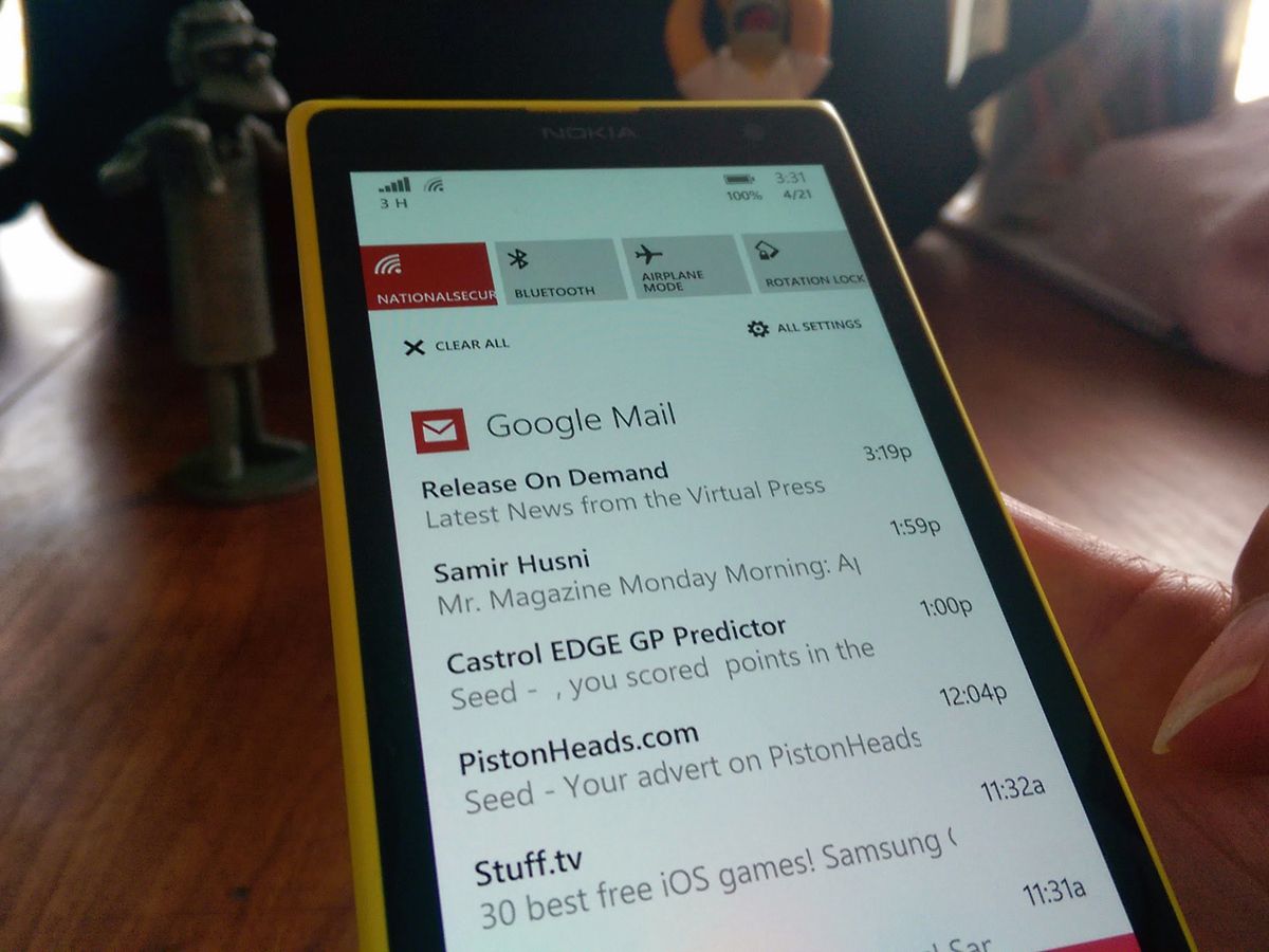
You can stop holding your breath, Dear World: 8.1 brings a notifications screen to Windows Phone. And just in case you’re worried that Microsoft has invented some kind of unique twist on a well-established system, you can relax – 8.1’s new Action Centre borrows happily and heavily from iOS and Android.
You access the Action Centre by swiping down from the top of the screen (sound familiar?), to be greeted by notifications sorted and stacked by type (novel, ay?). You only need to swipe to get rid of them, although curiously, you can’t banish individual alerts – you either swipe away all of your Facebook notifications, or none at all.
You’ll find four quick settings buttons atop the notifications screen that would look at home on any Android handset, along with a shortcut to all of your settings. By default, the four quick links are set to WiFi, Bluetooth, Airplane Mode and Rotation Lock, but you can change them to your heart’s content in Settings.
So there’s nothing new or crazy in the long-overdue debut of notifications on Windows mobile, but that’s absolutely fine by us. During our week with 8.1, we found everything where we expected it to be, and working as it should. For a platform that has sometimes refused to do either of those things, we couldn’t ask for any more.
An impossible fight for Windows Phone? Not at all.
Microsoft could do with a reward for its bravery. For all of its failings, the non-phone Windows 8 at least tried to meet the challenge set by the proliferation of devices and screen sizes head on – albeit with the risky strategy of gluing touch and desktop interfaces together. And despite resulting falls in PC sales and several failed attempts to usurp the iPad with the Surface, Microsoft has stuck to Windows 8, convinced that its solution would pay off in time.
In the case of the recent update to Windows 8.1, Microsoft's latest tweaks haven’t cured all of the ills – the new dabs of glue joining touch and desktop are too obvious (and with, in some cases, seriously illogical results).
But Windows Phone 8.1, due for final release this summer, has no need for glue – it can focus on refining one experience, with the singular aim of dislodging iOS and Android. And while 10% market share in the UK may not sound like the stuff of victory, it’s enough to take Windows Phone from obscure irrelevance to interesting underdog.
Even better, Microsoft's £4.6bn buy-out of Nokia means that it has control over its mobile hardware in a way it never enjoyed with laptops or desktop PCs. Windows Phone OS can be tuned to suit its hardware and vice versa, a benefit that Apple has exploited for years – and there’s a range of new Lumia smartphones arriving at around the same time as the 8.1 update to reinforce the point.
UNIVERSAL SEARCH: BETTER THAN ITS DESKTOP EQUIVALENT
If you’ve recently updated Windows 8.1 on your PC, you’ll recognise Universal Search immediately.
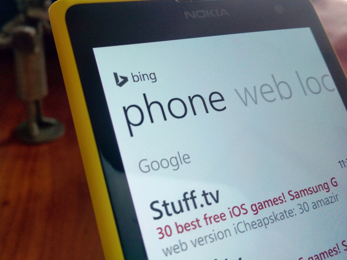
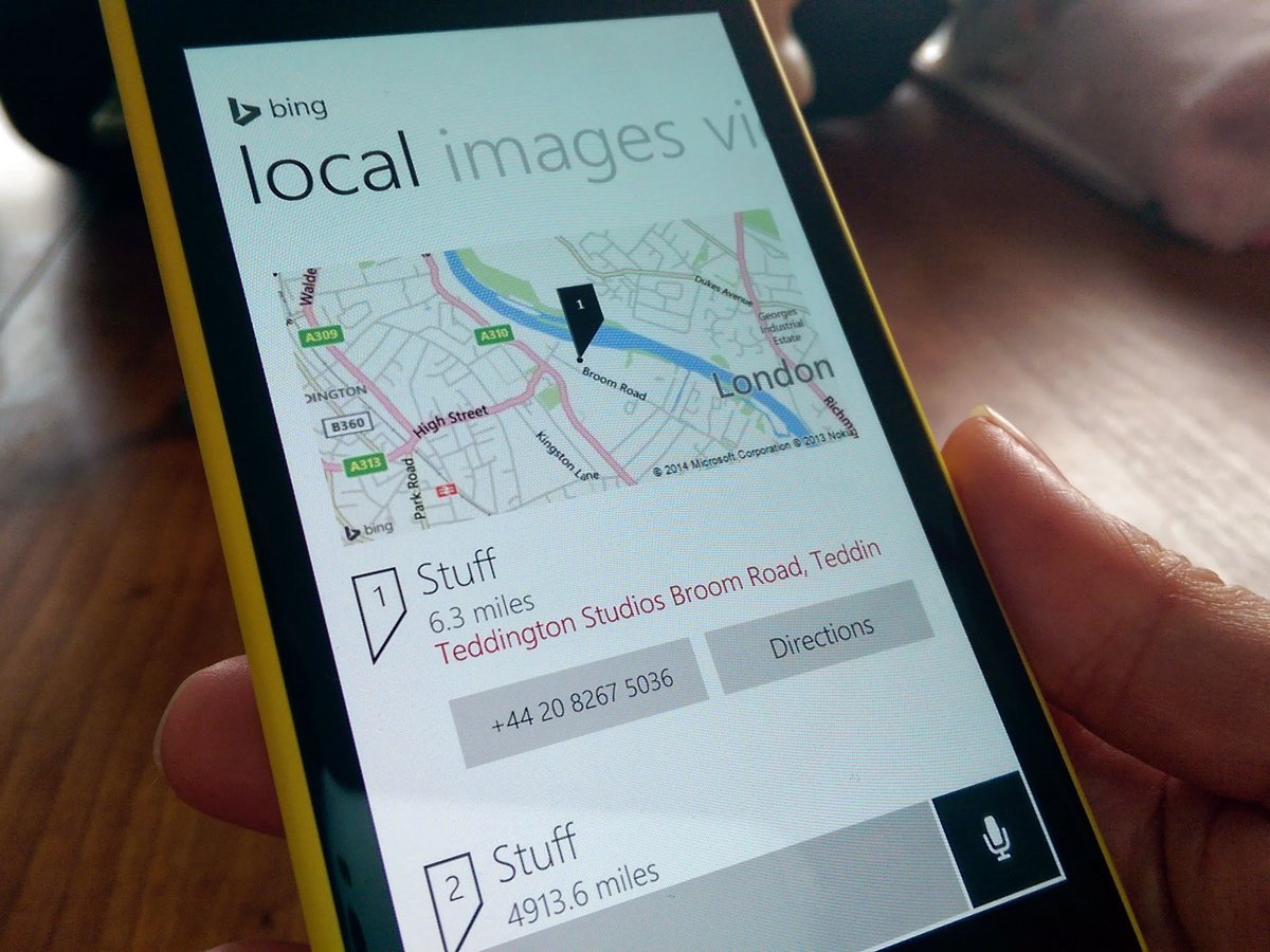
Run a query, and you can swipe between the Bing-powered results across five tabs – Web, Local, Images, Video and Phone. The results are accurate, look great, and the layout is eminently sensible and quick to access (compare this to the desktop Windows 8 version, where the horizontal scrolling of results is something of a barrier).
Quite how useful you find it day to day will naturally depend on your habits – as we found over weeks with 8.1’s desktop equivalent, there’s usually a quicker way to access a contact, for example, by pinning them to your Start screen. But if you’re the type who fires off high volumes of random queries, Universal Search is a useful second home.
The only slight foible we could find was the short delay before results appeared as you swipe between the screens – it’s not long enough to be off-putting, but noticeable enough to make you wonder why Microsoft didn’t choose to have the tabbed results load in the background, while you scanned the first screen.
READ MORE: Google Now – now available on your desktop
GOOGLE SYNC: THE CALENDAR’S BACK…
As a result of a wrangle between Google and Microsoft over Exchange Active Sync (EAS), Windows 8 users with Google Apps for Business accounts have been unable to sync their Google Calendars with the default Windows Calendar app since March 2013.
The good news is that 8.1 ends their misery – add a Google Apps account in Settings, and your Windows Phone will happily start syncing both your GMail and Google Calendars.
IMPROVED DATA AND BATTERY CONTROLS
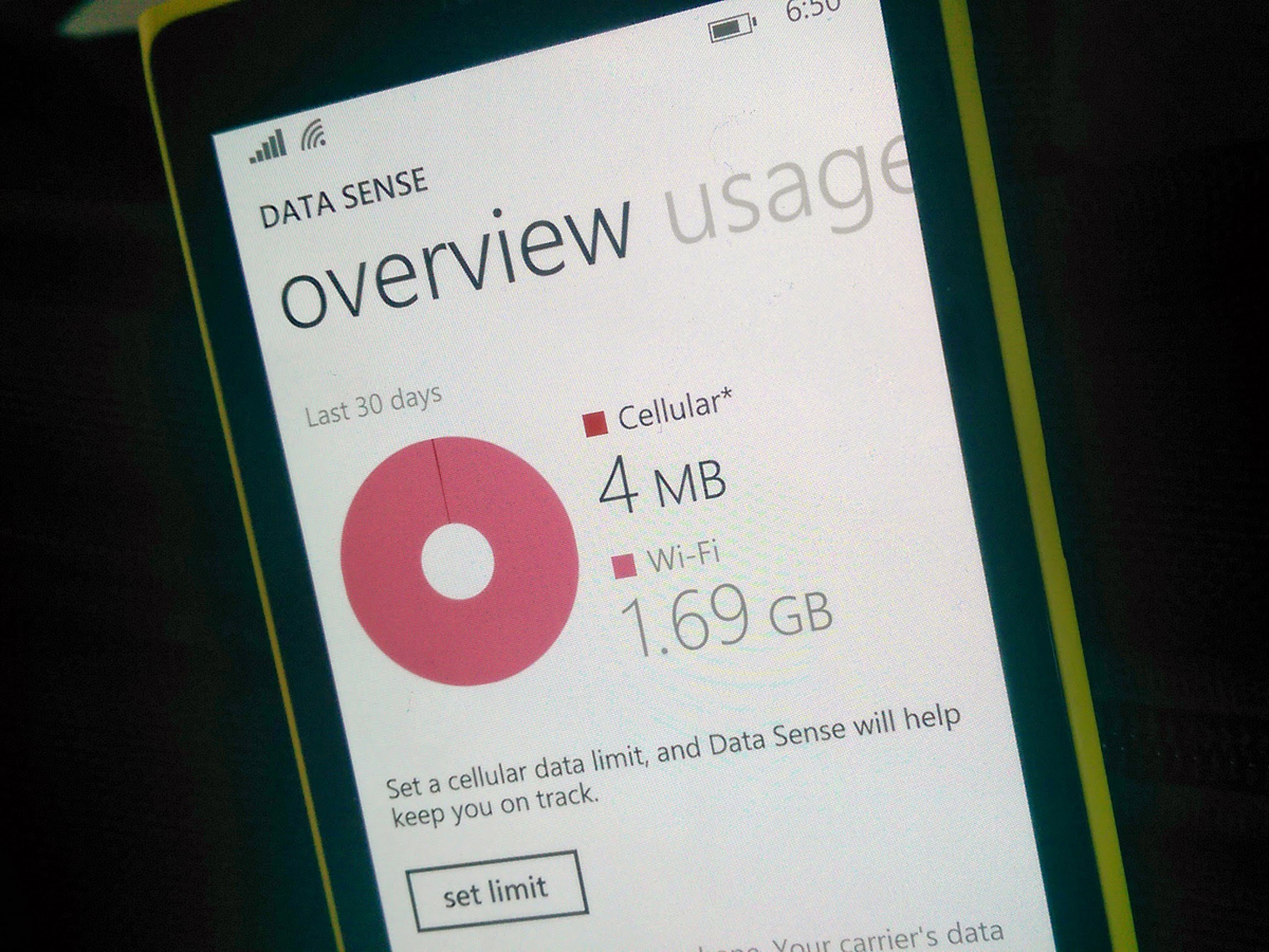
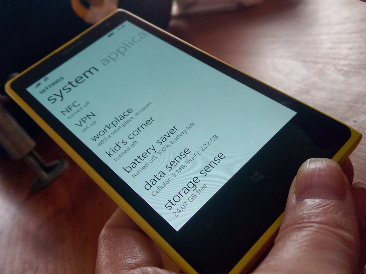
You’ll find one new screen to join an older partner in Windows Phone 8.1 settings – Data Sense, meet Storage Sense. The former’s a welcome addition to Windows mobile, to the point where it’s easy to overlook it in a review (‘what do you mean it wasn’t there before?’).
As with Notifications, Microsoft has kept to the basics and presented them well: Storage Sense shows how much space you’ve used (both on internal and external storage), while letting you switch storage locations for music, photos, apps and downloads. Data Sense lets you cap your data usage, both with a hard limiter, and also through restricting background data. Simple, unoriginal, but very effective.
How to get the Windows Phone 8.1 update now
We’ll safely assume you have a Windows Phone device (or you’re about to buy one). If so, and if you’d like the 8.1 update for free, head on over to the Windows Phone App Studio, and login using your Microsoft account.
Once that’s done, go to the Store on your Windows Phone, and search for ‘Preview for Developers’. Install it, then find and open the Preview app on your device. Again, login using your Microsoft credentials.
Now head back to Settings, find Phone Update, and check for updates – lo and behold, Windows Phone 8.1 should begin to download. Job done.
WHAT DID MICROSOFT MISS?
Although Windows Phone 8.1 is a real leap forward, there are still aspects of the OS in need of polish.
For example, Live Tiles can look a mess – a flashing wall of animations, none of which make much sense. Combine the wrong set, and you end up with a screenful of bad advertising, none of which you particularly recognise or want to tap. Android widgets, at their best, are still a superior life form (not least because many actually facilitate actions, more than giving information).
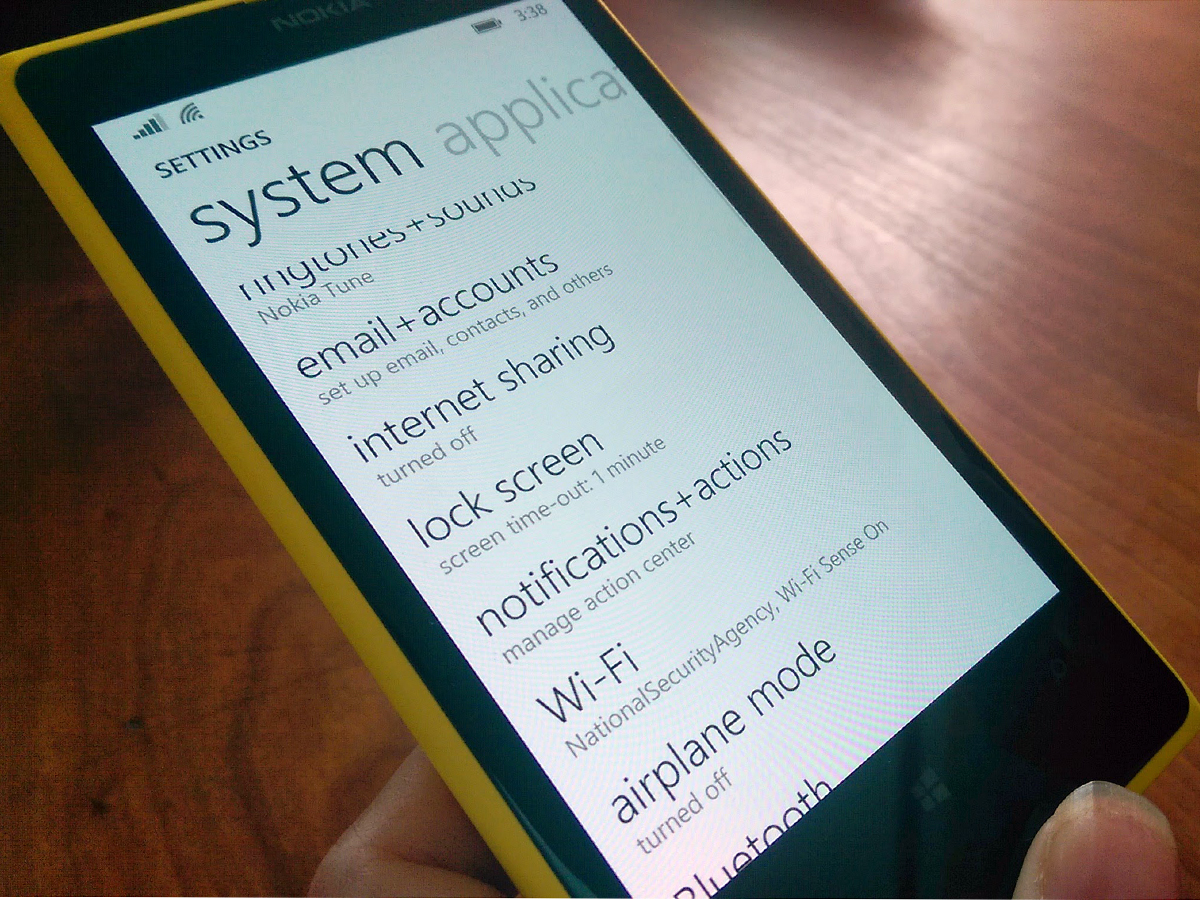
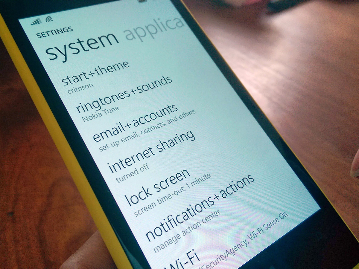
Then there’s the Windows Phone Settings screen, which is still a headache: too many entries, with no categorisation and often baffling decisions as to what gets filed where. If Microsoft are happy enough to borrow from the best of iOS and Android, this looks like the next logical place to run the photocopier.
Lastly, Windows Phone’s multitasking could be easier to use; although it’s quick enough to access with a long press of the Back button, you only see one app pane at a time. Compare that to stock Android, where you can see up to four, and scroll quickly through them (or even better, the nine-pane set-up in the latest cut of HTC’s Sense).
Windows Phone 8.1 verdict
Windows Phone 8.1 may only be an evolution of Microsoft’s mobile OS, but there’s enough spit and polish in this update to make it a serious alternative to Android and iOS.
Cortana shows real promise, and Universal Search is an addition you can imagine using every day. But ironically, it’s the fluffier aspects of 8.1 that may win Windows Phone new friends – the endlessly adaptable Start screen, the new tile transparencies, and the refinements to the animations.
Our only reservation, for now, remains the breadth and quality of apps available in the Windows Store. Yes, it’s now filled to the point where most of the mainstream apps are represented – but there still isn’t the depth of choice and consistently high quality that you’ll find in the Play Store or iTunes App Store.
But we’re at a point where the strengths are beginning to outweigh the weaknesses; 8.1 means that Windows Phone is ready for prime time.
READ MORE: Android 4.5 Preview
Stuff Says…
8.1 sees Windows Phone starting to realise its potential – with a couple of caveats this is now a worthy alternative to iOS and Android
Good Stuff
Pretty and now more customisable
Cortana’s powerful and effective
Notifications have finally arrived
Bad Stuff
Start can look messy if you arrange it badly
Settings and multi-tasking could be cleaner
iOS and Android still ahead on apps

