Oppo F1 review
Cheap phone, expensive-looking suit

No-one wants to admit they’re the kind of person who’d buy a car and plaster an ‘S’ or ‘R’ sticker on the back to convince passers-by they bought the Sport edition. But the phone equivalent is a lot more tempting.
The Oppo F1 costs the same as the 2GB RAM version of the latest Moto G, but is way slimmer, has a genuine metal back and could, from a distance, be mistaken for an iPhone 6s. At £169 you’ll only pay a third of the price for it, though.
It’s a shame the Oppo F1 won’t make it onto many high street shelves because, like the OnePlus X, it should be on the hitlist of anyone who’s after a low-cost phone that doesn’t feel cheap.
Bling factor on a budget
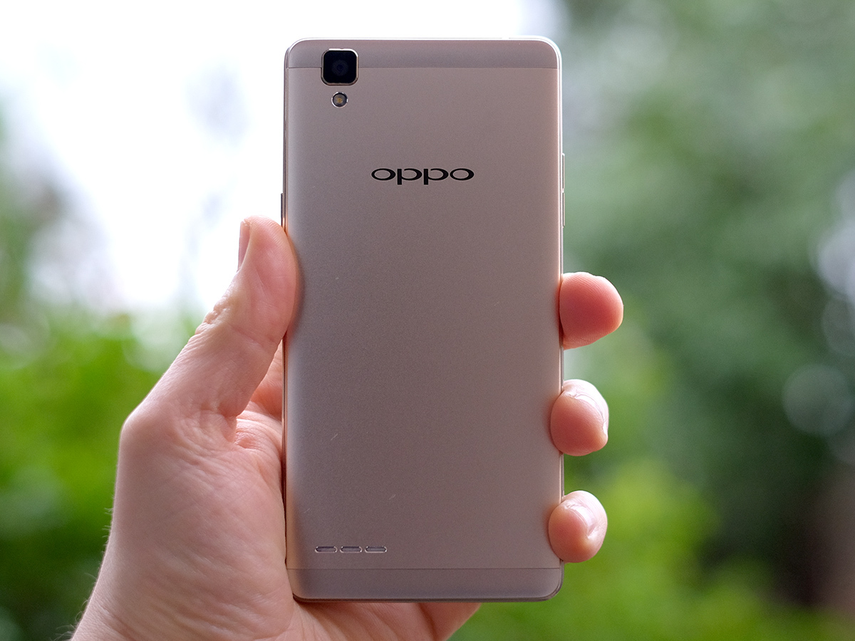
Oppo almost always offers you great specs for your money, but the particular appeal of the Oppo F1 is its design. The impression of build quality it gets you for the price is near-unbeatable.
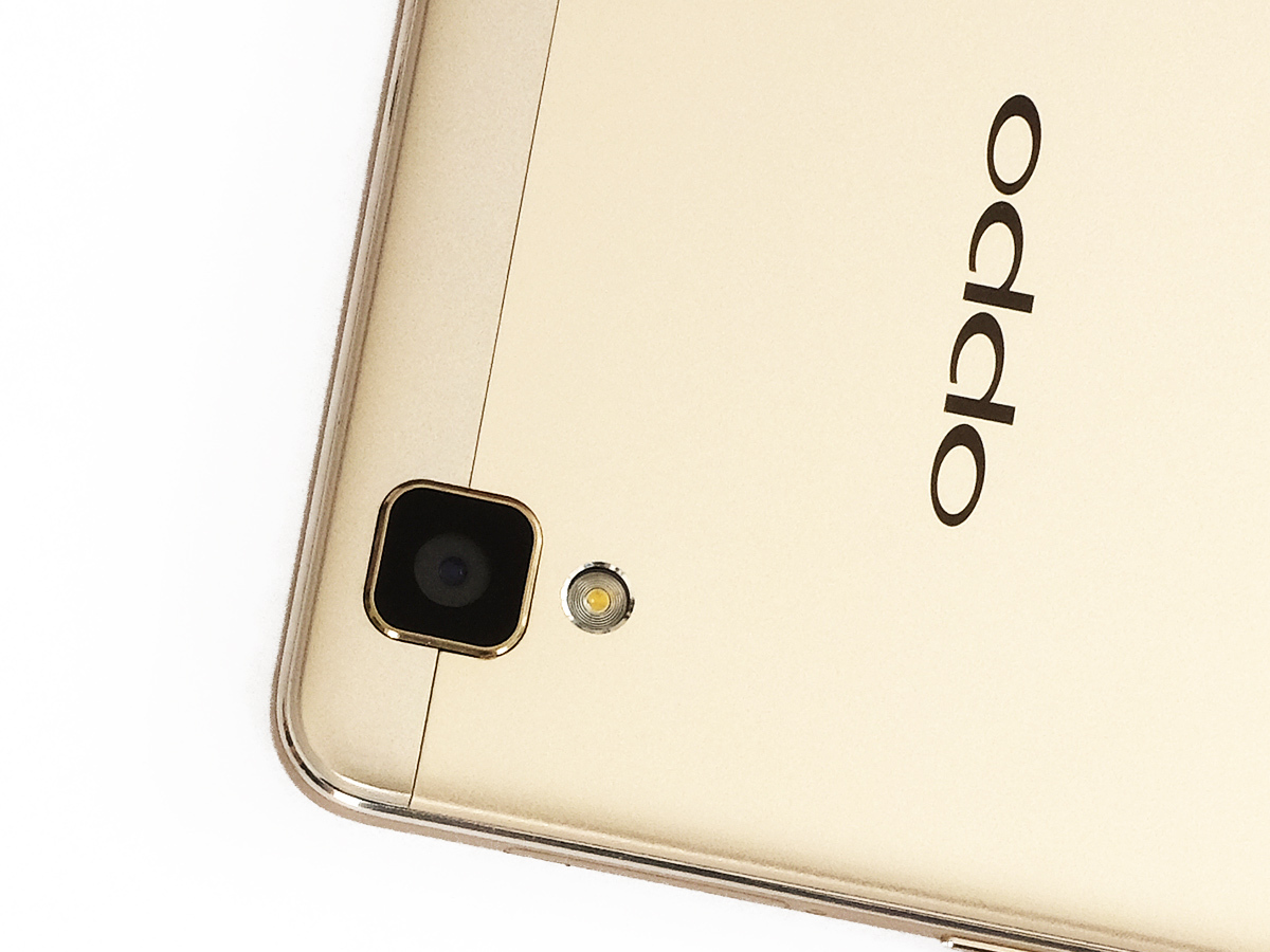
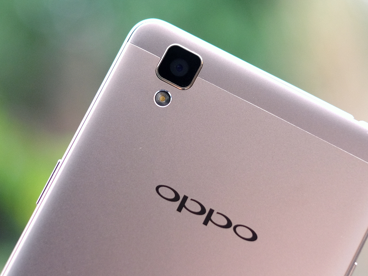
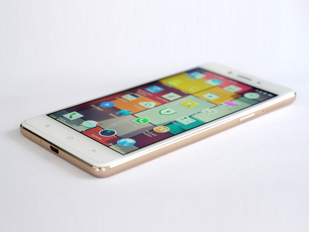
Where else do you get an anodised aluminium back and curved-edge front for £170? Even the metal Honor 7 costs a good bit more, and Oppo has really nailed its Apple impersonation on the rear. The metal just glints a tiny, tiny bit, looking classier than the metal phones that similarly price-gouging Huawei cranks out for under £200.
The eagle-eyed among you may have noticed I said “impression” of build quality earlier, because Oppo has pulled some clever tricks out of the bag to make the F1 possible. It’s not as fancy as it at first appears. First, while the curved front tricks your fingers into feeling it’s curved glass, but the curvy bit is mostly the plastic right at the edge.
This phone’s sides and the top/bottom strips of its back are plastic too. These let Oppo side-step expensive things like having to cut connector holes into aluminium. Finishing off those bits so they look and feel right is a lot more pricey than just making a plastic mould.
The Oppo F1 is a faux-spensive phone, one desperate to seem like it costs a lot more than £169. And while it’s a pretender, it does a very good job of tricking both your eyes and hands.
Going for a song › The best cheap smartphones – reviewed
Earning your tech badges
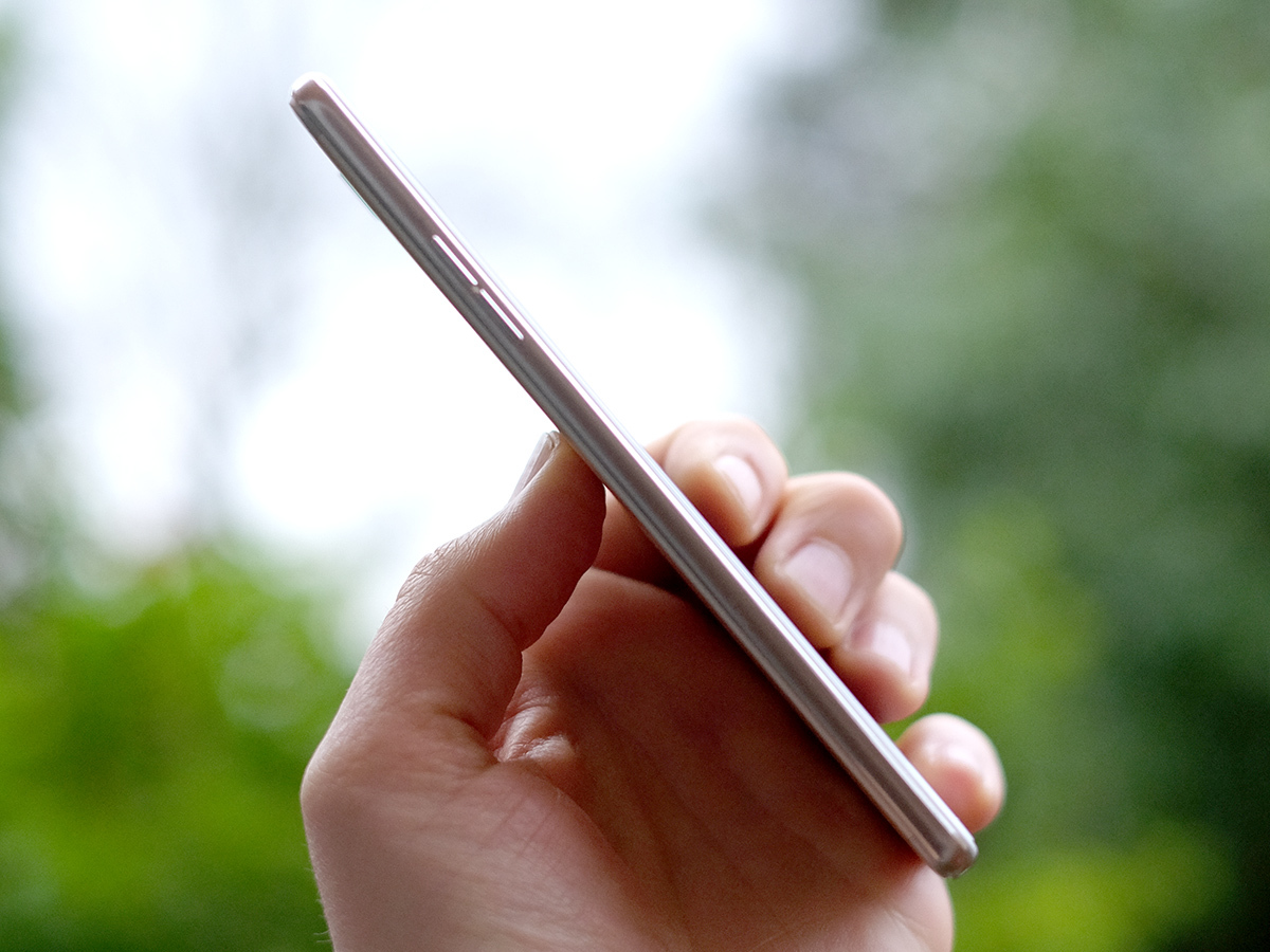
From a more practical perspective it’s a winner too. You get 16GB storage and a clever slide-out tray that lets you use either a nano or micro SIM (there are two slots) and a microSD card.
The Oppo F1 is a dead-slim 7.3mm thick too: easy to handle. The one slight niggle, and a sign this is a cheaper phone, is that while it uses hardware soft keys down below the screen, they’re non-lit. You can’t seem to switch to using software keys like the Moto G either. The OnePlus X makes the same move, but does let you switch to on-screen ones.
Still, it’s only likely to bother you as you’re getting to know the phone, and may just see you scramble around in the dark a couple of times if you’re not used to hardware soft keys. That’s about it.
Half-way to HD
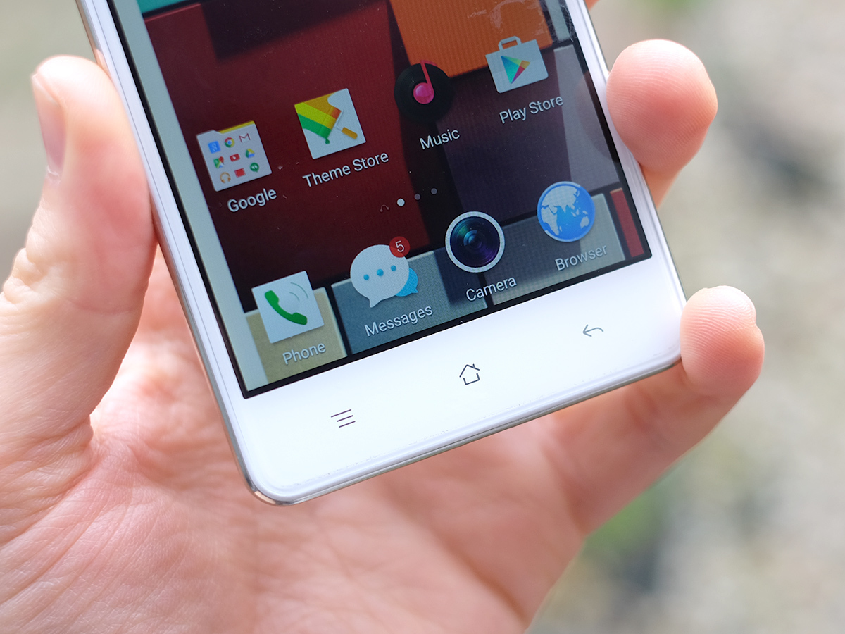
You get no prizes for guessing what kind of screen the Oppo F1 has. Like so many phones around the price, it’s a 5in 720p LCD screen. Just like the Moto G, the Sony Xperia M4 Aqua and a whole bunch of others.
This is about as low-end a screen as I’m happy to live with. But even coming from using the £600 Samsung Galaxy S6 Edge+ and Huawei Mate S Premium, I can live with it just fine. It’s big enough to be comfortable to use, just about sharp enough and IPS display tech gets you pretty good image quality.
This is a decent display, although I did find that, like the OnePlus X, the little guy’s ambient light sensor ends up making the backlight too bright a lot of the time. This can make brighter colours look a bit washed out, which is a shame because the Oppo F1 actually has pretty good colour for an affordable phone.
In typical fashion, I also had to bump up the brightness manually on bright days. The Auto brightness brain just doesn’t seem happy to go all that dim or bright. However, the hardware is spot on for the money.
The little issue we come up against here is that we’re approaching the sort of money that’ll let you get a 1080p phone rather than a 720p one. OnePlus’s X gets you a Full HD screen and is only £30 more. Plus you no longer need to ‘queue up’ just to get an invite to buy one of those.
In real life the difference is that the Oppo F1’s screen doesn’t look quite as pristinely smooth and sharp. Text is a tiny, tiny bit fuzzy. But it’s not as though you could drive a Transit van between the pixels. You’d have to be pretty picky not to be happy living with it.
Still, telling you that you get more if you pay more is no great surprise, right? The Oppo F1 also comes with a factory-applied screen protector that, for once, doesn’t seem to degrade the feel or image quality. And, for the cynics out there, this isn’t because the glass underneath is rubbish. It’s Gorilla Glass 4.
The supercheap competition › OnePlus X review
Cores: buy 4, get 4 free
So far, the Oppo F1 seems like pretty much the best of the rest of the £100-200 720p brigade apart from having a clever expensive-seeming design. However, it’s also unusually powerful.
This phone has a Snapdragon 616 CPU with 3GB RAM, which is not only very punchy for a 720p phone (the CPU seems like it’s really meant for 1080p ones), but also very up-to-date. The 616 was only announced at the end of 2015.
It’s an eight-core 1.7GHz CPU with the same style of Cortex-A53 cores some of the most expensive 2015 phones use when trying to devour less power. In Geekbench 3 it scores 3048 points, around double the score of the Moto G. In day-to-day operation it feels quite a lot like the 2GB RAM version of that phone, mind.
Don’t get too hung up on the number of cores, though. The Oppo F1 still has a pretty modest graphics chipset, although that’s all it really needs. Because the phone only needs to crank out games at 720p, everything seems to run just fine. Asphalt 8 and Trials Frontier are my main mobile weaknesses at the moment, and they are as smooth as you like.
Colouring-in Android
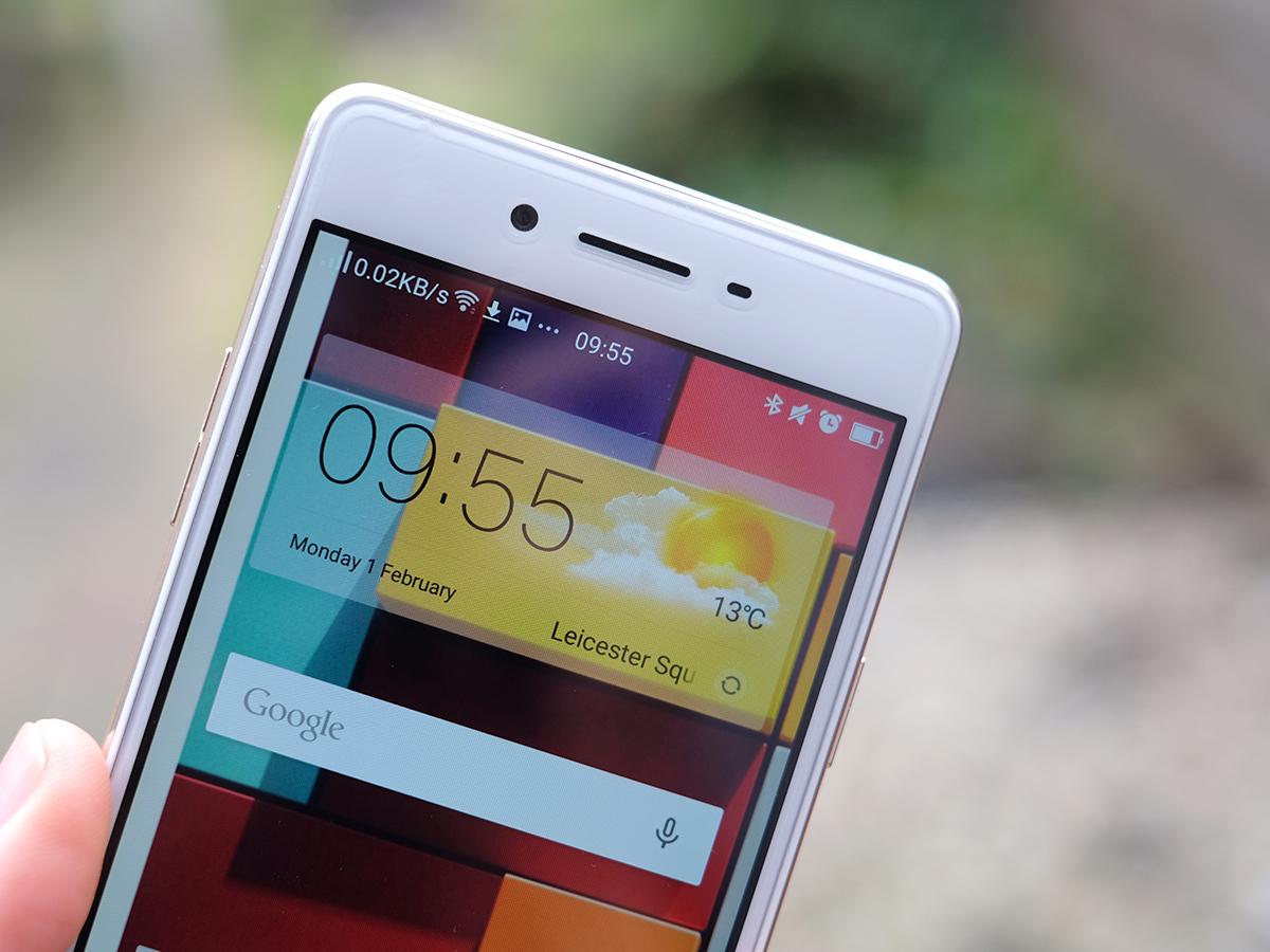
Where the Oppo F1 starts to get a bit more contentious is the software. It uses Oppo’s Color OS interface, which doesn’t seem to have changed all that much since the beginning of 2015 and makes some pretty drastic changes to the Android 5.1 workings underneath.
The biggie: it kills the apps menu. All you have are homescreens, and for real app fiends, I think the vertical scrolling apps closet of Android Marshmallow is a far better way to keep your catalogue under control. Sure, you can use folders, but it’s a bit of an effort and can still look messy unless you’re careful.
The other company that always raises eyebrows by using this style is Huawei, but where there are frankly weird bits in its Emotion UI, Color OS seems normal enough. It just doesn’t seem quite as on-the-ball or as slick as plain old Android Marshmallow in some areas.
What Oppo has tried to emulate from default Android is the smooth feel you get from all the swooshy animations Google brought in with Android 5.0. I’ve used a bunch of affordable Android 5.0/5.1 devices in the last year that have felt a bit slow, mostly because they had 1GB RAM, but with 3GB of the stuff the Oppo F1 works like a dream for the most part.
I had the browser complain that some sites has ‘stopped responding’ a couple of times, but this is one of those phones with two browser apps: switch to Chrome and it starts behaving.
Bits of Color OS you might actually like include that instead of having a weird news feed home screen or a Google Now digital assistant one, flick to the left of the main homescreen and you get a whole page dedicated to music controls. Color OS also offers themes that fully re-skin the Oppo F1. Icons, wallpaper: the lot.
Flicking through the Themes app’s wares is a bit like looking at the paintings wall of a nursery school. Most of them are user-generated. Most of them are rubbish. But spend enough time looking through them and you’ll find a few corkers. I’ll admit: I stuck with the default one. It’s perfectly nice.
Upset about Color OS? Don’t forget you can paste much of Android Marshmallow over it anyway using the Google Now Launcher app. Simples.
A top budget blower › Vodafone Smart Prime 6 review
Pappa-razzie?
The one part of the Oppo F1 that does feel a bit slow at times is the camera. Use it in daylight and it’s fine. There’s a tiny little bit of shutter lag, but nothing too serious.
What makes the Oppo F1 lag a bit behind some of its rivals is how slow some of the extra modes are. I’m a big fan of HDR shooting with phones, as it amps up shots that might look a bit dull otherwise. However, here the HDR mode is so slow it sucks the fun out of the thing.
The results are good, but the Moto G has a real advantage here: its HDR mode is way faster.
Other than that, though, there’s a lot to like. The Oppo F1 seems to use the same 13-megapixel ISOCELL sensor we met in the OnePlus X. As well as being fairly high-res it packs-in phase detection autofocus for more reliable locking-on of subjects.
I found it can still take a little while to focus at night, but it’s pretty reliable when it does. There are a couple of other minor niggles too: the white balance can get a bit skewed a dusk and the spot metering means you need to shoot while being careful about exactly what part of your subject you tap on. However, the Oppo F1 is among still the better phone cameras at the price. Pure image quality is pretty similar to that of the OnePlus X.
You can get great results in daylight, but in the dark everything seems to get quite mushy: perhaps a little bit less so here, although I haven’t had a chance to dual-wield the pair. The slowish f/2.2 lens isn’t going to help here. The single-LED flash will, but only for fairly close-up subjects.
Other than super-sharp low-light photos what you miss out on with the F1’s budget-friendly price is 4K video. This Oppo only goes up to 1080p. It’s actually the front camera that’s being talked about more than the rear one, though. The Oppo F1 has an 8-megapixel front camera with an 1/4-inch sensor. That’s the sort of size you might see on a cheaper rear phone camera.
So selfie-ish
Sure enough, the Oppo F1 selfies set new standards at the price, able to render crows’ feet and stubbly bits with intricate, and unforgiving, detail. Of course, it’s not just about the details we don’t really want to see.
This phone makes more lifelike selfies than I’m used to seeing at this sort of price, where cheaper phones’ selfies can seem like rough approximations of the real thing, ground down nubs where great big bags of processing is needed to make up for limited hardware. In low light you get some of this effect, but much less than usual.
For £169 it’s a great setup.
Milliamp champ?
The Oppo F1 battery life isn’t too bad either. Coming from using the ‘in bed by 10pm’ £600 Huawei Mate S Premium, I find it a definite improvement. Despite having only a 2500mAh battery, it should comfortably last a whole day, if not much more than that.
Two days? No chance.
Stamina seems close to the 3rd gen Moto G, although from a purely anecdotal take on things I’d give the Motorola the edge. But only just. Our usual video battery test shows similar findings. The Oppo F1 lasts nine hours 45 minutes when playing a 720p film, a respectable but not remarkable result for a mid-range phone. And, as that slim frame may have already told you, you can’t remove the Oppo F1’s battery.
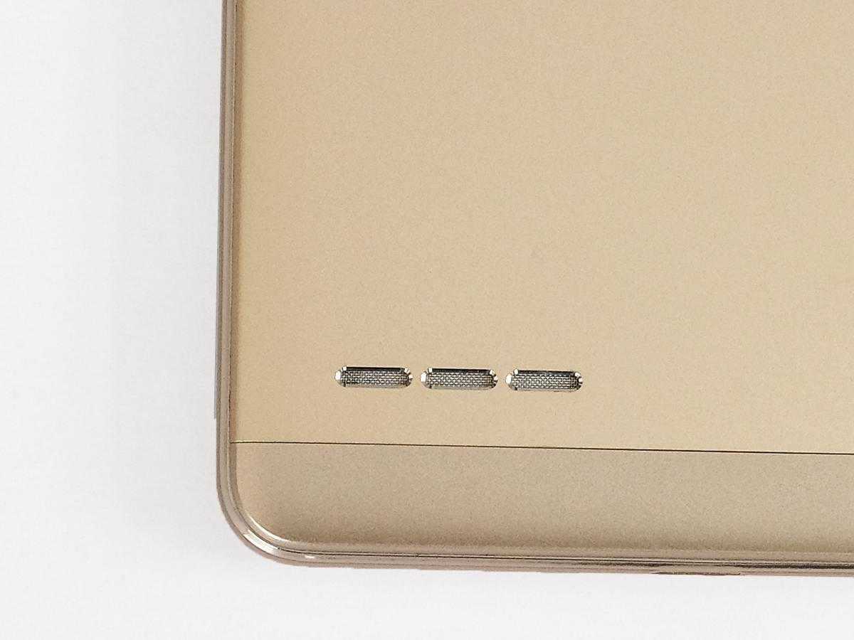
While the battery performance is run of the mill, I was a bit more impressed by the speaker. A slim frame and rear-mounted speaker is never a good sign for audio in a cheaper phone, but the Oppo F1 goes pretty loud and can max-out its volume without sounding ugly and distorted.
It’ll handle duties for a bit of music or podcasting while you’re in the shower without being totally drowned out — morbid pun not intended. But, like most phone speakers, can’t quite out-decibel a boiling kettle. Not the noisy old thing in my kitchen, at any rate.
Oppo F1 Verdict
The Oppo F1 is a terrific phone for SIM-only buyers. No contract, no massive expense, and yet you get a phone that, from arm’s length at least, doesn’t look like bargain bin fodder even next to the average £500 phone.
There are better cameras out there, better screens and sharper-looking software skins. But even when added together they don’t tower over the great big value-for-money mound the Oppo F1 lives on. Next to the 2GB RAM Moto G it’s a case of pros and cons for each, though. The Moto has better software, the Oppo is a bit snazzier and also, let’s be honest, just a bit more exotic too. Take ‘yer pick.
Best of the best › The 10 best smartphones
Tech specs
| Display | 5in 1280 x 720 IPS LCD screen |
| Processor | Snapdragon 616 1.7GHz octa-core CPU |
| RAM | 3GB |
| Storage | 16GB with microSD |
| Rear camera | 13MP with phase detection and f/2.2 lens |
| Front camera | 8MP with f/2 lens |
| Battery | 2500mAh |
Stuff Says…
A top budget pick for those who find the Moto G a bit too plain for their tastes
Good Stuff
Good value
Decent camera
Smart, expensive-looking rear
Bad Stuff
Only 720p screen
Snail’s-pace HDR camera mode
Software a tiny bit dated in parts


