OnePlus X review
A phone with the X factor, and plenty of it
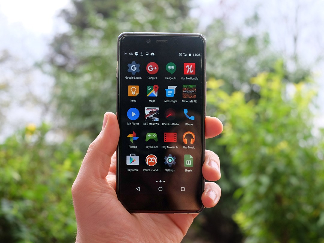
OnePlus is a cheeky company. With the OnePlus One and 2, it boasted that it had trampled all over much more expensive alternatives like the Samsung Galaxy S6. The OnePlus X limbos even lower, costing just £199 where the OnePlus 2 starts at £239.
It’s cheap. But not so cheap OnePlus hasn’t been able to make the little guy feel dead flashy. This is absolutely the most impressive sub-£200 phone you can get in terms of how it feels in your mitts.
Sure it’s not perfect, and some of you should probably spend the extra £40 on the more feature-rich OnePlus 2. But Samsung and Sony don’t offer anything nearly as delightful for under £200.
Well done OnePlus, you’ve only gone and done it again.
Glass class
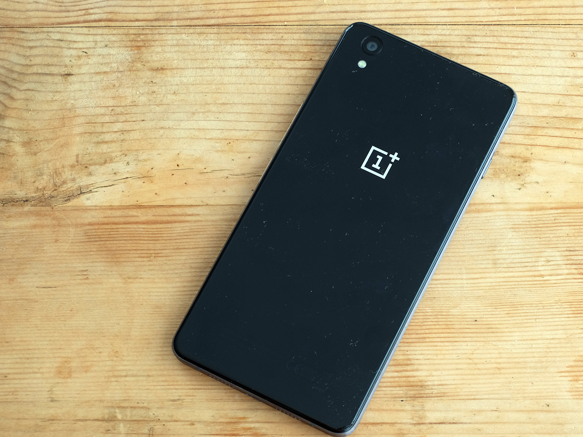
Until now, OnePlus’s phones have been mostly plastic things. The backs of both the OnePlus One and 2 are weirdly kinda fuzzy, but still plastic underneath. The OnePlus X’s rear is glass like, say, the Sony Xperia Z5.
I actually think OnePlus’s hardware design is actually nicer than that of the king Xperias, though. The front glass is curves a bit at the edges, really softening out the feel a lot.
The OnePlus X’s sides are metal too. No part of the thing is plastic, and that makes it feel tremendously luxurious for a phone that sells for less than £200. Well, a quid less.
I ended up using the OnePlus X just after the Nexus 5X, and this phone feels a lot more expensive. It’s not far off something like the Samsung Galaxy S6. How OnePlus managed this for £199 is a real head-scratcher.
It’s not perfect, though. Based purely on my experience with the OnePlus X, I do think the aluminium alloy on the phone’s sides seems a bit softer than some more expensive metal phones. For example, the OnePlus 2 uses a magnesium-aluminium combo and the iPhone 6s’ 7000-series aluminium.
After a few days, I noticed a few little micro dents on the ridged metal sides. I get the feeling this ridgy style is there so that the dents aren’t quite as obvious as they would be on the smoother-sided OnePlus 2.
But hey, it’s still metal and still both looks and feels fab. Not to mention totally different to the other OnePlus phones.
Smart snapper › Sony Xperia Z5 review
The side attractions
There’s also another, slightly more expensive ceramic version of the OnePlus X, which I got to have a fondle of at the phone’s launch a little while back. It doesn’t look much different to the one here, aside from having a slightly tinted reflection quality. As the OnePlus X uses Gorilla Glass 3, it’s pretty hardy anyway.
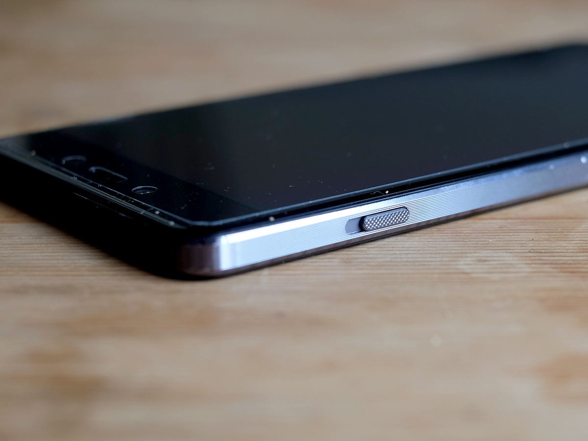
The other big hardware change is that, set off the party poppers, the OnePlus X has a microSD card slot. Its nano SIM and memory card sit in a little metal tray that pops out of the phone’s side, a bit like an iPhone. In a clever little twist, you can actually pop a second card in the memory card hole if you like.
The OnePlus 2 doesn’t have these chops. But then it does have a fingerprint scanner, which you don’t get here. Neither has NFC. Maybe OnePlus just hates wireless payments.
One other little OnePlus-staple extra is the switch on the side. This is one of just a few Android phones these days that actually has a silent mode switch on it. It’s prepped for the cinema. All of the buttons on the OnePlus X are metal too.
Some people really don’t like the feel of the OnePlus One and 2, but I can’t really imagine many people taking against the OnePlus X. It’s plain, but not bland and instantly impresses. Especially when you think about how much it costs.
One little bit I would change if given the chance is the way the OnePlus X’s soft keys operate. You can use hardware or software soft keys, but the ones that sit down below the screen are so subtle you can hardly see them. They don’t light up either so do take a little while to bed in, relying 90 per cent on muscle memory.
Still, I found the OnePlus X a delight to use. It feels petite and slim, and the sensibly-placed buttons are an ergonomic smash. This is a more accessible design than the OnePlus 2, which is a smidge big for some people.
OLED on a shoestring
It’s all change for the OnePlus range. And that stands for the screen too.
The OnePlus X has an AMOLED screen, where the other OnePlus phones use LCD displays. The difference? OLEDs have light-up pixels while LCDs have little LEDs that fire across the screen to light it up.
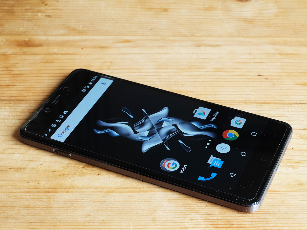
What this style allows is super-awesome contrast. The OnePlus X’s blacks are pure black. Even in a totally dark room, black bits of an image stay dark. As standard the X has a very black-heavy wallpaper and a dark apps menu, and you can barely tell between the actual screen and the black surround. It’s a striking look.
This screen is also way more striking all-round than the OnePlus 2‘s LCD. Colour richness is far higher, providing that classic OLED ‘pop’. I actually prefer the more relaxed look of this little guy’s brothers, but you like vivid screen colours you’ll definitely appreciate the OnePlus X’s AMOLED.
It’s sharp too. Even though the OnePlus X has a sharpness-reducing PenTile screen style, the 1080p resolution is enough to make the 5in nice and clean-looking. OLED fizz is only visible when you make your eyeballs virtually kiss the screen.
What does this tell us? The OnePlus X actually uses a Samsung screen. We’re not at Samsung Galaxy S6 level here, though. You don’t get the colour accuracy, and it doesn’t pull the same tricks to ramp-up outdoors visibility. I also found that the auto brightness setting tends to make the screen way too bright indoors too. It’s almost as though the software doesn’t take into account how bright the screen can go. OnePlus should be able to sort this out with a software update, though.
As with the design, any criticisms have to be seen alongside the price. And for £200 this is a top-notch screen. It’s lively, has perfect viewing angles and crazy-deep blacks.
OnePlus also sells the X with a plastic screen protector attached. It’s a neat way to keep the phone looking pristine for a bit longer. Or, y’know, you can rip the thing off as soon as you take the phone out of its box.
Smartphone sultan › Samsung Galaxy S6 review
O2 injection
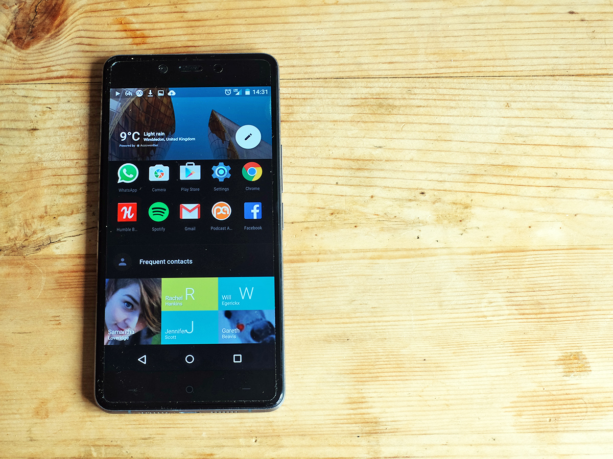
The OnePlus X’s software is the same as what you get in the OnePlus 2: Android 5.1 with the Oxygen UI. It isn’t configured the same, though. The default look is far darker, in order to both show off the OLED’s blacks and to save a bit of juice. With a screen like this, the more black on the screen, the less power it needs.
There’s plenty to tweak here, though. The whole point of Oxygen UI is that while it looks and feels a lot like standard Android, there are loads of customisations on offer.
I’m talking about things like being able to flick the apps menu between white and black themes, and using software soft keys if you don’t like the hardware ones. The single slightly more ambitious change is something called Shelf. This is an extra homescreen that is home to a few widgets, showing the weather, and your favourite contacts and apps. It feels a bit half-baked, though. It’s just not that useful. You can choose to… leave Shelf on the shelf when you first boot the OnePlus X up, though.
There are no performance issues here either. While I find the Nexus 5X a bit snappier, that seems down to the Android Lollipop style being a bit slower than Marshmallow’s, rather than anything to do with OnePlus.
Some people seem a bit upset that the OnePlus X has a fairly old chipset. It uses the Snapdragon 801, a top-end CPU from a couple of years ago. It’s a CPU grandad, an oldie but a goodie. It wasn’t infamous for overheating like the Snapdragon 810 is, and still has a better GPU than the Snapdragon 615 you might see in other phones at this sort of price.
It’s a great choice, and still earns a respectable 2530 points in Geekbench 3. The OnePlus X has a generous 3GB RAM too. A few years ago this spec would have cost you £500.
The one part that might hold the OnePlus X back is that its brains aren’t 64-bit, just 32-bit. However, I’ve not noticed any way in which it lets the phone down right now, and it doesn’t seem to get as hot as something like the Sony Xperia Z5. This makes a pretty great little mid-range gaming phone.
Sound Advice
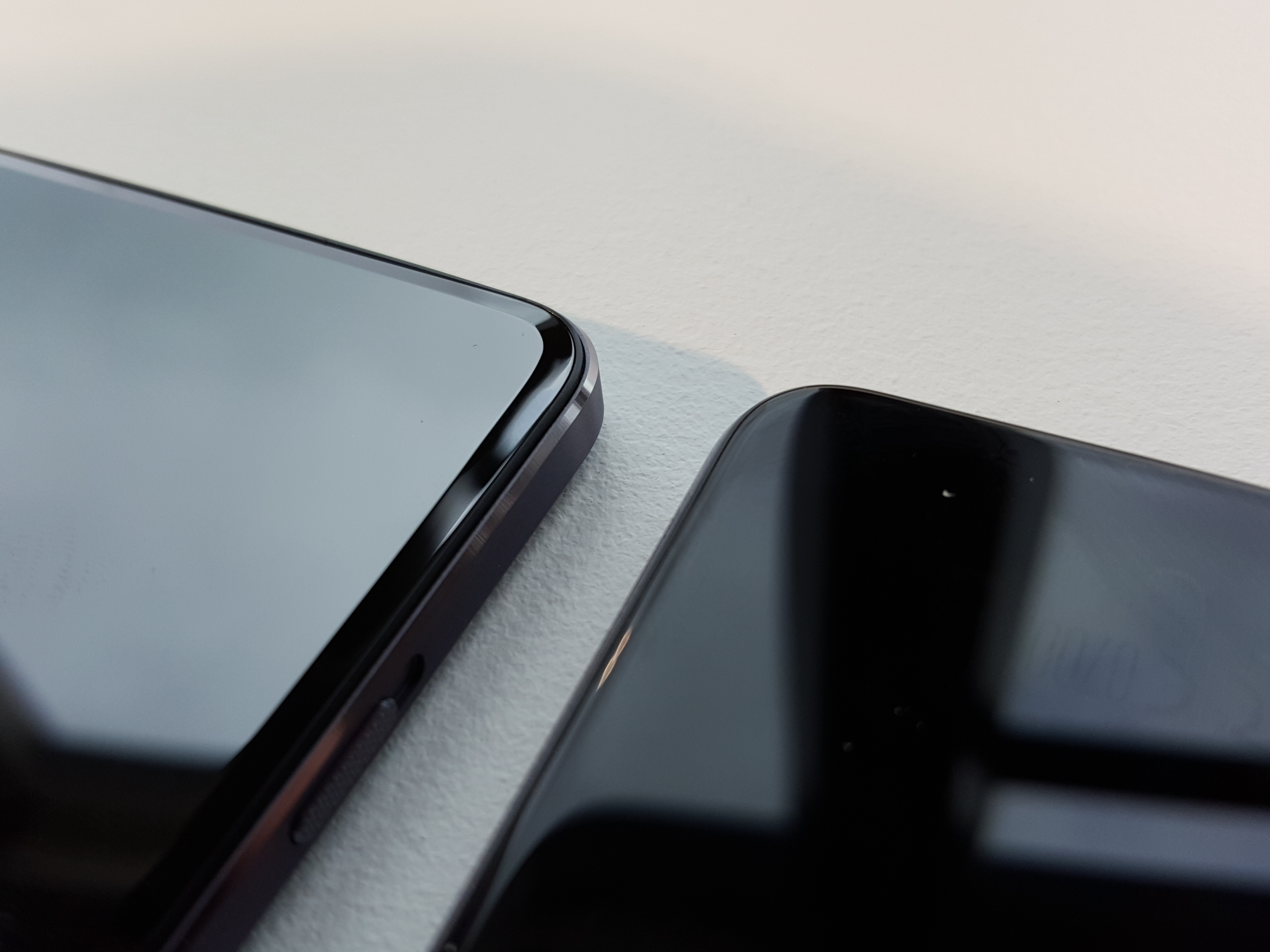
The sound side is less remarkable, though. The speaker sits on the bottom edge and is completely bog-standard. It sounds pretty harsh at top volume and is less beefy-sounding than the one on the OnePlus 2. Top volume is good and it really cuts through, say, a kettle boiling. But it doesn’t half grate on the ears when maxed-out.
Like lots of phones with this sort of bottom-loaded speaker style, the grille layout is lying to us too. Sound only actually comes out of one of the two grilles, so you have to be careful about not blocking the thing with your palm.
I didn’t hold out much hope for the battery life either, however it is actually pretty good. It seemed like OnePlus traded away battery stamina for that ultra-skinny 6.8mm glassy frame, but the OnePlus X lasts for 14 hours of video playback off a charge. That’s pretty great from a 2525mAh unit, similar to what I squeezed out of the Samsung Galaxy S6.
The efficiency of the screen must have a lot to do with this. I found it pretty easy to make the OnePlus X last through the day too. However, this is when using the battery-boosting ‘dark’ theme that the phone uses by default, and by manually overriding often nova-like Auto brightness setting. The display probably uses a chunk more charge if you switch to the white background look that’s much more vanilla Android-like.
Budget flagship › OnePlus 2 review
Locked in an ISOCELL
However, the OnePlus X camera isn’t quite as good as that of its bigger brother. It uses a 13-megapixel rear camera and an 8-megapixel front one. That sounds like an upgrade over the 13/5MP OnePlus 2 setup, but it isn’t. For example, there’s no optical image stabilisation, no laser focusing aid and a slower f/2.2 lens.
It’s still good, mind, and very fast. In daylight you get plenty of detail too.
Dynamic range isn’t mind-blowing and the metering can be a bit conservative, but it’s a decent setup that can create good results, especially if you’re willing to tweak post-shoot. I also found that HDRs don’t look weirdly overdone as they did from the OnePlus 2 when it first launched.
You can definitely tell that the OnePlus X doesn’t have optical image stabilisation at night time, though. While the OnePlus X is great at making your images look clear even at night, this involves whacking up the ISO level to as high as just under 5000 in order to make your shots look bright enough.
As a result, though, photos become pretty mushy-looking. The OnePlus 2 and Nexus 5X are both much better for low-light photos.
I’m also not a huge fan of the OnePlus camera app. Its mix of gesture controls and traditional menus feels awkward, and there’s no Auto HDR function, which lots of phone cameras have nowadays. There’s also no 4K video, just 720p and 1080p.
There’s no major benefit to the high resolution of the 8MP front camera either, and it’s not remotely close to the quality of the standard-setting one on the Nexus 6P.
What you get here is closer to the camera of the third-generation Moto G, and I did have a bit more fun using the Motorola camera app. This is a good camera, but not one that go toe-to-toe with the best out there, as some other elements of the OnePlus X can.
OnePlus X verdict
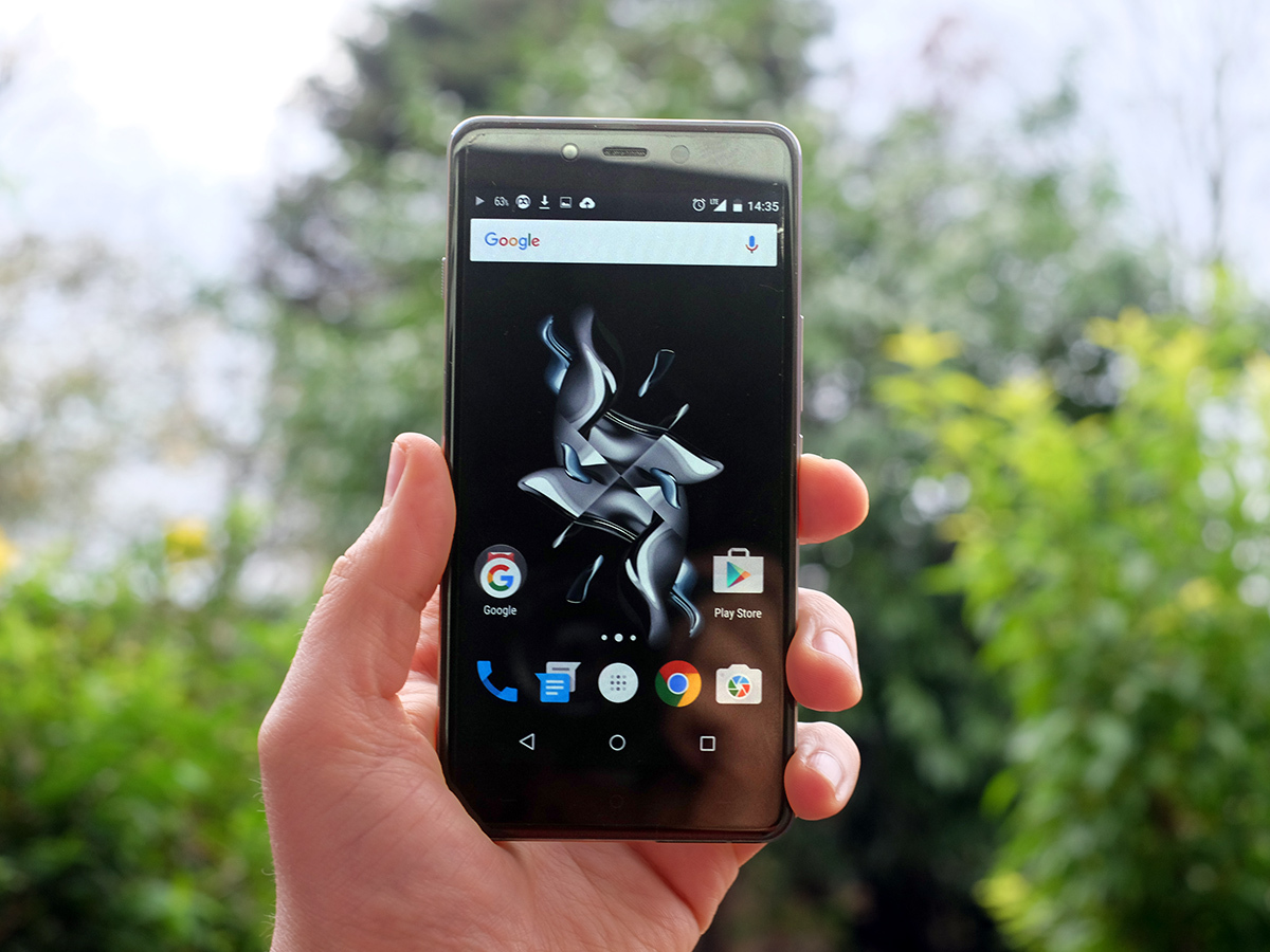
No-one has quite the price aggression of OnePlus. And the OnePlus X is yet another bargain blower for people who don’t like the feel of the OnePlus 2, or are after something a bit smaller.
Its design is lovely, with no sign that this is a supposedly ‘cheap’ phone. It’s a delight.
The only issue is that the OnePlus 2 only costs £40 more at £240 and has a more versatile camera and, for the screen snobs, more relaxed-looking colours.
Super smartphones › The top 10 smartphones in the world right now
Tech specs
| Screen | 5in 1920 x 1080 AMOLED |
| Software | Android 5.1 with OxygenUI |
| CPU | Snapdragon 801 Quad-core |
| RAM | 3GB |
| Storage | 16GB with microSD |
| Battery | 2525mAh |
Stuff Says…
A super-value phone that sets a new standard among sub-£200 mobiles. Not perfect, but bloody good.
Good Stuff
Fab design
Great performance
Stunning value
Bad Stuff
Dodgy Auto brightness setting
Mushy low-light photos


