iOS 12 hands-on: 6 things we love (and 3 we don’t) about Apple’s latest OS
Productivity and reading more vs. evil gestures and absent apps
We’ve told you how to back-up your iOS device and install the latest iOS public beta. We’ve also outlined how to master iOS 12. What we haven’t said is what we actually think of it.
Here, then, is the Stuff initial hands-on, outlining the really good – and the not-so-good – bits of Apple’s latest OS for iPhones and iPads.
The fab bits of iOS 12
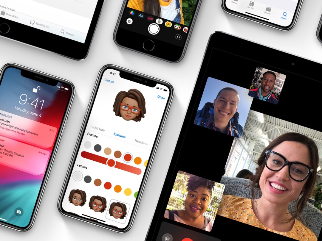
There are plenty of new fun bits in iOS 12, such as turning yourself into a custom Animoji, or plastering selfies in Messages with stickers and speech balloons. But during testing, we (somewhat ironically) found ourselves gravitated towards new bits of iOS designed to make us use our devices less.
Downtime
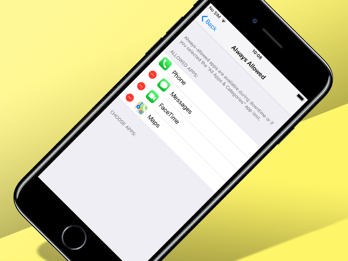
We’ll talk about Screen Time in a bit, because first, we want to specifically mention Downtime, which was a real eye-opener during testing. Turn on the feature and you set a period during which any apps outside your ‘Always Allowed’ list are effectively banned.
What’s perhaps more surprising is that this works across devices. At the user-defined time, the screen dims, and you’re given a very clear reminder to stop using all your iOS devices. Of course, you can override the warning, but at the very least, Downtime provides a nudge to get away from screens and go to sleep.
Screen Time
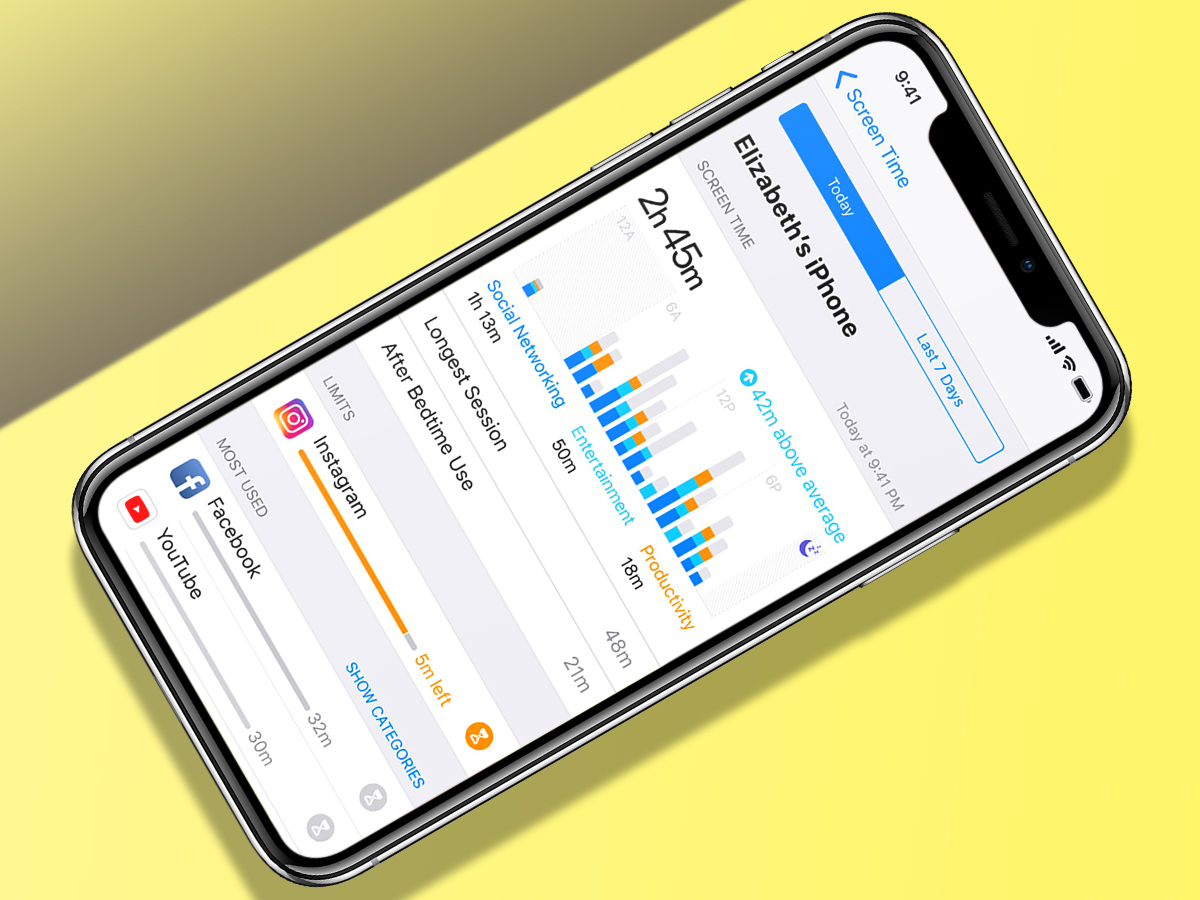
Tracking app usage has been a long time coming. Previously, the best you could do was check which apps had been eating into your battery life. But now, you get graphs that starkly illustrate what apps you’re using and when.
Adding limits is perhaps a bit muddled, as it stands. From the main page, you do so by category, which feels too broad. But tap the main usage graph and you can access limits for individual apps under ‘Most Used’. Now you’ve no excuse for not knowing about your Fortnite or Instagram habit – and doing something about it.
Expandable Siri
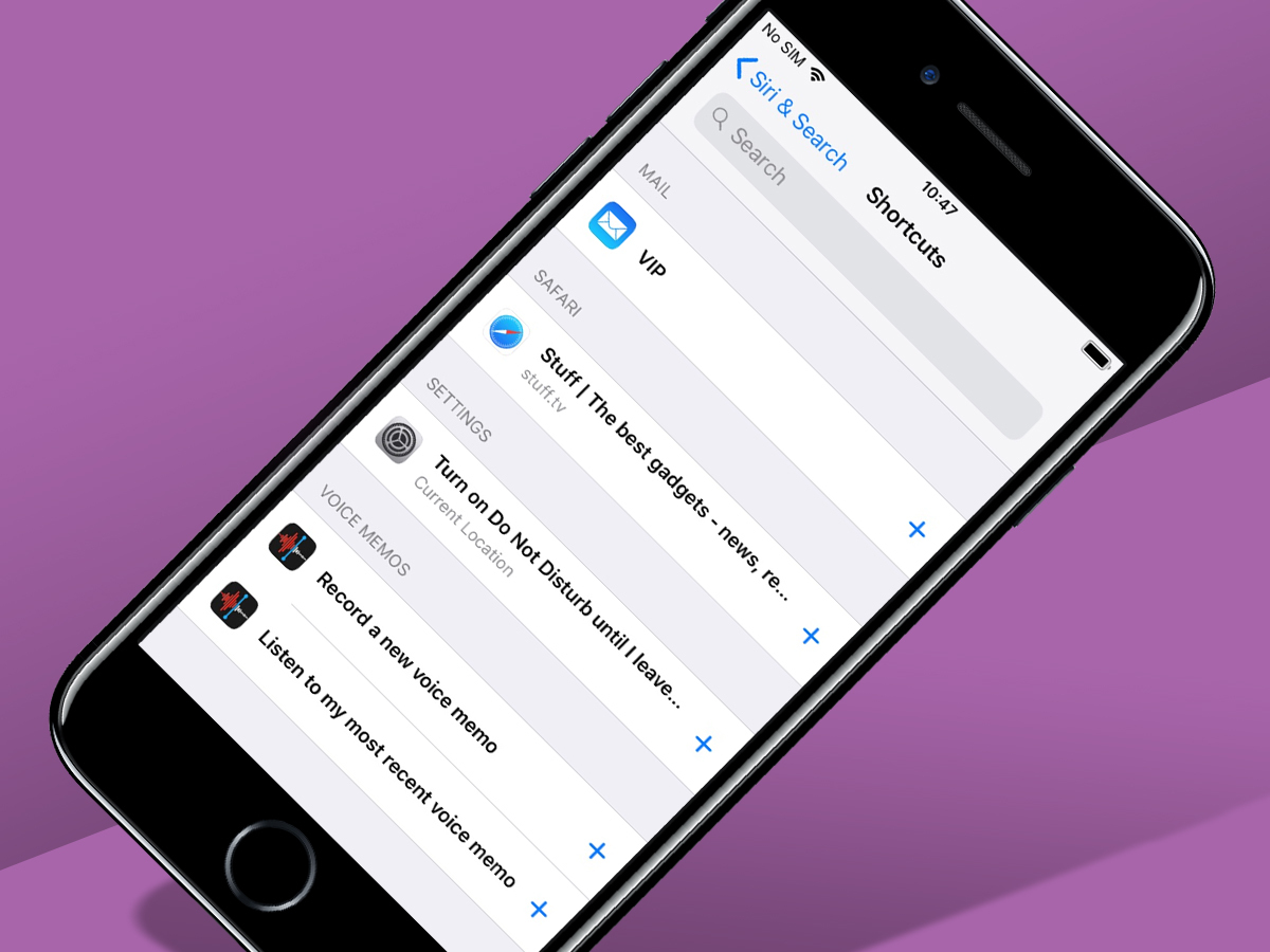
On the public beta, Siri’s smartest bit remains beyond reach, namely the new Siri-oriented take on Workflow, which enables you to quickly cobble together automation workflows triggered by a voice command. But in the meantime, you can add simpler tasks to Siri’s capabilities.
In Settings > Siri & Search, your device tracks actions you’ve performed and offers to turn them into shortcuts. So if you often visit Stuff.tv, you can connect that action to a phrase like “visit Stuff”. Ask Siri that and you’ll instantly be sent to our site, rather than Siri hoping for the best and spewing out search engine results.
Notifications coherence
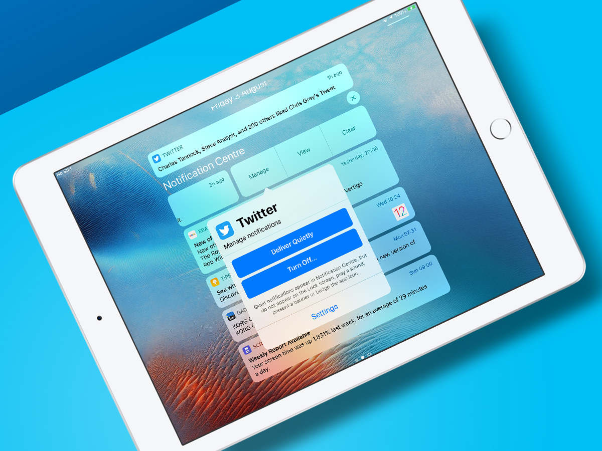
Notifications have always been a bit of a mess on iOS, but now they’re grouped by app. No longer will an explosion of Twitter replies transform into a massive list that causes you to miss something that’s actually important.
Great though that is, the best bit is being able to control notifications in real-time, rather than having to delve into the hell of Settings. Three taps and a noisy app or game’s notifications can be silenced – or turned off entirely.
Do Not Disturb
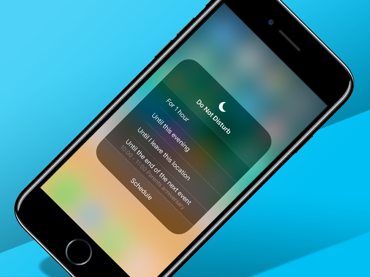
This feature started out as a brute-force option to shut up your iOS device, and gained a modicum of intelligence in iOS 11 by stopping people from bugging you while you were driving. But under iOS 12, disruption can be silenced in a controlled manner.
From Control Centre, a long-press on Do Not Disturb provides several options rather than just turning the feature on. It’s very handy to quickly shut up your iPhone in a meeting, or when at a cinema, knowing it’ll revert to its usual noisy self when your circumstances change.
The Books app look superb
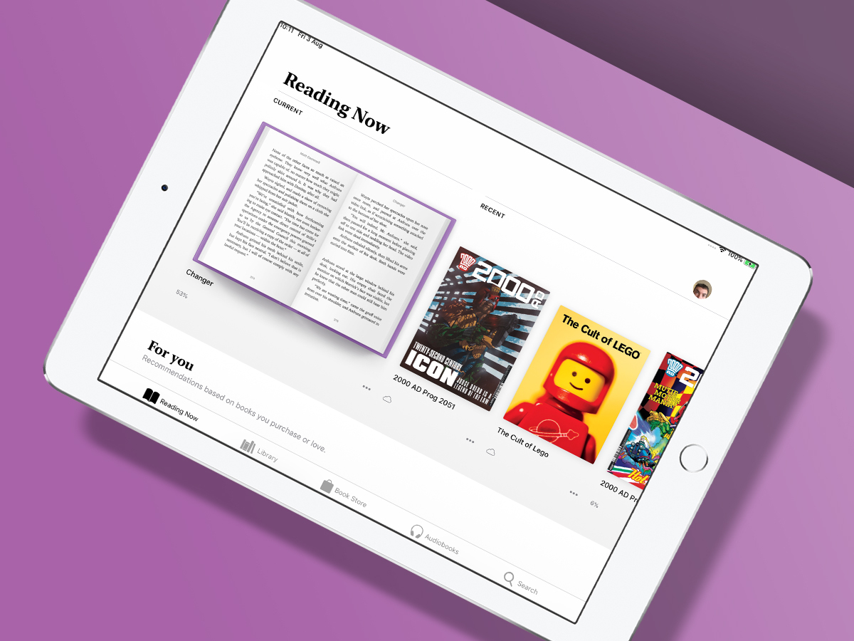
Apple often takes something that already exists and makes it more usable – including its own software. iBooks is now Books, and sports a massively improved interface – especially on iPad.
Whereas before books were displayed as a boring list that left most of the screen unused, now your current reads have large, vibrant previews, below which appear recommendations. The library view is similarly appealing – although you can revert to the old list if you hate change and always think things were better in the old days.
The bad bits of iOS 12
Bar the odd bug and lack of stability you’d expect from a beta, there’s little to grumble about. That’s not to say Stuff found the entire iOS 12 beta experience plain sailing. Choppy waters were to be found in things that seem incomplete or ill-advised, or are just plain missing.
Photos is still thick as a brick
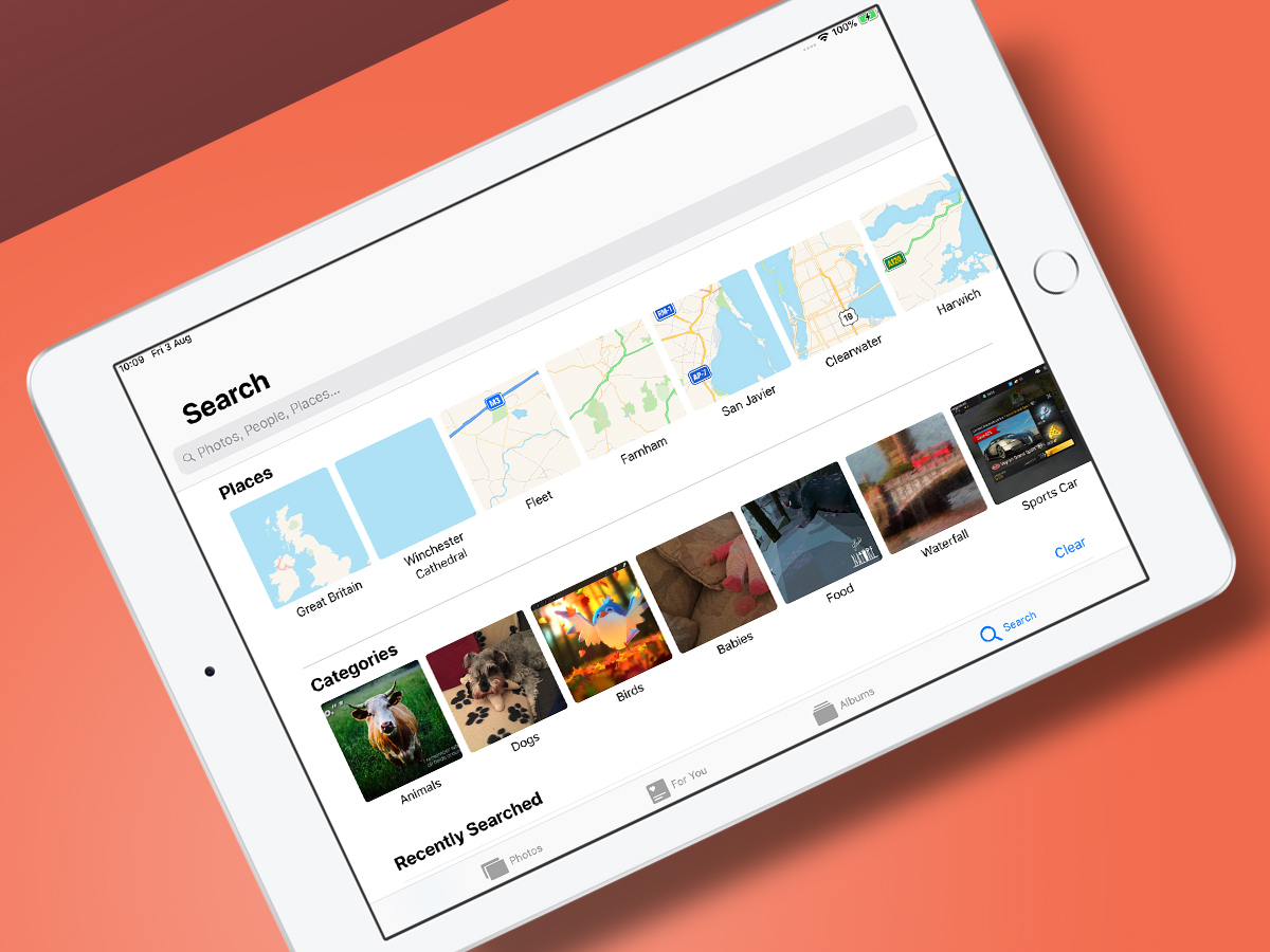
Apple makes a big deal about Photos offering a “smarter way to search your photos”, with suggestions making it easier to find what you’re looking for. Keyword searches have in fact been baked into Photos for a while, but are now front and centre in a bespoke Search tab. Alas, during testing results were scattergun.
Still, iOS will learn, and the new interface is a big improvement, offering fast access to locations, categories and recent searches. That said, would it kill Apple to add manual photo tagging to iOS?
The new iPad gestures are a mess
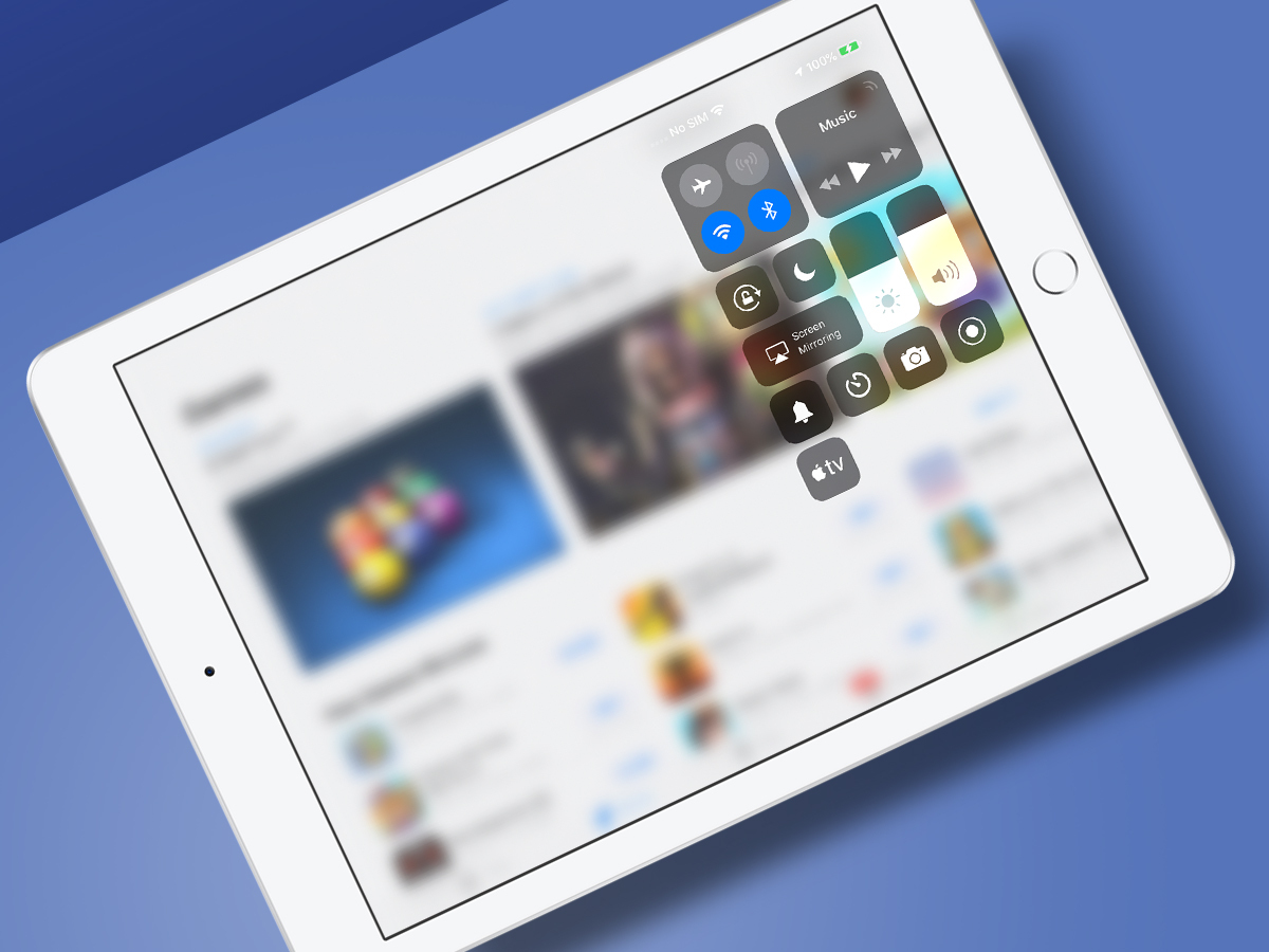
The second the iPhone X upended long-standing iOS gesture conventions, we knew change was coming to the iPad. It’s now here… and we’re not thrilled.
Control Centre is now dragged down from a smallish trigger area at the top-right of the screen (which Apple reckons is ‘convenient’), but the Dock’s worse: a quick swipe up from the bottom of the display makes it appear – but that gesture now also takes you to the Home screen.
You can still bring up the Dock when in an app by way of a ‘swipe and hold a bit’ gesture, and access the multitasking view with a longer swipe. But these changes feel fiddly, aren’t intuitive, slow you down, and are prone to failure.
iPad still lacks key apps
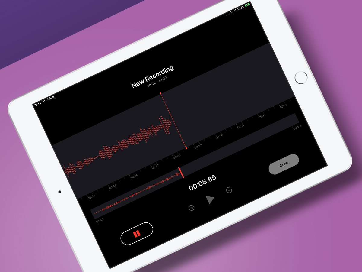
In iOS 12, the iPad finally gets Voice Memos, which now rather smartly syncs your recordings across devices. It also gets Stocks (aka ‘that app 99.9 per cent of users immediately delete). Inexplicably, iOS 12 doesn’t bring Weather and Calculator to Apple’s tablet.
Fortunately, there are fab free third-party apps to fill the void, but it seems weird that Apple doesn’t see the need for such apps on its tablet. If nothing else, surely all those Stocks fans will regularly want to tot up their riches?

