Huawei Mate S Premium review
An Android handset with Force Touch. So can it match the iPhone 6s?
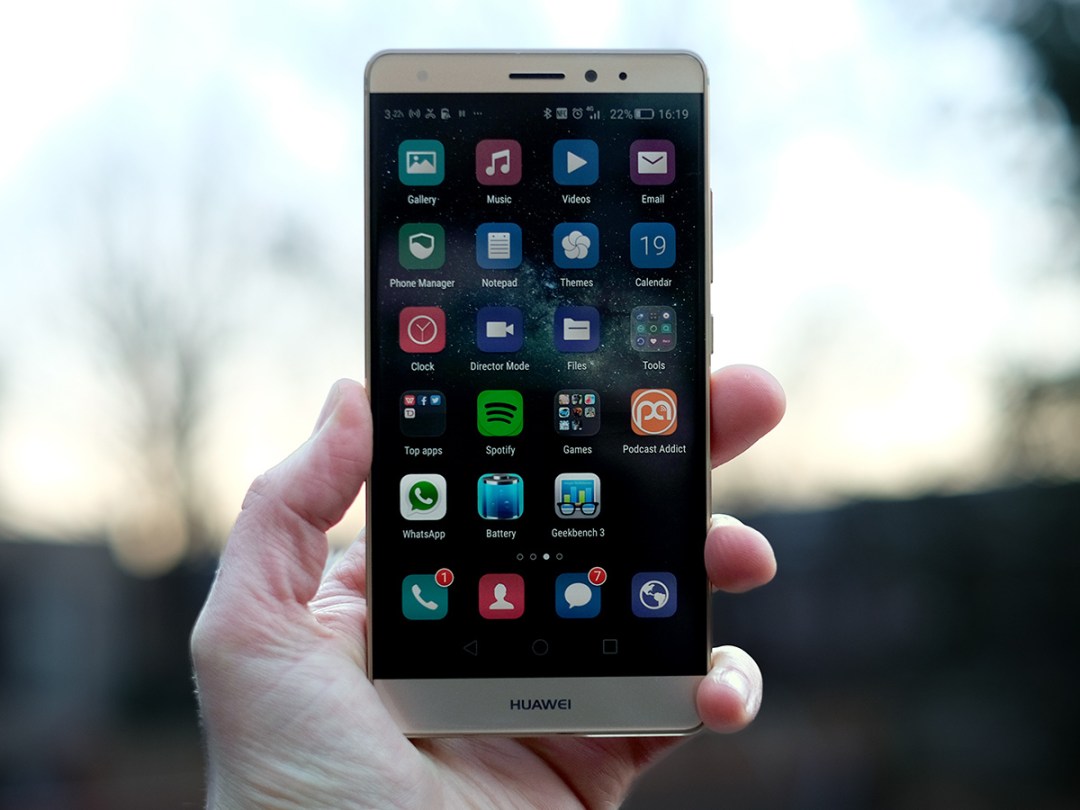
Meet the Force Touch phone. What’s this, a Star Wars signature edition of the Huawei Mate S we looked at last year? Not quite.
Huawei actually just pipped Apple in being the first company to officially announce a pressure sensitive screen phone last year. This is it: the Huawei Mate S Premium edition, with what was originally dubbed Force Touch.
This was such a contentious ‘me first’ job that Huawei itself has stopped calling the tech Force Touch altogether. I wonder whether Apple’s lawyers had a word. They’ve been using the term in their laptops for a while now, after all.
Want to know how Huawei has genetically modified Android to include pressure-sensing powers? Read on.
Mates of different kinds
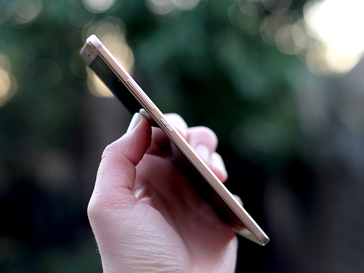
I’m not going to spend too long droning on about the fine curves of the Mate S’s frame, how it’s one of the most alluring phones Huawei has made in ages and so on. If you want to suck up all of that stuff, have a read of our review of the original Mate S review from back in September 2015.
Here’s the potted version: this is a very slick-feeling phone whose slim-bezel screen makes it feel smaller and slinkier than something like an iPhone 6s Plus. Even thought they have the same-size 5.5in screen.
What’s new in the Force Touch edition is that you get 128GB storage. In case you need telling, that’s a lot.
It’s only a side order, though. It’s there to soften the blow of exactly how much extra you’ve paid for a pressure-sensitive screen. The phone’s still not really available in the UK, you have to buy it direct from Huawei’s own online store, and it costs £100 more than the base model.
So, is it worth it?
Huawei made › Google Nexus 6P review
Under Pressure

Not really. While Huawei seems to have implemented the hardware side perfectly well, cramming that extra pressure-sensing layer in without adding any thickness, it still has a real problem here.
The issue is that while Apple’s pressure sensitivity works at OS level, because there’s no wide support for pressure sensitivity in the Android system, all of the pressure extras here live in the thin EmotionUI software. This is what Huawei paints on top of Android, and is probably the most complained-about part of Huawei phones. Sorry, Huawei.
What can pressure sensitivity actually do in the Mate S? There are a fair few little extras squeezed in, enough to roughly shadow what Apple offered at launch with the iPhone 6s.
Force Touch in action
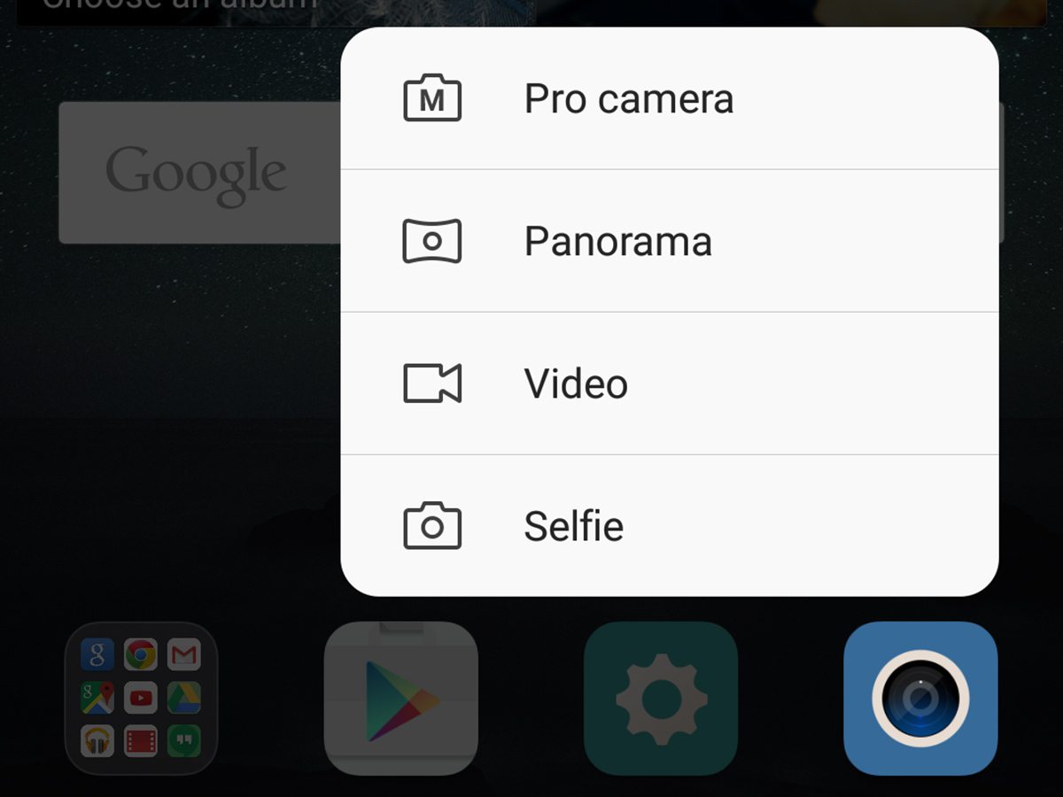
First up, you can get rid of the soft keys and just hard-press where they’d be to get the same effect. That’s right, phantom soft keys.
I tried this for a couple of days, but ended up concluding it’s a bit pointless. It doesn’t let you fit more icons on the screen, and this version of EmotionUI doesn’t look cluttered with the virtual soft keys there anyway.
The Mate S’s invisi-soft keys just feel more awkward. Round one: nil points.
Next up, in a similar vein you can hard-press the top-right and top-left edges of the screen to load a particular app. You can choose anything you like, even third-party ones, and it works from anywhere in the system as long as the screen is on.
Some of you might find a good use for this one, but my issue is that I’m generally perfectly happy with just putting favourite apps centrally on the homescreen. If you like something that much you could even put it into the app icon dock at the bottom. Those can be changed, you know.
The roguish alternative › Huawei Mate S review
Pressure sensitivity bonus round
Next up, you can zoom into photos by pressing a bit harder on the screen. This is one you get with an iPhone too. How it works is that when you use the Huawei Gallery app and press firmly, a large circle pops up, letting you zoom in and out of a small part of the image by winding the pressure up and down with your digit.
This is one I have used a bit, but mostly because of the weird way I end up using phones. I often check how grainy a photo is to see how its camera rolls, how it hacks low light, and this lets you do so a bit less awkwardly than most camera apps. I doubt whether many would actually use this feature other than to show off the pressure sensitivity, mind.
Where the Mate S Premium’s pressure-friendly screen starts to make a lot more sense is how it lets you interact with apps at the top level of Android, the homescreen. With compatible apps, a hard press brings up a little menu right on the homescreen, letting you zap over to specific parts of the app, or access specific features without any additional swipes or taps.
Gestures are suddenly starting to make sense. It lets you, for example, head straight to the Selfie bit of the camera app, or select a contact to call or message before you even head into the respective app. This sort of quick navigating though apps with gestures will probably be a basic part of Android one day.
Right now, we don’t flat-out need it, but this could start to tweak the way apps are laid out, how they’re designed. Yep, I’m peering into my Poundland crystal ball a little.
Early adopter issues
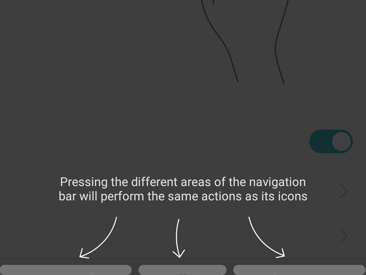
The Huawei Mate S Premium’s problem is that just having the tech behind this potential doesn’t mean it’ll get to taste the rewards. As I said earlier, all the pressure-sensing features are tethered into EmotionUI, not the Android underneath. That means it only works with Huawei apps, and not even all of those.
It’s useful for the camera, the SMS app and the dialler. That’s it. There’s one of these little homescreen pressure menus for the Phone Manager app too, but when the app itself is largely unnecessary, I might burst a blood vessel straining to care about its pressure sensing extras.
The Mate S Premium smacks a little of the sort of early experiments we saw a while back with the Samsung Galaxy Note Edge. It was weird and new, but ultimately hard to recommend to the average person just looking for a new phone.
But here Huawei has shot itself in the foot a bit in both offering a ‘normal’ version selling at a much more attractive price. Plus the recent Mate 8 is better in a few core respects. Most notably its battery life and next-gen CPU.
Generally speaking, the Mate S Premium’s timing isn’t great. Especially now that prices of older but fundamentally similar-level phones like the Samsung Galaxy S6 and LG G4 are now available for a lot less than they were last year.
King of smartphones › Samsung Galaxy S6 review
The rest of the Mate S Premium
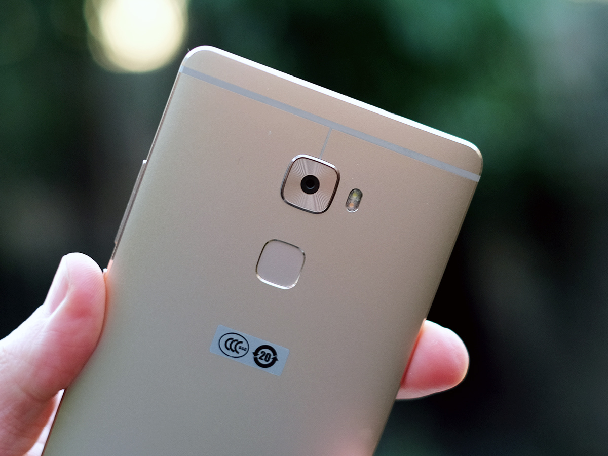
To sum up a few more of the good and bad bits with the underlying elements of the Huawei Mate S, it has a very good camera with an app that could do with a redesign, great fingerprint scanner hardware on the back of the phone and battery life that won’t blow you away.
I’ve found it easy to drain down within the day, much like a lesser-stamina 2015 flagship like the LG G4. A 2700mAh battery in a 5.5in phone doesn’t seem to cut it. Even though the screen here is only 1080p, not QHD like a lot of top-end large-screen phones these days.
I was recently impressed much more by the formidable stamina of the Mate 8 than the pressure sensitivity of the Mate S Premium. The standard Mate S is ultimately just as good a phone, bar the fantastic storage you get here, but sells at a far more attractive price. Once again, be sure to check out the original Mate S review for more details on the phone’s software, performance and screen quality.
Huawei Mate S Premium verdict
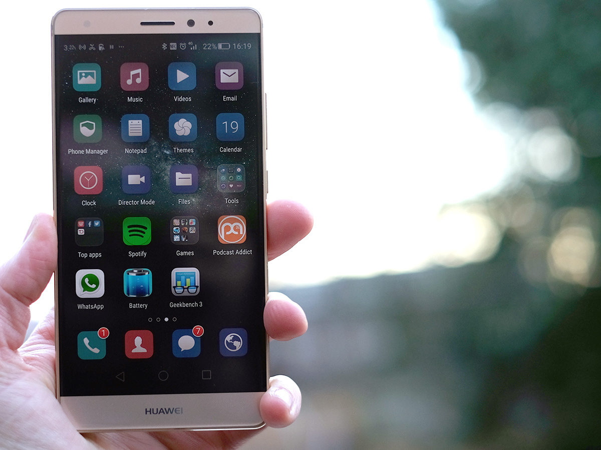
The Huawei Mate S Premium is out to show off what the future of phones will be all about. Ok, and it was also a way to one-up Apple as the first pressure sensitive phone, even if we’re only getting to look at this tech six months later.
Should you invest? Probably not. By being firmly limited to a series of Huawei-only uses, it comes across more as a tech demo than something you should pay a couple of a hundred quid extra for, over the normal Mate S.
Even the normal version has a bit of a tough time at the moment, with prices of the rival Samsung Galaxy S6 and LG G4 rapidly dropping now that 2016’s phone kings aren’t too far away.
Super smartphones › The top 10 smartphones in the world right now
Tech specs
| Screen | 5.5in 1080p AMOLED |
| RAM | 3GB |
| CPU | HiSilicon Kirin 935 2.2GHz Octa-core |
| Storage | 128GB with microSD |
| Camera | 13-megapixel rear with OIS, 8MP front |
Stuff Says…
An interesting look at the future of Android, but one with limited appeal out in the real world
Good Stuff
Good camera
High-quality design
Future-gazing tech
Loads of storage
Bad Stuff
Pressure sensitivity is very limited
Expensive
Battery life not great

