2016 Apple MacBook Pro 13in with Touch Bar review
Does the Touch Bar elevate the excellent 13in MacBook Pro to portable computer perfection?
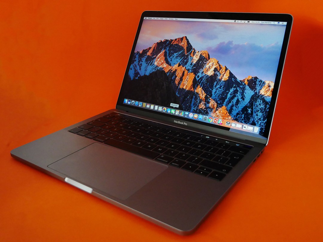
We’ve already delivered the Stuff verdict on one of Apple’s new MacBook Pros – and that verdict being it’s an absolutely brilliant laptop.
That was the entry-level version, too: the version that’s down on power, short of connections, and misses out on the headline-grabbing, Function button-replacing, contextual actions-adding sliver of OLED loveliness that is the Touch Bar.
Seeing as the version in front of us today combines all of the fantastic qualities of that entry-level model with all of those extra goodies, it’s also got to be a shoo-in for five stars, right?
Actually, it’s a little more complicated than that.
Apple MacBook Pro with Touch Bar design: the perfect portable computer
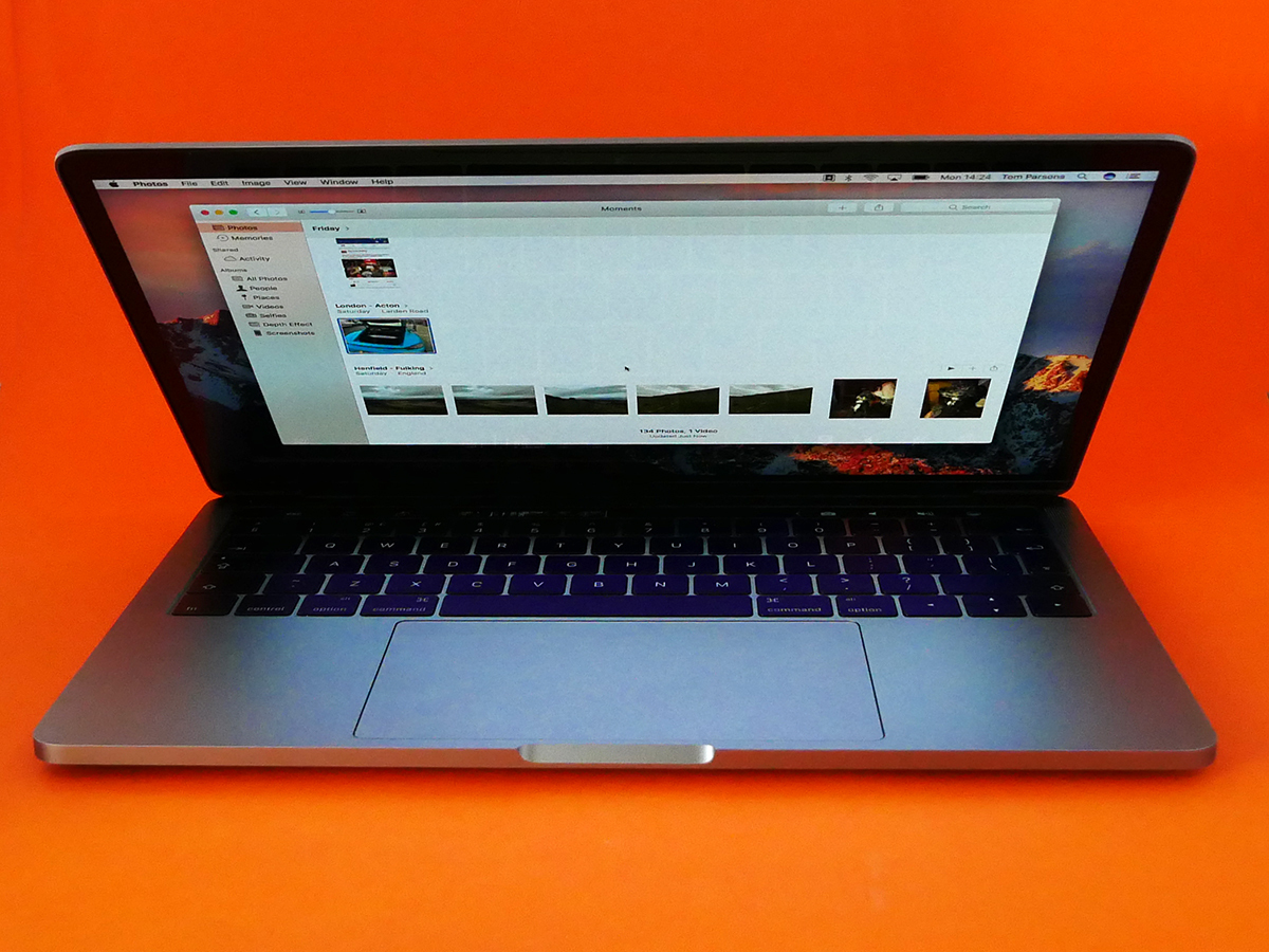
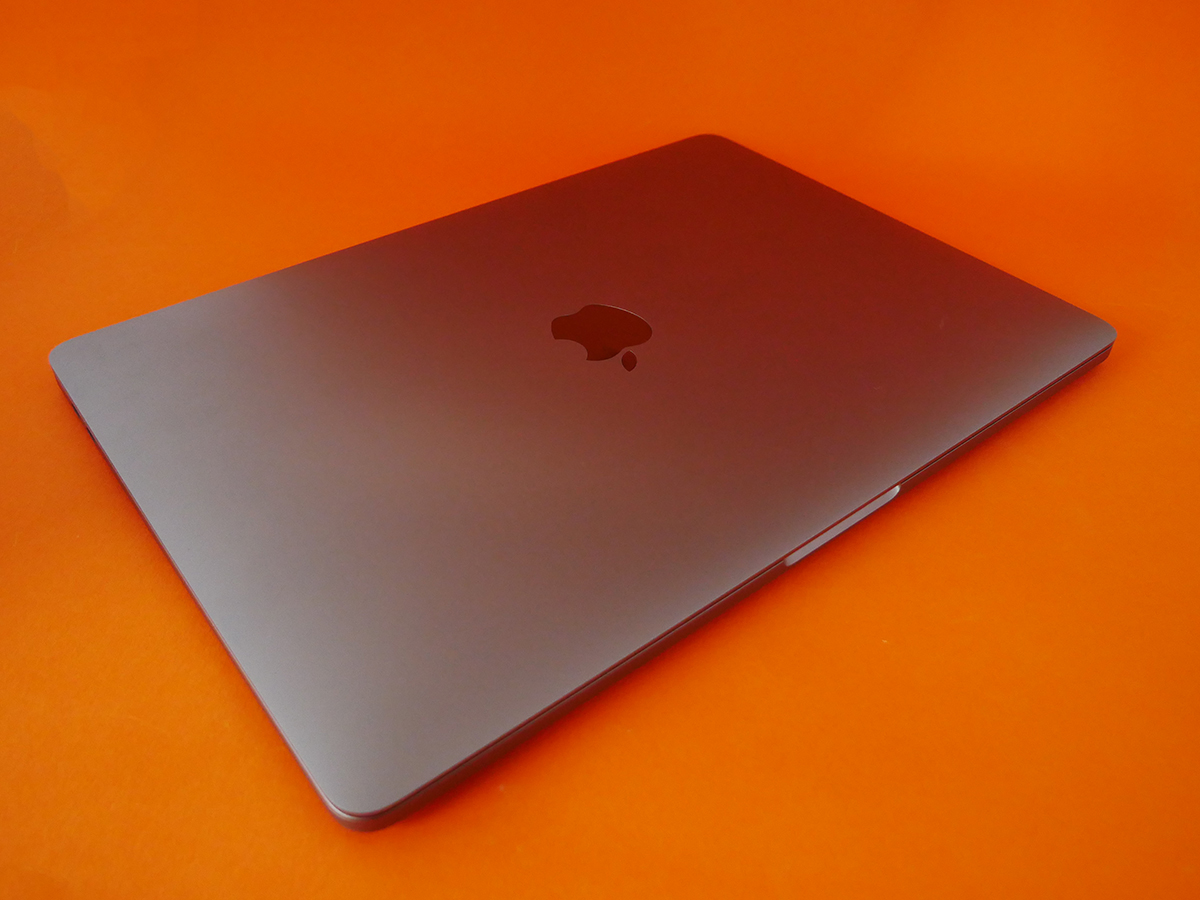
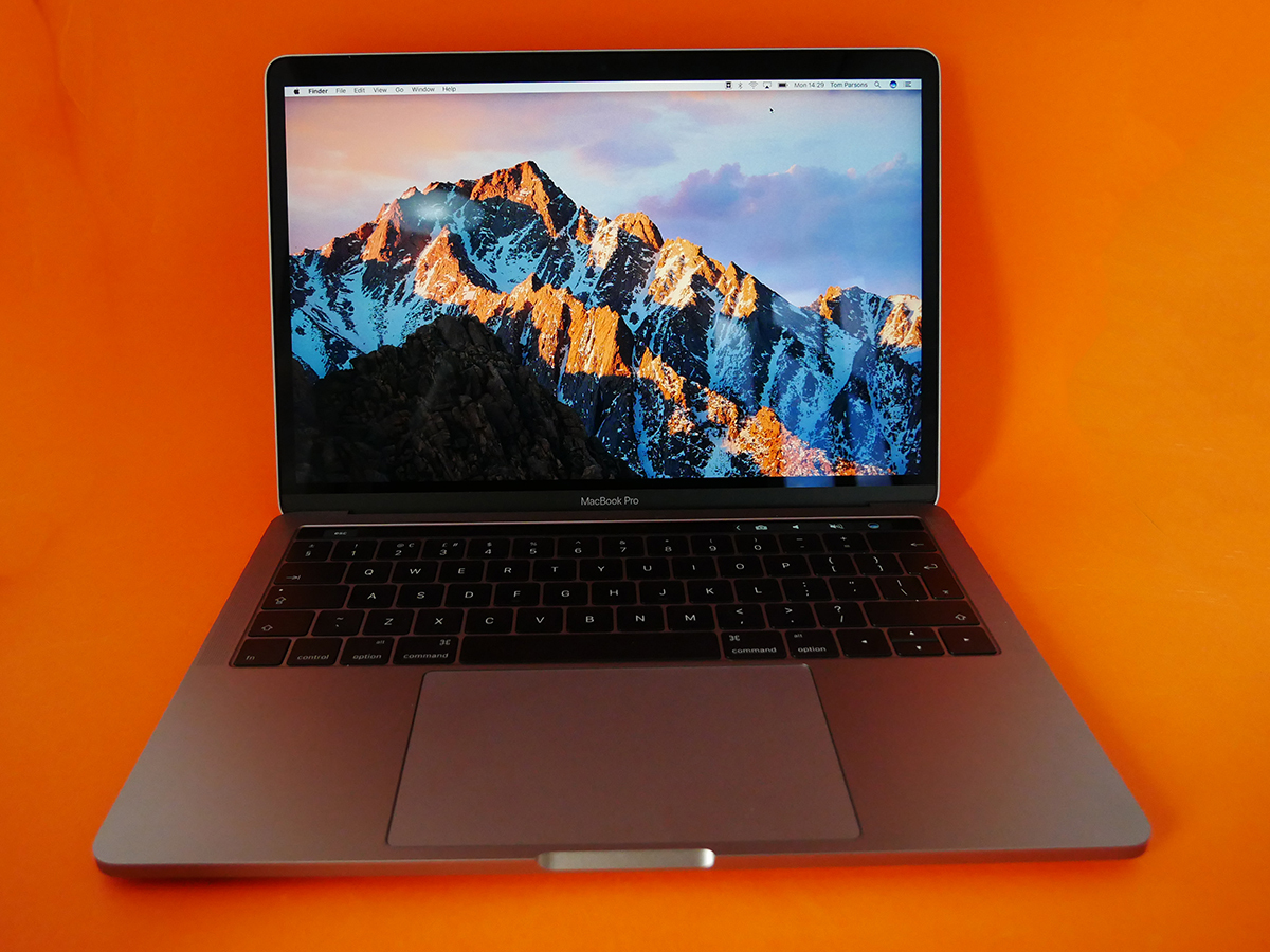
The Touch Bar-equipped 13in MacBook Pro is no larger or heavier than the entry-level version. That’s excellent, because the new MacBook Pro is a beautiful, and beautifully engineered, thing.
It’s small – smaller than a MacBook Air in fact – but terrifically dense, as if there’s not even a smidge of unused space inside it. That’s not to say it’s a heavy machine, because it’s actually also roughly the same weight as the MacBook Air: it just feels supremely solid. Like dark matter. Or The Rock.
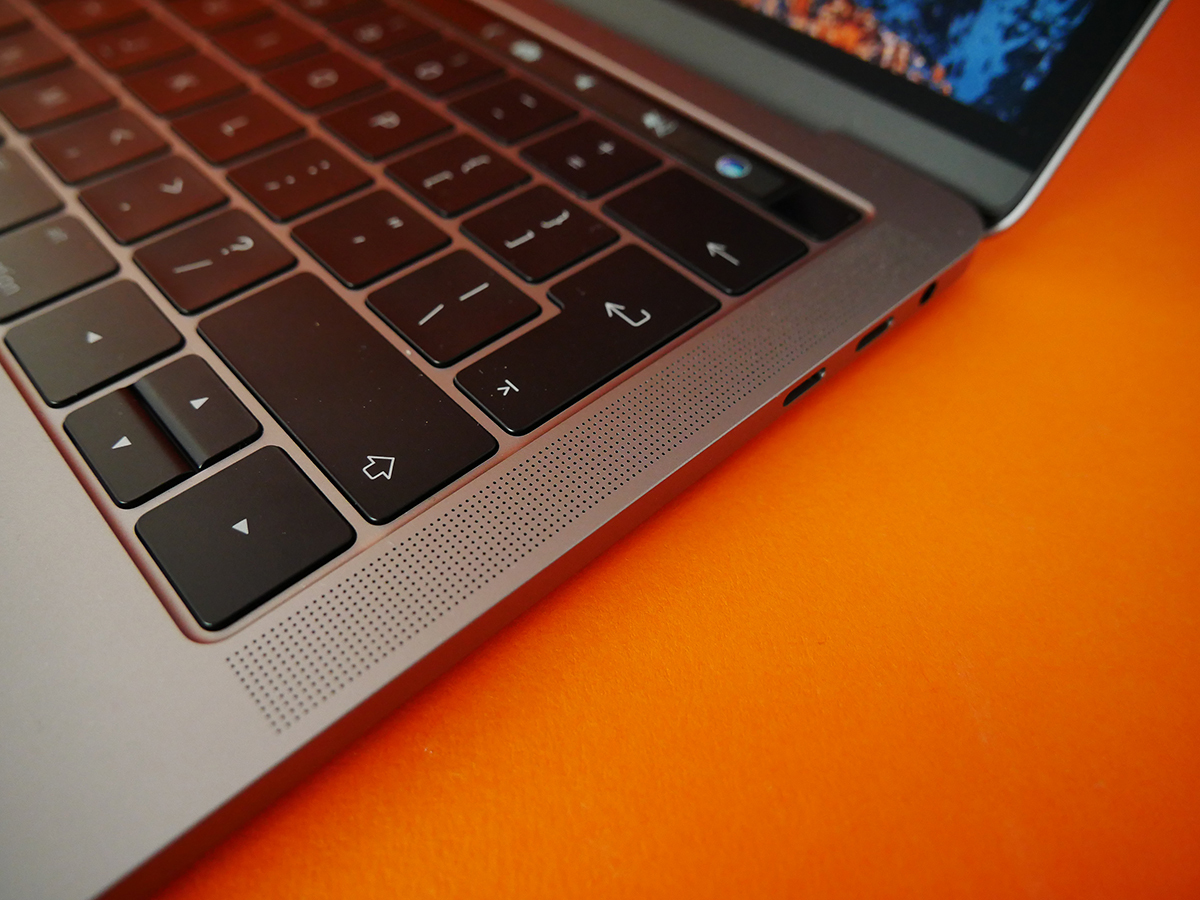
Lift the lid and you’re greeted by the same huge trackpad and flat, gapless keyboard you’ll find on the entry-level model. Both are brilliant.
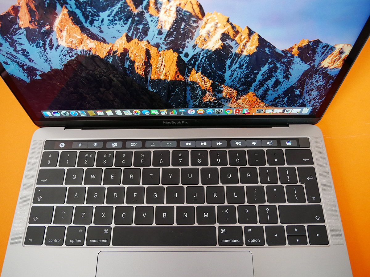
The keyboard uses a refined version of the butterfly mechanism first seen in the 12in MacBook – while the keys still have the same, minimal amount of travel, they feel as if they have more, and that’s crucial for typing satisfaction. It is, in fact, the most satisfying keyboard I’ve ever typed on.
There’s a clackiness to the keys that might wind up the person sitting next to you if they’re easily distracted, but to me the sound adds an extra degree of feedback. The larger keys also help cut down on typos and assists in touch-typing.
It made me a quicker, happier writer, and the hour I spent with an old MacBook Air while this review sample was being photographed was an unpleasant journey back to a time of tiny, weirdly spaced and spongy keys.
Beneath that fabulous keyboard is a trackpad so big it can probably be seen from the International Space Station. Its huge surface area allows for a great many multi-touch gesture controls. As ever with a new input method, you need to spend a little bit of time teaching yourself the new shortcuts, but put that effort in and you’ll find yourself spreading and pinching like a pro (no sniggering back there).
I felt the trackpad haptics in the entry-level MacBook Pro could do a better job of simulating clicks when you push on it, and I don’t think this version hits the physical feedback sweet spot either. Still, I’ve adjusted so it now feels pretty natural, and it makes the trackpad on older Macs feel old-fashioned and imprecise by comparison.
A little more refinement and I think it could be as satisfying as the keyboard.
X MARKS THE SPOT › Dell XPS 13 (2015) review
Apple MacBook Pro 13in: the Touch Bar
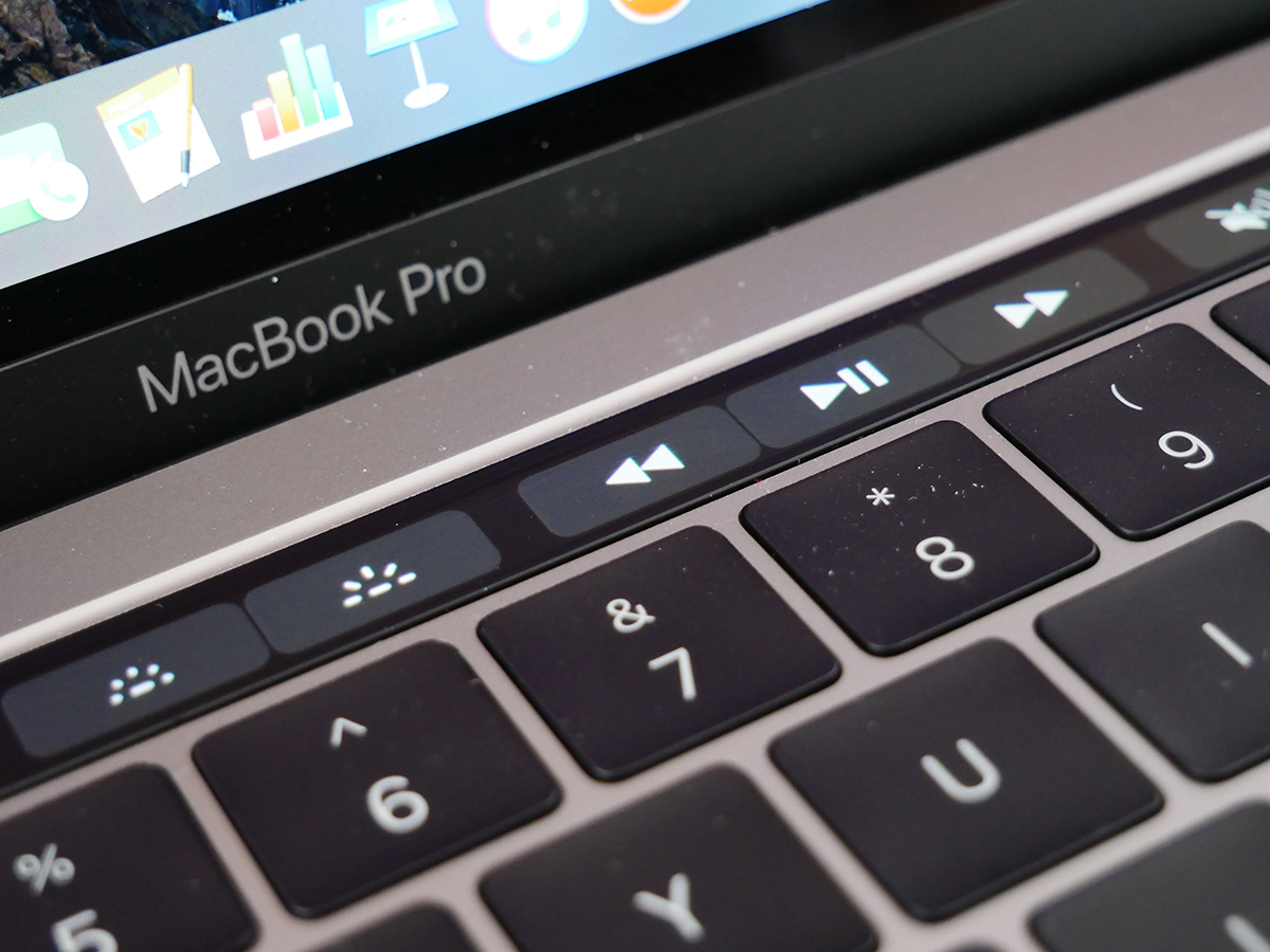
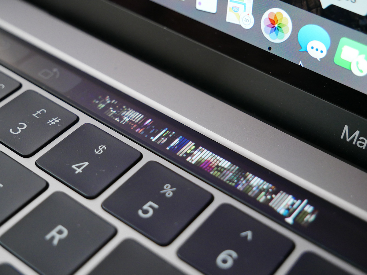
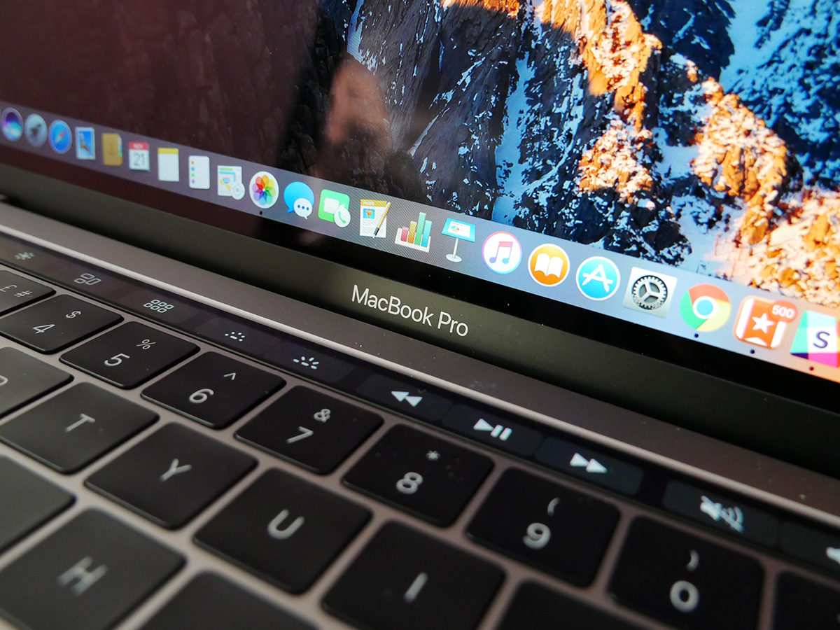
If you’ve somehow missed all the excitement/dismay [delete as applicable]; the Touch Bar is a long, thin OLED panel that replaces the row of function buttons that you’d find on any other MacBook. Instead, you get context-sensitive controls that change depending on what you’re currently doing onscreen.
Surfing Safari? The Touch Bar displays tiny versions of your stored favourites, or every tab you have open, letting you tap from page to page instantly.
In Photos, every snap is shown in miniscule form, so you can run your finger along the OLED strip to quickly flick through your entire gallery. Want to get editing? The Touch Bar has shortcuts for that, too.
It’s got iMessage and email smarts as well, bringing up a predictive text panel as you type and giving you quick access to a full catalogue of emoji that you can swipe through at your leisure.
Of course, the function buttons the Touch Bar replaces are all still there, too. When you’re on the desktop you’ll see the media controls, volume, brightness and all of that usual stuff represented as shining little icons, and when you open an app that has its own functionality, that “Control Strip” shrinks to four icons and an arrow for accessing the rest.
Best of all, you can customise the Touch Bar by choosing which functions it displays.
It’s a supremely cool thing, especially when it’s displaying a gallery of photos or some bright website icons. You’ll honestly be amazed at how colourful and sharp it is. It’s quick to use and relatively tactile, too, despite the surprising omission of haptic feedback.
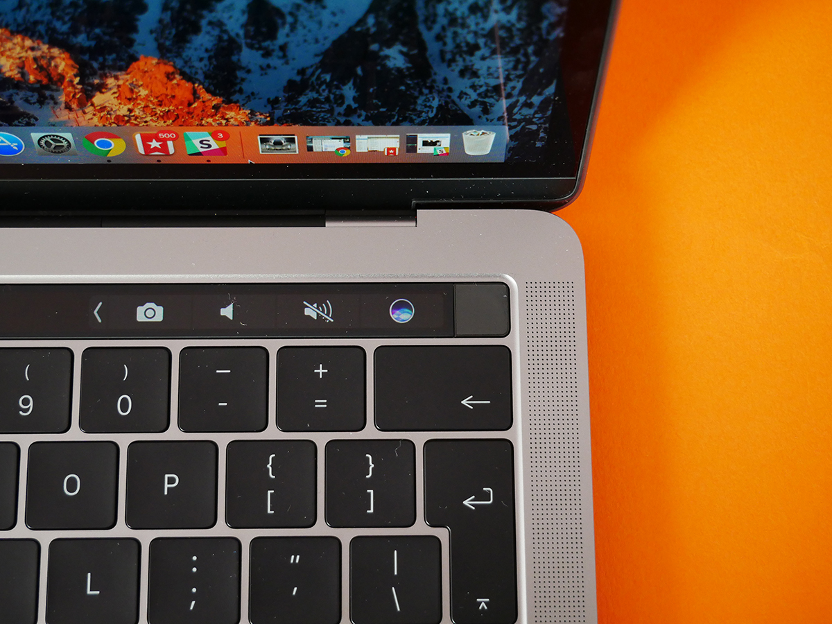
The problem is that, at the moment, the Touch Bar just isn’t actually all that useful.
This is partly because app support is pretty limited right now. Naturally, all of Apple’s own apps have been updated with Touch Bar functionality, but third-party support isn’t very extensive yet.
Photoshop and Microsoft Office should support it soon, and that will undoubtedly be a big deal to a bunch of MacBook buyers. There’s (perhaps predictably) no word on Google support, though, which is a real blow to those of us who use Chrome and Drive every day.
Even once apps do start to offer Touch Bar shortcuts, there’s a question mark over who they’re for. Professional designers, photo editors and video producers already have every keyboard shortcut nailed to the extent that their fingers work in a blur of muscle memory. The Touch Bar is not going to speed things up for those folks.
There’s a far more compelling argument that the Touch Bar is actually for the non-pros; for those who don’t know a piece of software inside out.
When implemented well, it can put precisely the editing tool you need right under your fingertips, saving you from that modern day hell of having to browse every menu and sub-menu 14 times before you finally lay eyes on the obscurely named function you’re after.
You still need to train yourself to look to the Touch Bar for that icon, though, rather than focus your gaze on the screen – a habit that’s going to be hard to break. I’ve little doubt that Touch Bar support will quickly grow, but right now it’s just not quite useful enough.
That wouldn’t be a problem if its addition came without sacrifice, but I have found battery life to be a little weaker on this Touch Bar-toting MacBook Pro than on the entry-level version, despite Apple’s claims that both variants will last for “up to 10 hours”.
There’s not a huge amount in it, but you can expect to get about an hour less Netflix streaming from this model than the more basic version, and that a working day without the power adapter can be that bit more touch-and-go as you get closer to clocking-off time.
SEEN A GHOST › HP Spectre 13 review
Apple MacBook Pro Touch Bar: Touch ID is a triumph
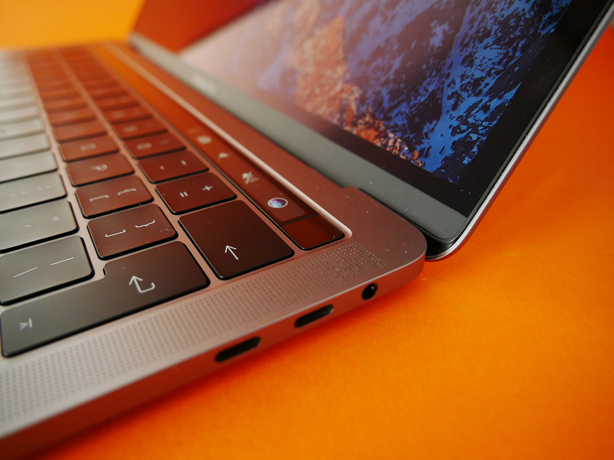
The tiny square where you’d find the power button on a standard Mac has also been given an upgrade. It still flicks the MacBook Pro into life, but it also doubles-up as a fingerprint scanner that brings Touch ID to an Apple computer for the first time.
As we’ve come to expect from its implementation on iPhones and iPads, Touch ID on Mac is awesomely quick and convenient, allowing you to sign in to your MacBook, authorise downloads from the App Store or iTunes, and make online payments via Apple Pay.
It’s a real time-saver, but even better than that, on MacBook Pro Touch ID can be used for multiple users.
If your laptop is the family computer, for example, everyone who uses it (up to a maximum of five people) can register a fingerprint to make switching user accounts as quick and simple as resting a digit on the little glass square. I know you don’t want to share your MacBook Pro, but if you have to, this is a pretty darn cool feature.
BENEATH THE SURFACE › Microsoft Surface Book review
Apple MacBook Pro with Touch Bar: a dazzling display
We’ve come to expect excellent screens from Apple, and the new MacBook Pro’s 13in display is perhaps the best yet.
Resolution hasn’t changed from last year’s 2560×1600 Retina model, but brightness and contrast have been improved pretty dramatically.
The result is a far punchier, more colourful picture, with deeper blacks and even greater perceived detail. Add the new Pro’s far slimmer bezel to that potent mix and you’ve got perhaps the most cinematic Netflix experience ever seen on a laptop.
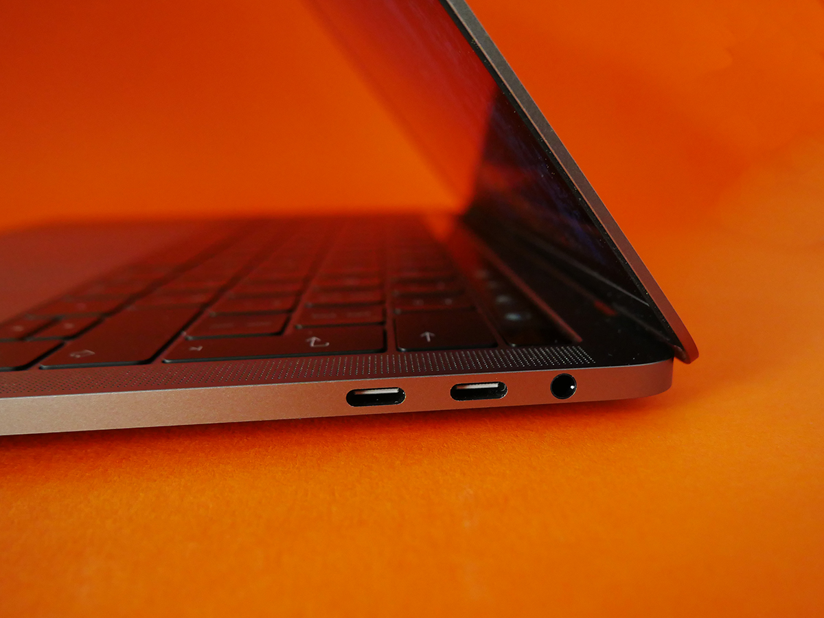
The redesigned speakers do an admirable job of making sure the sound doesn’t let the screen down, too. You’re still obviously best off with a pair of headphones (yes, there is a standard headphone socket) or a Bluetooth speaker if you’ve got one handy, but the MacBook’s own sound is loud, clear and has proper stereo separation.
WHY GO PRO? › Apple MacBook (2016) review
Apple MacBook Pro 2016: Extra power and more connections
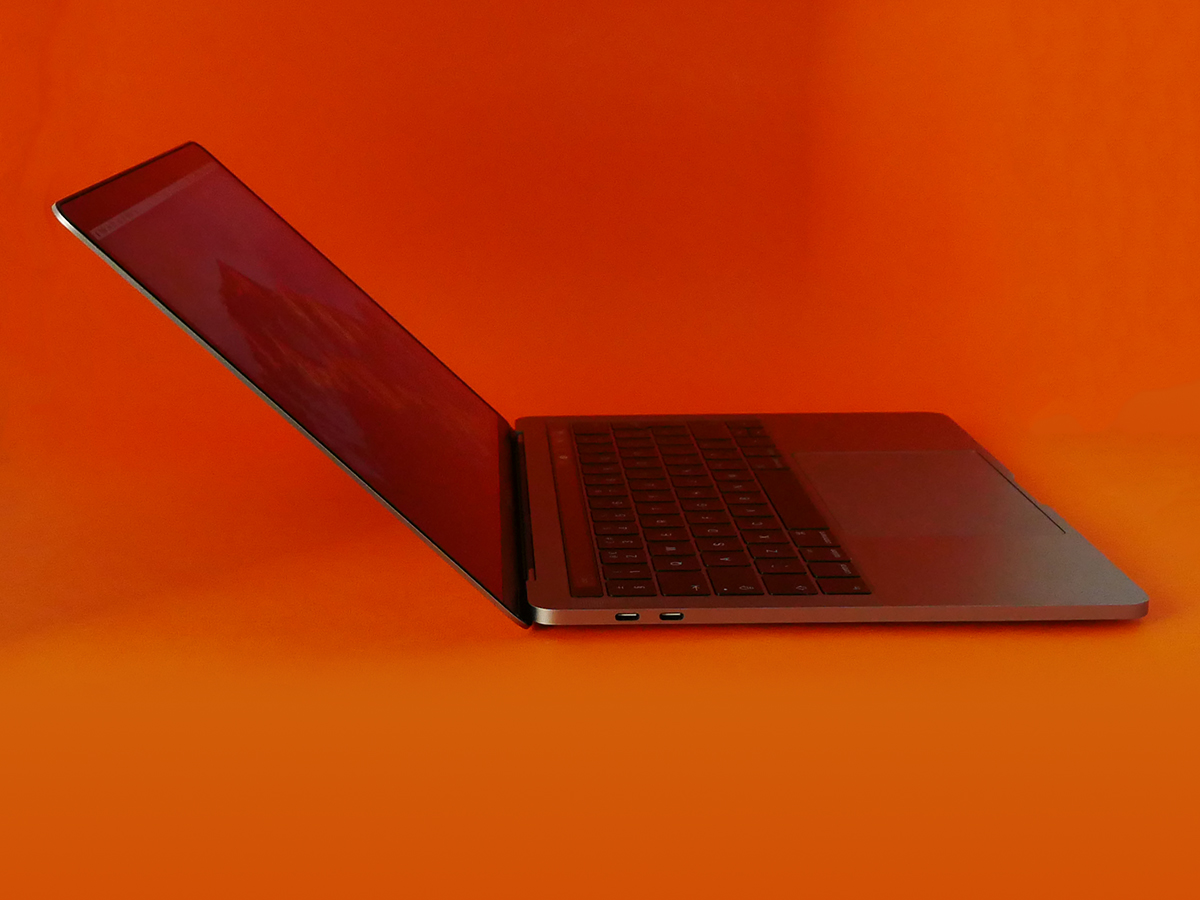
The Touch Bar model’s £300 price premium over the entry-level MacBook Pro also buys you a power boost, and twice as many Thunderbolt 3 ports.
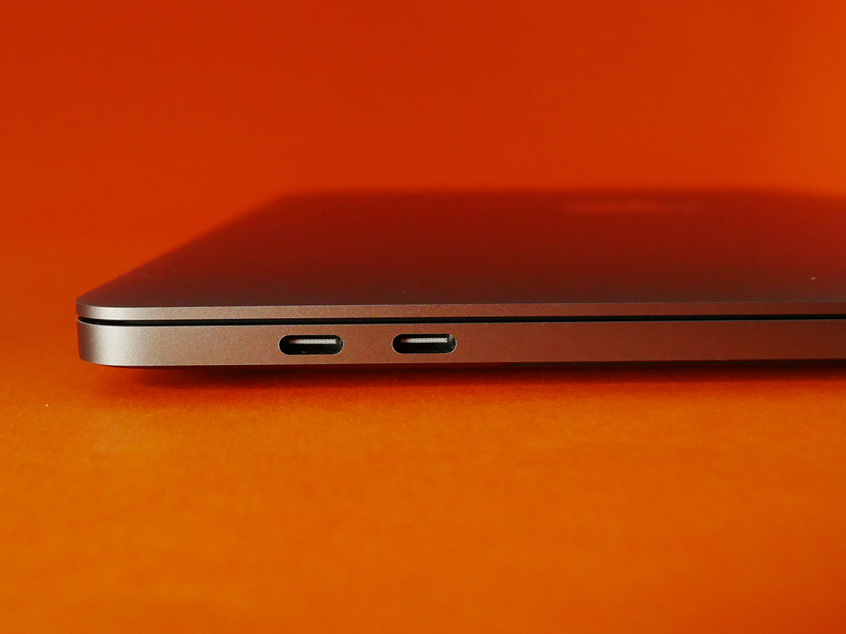
Extra ports can only be a good thing, especially as you now get two of them on each side of the MacBook. They’re all identical, so you can run the power cable to whichever side of your Mac is closer to the socket, or connect your display or external hard drive wherever it’s most convenient.
The fact that they’re all Thunderbolt 3/USB-C might be a big problem to some people, though. No-one likes enforced change, but I don’t personally see having to get a couple of adapters in these early days of migration to ubiquitous USB-C as a huge issue, especially as those adapters are currently being sold at discounted prices by Apple.
If you disagree and feel that you’re just not prepared to pick up one or two adapters to tide you over, or even that it’s a matter of principle and you simply shouldn’t have to, that’s cool – just don’t buy the new MacBook Pro.
Where power is concerned, it looks as though you’re getting a big boost by opting for the Touch Pad model. It comes with a 2.9GHz Intel i5 processor, rather than the 2.0GHz i5 of the entry-level model, and gets a faster type of RAM and slightly improved integrated graphics.
In my testing, though, the extra power hasn’t made a huge difference. I think the entry-level Pro has more than enough power for the vast majority of buyers, but gamers and 3D professionals will likely bump up against the limits of the system quite easily.
I don’t think that’s a situation that significantly changes for the Touch Bar-equipped MacBook Pro.
As you’d expect, it copes with everyday tasks, including heavy multi-tasking, without breaking a sweat, but it struggles with intensive 3D applications only a little less than the entry-level model. You’ll get a few extra frames per second when gaming, for example, but this is not suddenly a games machine.
That, for me, is the issue with this particular model – it’s sitting in a bit of a no man’s land.
For most people, the most affordable MacBook Pro will have more than enough power, and those who need much more should probably consider going the whole-hog and take a look at the 15in model, which adds an i7 processor, double the RAM and discrete graphics as standard – albeit for a £2349 price tag.
Or you could go down the route of adding an i7 to the entry-level model, which would take the final price to £1719 – still less than the starting price of the 13in Touch Bar version.
TIME FOR A TABLET › Apple iPad Pro 9.7 review
Apple MacBook Pro with Touch Bar verdict
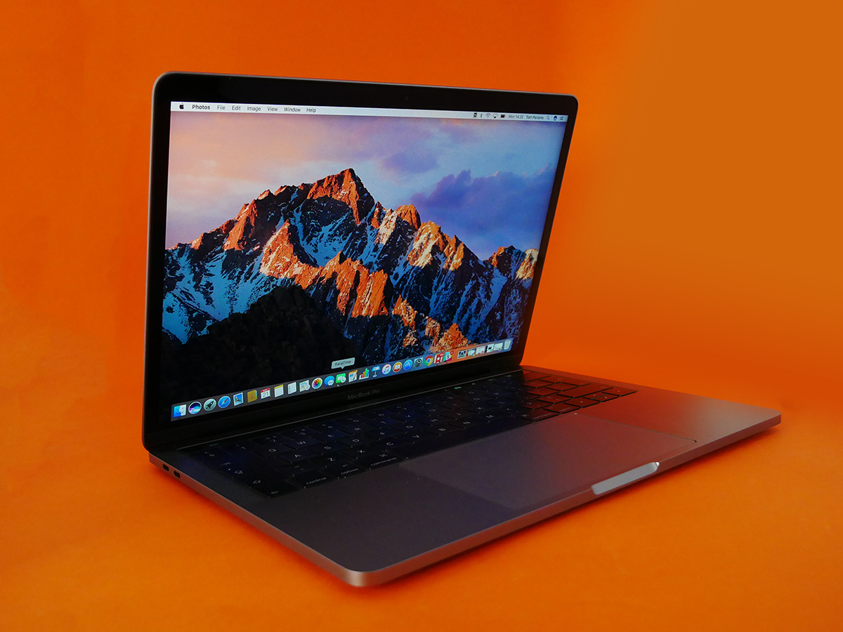
The new MacBook Pro is an awesome thing. It’s beautifully made, fantastically compact and an absolute delight to use each and every day.
Looking at the range as a whole, though, this 13in Touch Bar model looks the least compelling to me. The power boost just isn’t big enough to justify the extra £300 over the entry-level model.
Of course, your £300 also buys the Touch Bar, and no-one would blame you for getting all excited about that. It is, as I’ve already mentioned, darn cool.
It might become really useful in the future, too, but it’s not there yet. When that day comes, this version of the MacBook Pro could become the pick of the range, but for now we’d recommend going entry-level – or taking a look at the big daddy 15in model.
READ MORE › The 10 best laptops in the world right now
Tech specs
| SCREEN | 13.3in, 2560×1600 IPS LED |
| CPU | Intel Core i5 dual-core 2.9GHz |
| MEMORY | 8GB RAM |
| STORAGE | 256GB SSD |
| CONNECTVIITY | 4x Thunderbolt 3 / USB-C, 802.11ac Wi-Fi, Bluetooth 4.2 |
| OPERATING SYSTEM | Apple macOS Sierra |
| DIMENSIONS | 15x304x212mm, 1.37kg |
Stuff Says…
The new MacBook Pros are generally awesome, but this isn’t the pick of the range – at least not yet
Good Stuff
A beautifully made, fantastically compact device
The screen is fabulous
There’s nothing nicer to type on
Touch Bar looks awesome and has loads of potential
More ports can only be a good thing
Bad Stuff
Lack of Touch Bar-supported apps limits its usefulness right now
Not a huge real-world jump in power from entry-level model
You’ll need adapters – at least in the early days
