Apple iPad Pro 9.7 review
Is this the ultimate iPad? Spoiler: yes
Given the way it was revealed – in the support slot for a tiny iPhone at one of the smallest press events Apple’s held in years – you would be forgiven for thinking that the new iPad is no big deal.
It’s a device that’s far too easy to dismiss: it’s just an iPad Air 2 with some of the features from last year’s ginormous iPad Pro, right?
But that’s a bit like saying a Martini is ‘just’ a combination of gin and vermouth: the result is still bloomin’ delicious.
And so it is here. By combining the Air 2’s form factor with the Pro’s productivity and creativity skills (plus a few features that aren’t even on the big version), Apple has actually produced the ultimate iPad.
A familiar face
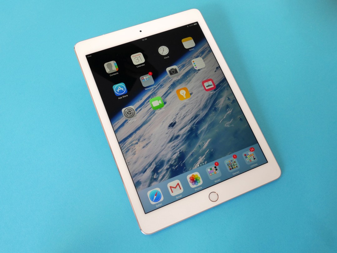
If familiarity breeds contempt, Apple’s playing a dangerous game with the iPad Pro 9.7: only an expert could tell the difference between it and the Air 2 at first glance. In fact, the two devices have utterly identical dimensions and weight figures.
But we already know that Apple likes to get as much mileage from its designs as possible, and who can blame it? It’s still utterly gorgeous, impossibly thin and fabulously lightweight.
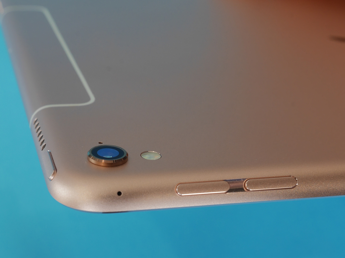
If you do fancy a game of spot the difference, go straight for the rear panel. The new Pro can be identified by its protruding camera lens (which surprisingly doesn’t create wobble when it’s flat on a desk) and associated True Tone flash, while cellular models now have just a white line towards the top edge, rather than the awkward white panel of the Air 2.
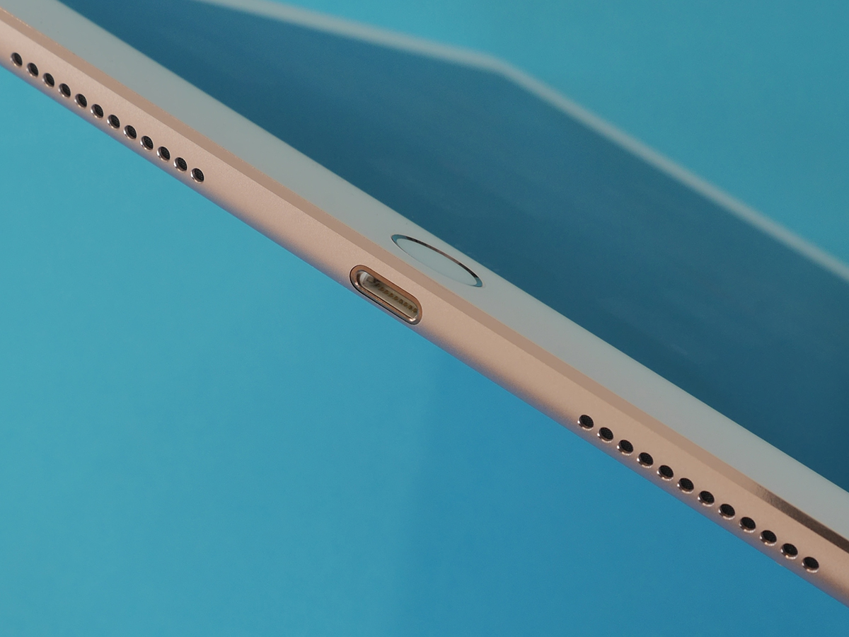
The edges also give the game away. Like the bigger iPad Pro (and unlike the Air 2) the Pro 9.7 has two sets of speakers on both the top and bottom, plus the row of three magnetic circles that constitutes Apple’s Smart Connector for keyboards.
Of course, if the iPad you’re holding is Rose Gold, you really don’t need to go hunting for differentiating details – only the Pros get Apple’s finish du jour.
Related › iPad Air 2 review
A warmer welcome
Specification wise, the iPad Pro 9.7’s screen appears to be identical to that of the Air 2. Both are 9.7in on the diagonal and have a resolution of 2048 x 1536, resulting in a pixel density of 264ppi.
At Stuff we’re certainly not above the clamour for moar pixels, and in a way it’s a shame that the resolution hasn’t gone up since the first iPad Air launched in 2013, but no-one’s going to look at the Pro 9.7 and find it wanting for sharpness or detail. Literally everyone I’ve showed the new Pro to over the last few days has muttered something along the lines of "that screen is amazing".
And rather than get into the 4K arms race, Apple has sought to improve the iPad’s display in other, decidedly more interesting ways.
This is the very first device to get a True Tone display, which means it can use an array of invisible sensors on its face to monitor ambient light and adjust the white balance of the screen accordingly.
The idea is that the screen behaves more like a piece of paper, in that it reflects the warmth of the light around you, which makes it less jarring and easier on the eyes. In a lot of ways it’s a more clever and dynamic extension of Night Shift, the feature introduced to every device with iOS 9.3 that reduces the blue hues in the display closer to bedtime in order to help you relax.
True Tone certainly works as intended. You may not always notice it (that’s sort of the point) but in a warmly lit room the screen becomes warmer, too, and while reading from an iPad is never quite the same as reading a paper page, this is a more natural experience than you’ll find on any other tablet.
But there’s a downside, too, in that True Tone changes the white balance of everything you view on the Pro, including movies, photos and games, all of which you really want to be seeing in as close to their original form as possible.
If you’re someone like me, then, you’ll find yourself delving into the iPad’s display settings in order to switch True Tone on or off far more often than you’d like. The ability to designate apps that automatically disable True Tone would be much appreciated in the next iOS update, Apple.
In light of (sorry) the True Tone shenanigans, the iPad Pro’s reduction in reflections seems rather unexciting, but while there’s no way for me to verify Apple’s claim that reflectivity is down by 40%, I can certainly confirm that reflections are far less bright and distracting.
Stuff Awards › The ultimate iPad wins computer of the year 2016
Pro performance
If the iPad Air 2 was all about content consumption, the new Pros are far more weighted towards content creation, which is enabled by both power and accessories.
Under the hood the iPad Pro 9.7 has the same A9X chip (and M9 coprocessor) as its bigger brother, and while RAM has been reduced from 4GB to 2GB, that doesn’t prevent it from absolutely storming through practically everything you throw at it.
This is a hugely slick and snappy experience all-round, and while an extremely demanding designer might be able to find the point at which the 2GB of RAM falls short, an extremely dedicated designer will also probably buy the bigger version of the Pro anyway.
Want some performance benchmarks? Of course you do. Antutu gives the big Pro a score of 184065 and the little Pro 162735, with heavy-duty 3D being the differentiator. The Air 2, by comparison, gets just 108103. Consider that the Air 2 has never felt anything but delightfully fast, and it’s clear that both of the Pros have oodles of power to spare.
What will you be doing with all of that power? The intention is that you’ll be creating stuff, whether that be an epic movie (you can edit three 4K movie streams at once), the latest breakthrough EDM hit (hello, Garageband), or a hand-drawn masterpiece.
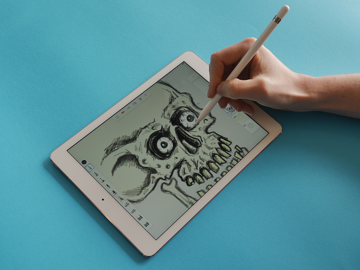
I’m certainly no artist, but even I can appreciate the natural feel of drawing on the new iPad. The weight of the Pencil (still £79) is just perfect, the way it and the screen respond to pressure and angle feels like actual magic, and the clever palm-rejection tech means you can lean on the screen just as you would a piece of drawing paper. Stuff‘s resident artist, Ross Presly, agrees – it’s his hand and skull-in-progress that you can see in the photo above.
Compact keyboard
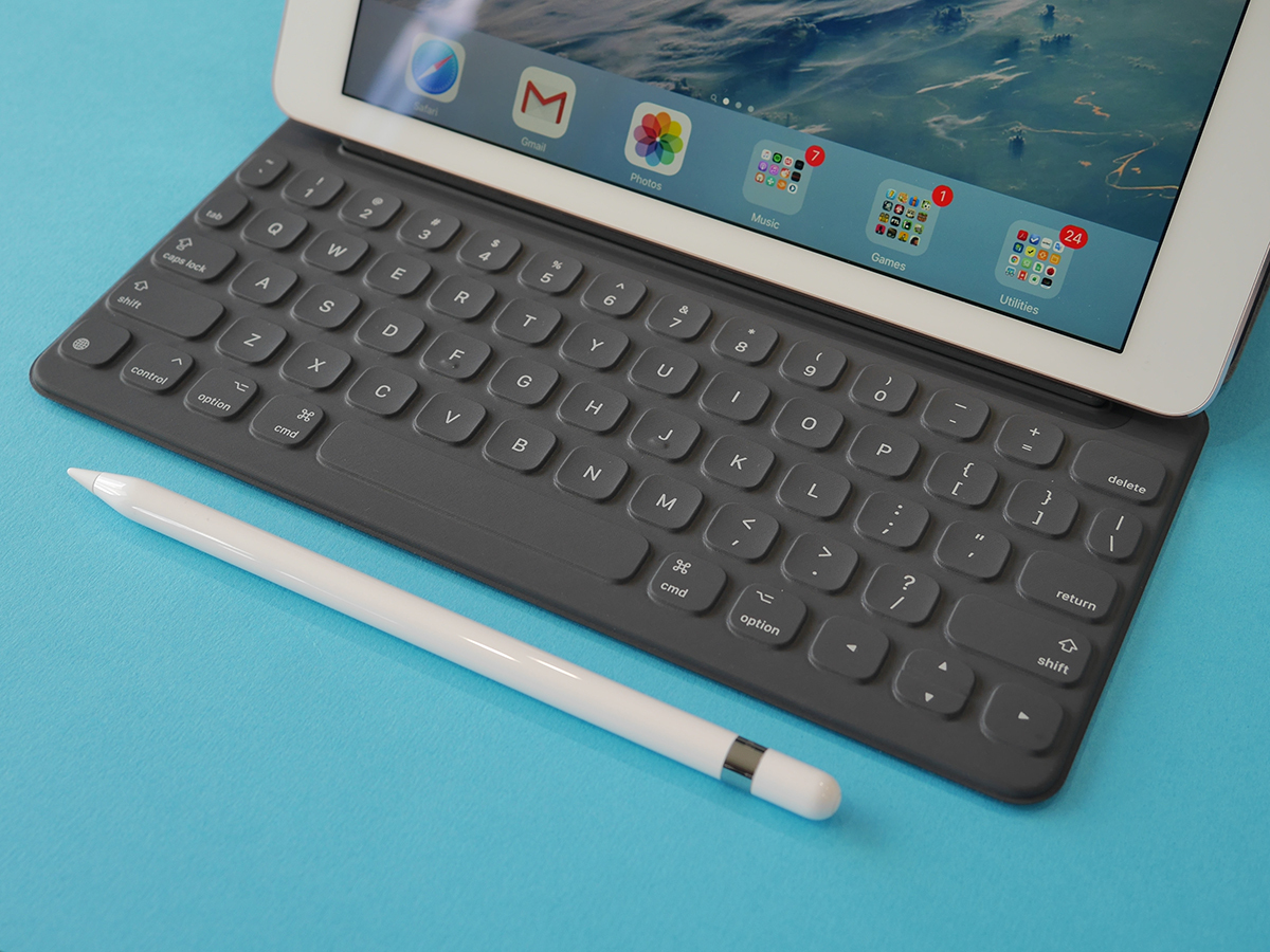
Of course, being a writer, it’s the Smart Keyboard that interests me more, and while not as magical as the Pencil I am rather impressed with it. Yes, it’s small compared to a laptop keyboard. No, it doesn’t have a trackpad and it’s not quite rigid enough for truly satisfying typing on your lap (although you can make-do). But it is very easy to adapt to and it has a lovely feel under the fingers, with a rather rewarding clackiness despite the shallow movement.
