Wileyfox Swift review
An absolute steal of a smartphone
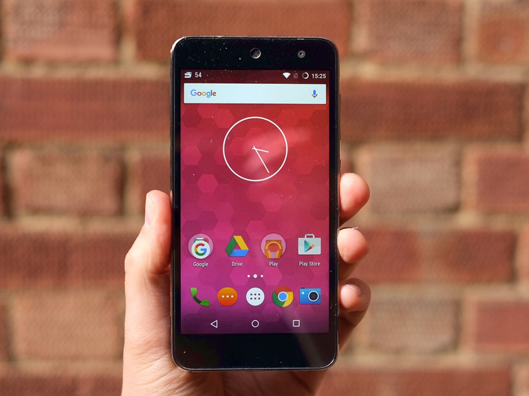
It’s not often a new budget phone seller arrives and really grabs our attention. Making the price as low as possible rarely works. But the Wileyfox Swift is something special.
This brand new contender has put together a £129 phone that crams the specs you might have to pay almost £200 for elsewhere. And yet it doesn’t feel or look bad either.
There’s a whiff of OnePlus magic to the Wileyfox Swift. If you can afford an extra £30, the waterproof Moto G is a bit better still in parts, but at the price this is our new top dog. It’s a red hot bargain.
Foxy phone
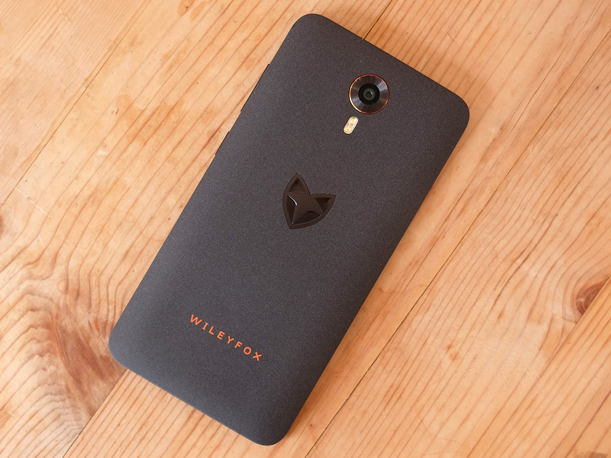
Wileyfox isn’t just making a phone. It’s building a brand too. And at times like this companies can go a bit overboard trying to make their mobiles stand out. However, the Wileyfox Swift stays on the right end of boring-to-gaudy-mess scale.
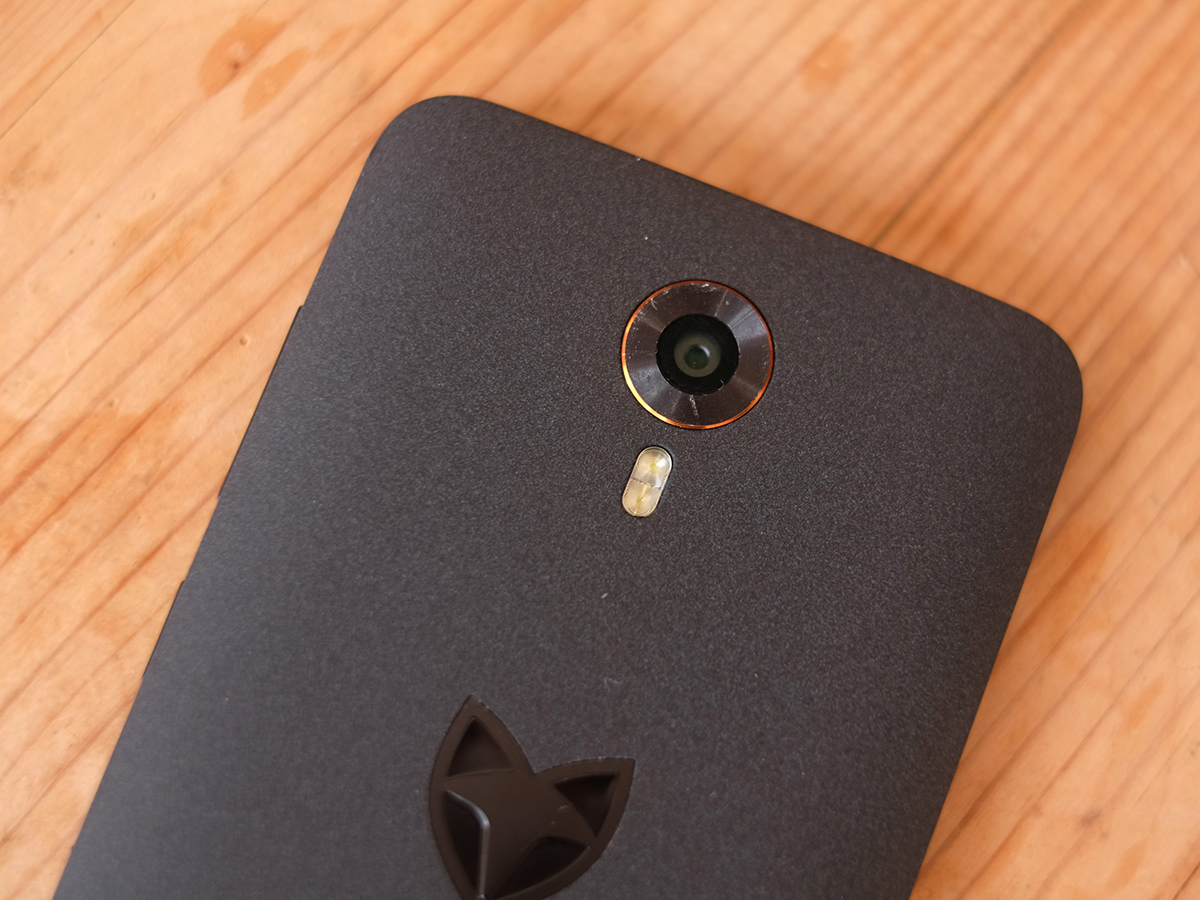
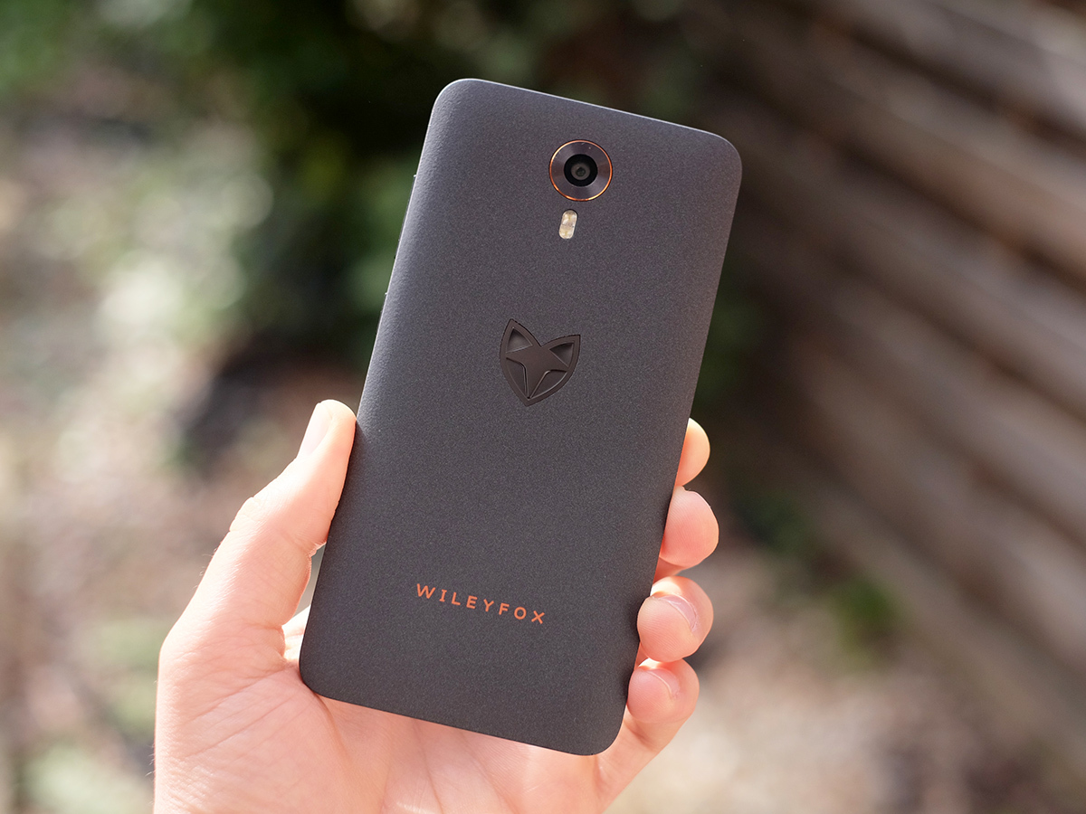
There’s a little embossed Wileyfox ‘fox head’ logo on the back, the company name in orange and a little orange ring around the camera lens. Would it look better without some of these flashes, or if the font was silvery/grey so that it stands out a bit more subtly from the back? Probably, but it’s not a bad-looking phone.
The feel is a bit different from the norm too. The Wileyfox Swift has your usual peel-off plastic back cover, but the finish is every-so-slightly bobbly, and soft-touch at the same time. It’s a nice combo, being that tiny bit rougher than the soft-touch plastic you get on the back of the Nexus 5 while still smooth.
Why am I mentioning that old classic? The Swift is similar in style and feel to the Nexus 5. It’s a bit taller, but the width is similar and so is the thickness. It’s 9.4mm thick, so a bit less chunky than the Moto G.
Are you tough enough?
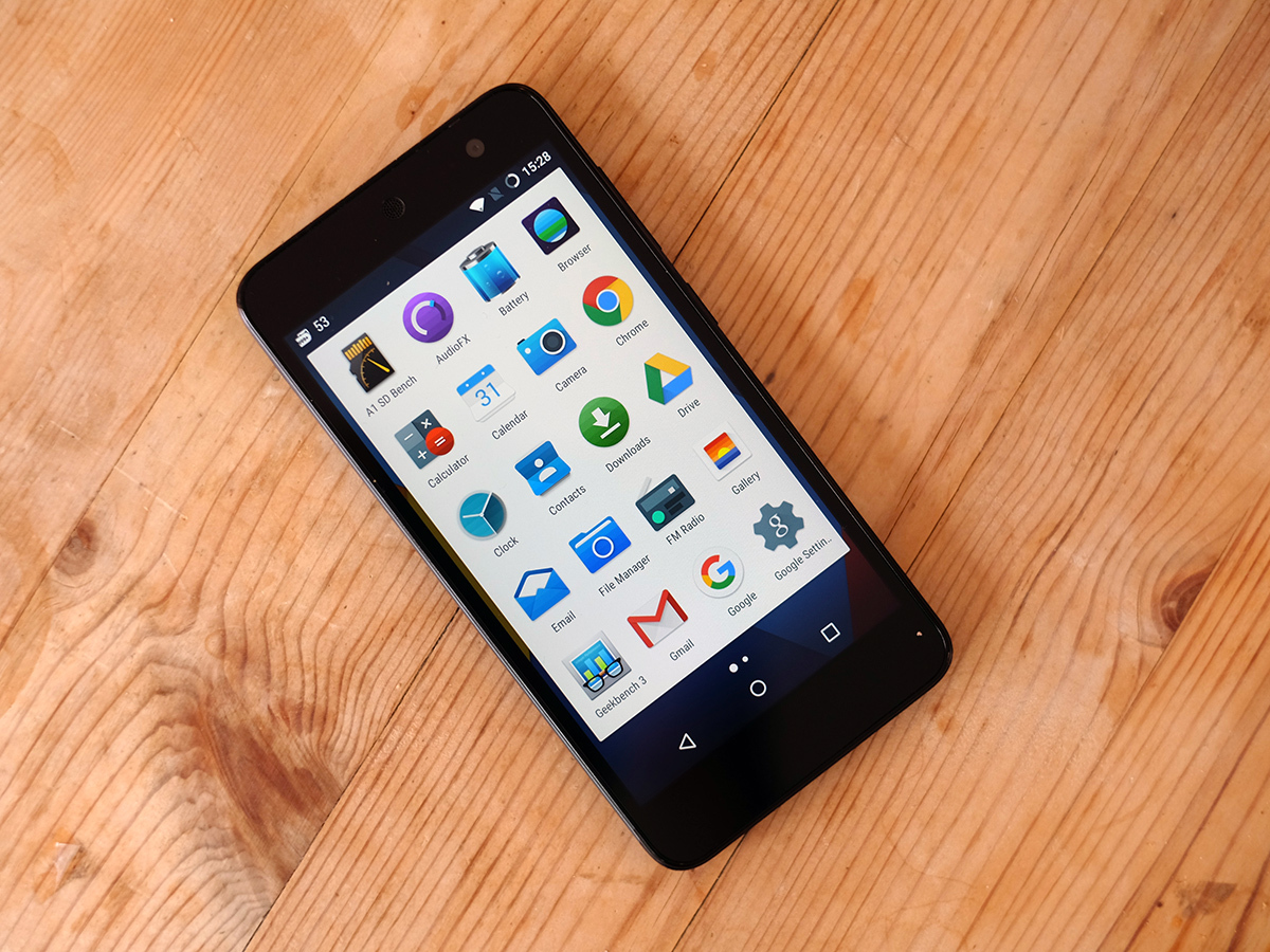
It feels like a simple, low-fuss phone. And at £129 that’s really what we want. The one budget flaw that becomes obvious after using the phone for a week or so is that the shiny bit around the camera lens is quite prone to scratches. This is one of the few real metal parts of the phone, and doesn’t seem quite as hard-wearing as it might be on a pricier mobile.
The Wileyfox Swift’s front seems a bit tougher, though. While there’s a bit of a ‘lip’ seam around the screen in which chocolate and crisp crumbs can get stuck if, like me, you’re on occasion a disgusting individual. On-top of the screen is a hardy layer of Gorilla Glass 3, which won’t get scratched up badly unless you do something terrible to it.
While the Moto G and Moto E have Gorilla Glass protectors as well, it’s a good sign that Wileyfox has its priorities in order. I’ve been pretty impressed with some other aspects of the screen too.
The smell of searing retinas
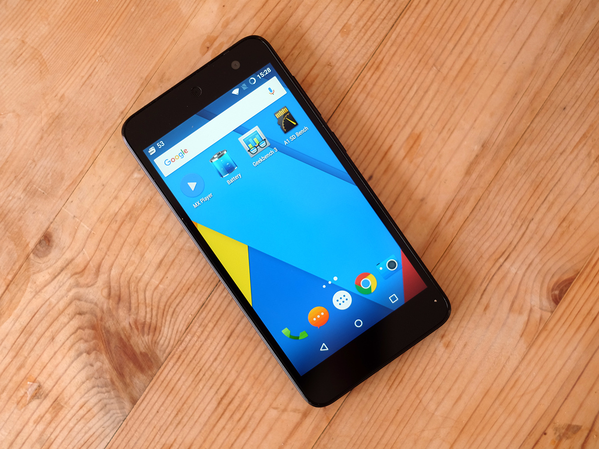
The Wileyfox Swift has an insanely bright display, brighter than most budget phones. Heck, brighter than a lot of more expensive ones too. This means that it can take sunny days in its stride, brushing off reflections like they’re no big deal.
There are a couple of trade-offs, though. The Wileyfox Swift’s backlight can often seem too bright indoors, because the Auto brightness setting doesn’t seem willing to dial the backlight down enough. It makes the screen’s blacks look quite blueish too.
This is a screen that favours nova brightness over amazingly deep contrast. I actually reverted to manual brightness control in the end, dropping it almost to the minimum level indoors.
When crappy outdoors visibility is often a real problem with cheaper phones, though, we can live with the trade-off. The display isn’t bad in general, either. You get a 5in 720p screen, just like the Moto G.
That’s enough to get you decent sharpness and a display big enough to make playing games pretty fun. General screen quality is a bit better in the Moto G, though. The Wileyfox Swift suffers a bit from colour shift, where the white balance of the display changes as you start looking at the screen from an angle.
You might think: why would I want do that? However, this and the blueish blacks mean it comes across as a less-than-pristine display. Still: not bad for £129, is it? And when Wileyfox gets around to fixing the Auto brightness setting, these issues will become much less apparent. Colour tone is very nice too for a cheap phone. Not undersaturated, not oversaturated, it’s just about right.
Shades of Cyan(ogenMod)
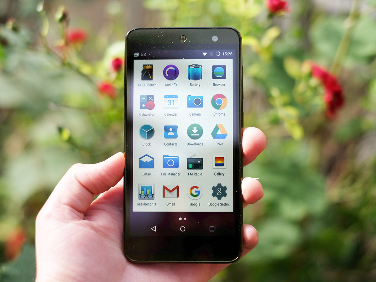
It has some neat customisation features too. As well as being able to radically alter the colour tone, you can make the Wileyfox Swift actually change its tone depending on the time of day, gradually getting warmer as the hours pass. It’s like the phone equivalent of a sleep-regulating SAD light.
It’s a bit naff, really, but does mean you have access to full screen temperature controls. This bit I like. I found the daylight setting a bit too blueish, the night one far too yellowy. My eyes seem to like the screen around the 6100k mark: just a hint of bonus warmth, like a duvet for you eyeballs.
One of the really unusual parts of the Wileyfox Swift is that it runs CyanogenMod rather than its own custom UI or standard Android, and it’s this software that provides all the extra bits like this.
On the surface it looks a lot like normal Android Lollipop, and it’s the latest 5.1.1 version running under the surface. We’ll forget for now that Android M is right on our doorstep.
However, look into the Settings menu you’re whacked over the head by a huge number of extra customisations. It’s the same software used in the OnePlus One at launch, although the OnePlus 2 moved over to the altogether friendlier Oxygen system.
The amount you can fiddle and tweak how the interface looks is quite mind-boggling. It gives you the scope to just-about ruin the phone. The problem here is that after all my playing with the settings, I ultimately ended up returning to the defaults. Google spent a lot of time working on the visual design of Android Lollipop, and it shows.
If you’re after a new look and don’t want to spend an age bumbling about in menus, there are also themes. These downloadable virtual facelifts change icons, wallpapers and even the look of the Wileyfox Swift’s settings menus.
As you might expect when most of them are user-made: Georgio Armani would not approve of 99 per cent of them. There’s the odd tasteful one your might want to test drive for a day or two, but once again I quickly reverted to the Google Now-style interface. Android used to look a bit naff, but it just doesn’t anymore.
64-bit brains
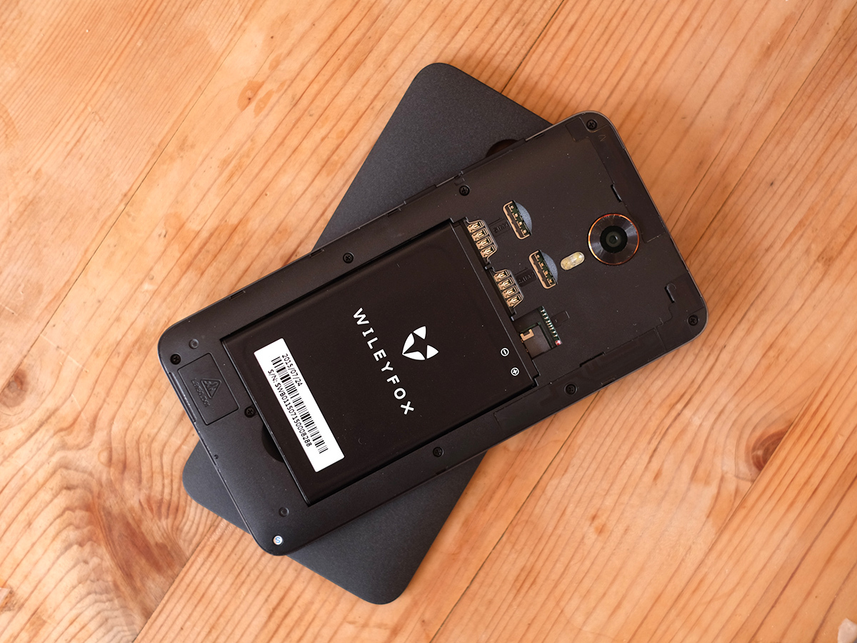
Performance is generally very good too, managing to avoid the bad lag we’ve seen recently in some cheaper Android Lollipop phones. How? Wileyfox has made the masterful move of packing 2GB RAM into the Swift, a seriously impressive amount for a £129 phone. You can really see how the company’s reliance on viral word-of-mouth over expensive marketing works in our favour.
It’s not perfect, though. I did stumble onto the odd geriatric pause, and apps aren’t always super-duper quick to load. But given some of the annoying stuttering I’ve seen in phones more expensive than this, i”m happy. Benchmark performance is fairly similar to that of the Moto G (3rd Gen) too, with 1414 points in Geekbench 3.
That’s no surprise: both phones use the popular Snapdragon 410 1.2GHz quad-core CPU. The Wileyfox Swift also has 16GB storage, making the phone much closer in spec to the more expensive version of the rival Moto G, which sells for as much as £90 more.
At every turn we wonder, how did Wileyfox manage to cram at this tech in for under £130?
A camera touched by Samsung
It’s a minor gadget miracle, and that doesn’t even stop at the camera. The Wileyfox Swift has a very interesting camera, one whose hardware we’ve not used before. It uses the 13-megapixel S5K3M2 Samsung sensor, with the same ISOCELL technology introduced back with the Galaxy S5.
This is impressive, as it uses similar pixel-isolating architecture seen in the iPhone 6S. And we’re certainly impressed with the results. Scratch that: I’m mostly impressed with the results. Use the Wileyfox Swift as a camera for a while and it becomes very clear this is very capable hardware. For its dynamic range, detail and the clean quality of photos in good lighting, the sensor/lens combo swashbuckles all over the budget setup seen in phones like the Sony Xperia M2 Aqua and HTC Desire 626.
You can shoot high-contrast scenes without everything becoming a purple-tinged mess and aside from very red objects looking a little unnatural, colour performance is very good too. Some of the shots it takes could easily be mistaken for those of a standalone camera.
What it’s not so good at includes perfectly judging metering, applying processing and making use of the modes that can really take a phone camera to the next level. The worst offender is HDR. It’s dreadful.
High dynamic range is a mode that tries to increase detail in a photo by pulling more info out of the lightest and darkest areas of a scene. But here it just takes the normal view and progressively brightens it, almost always ending up in a horrible, overexposed mess. You can try to trick it by focusing on a brighter area of the scene (causing the image to dim), but at their best the results aren’t great. Shooting in HDR is intensely slow too.
Just stick to Auto mode: it’s generally fairly reliable. However, it too tends to have the odd metering problem. There are different exposure modes in the camera app you can play with, but I honestly don’t think many will dig that far.
The Swift’s camera app itself is pretty poor too. You flick up and down to change the shooting mode, from Auto to HDR to Night to a whole bunch of naff filters. Who thinks “what I need for this scene is a filter that turns everything blue”? No-one does. All the Instagram-obsessed types I know apply their filters after shooting, not before it. And the way you switch between filters makes it far too easy to shoot with something other than Auto without realising it. Plus the filters are simply crap.
There’s also nowhere near clever enough provision for night-time shooting. This should be built into the Auto mode, not shipped off to a special ‘Night’ mode no-one will reach for when it involves flicking at the screen up to six times. Night shots do tend to retain a good amount of detail, but are quite noisy and way too dark. You can tart them up nicely in Photoshop, but we shouldn’t have to.
The blame game
I should note, though, that this is the camera app of CyanogenMod, not something Wileyfox has come up with. Part of the reason why this phone is so cheap is that its maker has basically taken the software off the shelf rather than having to put in months of work itself. It must have put in some tweaks, mind.
The Wileyfox Swift is absolutely up there with the best ultra-budget phone cameras. It has a good sensor and a good lens, and the software/processing wonkiness can’t spoil that. However, it does feel like a bit of a step down from the Moto G. Both reach similar heights of photographic loveliness, but the Moto G’s camera is much more consistent and its app far more intuitive.
Battery life is similar to the Moto G, perhaps a smidgen worse. It’ll last for about nine hours of looped video, which is better than the second-gen Moto G but just a bit worse than the latest one. You’ll get a solid day’s use and change off a charge. Two days? Probably not.
It’s nothing to boast or worry about. The speaker is a similar case. There’s a single speaker unit at the bottom, with two grilles so that if you block one with a hand the Wileyfox Swift isn’t totally silenced.
This is a pretty thin-sounding speaker, though. You’re not going to want to listen to it for too long at a time.
Wileyfox Swift verdict
You can try to make a brand by piling millions into adverts, and getting rappers to wear your product in all those ‘sauntering stylishly out of a night club’ photos. However, we prefer Wileyfox’s way. With the Swift it has produced a tremendous bargain of a phone. It’s not perfect, but it exceeds most of what else is out there at the price so clearly that we can’t help but love it.
This budget wonder has come from nowhere and fires straight up to the big leagues of our favourite budget phones you can buy. If you can’t quite stomach the price of the Moto G, this this the phone to get.
Stuff Says…
This mega-value fox is a great cheap phone, and almost a match for the Moto G
Good Stuff
Amazing value
High-quality camera sensor and lens
Good screen
Bad Stuff
Dodgy Auto brightness setting
The odd glitchy pause
Camera software needs improving
