TomTom Spark Music + Cardio review
Multi-sport magician or a confused cardio companion?
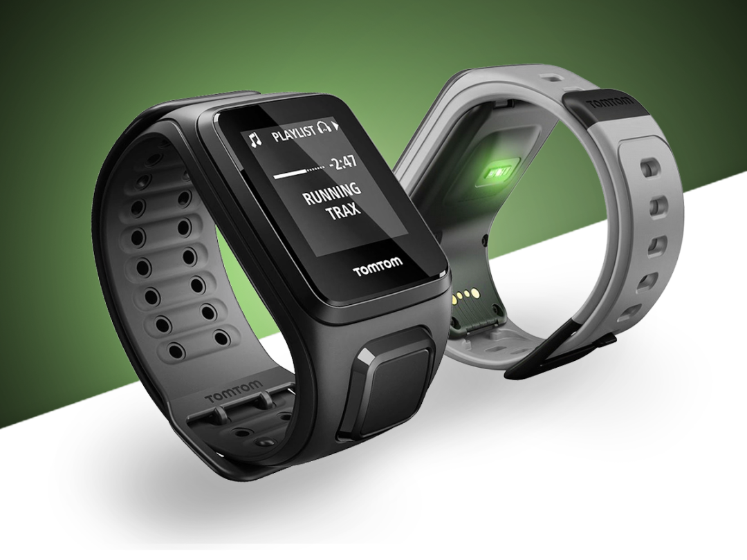
TomTom’s Spark wants to be the Jessica Ennis of wearable tech. It’s a GPS-equipped tracker with wealth of self-sufficient smarts. And it offers music storage too, so you can leave your smartphone at home when training for a heptathlon… or something less intensive.
Sounds like the strap-on sweat-sensor solution to end them all, right?
Alas, this fantastic feature set comes in a form that only a mother could love. Add to this a ropey battery life and unreliable heart-rate tracking, and the Spark all too often fizzles out in the hands of fitness fanatics.
Strangely-shaped smarts
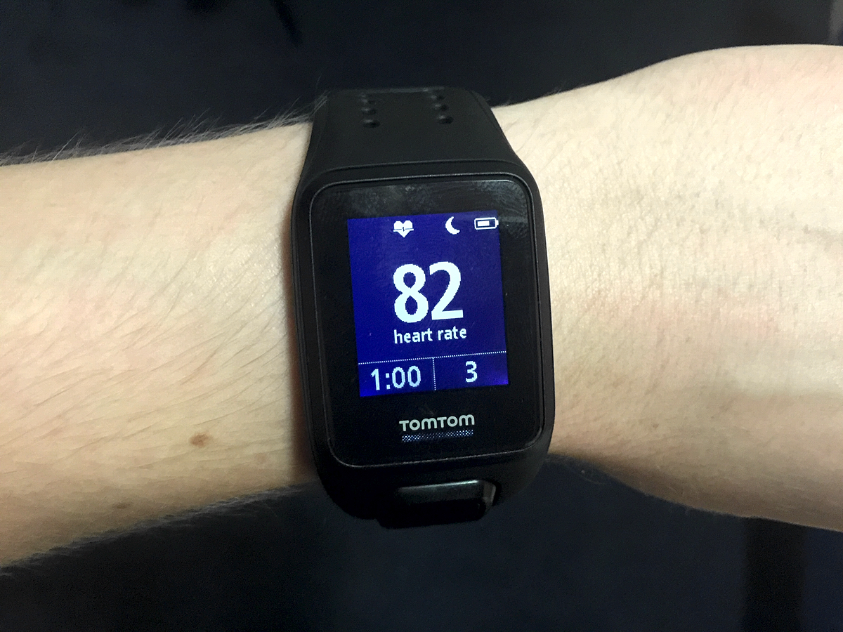
The TomTom Spark looks like an identity crisis with a wristband. Is it a sports watch? Is it an all-day activity band? From its lopsided design, it’s impossible to know.
With a sturdy silicon strap well-suited to sports – complete with nifty over-under-over pop-to-lock buckle – it’s close to the fitness-focused norm. But its asymmetrically-rounded form, complete with hulking four-way control button, means it’s neither sleek enough to wear to dinner, nor sufficiently convenient as an on-the-jog companion.
Budget bands › Best cheap fitness trackers 2015- reviewed
Beats in the body
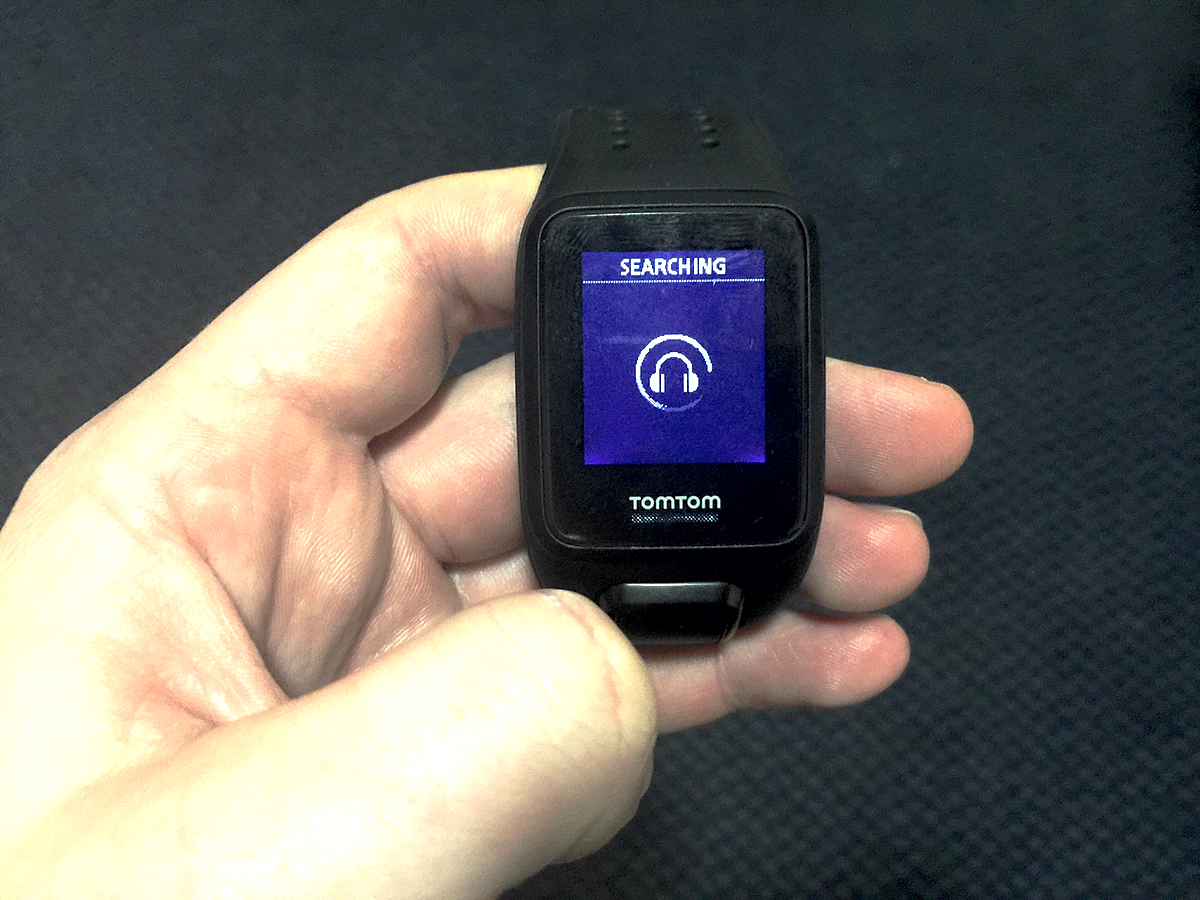
And that’s a great shame, because the Spark has quite the suite of smarts. Even if it fails to offer some key basics, such as idle alerts and notifications.
Forever frustrated by slapping a smartphone in an armband or clutching it in your perspiring paw as you peddle and pound? The Spark – in its Music+Cardio iteration – has the answer.
A huge 3GB of internal memory means you can load up TomTom’s tracker with plenty of tunes. Doing this is as easy as plugging it in to your laptop and transferring albums or playlists.
The Spark is no song-streaming replacement: activities are still its focus, meaning playlists make much more sense. Whilst you can skip through songs, there’s no ability to select; rather, it’s a case of choosing a list to play – whether one of your own or the bundled Running Trax.
Still, pair the Spark with some Bluetooth headphones and you’ve saved yourself the hassle of having to lug your phone around with you on your morning jog.
Push it, push it – but not too hard
Initially, this Bluetooth connection was patchy with songs cutting out when we’d just hit our stride. After updating to the Spark’s to run a later edition of TomTom’s software, performance was a lot better. Songs didn’t cut out anymore, although it was occassionally tricky to sync the Spark with our iPhone. We once had to set it up again as a new device.
As for the Spark’s operation, it’s best to select your chosen tunes before you start, because delving into the music controls can be confusing at the best of times, let alone when you’re deep into conquering your Christmas calorie intake. That, and the fact that the Spark’s D-pad is a disaster when you’re on the move.
Pushing hard enough to register an input frequently forces the main module out of its oddly-curved casing, whilst the bevelled buttons themselves are so slim as to be annoying in anything but a static situation.
This is made all the more mystifying in light of the simplicity of TomTom’s menu design. Sat on the sofa, it’s a joy to use: forgoing any ‘select’ button, the Spark elects for directional inputs – and it really works.
Screenless superstar › Stuff Gadget Awards 2015: Moov Now is the Health & Fitness Gadget of the Year
Four way fun
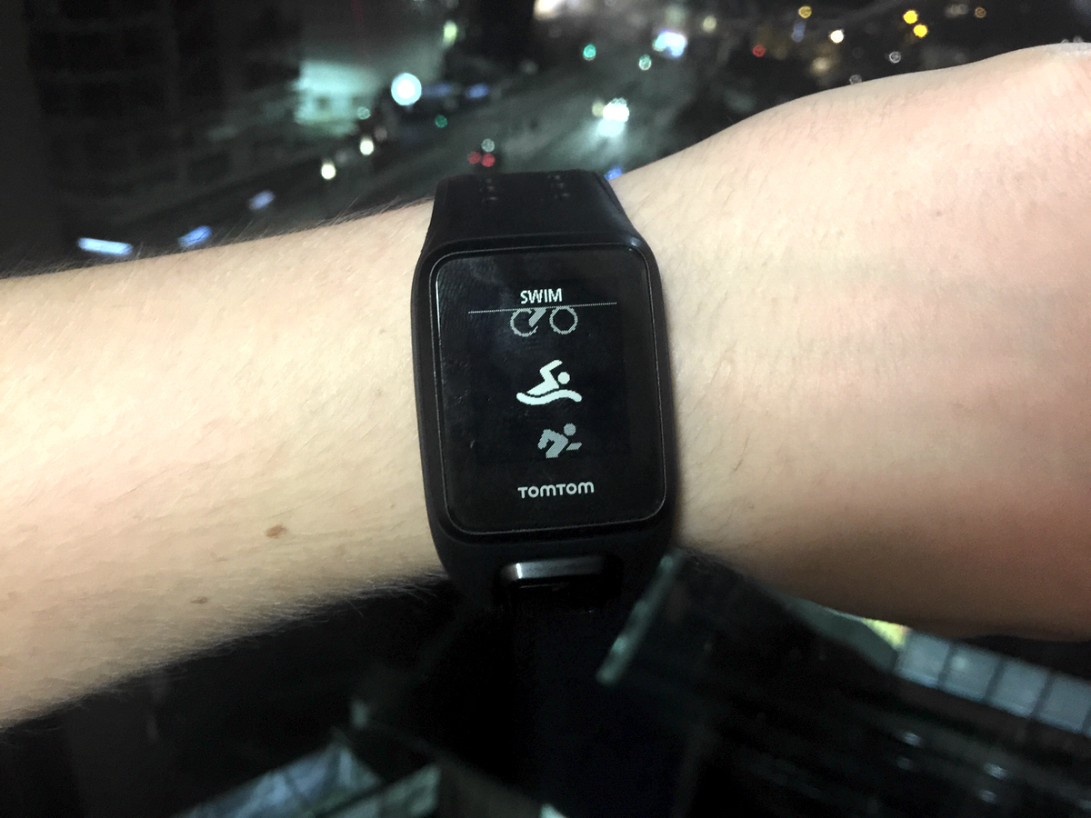
In a similar manner to the smartphones it’s abandoned, the Spark features a number of screens which scroll horizontally and vertically to show different stats.
Navigating left displays daily and weekly activity totals, with custom goals as the hub and sleep, calorie, distance and time details above and below. Heading right, instead, takes you to a sports tracking page, from which you can choose a specific activity to track, or enter stopwatch mode if your pace-pushing preference isn’t quite mainstream enough.
Accessing data during sport involves this same directional approach: press down to access training options – including intervals, racing previous times, laps and zones – and up to view recent activities. In short, it’s an interface that puts stats and adjustments a second away, making the necessity of a partner app a distant memory. Almost.
Find yourself, lose your juice
Want to make use of the Spark’s in-built GPS smarts? Syncing with the app once every couple of days is a must, as doing so delivers data covering the positions of signal-streamers in space for the next three days – dubbed QuickGPS.
Using this makes for rapid mapping, so you can get on with the good burn. Forgotten to sync? You’ll be waiting a while: stay static, with a clear line of sight to the sky, and pray for a satellite to pass your way.
Still, once you’re located, mapping is very effective. Off road or on, the Spark did a pretty precise job of following our jogs, even as we ran under tree cover.
The downside? Sticking on GPS sensing – as most of the Spark’s sports modes do – can lead to sudden and dramatic drops in battery life. TomTom’s wearable is generally good for around 3-5 days in the background, but we found a half-full cell can empty in the space of a 90 minute sweat session. So don’t go jumping into bed intending to use the watch as your vibration alarm if it’s relatively short on power.
Turning off night mode – which seems to increase the sensitivity of the light sensor used to activate the backlight by covering it with your palm – and music helps, but the Spark still appears to suffer from significant GPS-related battery drainage when you take it for an intensive workout. TomTom says that the message you receive stating the Spark’s battery is half-depleted appears prematurely to users, and it’s working on a fix.
Still, this doesn’t alter the underlying issues affecting the Spark. A full loss of life once forced us to reset the watch, and spend several minutes spent re-pairing it with our phone.
Best of the bands › Jawbone UP3 review
Data, straight from the heart
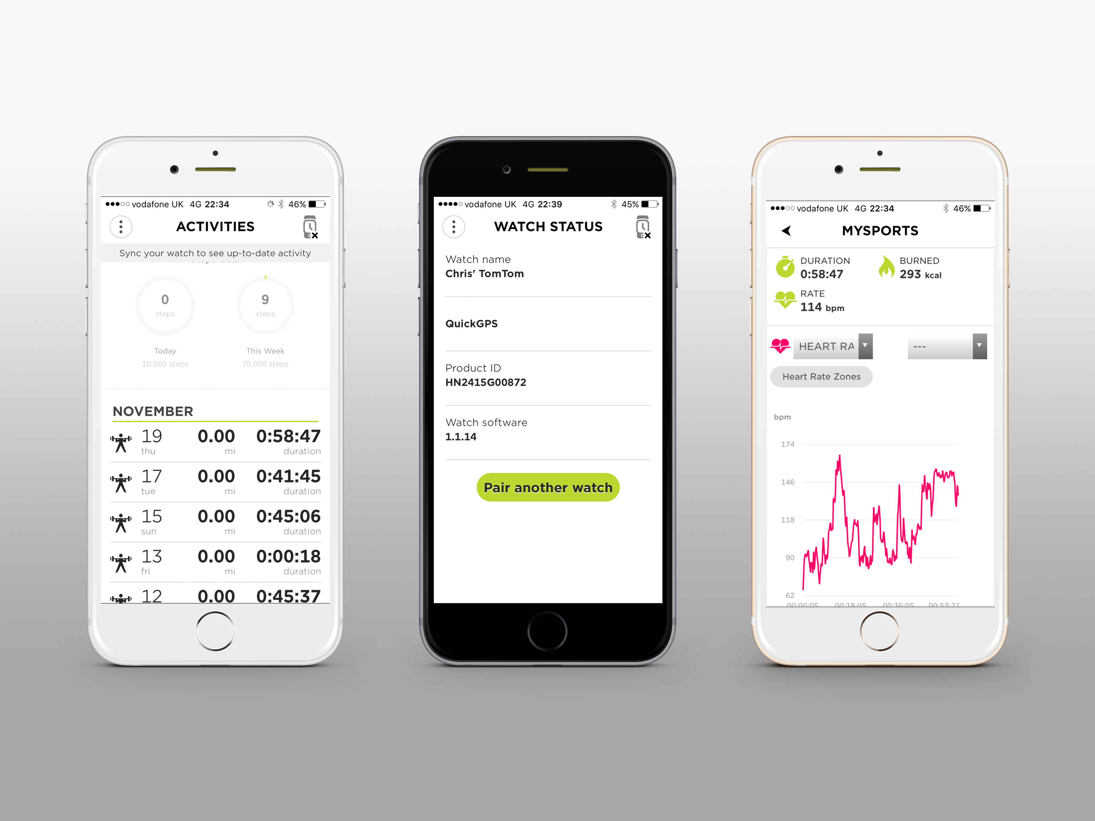
At least once you’re home and showered you can fire up the app to assess your data. It’s best to leave the Spark to do its thing though, as syncing and data upload can be slow, especially if you’ve been busy.
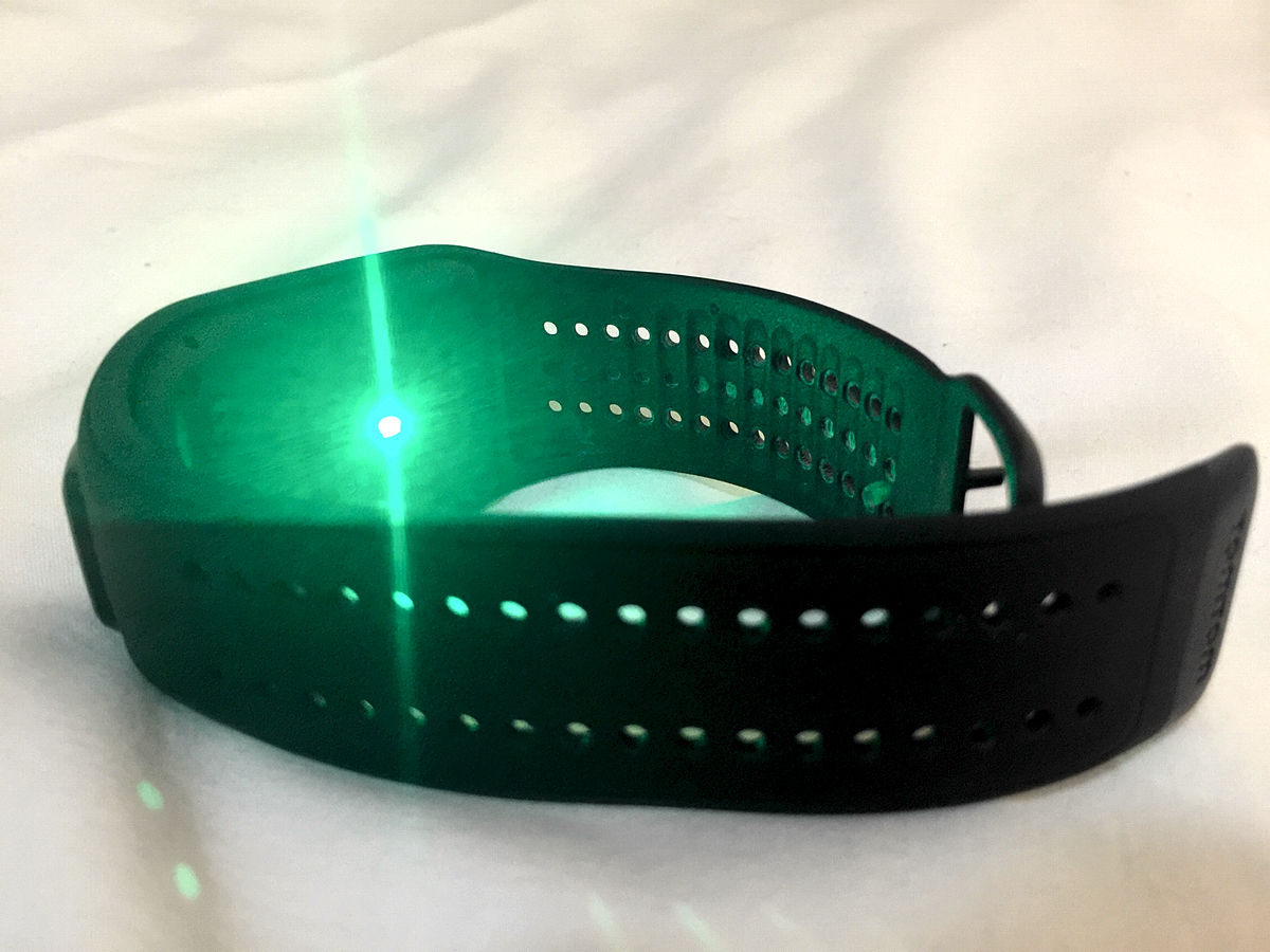
In the app, as well as on the MySport web platform, there’s route-mapping and detailed exercise data, as well as rolling targets to display how often you’ve met and exceeded your activity goals. It can also compute your heart rate zones, which would be useful, was heart rate monitoring meaningfully accurate. Which it isn’t.
Comparing the Spark’s readings to those of a chest-strap sensor during the same exercises gave vastly different results, surprisingly so given the sporting status of the TomTom. Sure, wrist-mounted monitoring is tricky, not least due to its needing to account for blood flow surges, but, even with the Spark strapped on tightly, body beats were inconsistent, meaning equally inaccurate calorie counts.
TomTom Spark verdict
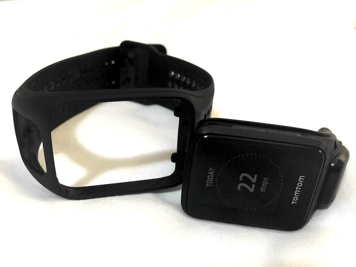
Does that matter much? Well, it’s a telling symptom of the Spark’s insecurity. The app and abilities of the watch paint it as an all-singing ally – including cadence sensor pairing for cyclists, and swim-tracking for water paddlers.
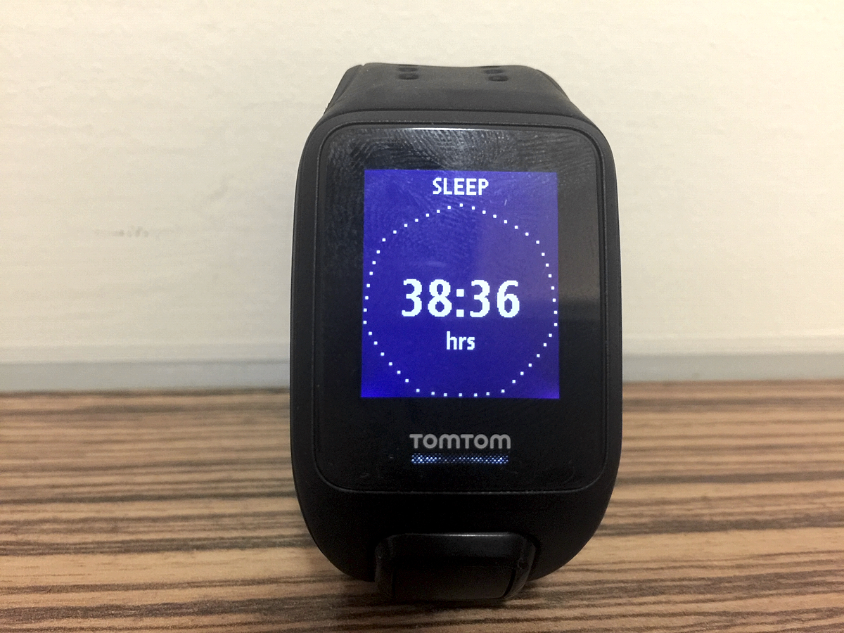
But the watch is only truly consistent – and, in fact, addictively usable – as a standalone sleep and daily activity tracker. Enough data is displayed on the device itself to render the app a necessity only for data-driven sportsters, yet the hardware is just too clunky to appeal to such number junkies.
Additionally, the Spark is too complex and inefficient a wrist-wrapper to make sense as a simpler sensor of steps and snoozes – with detailed training modes, tracking and tunes, as well as exports to the likes of RunKeeper and Strava.
This means the features supposed to make the Spark special are sufficiently unstable as to render them superfluous, leaving TomTom’s ticker neither a jack of all tracking trades, nor a master of one.
Healthy helpers › The top 10 fitness trackers in the world
Stuff Says…
A tracking ticker with promise that tries to be both sports sensor and all-day assistant – and fails at both
Good Stuff
Properly powerful sports sensing
Sounds and situation, without a smartphone
All day tracking on tap
Reliable location lock-on with QuickGPS
Bad Stuff
Divisive design
Battery can disappear fast with GPS tracking
Heart-rate tracking is way off
Bluetooth signal susceptible to breaking up

