Pebble Time Steel review
Pebble goes all heavy metal on us
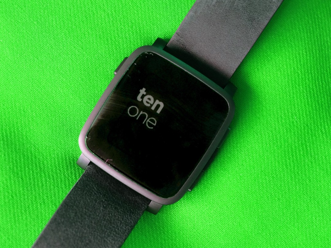
What would you do with a smartwatch? While Android Wear and the Apple Watch offer you the choice of ‘everything’, the Pebble Time Steel takes a different approach.
It’s a lower-key, low-maintenance watch with much less eye-catching tech. You might think this also makes the Pebble Time Steel less interesting, but its style makes sense. Get this: the Apple Watch lasts a day off a charge, the Time Steel up to 10 days. And its screen stays on 24/7.
There’s a good chance you know all this, though, because the Pebble Time Steel is the all-round fancier version of the Pebble Time from earlier this year. It gets you a full-metal case, better stamina and some other hardware upgrades for an extra £50. Is it worth it? Just about, but mostly because it seems to take bumps and scrapes a bit better than the cheaper version.
More steel, less steel?
Making a ‘Steel’ version of a watch is nothing new for Pebble. It pulled the same trick with its last generation of watches, the original Pebble and Pebble Steel.
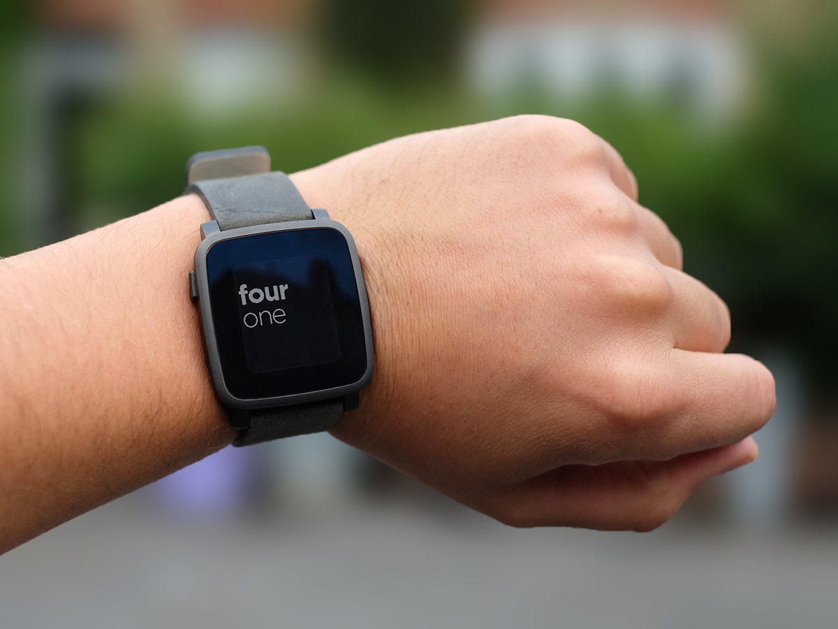
However, those two watches were much more clearly different than the Pebble Time and Pebble Time Steel are. Looking at these two watches side-by-side reminds me of playing spot the difference.
The funny thing is that the ‘non-Steel’ version actually has loads more steel on-show, from the front. You see, the front surround of the bog-standard Pebble Time is still made of PVD-coated steel, and this steel surround is way chunkier in the cheaper version.
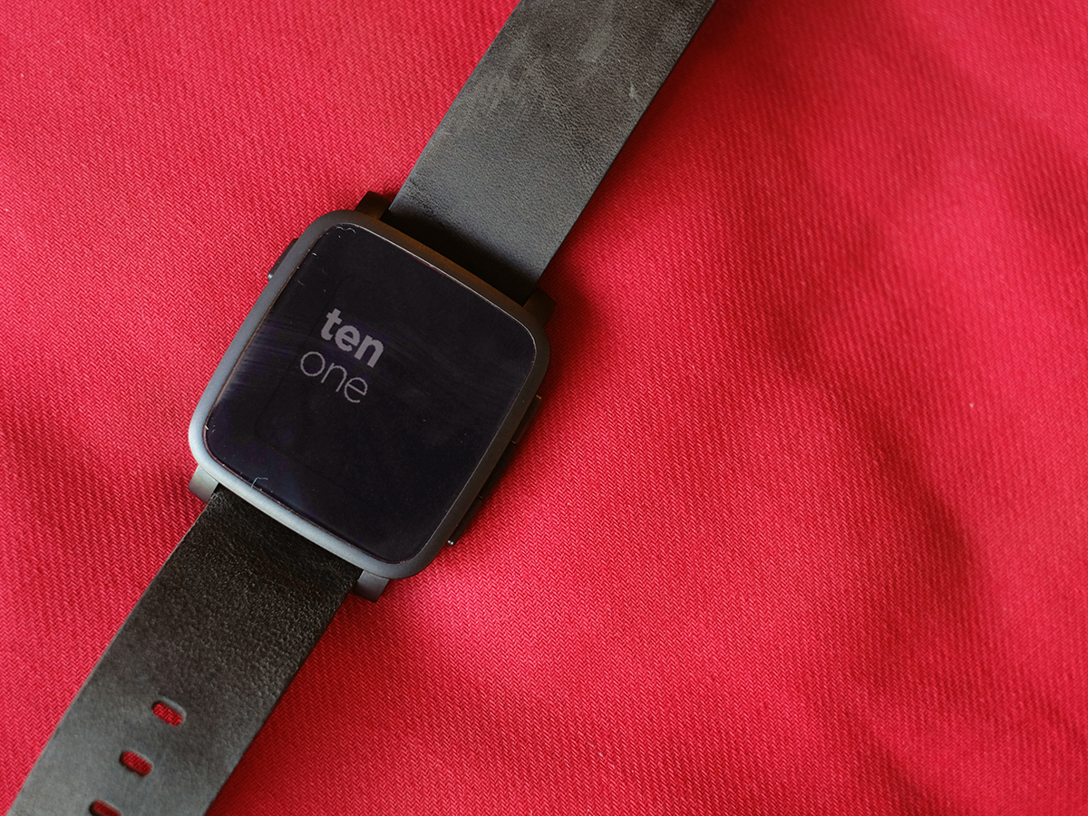
The Pebble Time Steel radically slims down this border, covering most of the front with Gorilla Glass 3 instead. The screen is no bigger, the border’s just made of different stuff.
Is it a better look? We’re really not sure, as it looks pretty bezel-tastic. But it does help to address one of the big problems I have with the Pebble Time: if you’re not careful it’ll look dead tatty after a few weeks.
PVD-coated steel is pretty prone to scratches, and there’s less of it to muck up here. I’m using the black version, but if you opt for the gold or silver ones any damage should be much less clear. The black Pebble Time Steel looks great as soon as you take it out of the box, but it may not do after a month’s abuse.
Where it all started › Pebble smartwatch review
Steel-hard abs
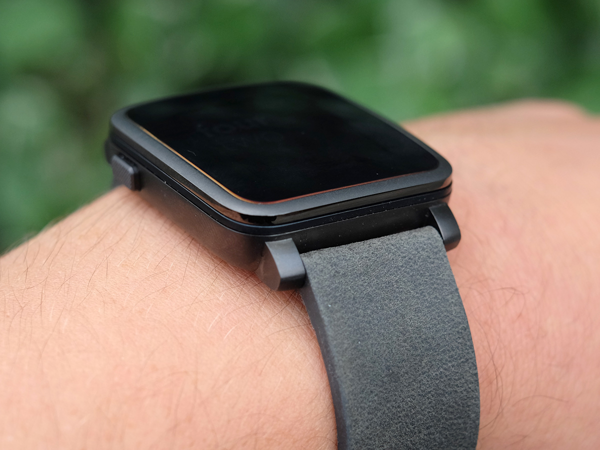
The extra metal of the Pebble Time Steel isn’t on the front, but on the rest of the watch. Other than the front of the vanilla Pebble Time, the rest is plastic, but here the whole frame is steel. Its construction is a lot more like a ‘proper’ fancy watch, even if the Pebble Time Steel doesn’t exactly look anything like a classic timepiece.
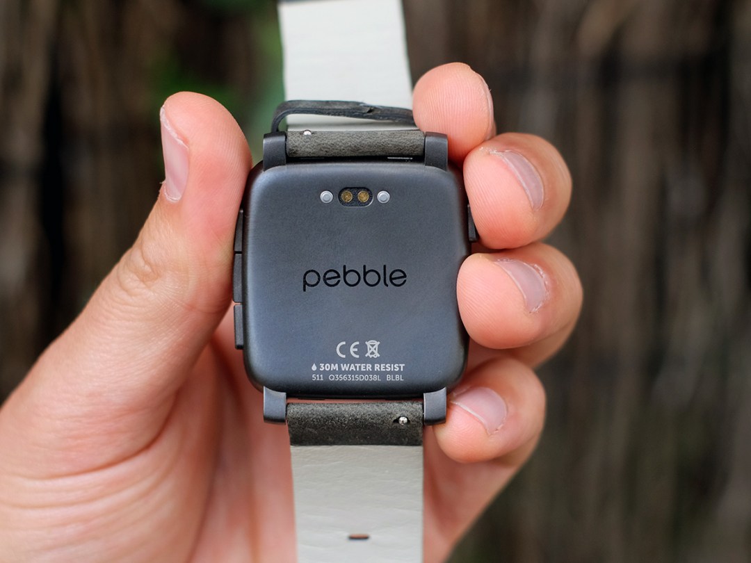
On first putting it on, you get that fancy cool feel of metal on your wrist, but in the following few hours the main watch bit feels much like the standard Pebble Time. That’s no bad thing, though. The back is lightly curved to hug your wrist, and the watch is both light and comfy.
The Pebble Time Steel comes with an upgraded strap, though. My watch has a matt-finish leather strap that’s quite obviously a bit fancier than the comfy-but-basic silicone one of the standard Pebble Time.
This is a watch I could wear overnight with no trouble. And have on several occasions. I can’t say the same about every Android Watch, especially not super-bulky ones like the LG Urbane. It’s waterproof to 30m too, meaning you don’t need to take it off in the shower or swimming pool. Blasting the watch with water/chlorine will probably make that lovely strap age quicker, mind.
The smartwatch chill pill
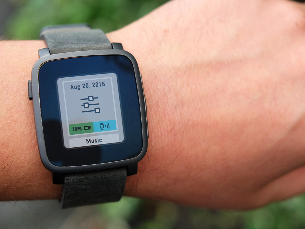
The Pebble Time Steel is a watch you don’t really have to worry about, though, even more so than the Pebble Time. Pebble says the battery will last 10 days off a charge, thanks to its larger unit. The pay-off is that the watch is about 1mm thicker.
Using the watch to check out just about every single notification my phone receives, and leaving the backlight to come on at the flick of the wrist, the press of a button — whatever — it lasts for around 6.5 days. That’s a way off, but I’m not calling Pebble out here. It’s all about how you use the watch, and I’ve been using it a lot.
Having switched from using the Pebble Time right before the Steel, there’s clearly a real battery benefit to the more expensive model too. It lasts a couple of days longer: case closed. You just hook up the watch to a magnetised charge cable to juice it back up.
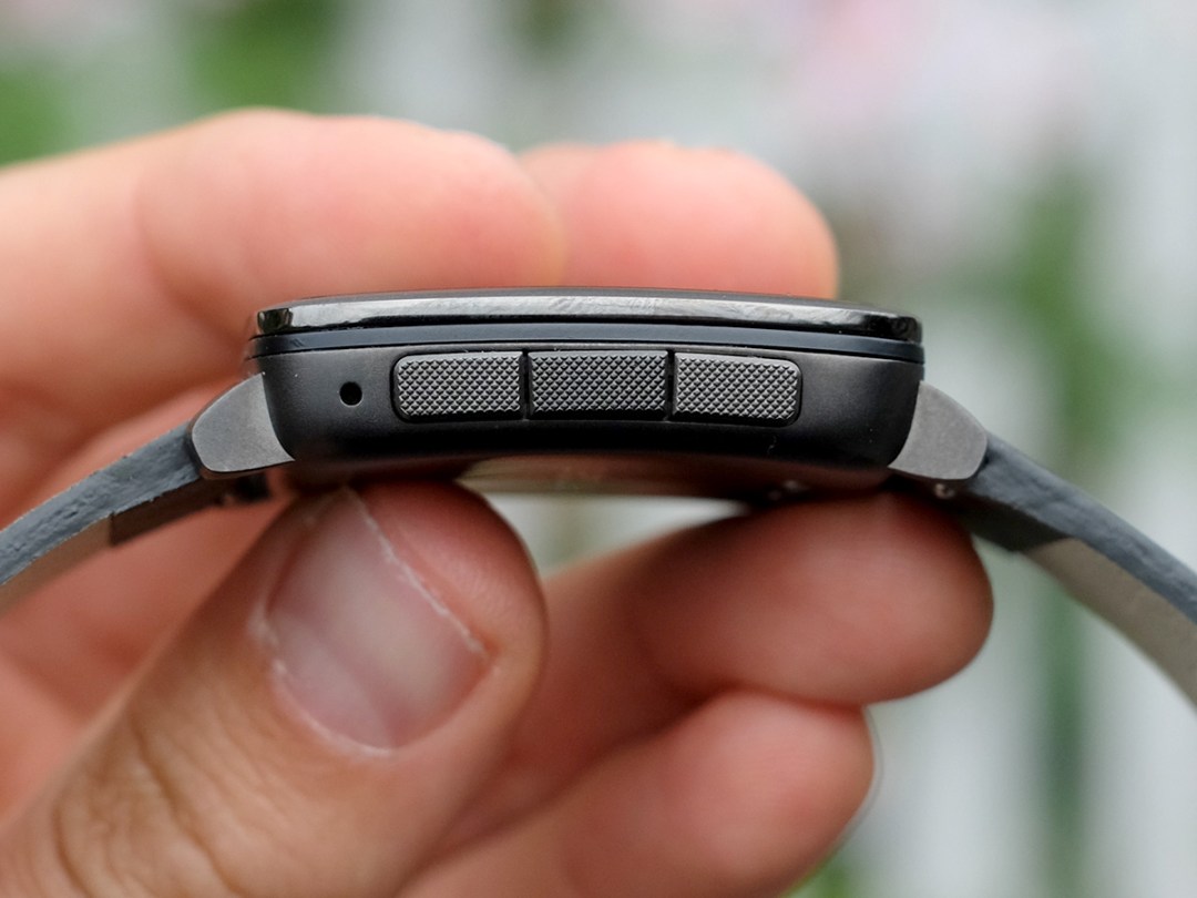
The one other benefit to the Pebble Time Steel is that its side buttons feel a little different to those of the Time. They’re metal rather than plastic, predictably enough, but the action is different too. It’s a touch lighter, a little crisper. Some people find the Time’s buttons a bit of a chore. These ones aren’t radically different, but are noticeably better.
The minor downgrade › Pebble Time review
Not quite all-change
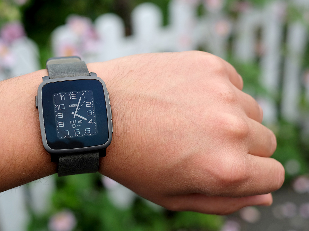
New battery, new buttons, new face, new backside. There are a few little changes in the Pebble Time Steel. But after using it for a while, I can only conclude it’s 90 per cent the same as the Pebble Time.
It still has a screen that balances out a low-intensity colour and needing a backlight at night time with amazing battery-saving tech and that it stays on all the time. Not nearly all the time, but every minute of every day.
In eradicating those little delays as you wait for the screen to switch on, the Pebble Time Steel feels that bit friendlier, its experience that bit more seamless. Just being able to glance down at my wrist idly to see the time while working without having to flick my wrist to get the screen to turn on earns Pebble watches big brownie points.
Slim app operator
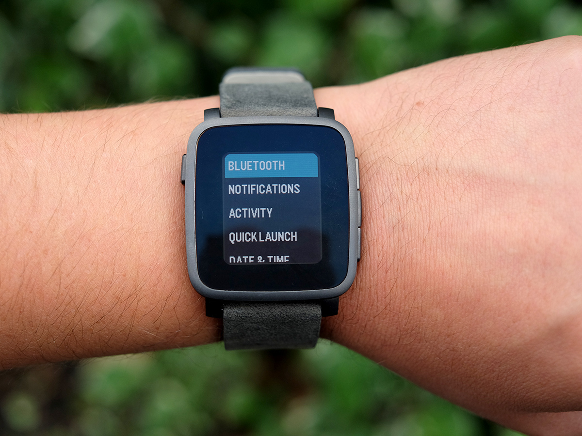
90 per cent of the time when I use the Pebble Time, it’s for notifications. As you receive one, it gives you a vibrate buzz and shows up on the display, nudging the clock display out the way (there’s still a time read-out at the top). You can then use the side buttons to scroll through all your recent notifications.
It’s very simple. There are no gestures to learn here. The Pebble Time Steel doesn’t even have a touchscreen. Everything is operated using the three buttons on the right side, and the one on the left.
Up/down scrolling is used throughout the interface too, keeping everything dead intuitive. Scroll up and down from the clock and you move through the Timeline view. This shows you the calls and calendar events in your past and future, as one smooth stream. Some apps can hook into this too, adding their own entries.
The apps menu is a totally linear up/down affair too. There’s no zooming in and out, flying about, as there is in the Apple Watch apps menu. The Pebble Time Steel is simple, to the point.
Our #1 smartwatch › Apple Watch review
Is it enough?
However, if you’re after a watch that feels flashy and futuristic rather than one that just slips into your life, you might not get on with the Pebble Time Steel quite as well. It has apps, thousands of the things, but they can seem quite simple compared with those of Android Wear and the Apple Watch.
It comes down to interaction. While the Pebble Time Steel has a microphone to let you take voice notes and reply to messages, everything else has to be done using four in-out buttons. There’s not the fidelity of input you get with a touchscreen.
Here’s where we reach the crux: we’re yet to stumble on any watch apps for any platform that single-handedly justify getting hold of a pricey smartwatch. Basic things like reading notifications, counting your steps and, yup, getting the time are all still the bread and butter of a smartwatch.
There’s more on offer, but the best bits involve piggy-backing off your phone. For example, the Pebble Time Steel will hook up to your mobile internet connection to pump info into the Pebble TripAdvisor app and let you find out about nearby restaurants.
It’ll do the same job with your phone’s GPS connection with a run-tracking app like Runkeeper, or a cycling-focused one like Strava. It can work pretty much like a Garmin Forerunner watch. Not bad for a ‘low-tech’ smartwatch, right?
You have to accept that the Pebble Time Steel can’t do an awful lot on its own, though. It doesn’t have a heart rate sensor, its own GPS, or Wi-Fi to strengthen its connection with your phone. It has Bluetooth to talk to your phone, an array of motion sensors, and that’s it.
And to an extent it’s up to you to find good uses for the Pebble outside of the basics. And it might take some effort. One I came up with was using Pebble Movies to check out local cinema times, having bought so many tickets on Groupon it’s almost physically impossible to use the things before they expire.
Pebble Time Steel verdict
The Pebble Time Steel is very similar to the Pebble Time, far more so than the original Pebble and its classed-up brother the Pebble Steel. We really don’t think this is an essential upgrade, especially if you already own the cheaper version.
However, the extra Gorilla Glass 3 on the front makes it a bit less prone to everyday damage and the bonus battery life means it’ll last for a solid week of proper use, a couple more days than we wringed from the Pebble Time. These tweaked features are enough to ensure that the Time Steel is the best Pebble you can buy.
Buy the Pebble Time Steel here from Amazon
The best of the rest › Top 10 smartwatches
Stuff Says…
A bit too similar to the Time for comfort, but still a blissfully easy-to-live with, long-lasting smartwatch.
Good Stuff
Fab battery life
Comfortable
Small, comfy design
Bad Stuff
Pretty similar to Pebble Time
Apps are generally simple, low-key


