Palm phone review
Honey, Palm shrunk the smartphone
Tech fans of a certain vintage might have fond memories of Palm.
The company’s last phone was the ill-fated Pre, the second of which was released way back in 2010. And while it ultimately failed, the Pre’s influence can be seen all over the smartphone world to this day. Wireless charging? The Pre did it first. The gesture-based navigation on the iPhone X and XS? Palm’s webOS introduced something very similar. Proper multitasking with thumbnails? You guessed it.
But nearly 10 years out of the smartphone game has yielded the mononymous Palm – a tiny Android-powered device that’s sold by Verizon in the US as a companion to your regular smartphone. It shares one number between both, the idea being that you take the Palm out when you don’t want to be constantly interrupted by notifications and just want something to handle the basics.
In the UK it’s a Vodafone exclusive, but one that’s sold just like any other handset, either free on contract from £31 per month or on PAYG for a fairly hefty £350 up front. That means it’s more likely to be bought as a main phone rather than some sort of occasion-specific second choice, which changes the proposition almost entirely.
You have to earn the right to go by a single name. Madonna did it. Kylie did it. Prince definitely did it. But has Palm done it?
Design and build: old-skool vibes
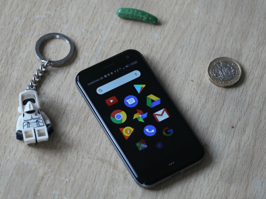
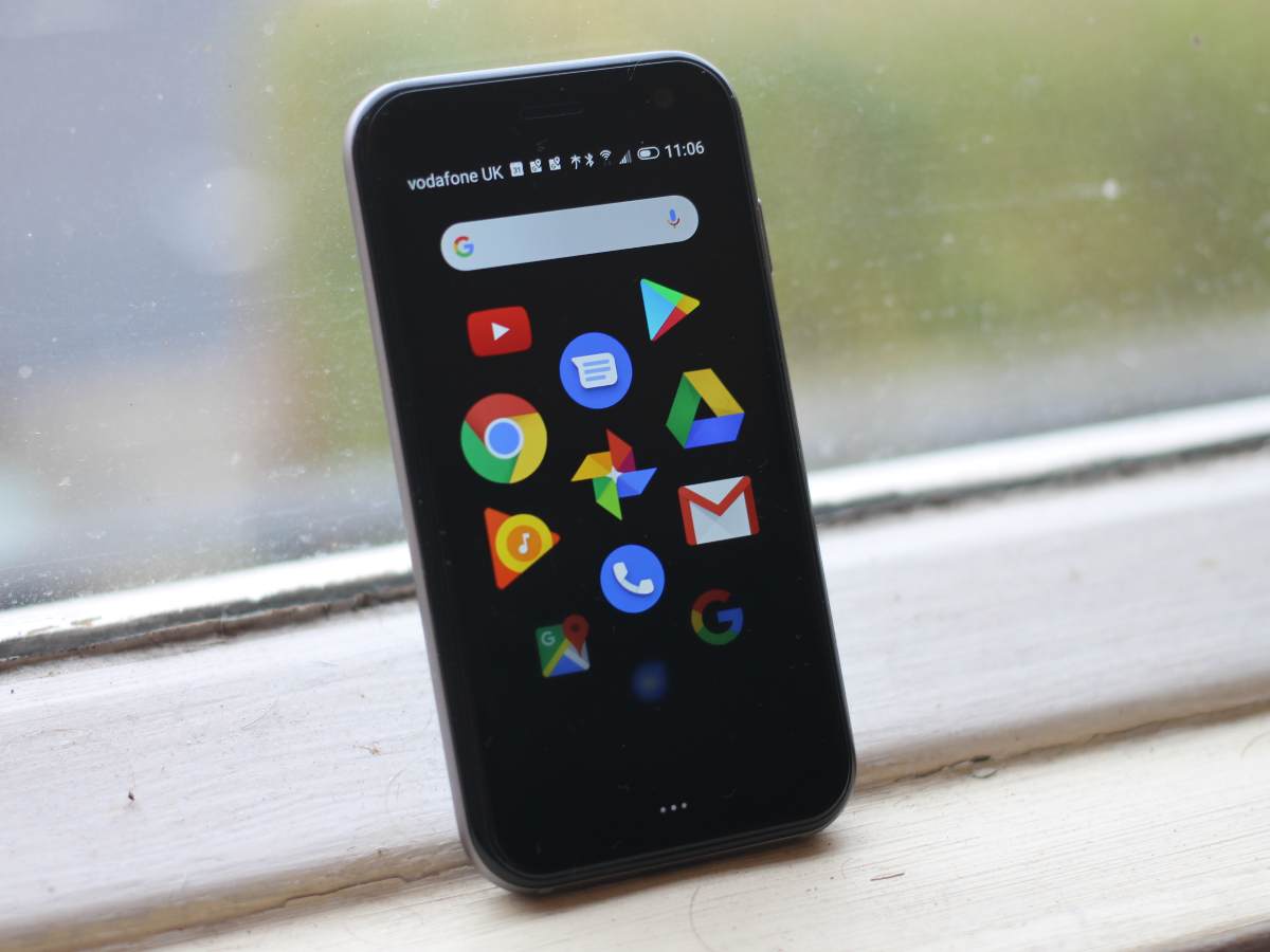
Holding the Palm for the first time is a bit like going back in time to an era when miniaturisation was tech’s great obsession, not ever-growing OLEDs and multiple cameras. Its surface area is slightly longer but narrower than a credit card, with pretty large bezels above and below the screen.
In fact, it’s most strongly reminiscent of an MP3 player circa 2009 or so, albeit one without a headphone port. It also has a much more premium feel than any PMP Samsung, SanDisk or Creative churned out, with Gorilla Glass front and back inside an aluminium frame.
That makes the Palm a slippery little customer. Put it down on anything that isn’t perfectly flat and it’ll make a break for freedom. Get too comfortable with it in your pocket and you won’t notice when it slides out. Considering how hard it is to keep track of, it’s probably for the best that it’s rated IP68 for water- and dust-proofing.
Given the Palm’s dimensions it should come as no surprise that there’s only one physical button on it: a wake-up button above the SIM tray on the right-hand side. Below the screen there’s also a touch-sensitive panel that can be used to navigate the Palm’s menus (more on that later), a USB-C port on the bottom, and you get cameras front and back, but the overall feel is one of minimalism.
Most annoying is probably the lack of a physical volume control. To adjust how loud anything is you have to turn the screen on and pull down from the top to reveal a slider. If you’re wearing Bluetooth headphones with built-in controls that won’t be a huge deal, but in pretty much any other situation it becomes irritating.
If nothing else, people will definitely ask you about the Palm when they see you using it. It’s just that most of them will only ask you if you put your phone on a hot wash by accident.
Display: size matters
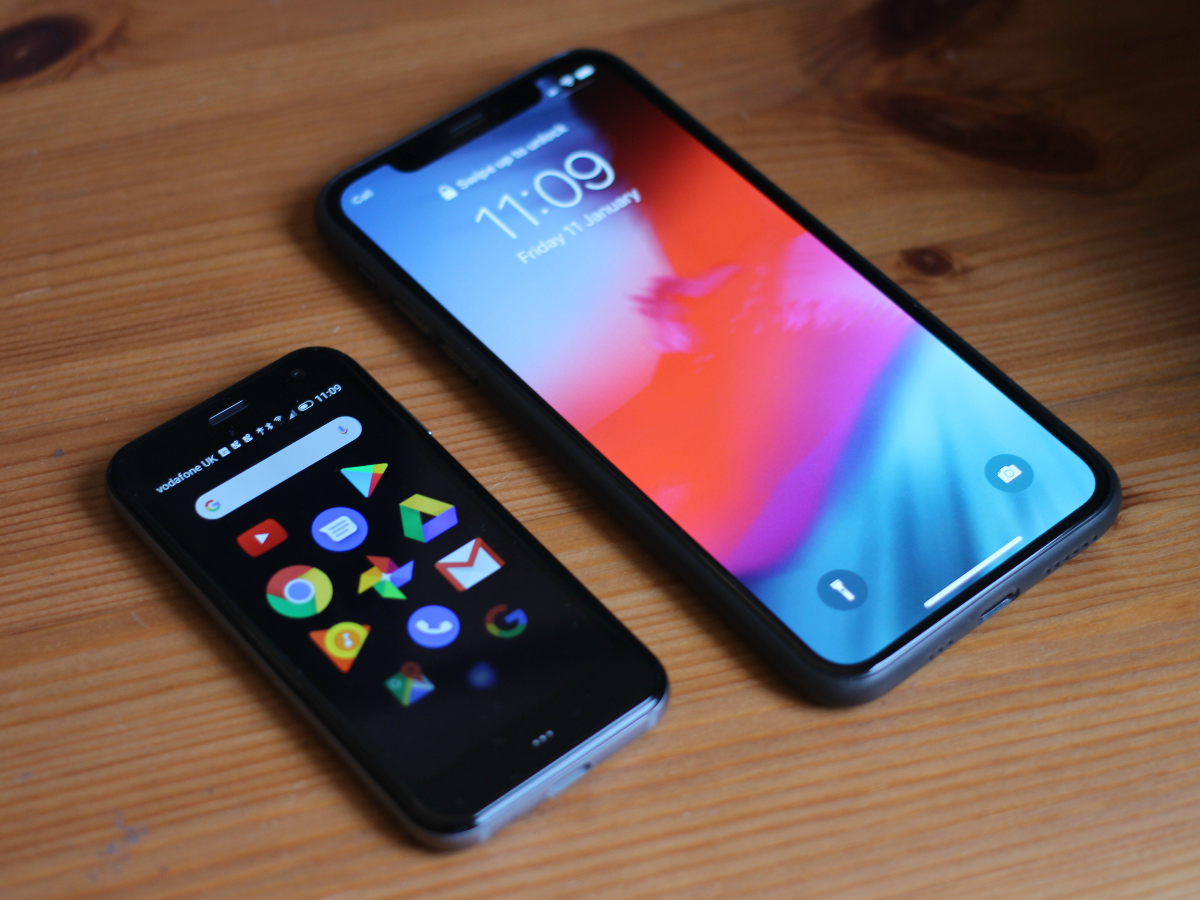
Fun fact: the Palm’s display is actually only 0.2in smaller than the screen on the original iPhone, although with its 16:9 ratio it’s a lot narrower. Coupled with the much higher 1280×720 resolution, everything displayed on it feels a lot smaller than on Apple’s original smartphone. It’s pretty sharp, with 445 pixels packed into every inch, although as it’s only an LCD it’s not as vibrant as larger OLED rivals.
The problem is, most apps are designed for screens much bigger than 3.3in, so the Palm making it a real chore using them. For example, it can only display one Facebook post at a time, which makes scrolling through your feed a pain – both figuratively and literally.
Even those with Donald Trump hands will quickly get finger cramps from using the tiny screen to navigate the apps and menus.
Camera: a waste of megapixels
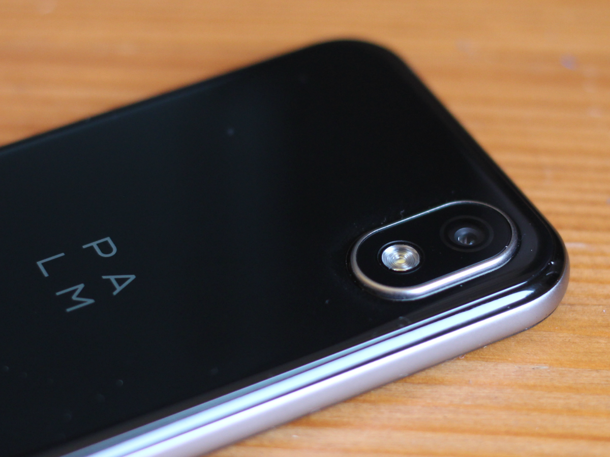
The Palm has a 12MP camera (with flash) on the back and an 8MP one on the front, but it doesn’t really matter how many megapixels they have, the size of the screen makes using them pretty difficult.
You can switch between HDR modes, add filters and even go fully manual, but it’s not so much the size of the icons that are a problem, more the fact that you can’t tell whether the pictures you’ve taken are any good.
Upload a few, or look at them on a bigger display, and you’ll soon realise that you needn’t have wondered: they all look flat and lacking in detail. Anything taken in decent light is passable, but zoom in just slightly and things get soft very quickly.
This probably shouldn’t come as a huge surprise but for most people the camera is one of the most important features of a phone; you never know when an unmissable photo opportunity is going to arise. Even if you’re expecting the Palm to be a second-choice handset, it should be able to take better pictures than it does.
Palm sample photos:
Software: one size fits all?
The Palm runs Android 8.1, which is not designed for a screen this small. Notice a theme developing here?
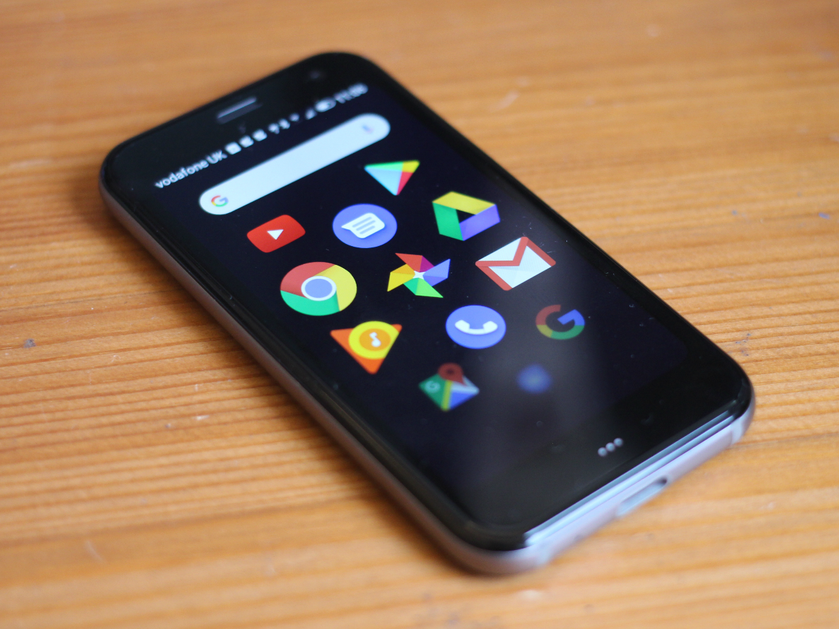
To make up for it, Palm has given the phone a bespoke main menu, which displays a maximum of 11 app icons at once. Scrolling from page to page is not dissimilar to browsing the apps on an Apple Watch, although the screen isn’t always as responsive as you’d like.
By default the UI still has on-screen navigational elements to it, which as you might imagine, are absolutely minuscule. You can turn them off and use the touch-sensitive button below the screen instead: one press goes back, two goes home and a long press shows all the apps you currently have open. It’s not bad when you get the hang of it, but something gesture-based like the Pre/iPhone system mentioned above would work so much better.
Saying that, Palm has included a gesture mode of sorts, which allows you to draw letters on a pop-up area at the bottom of the screen. These are supposed to act as shortcuts, but in practice it’s like playing the worst guessing game ever conceived.
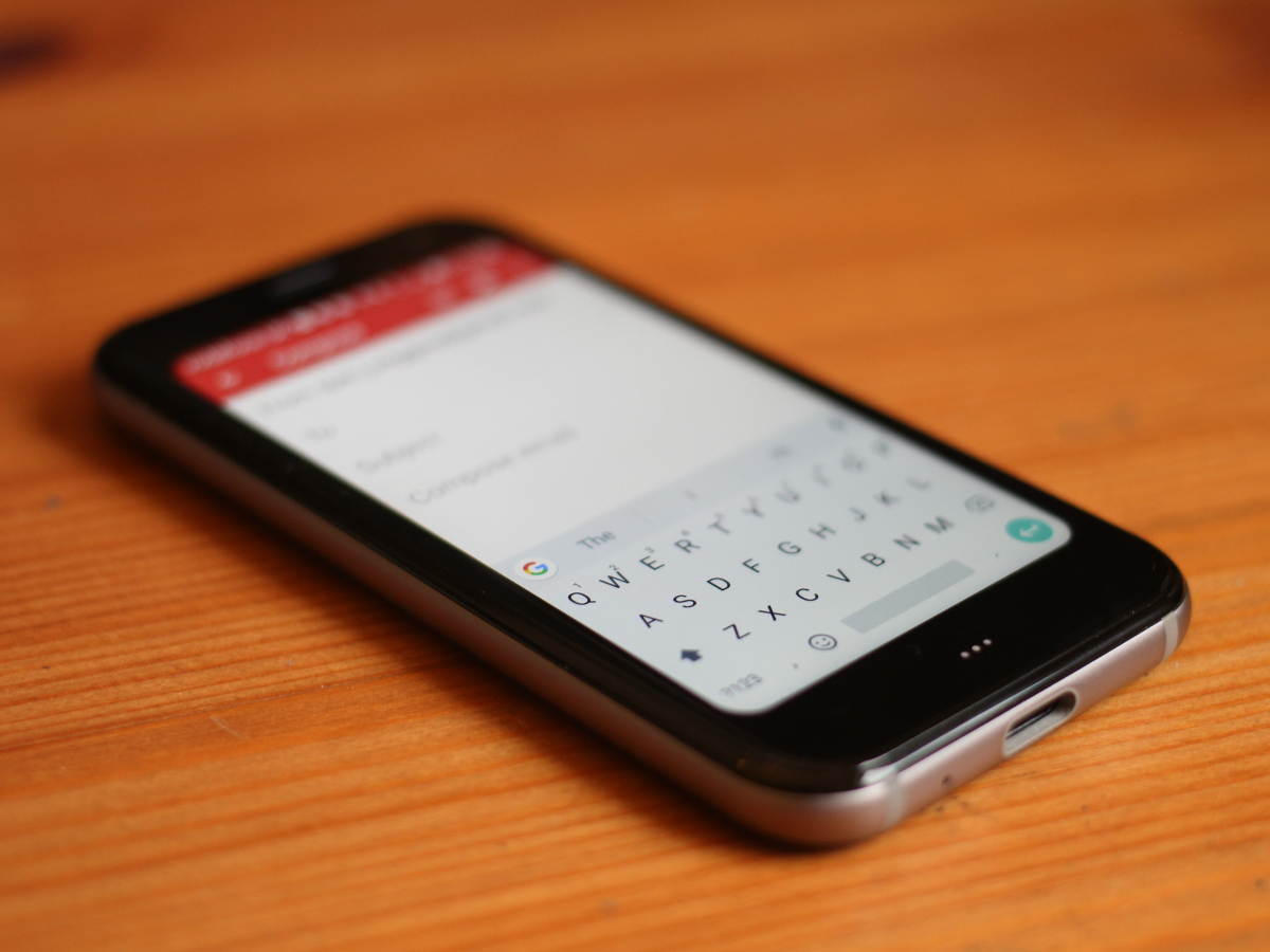
The on-screen QWERTY is similarly Lilliputian, and while it’s not as much of a nightmare to use as you might imagine, it’s not exactly what you’d call a joy either.
With no space for a fingerprint reader you’ll have to rely on good old-fashioned PINs or patterns to unlock the Palm. There is a Face Recognition option but it only uses the standard front-facing camera, so while it’s speedy enough in the daytime, it won’t work at all in the dark. That also means it’s entirely image-based, which raises a few concerns around security, although there’s no NFC here, so you can’t use Android Pay anyway.
You can understand the absence of a headphone port or a clever multi-sensor camera, but for something that’s supposed to have all the basics covered the lack of contactless tech feels like a bit of an oversight.
Performance: ideas above its station
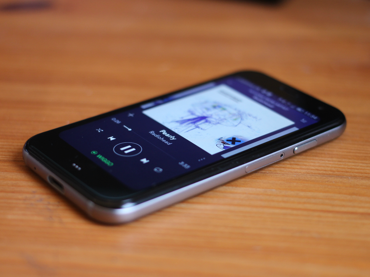
The Palm is powered by a Snapdragon 435, which is pretty low on Qualcomm’s processor menu. We’re certainly not talking chef’s special here.
In day-to-day use it’s quite clearly underpowered. Basic web browsing is fine but when you fire up an app that hasn’t been used in a while you notice that slight wait for things to catch up, which over time will only get more and more frustrating. Switching between front and back cameras also takes just a beat too long. Install a few apps at once or ask it to do anything remotely taxing and the Palm starts to get noticeably warmer.
Even a simple game like MiniClip’s 8-Ball Pool doesn’t run entirely smoothly, although the bigger issue – as you might be able to predict – is usually the size of the screen. It makes any kind of fine control nigh-on impossible.
It feels churlish to criticise the Palm for being bad at things it’s clearly not designed to do, but if the functionality is there people are well within their rights to want to use it. They’ll just change their minds about it pretty quickly.
Battery: gasping for breath
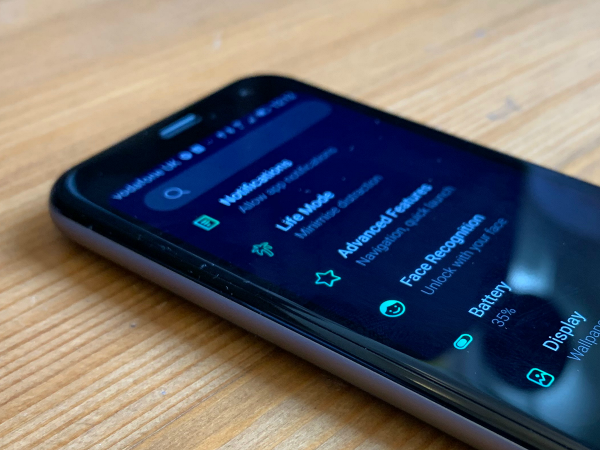
Such a small chassis leaves little space for very much of anything but one thing that’s really shrunk is the battery. You get just 800mAh, which is nothing when you consider most flagship smartphones have 3500mAh or more.
Of course, without such a large screen to power it’s not under such heavy demand but even when it’s idle the Palm seems to guzzle juice, dropping nearly 70% when left doing absolutely nothing overnight.
Palm’s solution to its lack of stamina is called Life Mode – an extreme version of other phones’ Do Not Disturb function. Switch Life Mode on and the phone goes into airplane mode whenever the screen’s not on, meaning no calls, texts, Instagram notifications or, well, anything you could conceivably want a phone for. Even with it turned on the battery dropped by 50% over the course of an afternoon – and for the vast majority of that time the phone went completely untouched.
Palm verdict
If the Palm’s only aim is to get you to use your phone less, it’s well and truly mission accomplished, but it’s probably not for the reasons intended.
There’s some functionality there, it’s just trapped teasingly behind a tiny window of a screen and truly dreadful battery life. It’s hard to imagine anybody buying one and being pleased by that.
All the Palm really has going for it is its size and minimal design if that’s your bag. However, if you want a phone that can cope with the basics but won’t be too much of a distraction, there are plenty of budget handsets with Do Not Disturb modes out there that’ll set you back much less than this, and when you do want to use them, they’ll do a far better job.
Sorry, Palm, but it’s back to the drawing board with this one.
Tech specs
| Screen | 3.3in, 1280×720, 16:9 IPS LCD |
| CPU | Qualcomm Snapdragon 435 octa-core |
| Memory | 3GB |
| Camera | 12MP w/ flash, 8MP front |
| Storage | 32GB (non-expandable) |
| Operating system | Android 8.1 |
| Battery | 800mAh non-removable |
| Dimensions | 96.6×50.6×7.4 mm, 62.5g |
Stuff Says…
Unless you’re looking for a phone you won’t want to use, give the dinky Palm a wide berth
Good Stuff
Stands out from the crowd
Feels well built
Incredibly light
Bad Stuff
Underpowered
Dreadful battery life
Expensive
Tiny screen makes Android hard to use


