Oppo F1 Plus review
A £300 phone in a £500 suit
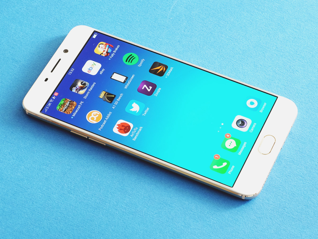
What on Earth has happened to Oppo? The company that used to make crazy phones with rotating cameras has suddenly come up with a bonafide alternative to the LG G5 and Samsung Galaxy S7 Edge.
The Oppo F1 Plus is a bit of an eye-opener. For just £300 you get a 5.5in, all-metal phone with a design the iPhone 6S Plus follow-up could take a few tips from.
There are a few quirks to put up with and some components that are aren’t truly top-end, but if you want a phone that feels like £500 and costs £300, you can’t do much better.
Look familiar?
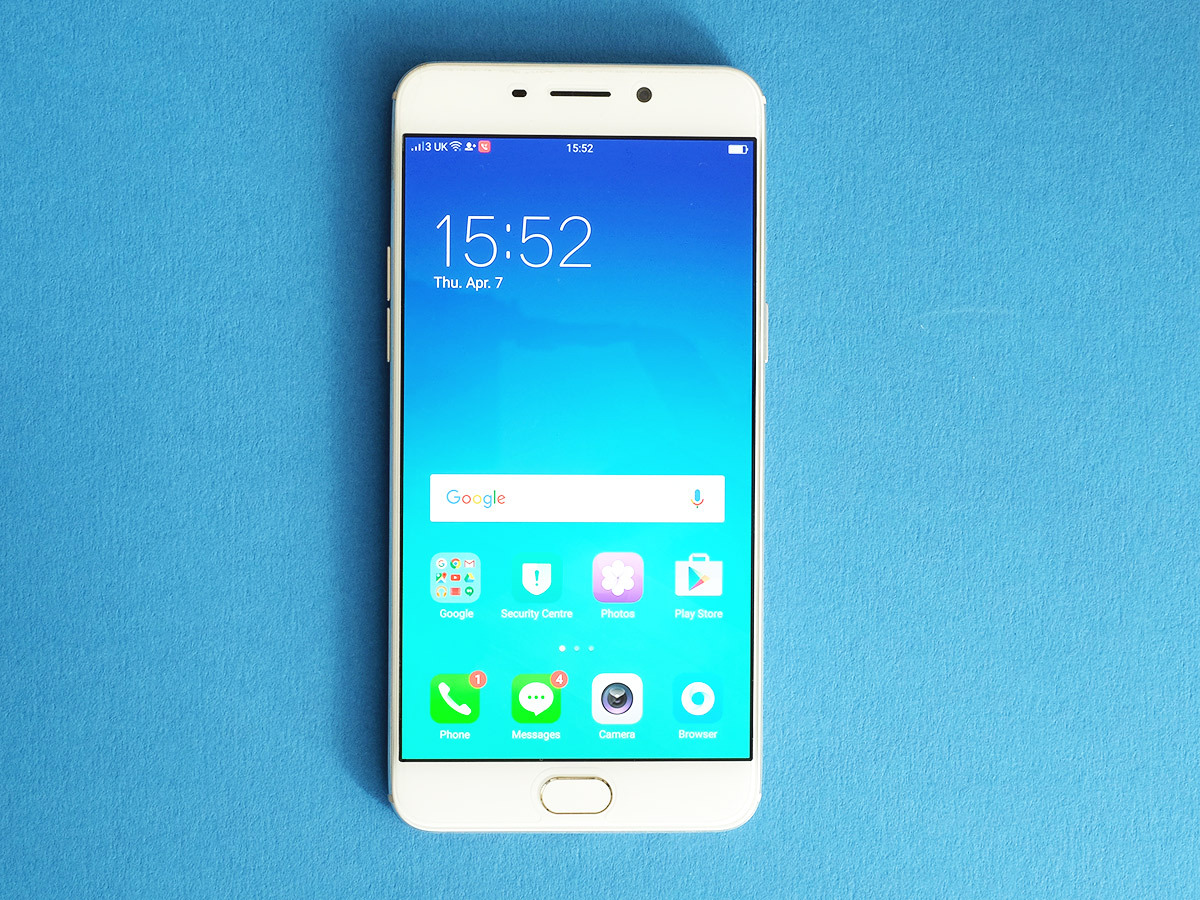
Let’s get this one out of the way early: yes, I know the Oppo F1 Plus looks like the iPhone 6S Plus. The colour, the lines, the 5.5in screen and curves are all pretty familiar, with just a slightly different character to them.
Apple 1, Oppo 0? Not quite. This design is actually more advanced than the iPhone 6S Plus in some ways.
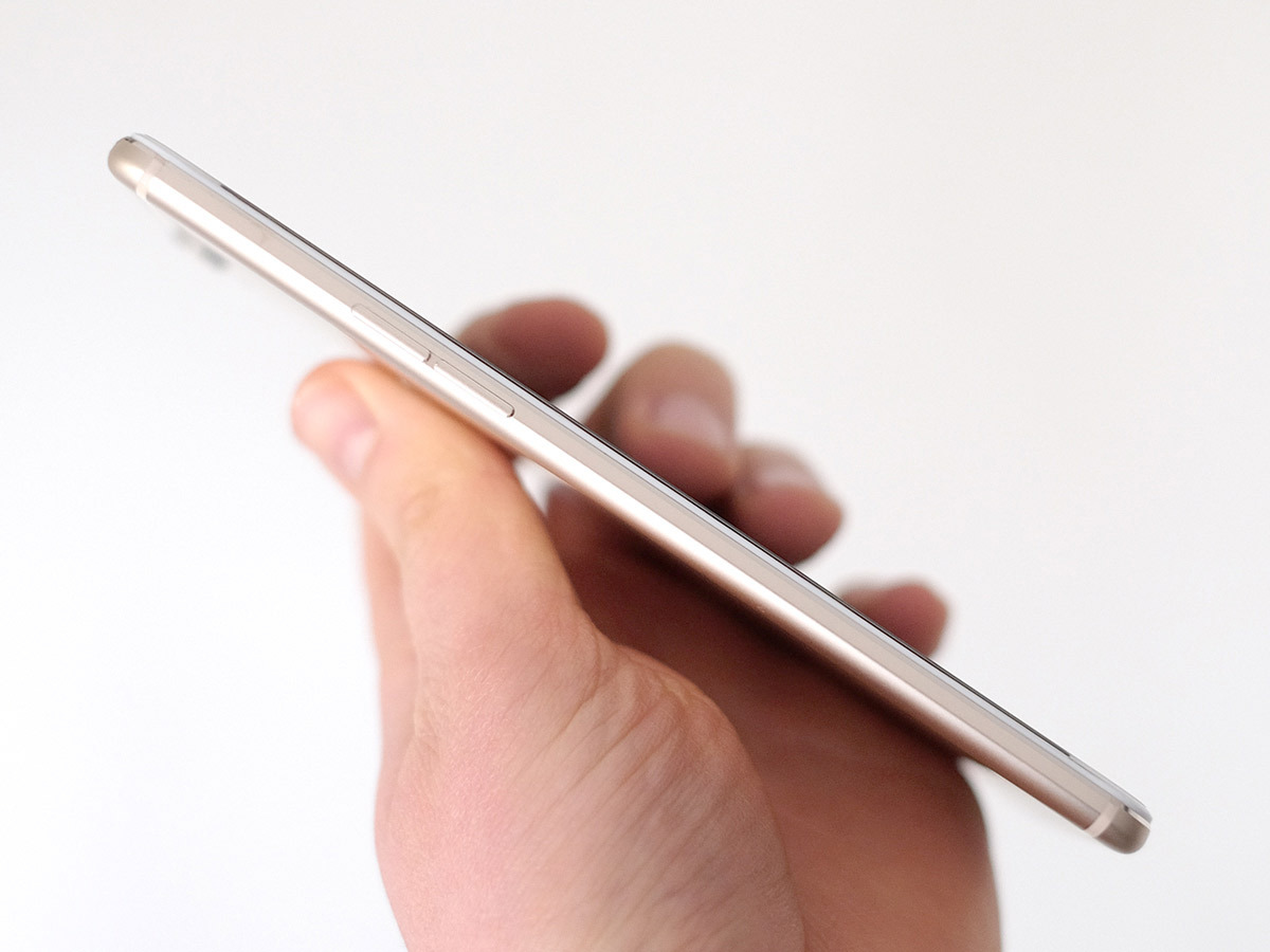
Apple’s big ‘un is a lovely phone, but it isn’t half, well, big. The Oppo F1 Plus slims down the screen surround and the bulk of the phone, avoiding the ‘cor blimey, no more skinny jeans, eh?’ effect that comes with buying a 6S Plus. All told, the F1 Plus is more than 6mm shorter, 3.5mm narrower and 0.7mm thinner than Apple’s phablet.
Before you tell me I’m making a point of nothing, one of the commonest mobile complaints I’ve heard over the last couple of years has been people moaning that while they really like the iPhone Pluses, they find them just a bit too big. The Oppo neatly sidesteps that complaint.
There’s very little to dislike about the Oppo F1 Plus design unless you really must have originality. It looks great, feels fantastic and really isn’t too big considering the screen size.
RELATED › The 35 best games on Android right now
Nerd culture
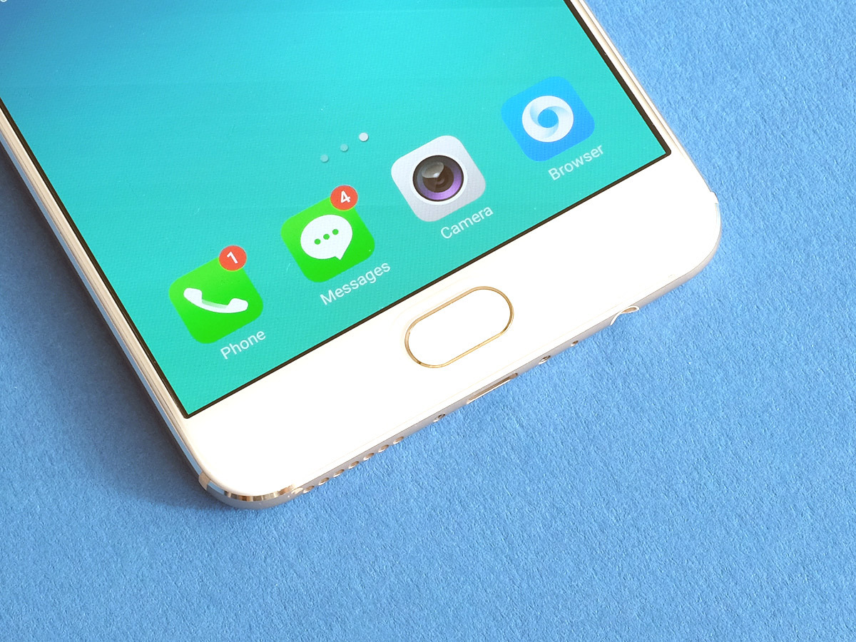
Oppo hasn’t suddenly ditched its original geeky fanbase to get these lines, either.
For instance, the F1 Plus still has a dual-SIM slot, the second of which can double as a memory card slot. I’m not sure I’d ever even need to use a memory card, though, because the phone has a fantastic 64GB of storage too. Samsung would probably still offer you 16GB at this price.
Thinking Oppo might have just stuffed the F1 Plus with the cheapest memory it could find, I revved its engine a bit to see how fast it goes: it reads at 164MB/s and writes at 138MB/s. For those who don’t sit around seeing how fast their USB stick are (and if that’s you, you’re really missing out), this is pretty nippy, and comparable with some top-end phones. Real cheap phones‘ storage is as slow as a tenth of this.
The Oppo F1 Plus is starting to sound like a sweet deal, and we’ve not finished yet. It also has a fingerprint scanner. Like the Galaxy S7, it sits on a clickable Home button down below the screen. You need to actually click the button to unlock the phone from sleep, but it’s virtually instant in doing so. The days of crummy scanners truly are over.
Unlike its smaller, cheaper brother the Oppo F1, the F1 Plus has tiny light-up soft keys too. Their design is spot-on: they are invisible when not lit-up, subtle when they are.
For pure look and feel, this phone can sidle up to any in the world. And even if you do call it an iPhone 6S Plus rip-off, you’d have to admit it’s a nice one.
A brute of an OLED
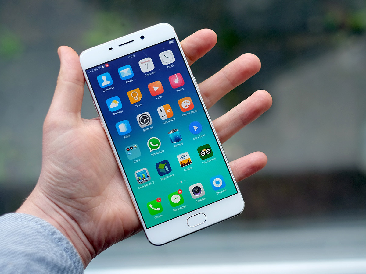
The first point at which you notice the tiniest hint of a crack in the Oppo F1 Plus’s glossy £600-a-like coating is its screen. It’s big, it’s bold and it’s sharp, but the Samsung Galaxy S7 Edge‘s is better: no great surprise.
On the good side, the Oppo F1 Plus has a 5.5in 1920 x 1080 AMOLED screen. And it’s mostly lovely to look at: I could watch films and play games on this thing all-day-long. Well, on a long flight at least.
One obvious benefit of using an OLED screen rather than an LCD one is that it still looks amazing in dark rooms, where LCDs can end up looking a little greyed-out. For those who indulge in a bit of pre-sleep Instagram-crawling or late-night Netflix binges, the F1 Plus even has an Eye Protection mode. This is similar to Night Shift in iOS (itself far from the first to do this), cutting out a lot of the blue light wavelengths that can disrupt your sleepy-bye-byes pattern.
It’s not automatic in the Oppo, but can be accessed from the drop-down menu pretty quickly. Loads of people are going to ignore the feature altogether, but I like the manual approach as Eye Protection does make the Oppo F1 Plus screen look a bit orangey. A bit like when you soak a piece of paper in tea to make it look old.
So why is the Galaxy S7 Edge screen better? First, it’s sharper. Close-up you can notice the tiniest hint of fizz on this 401ppi display. Should you worry about that? No, it’s still very sharp. Second, the colours lean towards a more saturated style, reds looking a lot deeper than they do on an iPhone 6S. Sat next to a Galaxy S7, colours are actually pretty similar in the S7’s ‘Adaptive’ mode, but then the Samsung also offers other modes that make the tones chill out a bit. The Oppo F1 Plus doesn’t.
Only screen snobs should worry about this, and turbo-charging colour seems to be the ‘in’ thing at the moment anyway. The F1 Plus also doesn’t offer the turbo-brightest of the best Samsungs. I dug out a screen-measuring gadget to see exactly how bright these displays go, then put the Plus and the Galaxy S7 next to an 1800-lumen light to roughly simulate a daytime stroll out on the surface of the sun.
Where the Oppo F1 Plus can go to 348cd/m brightness, the S7 goes up to 470cd/m. The Oppo will be fine out on a sunny day, but the top Samsungs will be better. Are these tests fair when the equivalent Samsung Galaxy S7 Edge costs twice the price? Not exactly, but when this phone seems to promise all the hardware at 50% of the price, you need to know what you’re getting.
Still, so far I’m impressed. None of these little screen bits need put you off. This is still a top-quality display.
RELATED › Samsung Galaxy S7 Edge review
Color me ambivalent
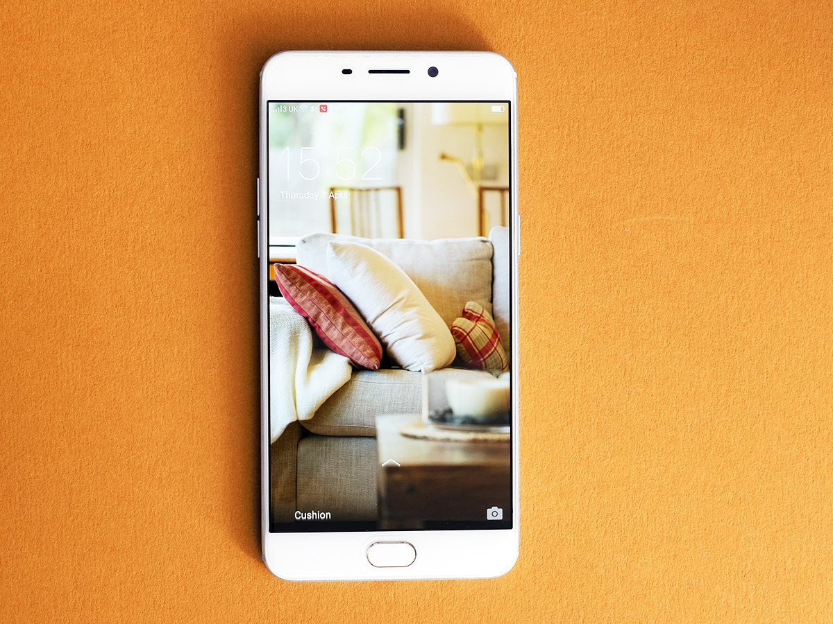
Last time I reviewed an Oppo phone, the plain F1, I had a few complaints about the ColorOS software used on top of Android. Here we get a new version, though, 3.0. It sorts out a lot of the dated visuals of the old v2.1, and no longer feels a bit laboured with its screen animations.
ColorOS feels right in an important sense: it’s fast. Using it side-by-side with the S7, it also makes TouchWiz look complicated, even though Samsung has spent the last two years pruning back some of its software extras.
What many of you might not like is that the Android apps menu has gone. Vanished. So while your apps get put on a homescreen, there’s no automatic arranging. I tend to barely touch my homescreens, so like to rely on the alphabetic apps menu found on most Android phones to avoid the handset becoming a digital thrift shop. But I can’t do that here.
ColorOS 3.0 also uses a comically bad lock-screen style by default, displaying a random picture from a selection whenever you turn the F1 Plus on. You might get a picture of a sofa, followed by a half-naked model, followed by BoJack Horseman. As much as we love BoJack, it’s all faintly embarrassing.
Final complaint: the Oppo F1 Plus also uses the old Android 5.1 OS at its heart rather than Android 6.0. When ColorOS is so different anyway, it doesn’t necessarily matter as much as you might expect. The major missing part is Google Now on Tap, which scans the page for terms the Android digital butler can fetch you information about.
RELATED › Apple iPhone 6s Plus review
Eight-core norms

Still, I find general performance to be on-par with the more expensive phones, even though the Oppo F1 Plus has a deceptively humble CPU: it uses the MediaTek P10, not a processor we see around much.
While the P10’s eight cores make it sound like a beast, the fact remains that they’re all lower-power Cortex-A53 cores. Really, it’s a mid-range processor rather than a true high-end one, comparable with the Snapdragon 616 used in the Oppo F1.
Accordingly, its Geekbench 3 score of 3345 is the least you’d expect for this sort of cash in 2015 – but then again, does it matter? The phone feels fast and, perhaps most important, the Mali T860 CPU has the chops to let you max-out graphics in games without any major knock-on effects in frame rate.
While the CPU brain has similar power to Oppo’s own Snapdragon-powered £170 F1, the GPU here is significantly better. 3D Mark’s Unlimited test proves it: the F1 scores 8992, the F1 Plus 11079. I’d call this sort of spec ‘enough for 1080p’, especially when it’s matched with fast storage and a massive 4GB RAM. Want proof? It runs high-end 3D flying game Storm Raiders at Ultra High graphics settings at totally playable speeds.
Of course, I’d get pretty miffed if Oppo tried to get by with the MediaTek P10 in a £600 phone. No, there’s not a big difference right now, but there might be two years down the line. But in a £300 phone it’s more than acceptable.
RELATED › Samsung Galaxy S7 review
Make some noise
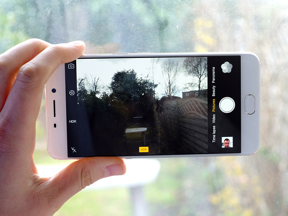
The Oppo F1 Plus’ main camera is a lot like the CPU: it’s good, but not on the same level as real top-end mobiles such as the Galaxy S7 and LG G5. This is something I’ve seen first-hand, after taking both the F1 Plus and Samsung Galaxy S7 out on a shoot.
Let’s start with the good bits, though.
The Oppo F1 Plus feels fast to shoot, which is a big part of making using a phone camera fun. It slows down a bit in poor lighting but doesn’t suddenly become a shutter lag-y mess. It may not be the very greatest camera in the universe, but I’ve enjoyed using it.
The camera app is solid too. Like the design, it’s basically nicked from Apple, but has a bunch of worthwhile extras including a full manual mode (that only lacks proper granular shutter speed controls).
Taking the Oppo P1 Plus out into the real world, it shoots generally good pictures, tending to get the exposure and white balance more-or-less right. However, even though it has a 13MP sensor, the level of detail and noise isn’t quite as good as that of the latest 12-megapixel phones. That’s because the F1 Plus has a pretty regular mid-range sensor, whereas the new generation of 12MP phones use their lower resolution to offer better low-light performance and dynamic range.
Contrast isn’t as strong as it is in the higher-end crowd, either, or the Nexus 5X/6P. It does seem to be better than the one in the Oppo F1 from the results I’m getting, though. For final proof this isn’t a real high-end setup: video capture tops out at 1080p.
The real eye-opener of the Oppo F1 Plus is that its front camera is higher-resolution than the rear one. Yes, really: round the front it has a 16-megapixel sensor, the highest-resolution selfie-cam I’ve seen in a phone. In good light it’ll bring out every little follicle with unforgiving clarity and make you look more tired than you’ve ever looked on your way to work. Its fast f/2 lens may help here, too.
However, I’m not seeing a massive difference in detail over some of the great recent 8-megapixel selfie cams. It seems to use a slightly weird processing algorithm that’s pretty active about sharpening some areas of the image and smushing others. In other words, it’s a good selfie camera, but don’t go thinking it’s the best in the world just because it has more megapixels than sense.
RELATED › LG G5 review
Back to planet Earth
The selfie camera is the one area where the Oppo F1 plays specs Top Trumps. Its battery is less of a show-off: you get a 2850mAh unit, which doesn’t sound that big for a phone this size.
Despite that, I was very impressed by how long it can hold on when playing a video – you get about 15 and a half hours. This is Samsung Galaxy S7 Edge territory, which tells you that the Oppo F1 Plus must have a very efficient screen. Oppo’s own claim is that it’ll last for 14 hours of “heavy” use. Acting a little more laid-back, I got the F1 Plus to breeze through a day, ending up with a pretty amazing 48% battery left by midnight. Most phones don’t have a hope of leaving me with that much. For a 2850mAh battery, this is eye-opening.
However, I have noticed the Oppo F1 Plus uses some pretty aggressive techniques to get to this level of stamina. For starters it’s intensely strict about managing backgrounds activities, being slower to pick up on notifications a lot of the time and going as far as to switch off my podcast app five minutes after the screen’s turned off, like clockwork. You don’t get much more annoying than that, and this is after all the app-specific optimisations have been switched off.
I’d like to see Oppo loosen this up a bit with a ColorOS update, even if it does dent that fab battery life a bit.
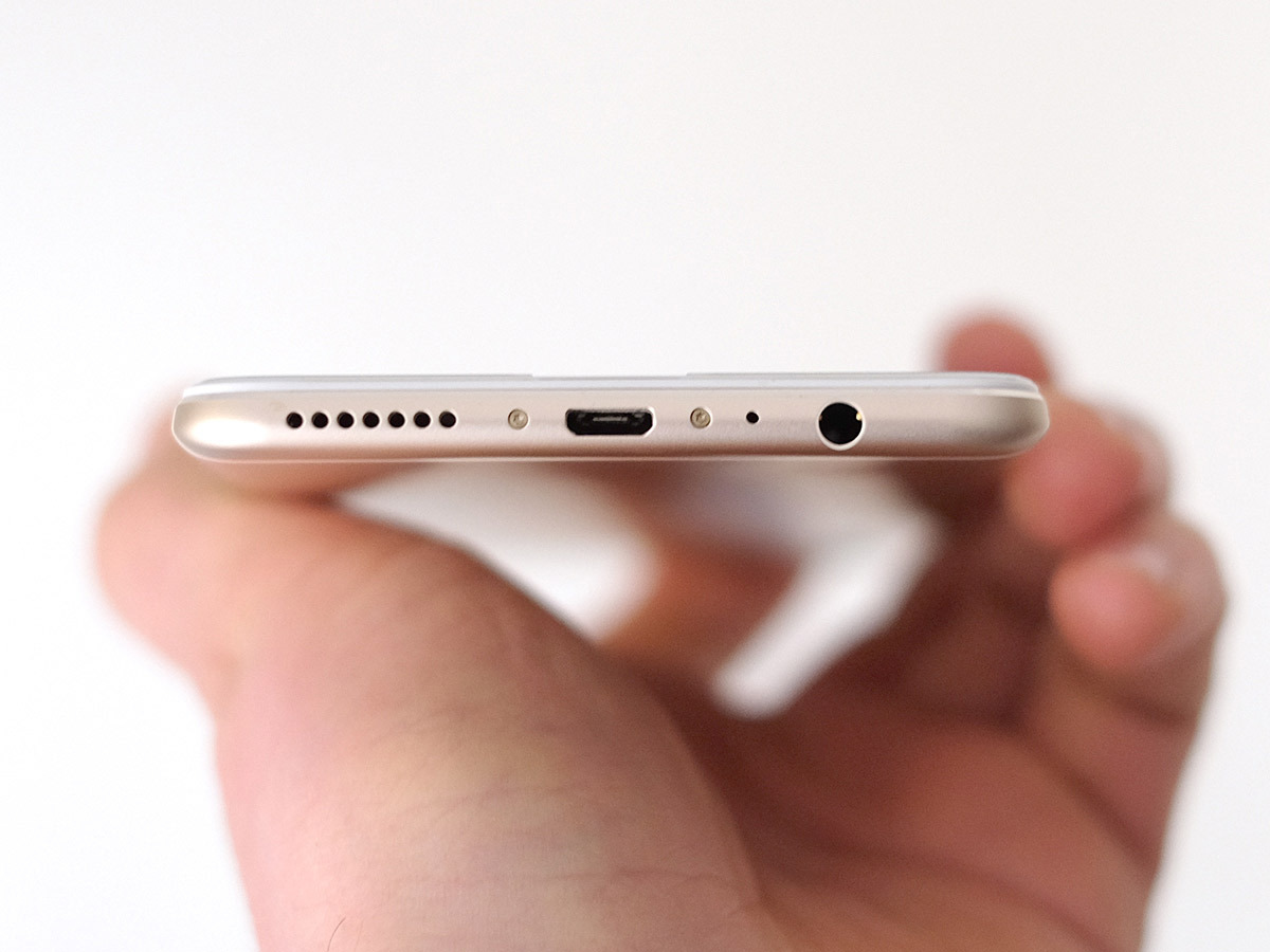
One thing you may see people complain about a bit more is the Oppo F1 Plus’ microUSB charging socket, given that 2016 is meant to be the year we all shift over to USB-C. It’s not worth getting too upset over, though, as it means you can also use your old phone charger cables.
If you do use the official F1 Plus charger, you get VOOC fast charging too. This doubles current from 2A to 4A, and gets your phone to near-100% charge in half an hour. At this point, I’d rather have that than USB-C. Just having the connection doesn’t mean you get any benefits such as fast charging or loads more bandwidth: a common misconception.
The last little extra Oppo has squeezed into the F1 Plus is a really pretty decent speaker, as ordinary as it may look down there on the bottom of the phone. Like the smaller Oppo F1, it’s not going to challenge an iPhone 6S Plus on tone, but it does go nice and loud.
Verdict
The Oppo F1 Plus is a case of Oppo putting its gimmicky design gadgets back into the toy box and coming up with a phone that has a chance of attracting more savvy-but-normal buyers.
It looks and feels about £200 more than it actually costs, with more storage and a nicer design than you’d get on a comparable mid-range phone such as the Samsung Galaxy A7. The processor itself is mid-range but doesn’t end up being a major turn-off, and from its speakers to its battery life it has plenty of good things going for it.
As you’d expect at this price, it’s not entirely without compromise: its camera is good rather than mind-blowing, and its software, while simple, has a few quirks. But then again: it costs £300.
So while you won’t find the F1 Plus on the high street, it’s worth seeking out online if you’re after a mostly high-end phone at a decidedly mid-range price.
Stuff Says…
A smartly-priced premium handset that costs half the price of the phone demigods
Good Stuff
Great value
Flashy design and build
Fast charging
Big, bold screen
Bad Stuff
CPU and main camera are ‘only’ mid-range performers
Uses old Android
ColorOS 3.0 looks nice, but has some quirks
