iPhone 5c review
"Beautifully, unapologetically plastic". Yeah, right. But if you push on through the dodgy cases, colours and marketing, the new iPhone 5c is no slouch
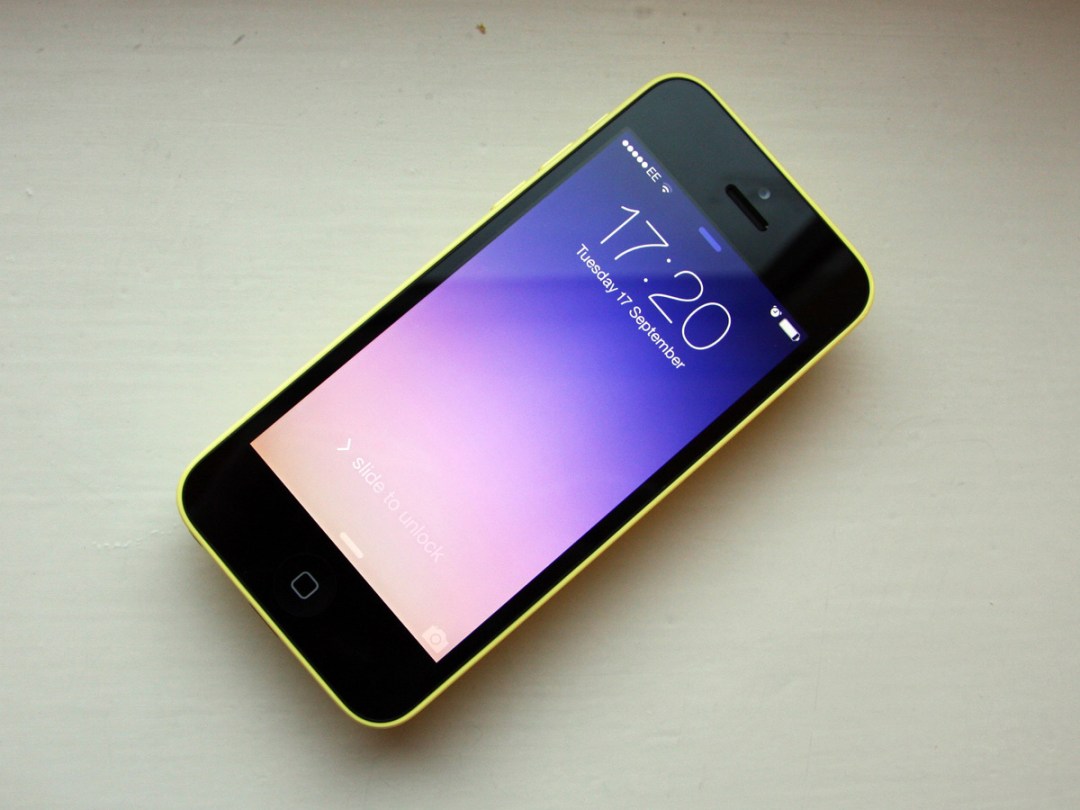
This, dear reader, is more than a new smartphone – it’s a pub quiz, a multinational corporate strategy and a radical meme from one of the world’s greatest designers, all wrapped up in something that makes phone calls and plays music in its spare time.
Stripped of its cultural payload and heavyweight marketing, the new iPhone 5c is an iPhone 5 in a plastic neon jumpsuit. The (back) camera’s the same. The screen’s the same. The functional design’s the same (in fact, the only changes of substance are the battery and case material, but more on that later).
Not that a single prospective 5c buyer will reference its technical heritage in the coming weeks. No, those buyers will be too busy taking sides between two warring tribes to make such cool evaluations.
On one side of the world’s Apple Stores, you’ll have The Haters, clutching their MacBook Airs while spitting corrosive bile at the 5c’s lurid packaging.
On the other side, squabbling to grab the last of the remaining 5c cases, you’ll have an entirely new tribe of… well, we’re not sure what to call them. But we do know they’ll be jolly extrovert, have a penchant for ultrathin sans serif fonts, and be excitable – really bloody excitable.
You probably know the tribe you’re in, especially if you’ve read any of the scathing critiques of the 5c since its unveiling. But before you settle comfortably into your elitism, we’d ask you to stop a moment – the iPhone 5c’s motives aren’t quite what they seem…
THE SOFTWARE: SAY HELLO, iOS7
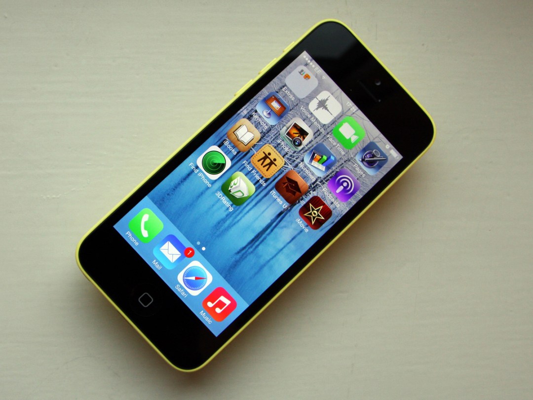
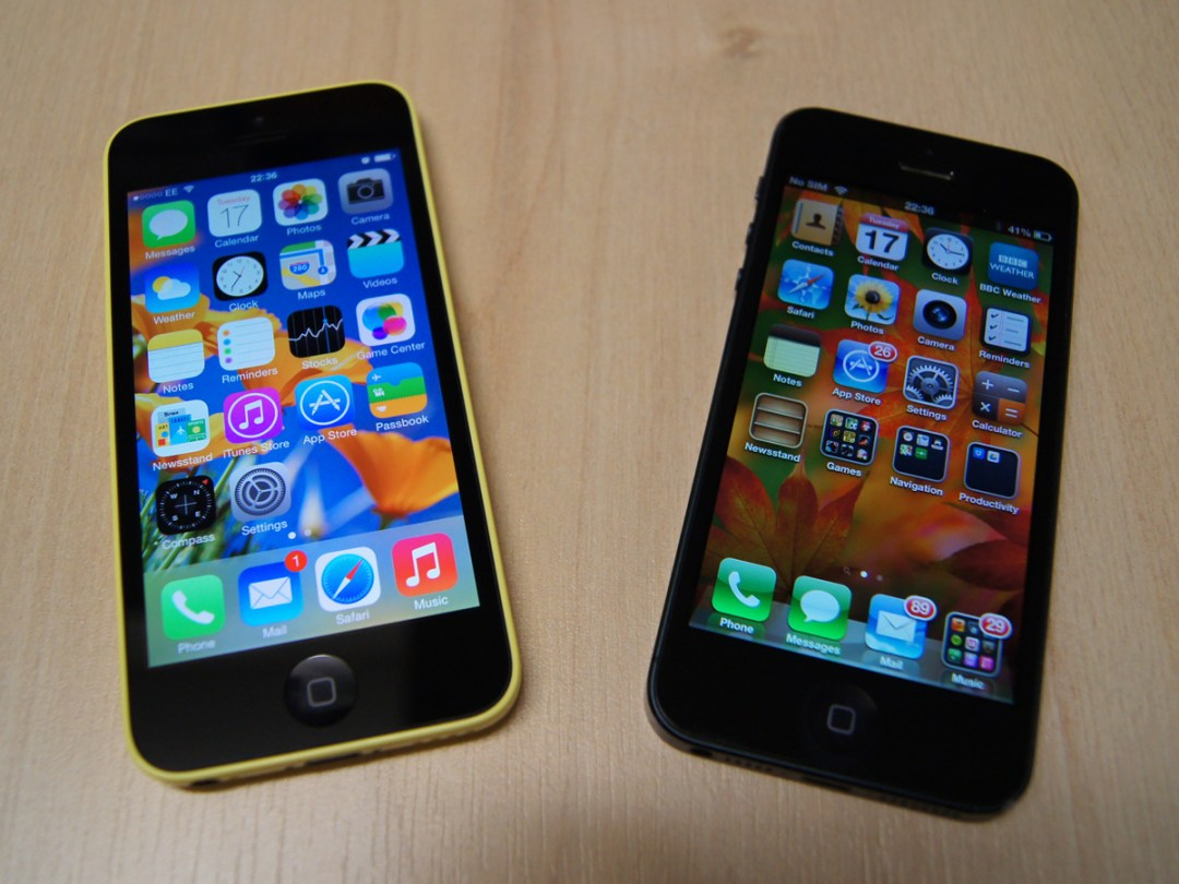
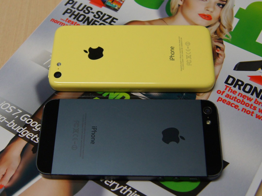
The iPhone 5c comes with iOS 7, Apple’s most dramatic revamp of the iPhone’s operating system ever. And it is dramatic (if anyone tells you otherwise, it’s because they’ve been using iOS 7 since the first beta in June, so have grown used to it). You can be fiddling with the new iPhone 5c for days, and still be unearthing changes in the way the interface looks and works. The overhaul really runs that deep.
Gone are the skeuomorphic icons and textures that have screamed iOS since 2007. Instead, you have minimalist icons, ultra-thin type, neon primary colours and subtle transparencies. Many of the gestures are all-new, too, from a swipe up to reveal the new Control Centre panel, to left and right swipes in Mail and within folders.
iPhone diehards may momentarily panic, until they take a minute to realise that they’re still at home – only someone has thrown the wood and leather into the skip, and swapped the house for a too-cool-for-school digital consultancy in the middle of Roppongi.
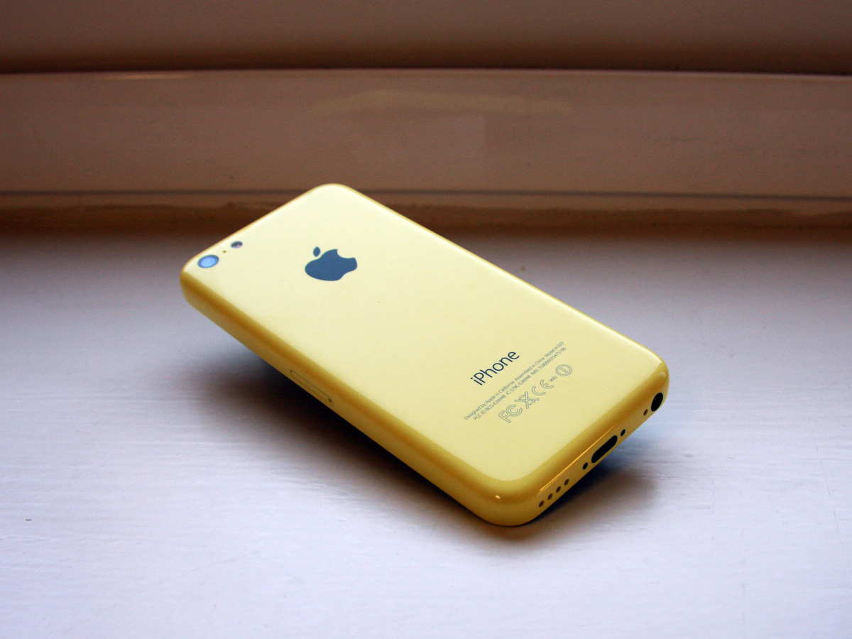
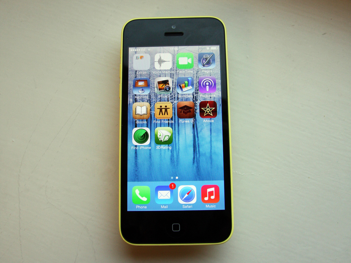
We’ve started a hardware review with the software, because iOS 7 is 70% of the story, and critical to how the iPhone 5c tries to seduce you. It’s not the first attempt to theme an interface with its casing (turn on a Microsoft W8 Phone and start adjusting the Modern tile colours), but the combination of iOS 7 and the 5c takes the game into extra time, with the new operating system’s colours tuned to fit with the 5c’s vivid casings. Buy a canary yellow 5c, and it will launch with yellow wallpaper – this thing is that themed.
Regardless of whether the 5c disgusts or delights you, that shouldn’t distract from the merits of the core system. So what do we think of iOS 7? It’s beautiful. The icons are (almost) cohesive, attractive and usable. The type is (almost) tight and right. And the transitions – if you’re happy to squint at the odd rough edge – are (almost) delightful.
It’s a remarkable achievement for Apple’s design team: replace the design language that defined your products for thousands of developers and millions of users every day (and was so close to the heart of the man that built your company), and to come up for air with a powerful new statement that actually works.
You’ll find it even more incredible if you were one of the few to run the initial iOS 7 betas this summer, as we did. The first beta was shocking: the new iconography was as ugly and inconsistent as the typography. And while any beta has every right to be buggy, the new screen and folder transitions were rougher than you’d ever expect from Apple. That the final result has such cohesion and finesse is miraculous.
Yes, you’ll bump into Android and Windows 8 as you tap and swipe through iOS 7. Open its new Calendar – pure W8, right? Now try the lock screen – that’s a Nexus, isn’t it (albeit one that got locked in the cellar with a case of absinthe)? But the whole is still enough Apple to be its own thing – enough of the past to hold its heritage, with enough of the new to be slightly scary.
The real litmus test will come if you use the iPhone 5c for a few days, then suddenly switch back to an iPhone 4S or 5. Weird, is it? iOS 6 looks familiar, but suddenly aged and cluttered – all buttons, bars, thick grey gradients and ‘authentic’ textures, with the content elbowing its way through the hoarded furniture. By comparison, iOS 7 is Zen.
That said, (and in direct contrast to our experience with the 5s) we still found bugs and niggles. The settings screen quit twice, and the transition back to the home screen would land with a final jolt rather than a glide. Too many in the Stuff team struggled to read some of the fonts or even recognise some of the icons. And we’d swear that there was the odd dodgy touch response (i.e. there was no response).
There were no showstoppers in our time with the 5c, but it’s clear that iOS 7 – for all its brilliance – is still a work in progress.
THE SCREEN: LOOK FAMILIAR?
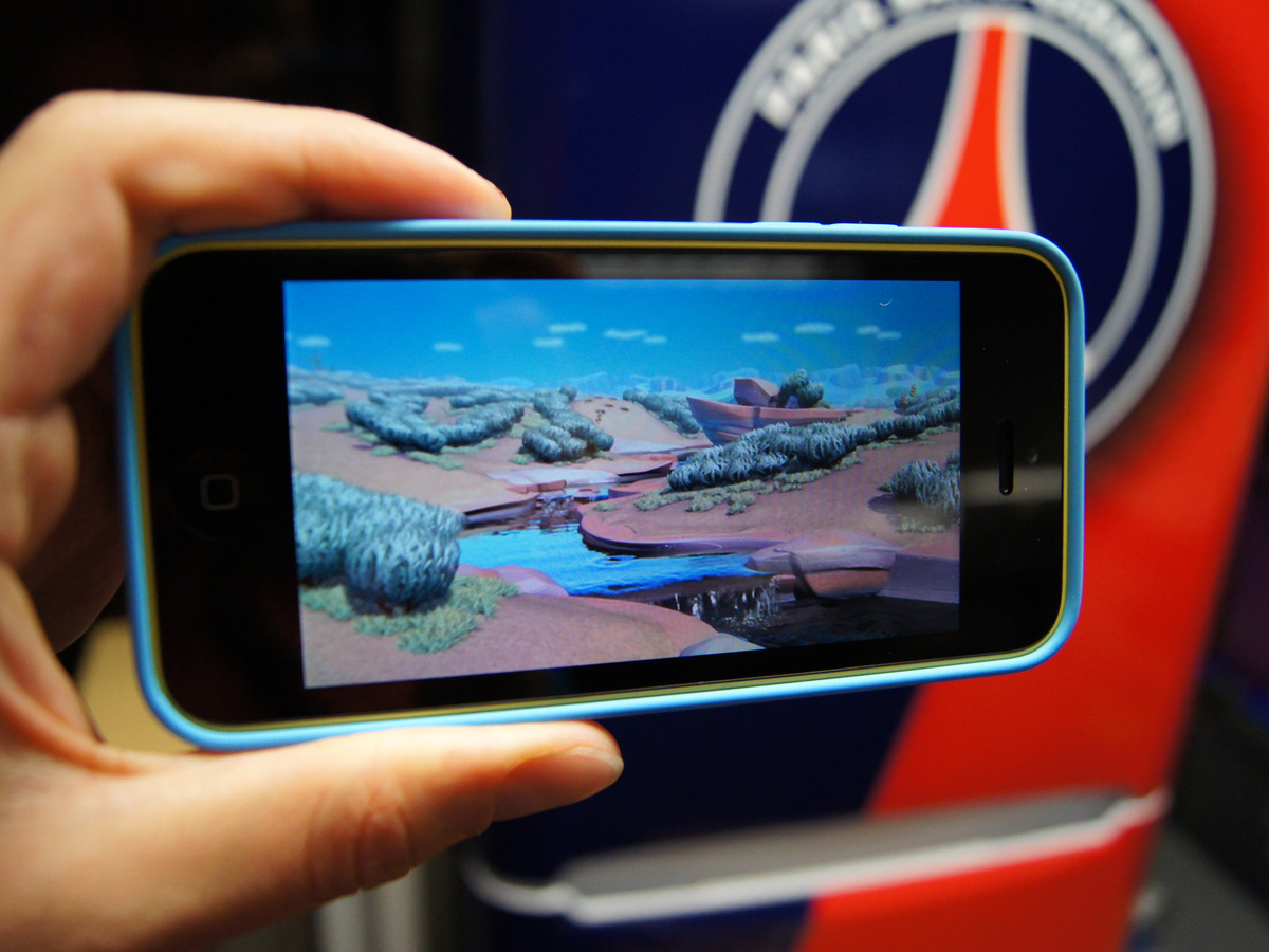
Buy an iPhone 5c, and you now own an iPhone 5 in a plastic and steel shell (a rather crude summary, Apple, but fundamentally true). You’ll be looking at the same four inch, 326ppi Retina screen, and taking pictures using the same 8MP camera.
But the fact that the 5c is virtually a rehash shouldn’t damn it. The iPhone 5 has remained a fiercely competitive device, so it’s no surprise that the 5c gives many of its prime-time rivals a run for their money.
The 1136 x 640 Retina display is the same one that millions have been staring at since it first appeared on the iPhone 5, and has most of the attributes of the first Retina to appear in 3.5in guise on the iPhone 4 in 2010. And it’s none the worse for it: it’s bright, viewing angles are excellent, and it’s a pleasure to look at. The colour balance is on the warm side, but we’re down to issues of taste, not competence.
We wish that Apple would reconsider its dogged allegiance to four inch screens (surely a 4.3in alternative wouldn’t bring Cupertino crashing to the ground?), even if we also know why they’ve stuck with it. A vast swathe of iPhone users want to be able to use it single handed. And for that to work, the distance from the base of the handset to the top of the screen can’t extend further than the length of the average human thumb – which just happens to be about four inches.
Apple knows its users, and we know enough iPhone fans who would ditch the device the day that they couldn’t bash out a text single-handed. But the new wave of Androids are now flooding the world over four inches – and we refuse to believe that not one of those proud new One or S4 owners (Mini or not) have ever owned an iPhone.
That said, Apple is still working miracles with the limited screen real estate – iOS 7 crams more content into the same space by stripping away navigational furniture. And as more popular apps begin to update their designs to fit with iOS 7 guidelines, so your new 5c will steadily improve.
PERFORMANCE: MORE THAN FAST ENOUGH
The iPhone 5c sticks with the 32-bit, dual-core A6 processor that powered the iPhone 5 – which you could see as a problem, especially when its new 5s big brother now packs the glamorous A7 64-bit chip (backed by an M7 coprocessor to look after motion data). By comparison, the iPhone 5c looks like an anaemic (and cheerily dressed) cousin.
Indeed, in our AnTuTu benchmark test it actually scored a little lower than the iPhone 5: 12022 vs 13608.
But if you’re happy to abandon any specification machismo for the trash it usually proves to be, the iPhone 5c is more than powerful enough for virtually any job. The iPhone 5 remained competitive until the end of its life, so it’s no surprise that the 5c can still look most of its competitors in the eye.
Response to a tap on the touchscreen is all but instant, apps switch without any stutter, and there’s no lag when opening crucial items such as the camera. Any delays in using the 5c are more a result of the new animations introduced by iOS 7 than any flaw in the hardware (a few colleagues during our week with the 5c commented that the fly-in icons as you open the home screen could do with getting a move on).
If you’ve already studied the 5c’s spec sheets, you’ll have spotted that it isn’t a total line-for-line copy of the iPhone 5. In fact, the casing is slightly deeper (8.97mm vs the iPhone 5’s 7.6mm), presumably to house its slightly beefed up battery (1507 mAh vs 1440 mAh).
Apple claims 10 hours of 3G talk time for the 5c, a whole two hours more than the iPhone 5, and respectable 250 hours of standby. We won’t claim to have conducted days of laboratory testing for this review, but we can say that on at least two occasions, our iPhone 5c showed 85% of battery remaining after 14-15 hours of standby and several hours of use. Which is pretty damned impressive, and means that two days of light use before a recharge doesn’t sound fanciful.
In fact, our only quibble with the 5c may be a result of its combination of 1GB of RAM and iOS 7’s new multitasking. Whether it was down to our early review unit, or apps that have yet to be updated to full iOS 7 compatibility, there were definite redrawing issues when swiping through the new multitasking screens.
iPhone 5c tech specs
IMAGING: A QUIET REVOLUTION
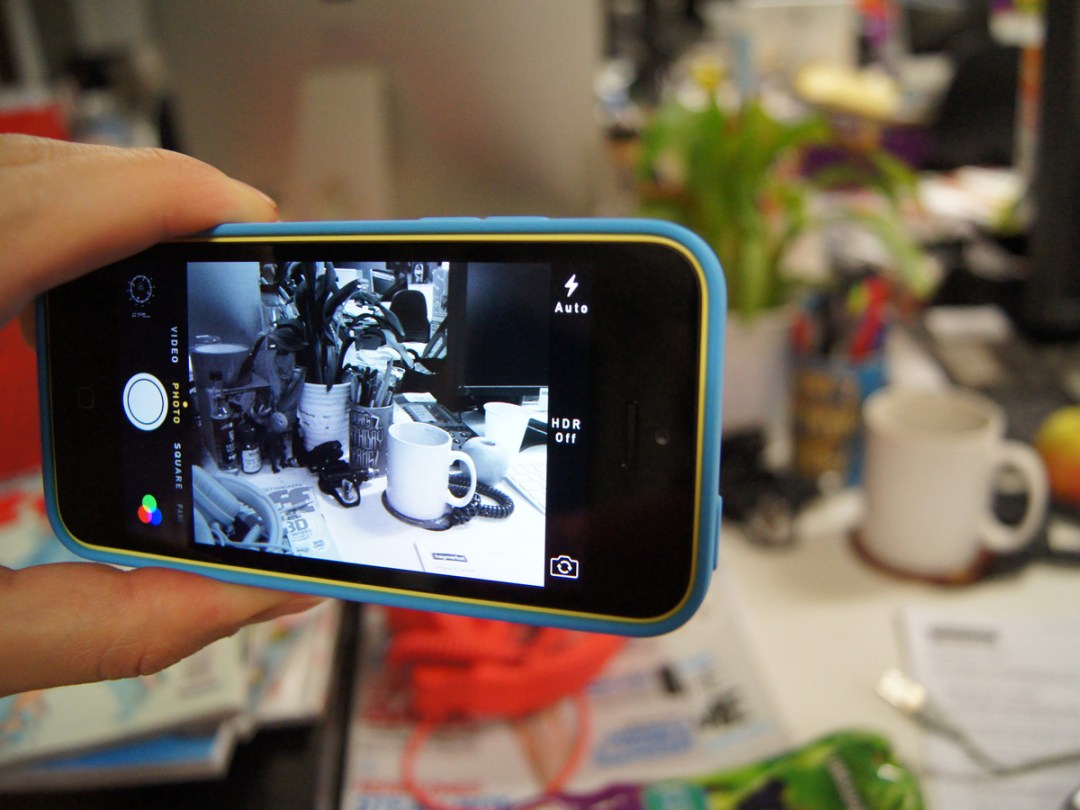
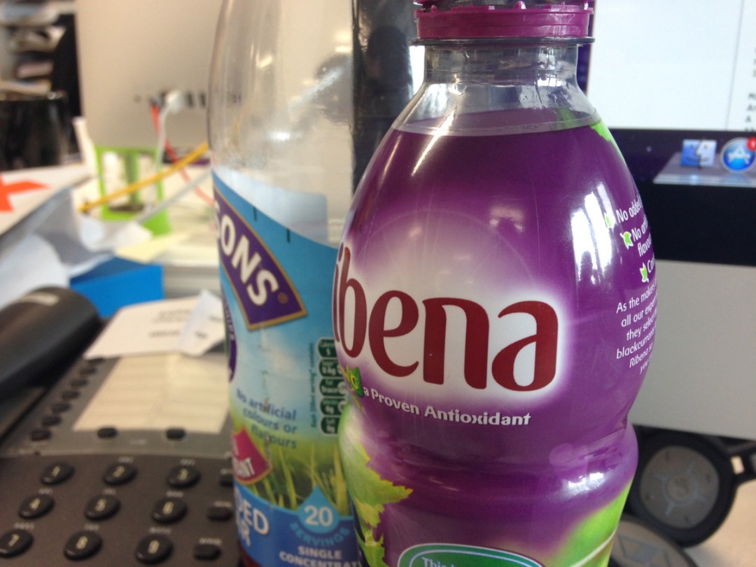
The iPhone 5c’s photo hardware may be familiar enough, with its 8MP, five-element lens camera with LED flash inherited from the iPhone 5, but the camera app has undergone an overhaul that effectively makes the 5c all-new.
That’s a big claim, but the software redesign really is that good. For example, switching between stills and video modes is now a quick flick across the screen, rather than a fiddly prod on a tiny switch in the corner, as was the case in iOS 6.
And two further modes have been added as you swipe across, namely ‘square’ and ‘pano’. The former will have the planet’s Instagrammers beaming broadly, while the latter will be a relief for those who fell in love with the panoramic features first introduced with iOS 6.
Lastly, there’s a new set of Instagram-like filters, which are easily accessible from the bottom right of the screen. While there’s nothing revolutionary in any of the new features in themselves, they combine to make an iOS 7-powered iPhone a powerful creative tool – thanks largely to the fact that modes and filters can be switched so easily.
Switch to video mode, and you’ll find the same 30fps, 1080p recording featured in the iPhone 5, along with 720p from the 1.2 megapixel front-facing camera (although the camera had been updated, with more pixels and improved backside illumination).
Just remember that if go for the 5c, you’ll be relinquishing the slow motion video recording of the iPhone 5s – and we somehow suspect for many, that slow-mo (which is really, really good) may prove the tipping point in deciding whether to spend the extra £80.
SOUND: NO BEATS BEATER
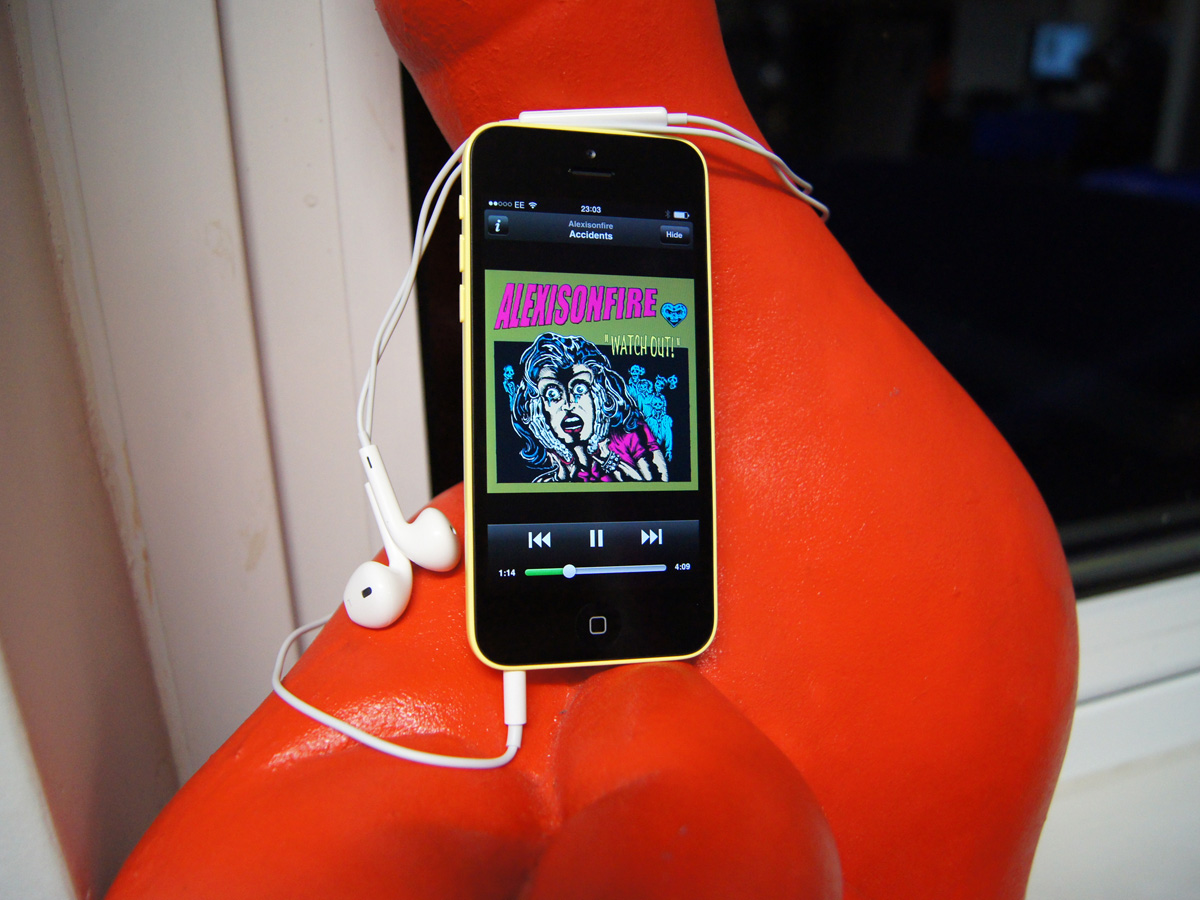
You’d expect a firm that changed music forever to do a rather splendid job of eliciting fine audio from its hardware, and Apple does.
The 5c and its accompanying in-ear phones (which are just white, by the way – no luminescence here, folks) produce a rich, fulsome sound with a decent dynamic range, and quite enough volume to drown out the world around you with distortion.
However, the story changes somewhat once you start comparing the 5c to the handset that has arguably set the audio standard for smartphones – the HTC One.
Although the margin of victory isn’t catastrophic for the iPhone, the One is more rounded and realistic. In comparison, the iPhone 5c – especially at high volumes – is a little brash and hard-edged. You could call it an unfair comparison given that the One is pricier than the 5c, but we’d argue that buyers expect the absolute best from Apple.
The 5c’s built-in speakers make it a working sound source in its own right, albeit not one that you’d brag about to friends or use for extended periods. The margin of victory for the Beats-equipped HTC One over the iPhone 5c grows considerably: the One can be used as a your go-to mini system, while the 5c is at best occasional.
Voice call quality through the iPhone 5c is very good, but there’s a somewhat warm, processed, slightly compressed quality to human voices by comparison to the aforementioned HTC.
PRICE: IS THE 5c GOOD VALUE?
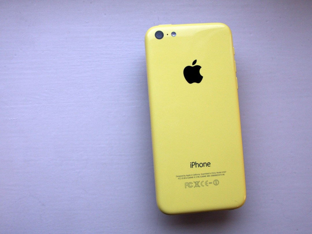

This is the bit we don’t get. A 16GB iPhone 5c weighs in at £470 SIM-free. So in no way is this a ‘budget’ device – in your local showroom, it’s on the same rack as a host of hyper-powered Android rivals costing only a few pounds more (including an HTC One, for example, at £490). Make the comparisons using monthly contracts, any aspirations the iPhone 5c had to affordable utility are eroded yet further.
But maybe that’s part of the 5c’s pub quiz. Both HTC and Samsung saw it coming, and put smaller screened versions of their flagship phones to market (the One Mini and Galaxy S4 Mini), undercutting the 5c’s SIM-free price. But then neither the HTC nor Samsung deals Apple a killer blow in a spec sheet smackdown (see the One Mini’s 4MP camera, for example, or the S4 Mini’s miserly 8GB of onboard storage).
The conundrum doesn’t end there. You only need spend another £80, and you’ll be clutching an iPhone 5s, complete with its 64-bit innards, upgraded camera and show-off fingerprint tech.
It’s at this point that Apple’s marketing for the 5c snaps into burnt orange clarity. Those pupil-busting colours and Connect 4 cases are not there by accident – you’re not spending £470 on a slightly older phone in a plastic case with very decent specs. No, you’re buying a statement, folks, one you’ll make every time you pop the phone from your pocket on the tube.
So everything hangs on your perception of the packaging and the new OS. In our week with the 5c, the seas parted into outright rejectors, and slavish acolytes.
The 5c rejectors mocked the Early Learning Centre operating system and packaging, along with the ‘borrowed’ hardware. The 5c acolytes cooed over the fresh sophistication of iOS 7’s looks, and brazenness of the colour schemes. The rejectors wouldn’t pay £10, let alone £470, while the quasi-religious would part with £600 without so much as a blink.
Verdict
There can be no one verdict on the iPhone 5c – reactions to it are so extreme and subjective that any attempt at an all-encompassing objective pronouncement is impossible. Daft, even. The most we can do is set it in context, and be honest.
We’ll start by banning discussion about the price: some analysts see the 5c as a cynical repackaging that doesn’t move the game on, but most people won’t care (as evidenced by the rumoured 1m pre-orders). And there’s enough that’s great about the 5c for us not to try and persuade them otherwise. If you want to pay the £470 for the 16GB model, we won’t laugh.
We also admire the 5c’s commitment. If you’re going to leave the world’s Apple purists speechless at your abandonment of good taste, don’t back off – right down to the atrocious cases and the collars-and-cuffs wallpapers.
Lastly, we love the OS. Yes, we can see every one of the things that need fixing, and we know that iOS 7 could have been so much wilder. But the new OS is beautiful, and we like celebrating the delightful, rather than meanly fixating on every failing.
All that said, there remains one question – what would we do?
With its 64-bit guts, fingerprint tech and weaponised camera, the iPhone 5s for an extra £80 is too much to resist. But then, we never were that wild on canary yellow and Connect 4.
Which side of the tribal divide are you on? Let us know in the comments below…
UPDATE: It looks like the American public decided with their wallets in the first weekend of the new iPhones going on sale. According to analytics company Localytics, the iPhone 5s outsold the 5c by 3.4 to 1 in the US over the opening weekend.
Stuff Says…
If you can overlook the cases, colours and marketing (and they’re big ifs), the 5c’s a powerful, smart package, with a great OS
Good Stuff
An iPhone 5 for less
iOS 7 lives up to the hype
Excellent new camera app
Bad Stuff
Colour theming will alienate diehards
Legibility issues with some fonts and icons
Still too darn expensive

