Doogee Mix 2 review
Mega battery life, but not quite as bezel-busting as it seems...
Doogee calls the Mix 2 a “bezel-less” smartphone. In pictures it looks about as exciting as a Samsung Galaxy S9, but only costs about £200.
The Mix 2 also has monster specs for the price, and there’s no plastic in sight. Sounds a dream, right? Unfortunately the reality, as is often the case, is a bit less appealing.
This is a chunky beast of a phone, with camera autofocus that isn’t great – and in the metal, it doesn’t really look like it does in Doogee’s rendered pictures. Cheeky gits.
However, it’s still good value if you want a phone with a massive screen, and lasts a long time between charges.
Doogee Mix 2 Design & build: Not quite bezel-less
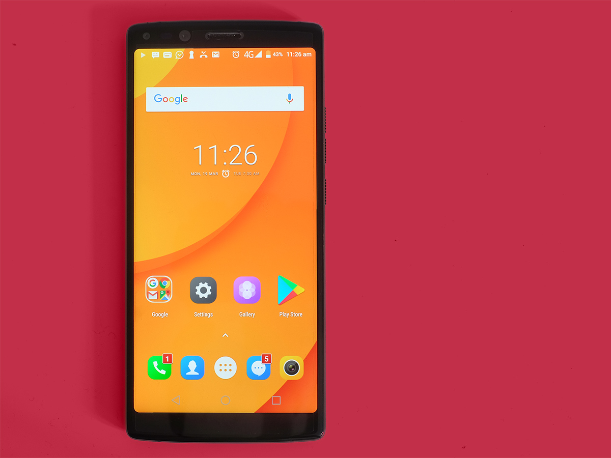
Before the Mix 2 arrived, we were expecting something pretty special. Look at the official site and Doogee sells you the idea of a bezel-free phone, just like recent top-end Samsungs.
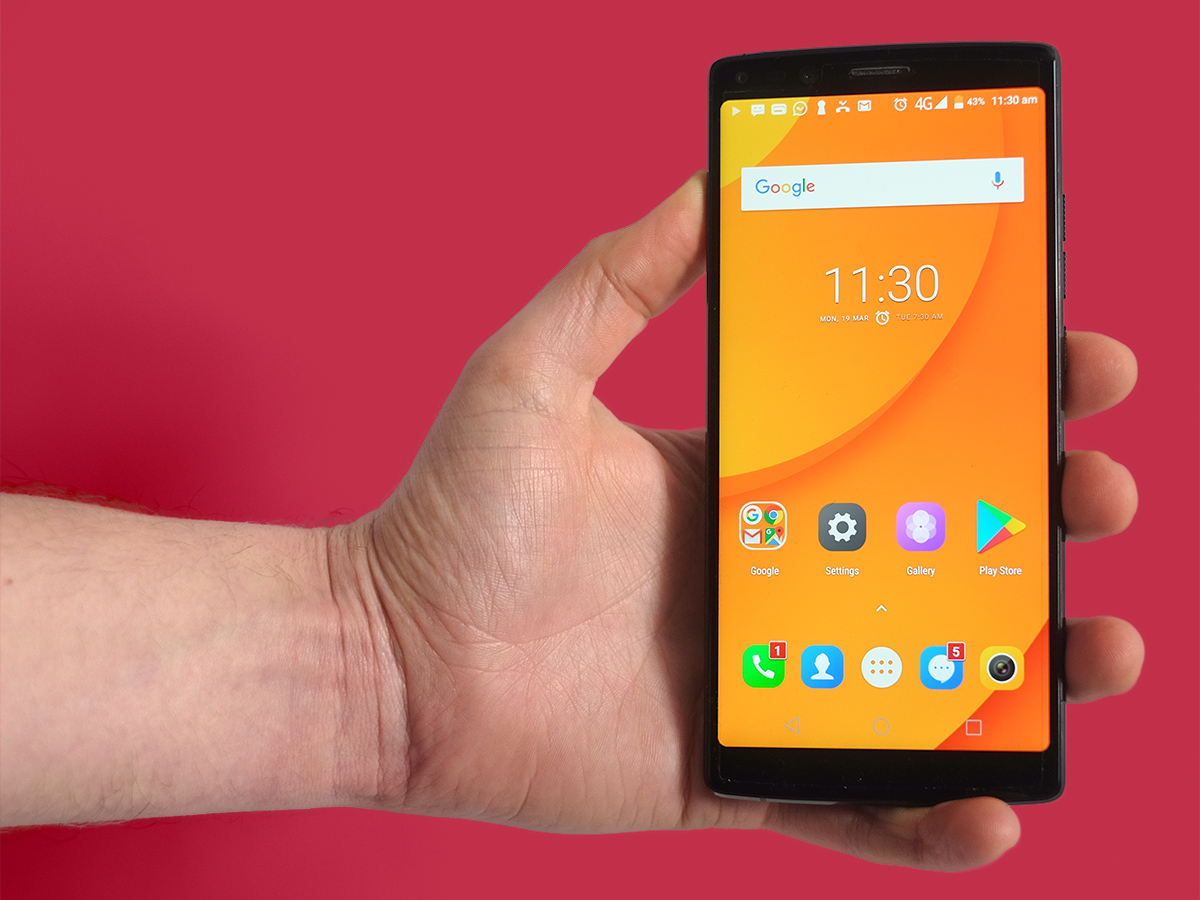
In person, though, there’s actually a fair bit of space around the screen. Not as much as other similarly-priced phones, of course, but Doogee is still selling something different to what it actually delivers. And that’s a bummer.
The Mix 2 is also very heavy, weighing in at 219g according to our scales. That’s 30g heavier than the Samsung Galaxy S9+ it wants to seem a match for. Sure, there’s a bigger battery here, but the greater weight also points to less careful design. The relatively rectangular design adds to the impression of heft, too.
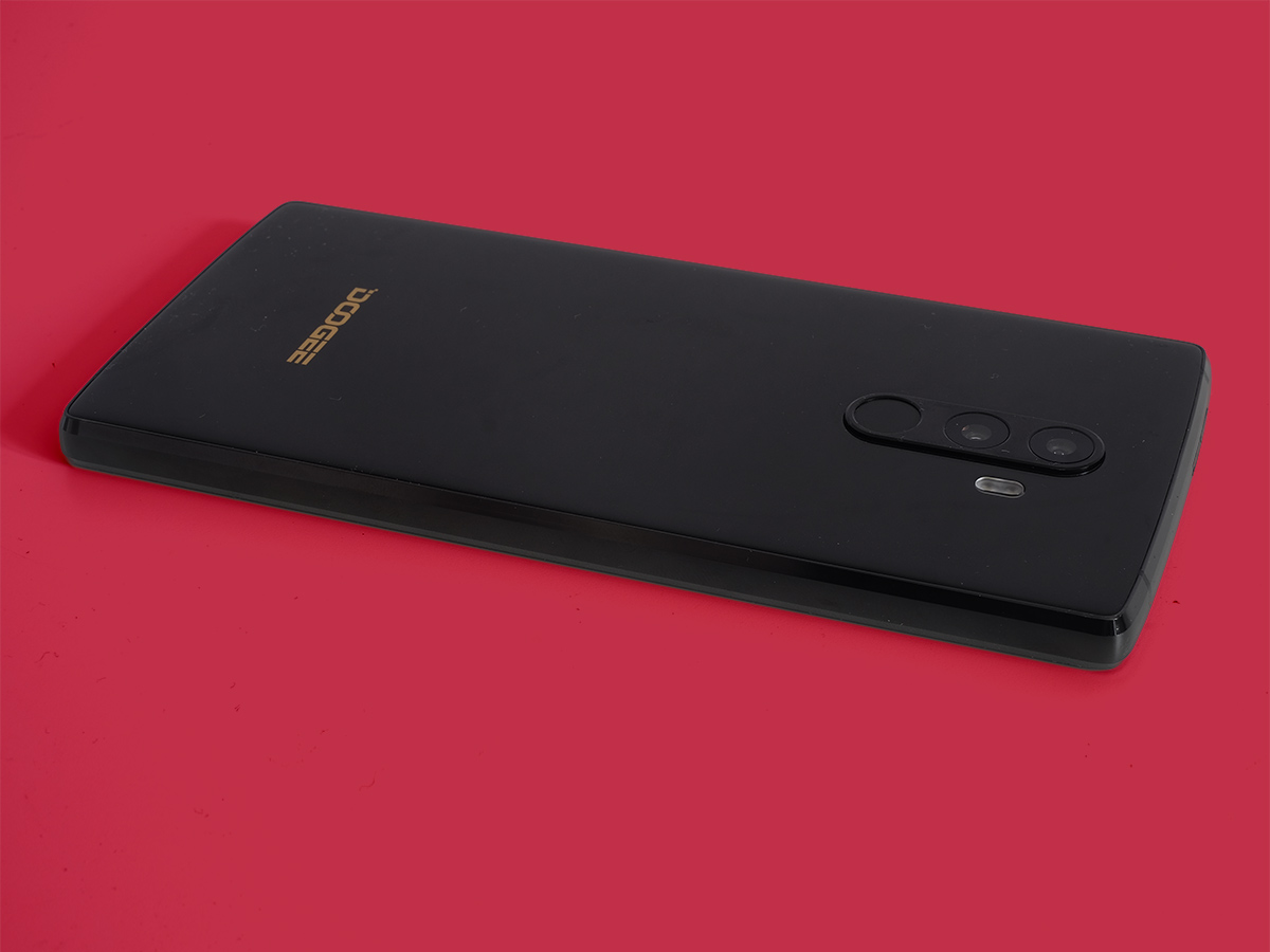
Get those design bits out of the way, though, and there’s plenty to like. The Mix 2 has a fast fingerprint scanner on the back, 64GB of storage to play with, and the phone feels solid. And not just because of the weight.
There’s glass on the front and back, and Doogee has used high-quality Gorilla Glass. The sides are aluminium rather than plastic, too. It also comes with an expertly applied plastic screen protector.
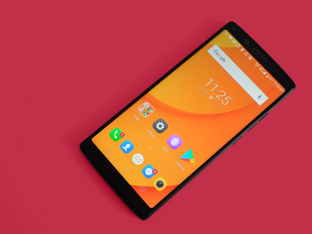
For all the disappointment of the not-really-bezel-less design, the Mix2’s front is still mostly screen. This is an 18:9 phone, leaving just a bit of space above and below the display.
Doogee Mix 2 screen & sound: A 6-inch show off
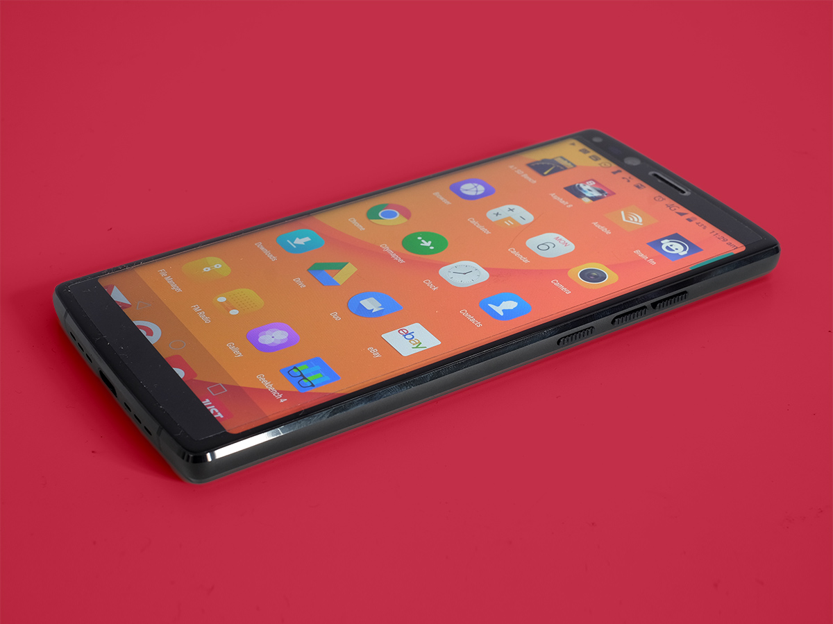
That screen is huge, too. It’s a 6in, 2160×1080 LCD panel with the en vogue ultra-wide shape. It’s sharp, colours are vivid and there are no obvious tells of any major cheaping-out with the panel. Contrast and brightness are both decent.
There are a few issues, though.
The automatic brightness settings are all over the place, making the screen far too bright at times, and often refusing to react to any changes you make to the brightness slider.
Fresh out of the box, there’s quite a significant blue shift to the white balance too. This can make a screen look brighter, but also leaves Mix 2’s display looking less alluring that it should. You can tweak this using the MediaTek MiraVision display customiser, though, which can make alterations to the colour, white balance and contrast.
It won’t solve the way the brightness drops off at an angle much more than a top-end LCD. But you’re not paying a top-end price either.
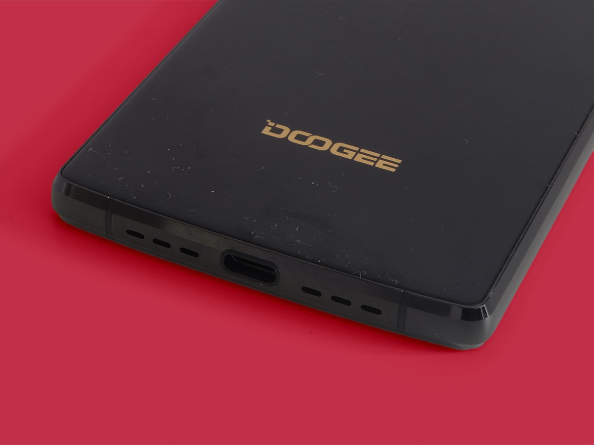
As for sound sound? The Mix 2 might have two grilles on the bottom edge, but there’s only one speaker driver hiding behind them. It’s too easy to block while you play, and while sound quality is OK, you might expect more given the sheer size of this phone. It doesn’t have the extra hit of bass and mid-bulk of the better phone speakers.
Doogee Mix 2 OS & software: MediaTek fest
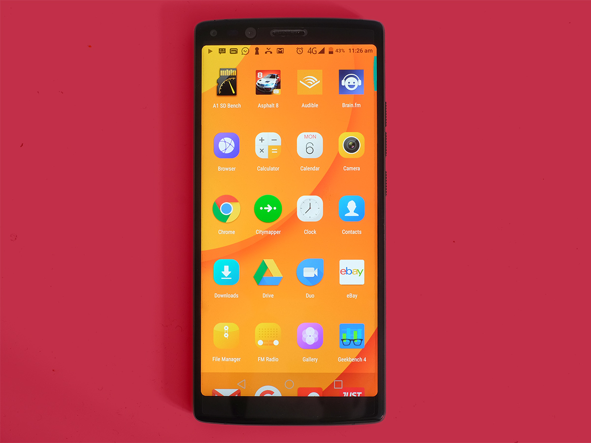
The Mix 2 runs Android 7.1.1, not the latest Oreo version, and it has a light MediaTek-made skin on top that makes a few minor, but annoying, changes.
Animated transitions between screens are far more obvious here, cheapening the look of the software. There are custom icons, the settings menu looks a little less professional than normal, and this interface makes almost zero use of the extra screen space.
Only four rows of icons fit into the Mix2’s apps menu, making them look like a handful of Cheerios floating lonely in a bowl of milk. Come on MediaTek, five rows would look much better here.
The Mix 2’s software also feels more sluggish than vanilla Android, or any of the best custom interfaces. It’s not a lag-fest by any means, but the played-out animations and a tendency to react a little slower to your taps and swipes means it seems less than lightning-fast.
Doogee Mix 2 performance & battery life
Given all the MediaTek software on-board, you’ve probably guessed the Mix 2 has a MediaTek CPU. It’s the Helio P25, which MediaTek calls a “premium performance” chipset – but it’s really exactly the sort of lower-mid range brain you’d expect in a phone at this price.
It has eight Cortex-A53 cores, just like almost every well-known phone at the price, and produces the performance you’d expect. The Mix 2 scores 3851 in Geekbench 4, which is pretty similar to the Moto G5 Plus.
It is paired with a massive 6GB RAM, but peering into the memory usage stats reveals that the phone rarely seems to use all that much of it. It does mean the Mix 2 can theoretically cache loads of app data without having to purge it, though.
The Helio P25 also has a much slower graphics chip than the Adreno 510 used by the Snapdragon 650. However, it roughly matches the Moto G5S Plus for gaming power, and actually beats the rival Huawei P Smart. There’s the odd frame rate drop at the start of races in Gameloft’s Asphalt 8, but it’s otherwise pretty smooth. And the ultra-big, ultra-wide display is great for play.
The Mix 2 has a such a giant battery, it’s almost enough to make you forgive its weight problem. The 4060mAh cell is 1060mAh bigger than the Moto G5S Plus’s, and it means you can abuse this thing all day and it won’t conk out.
After a full day of heavy use, including well over an hour of solid web browsing, a few hours of podcast streaming, some gaming and the usual WhatsApp messaging, the Mix 2 still had 37% charge left at midnight. It’ll also last for about 15 hours of movie playback if you have files stored on your phone. This is the kind of stamina you want.
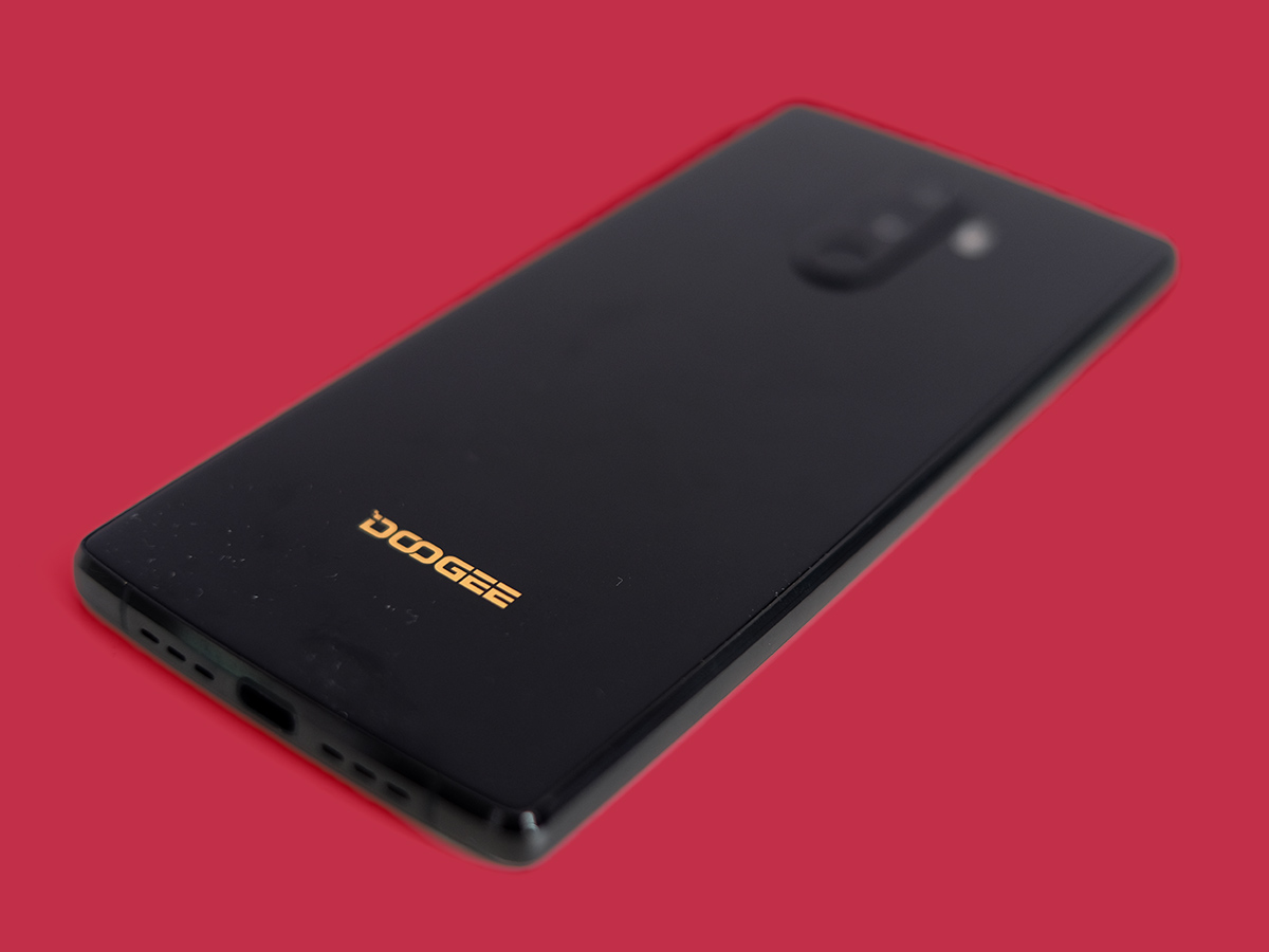
The Mix 2 doesn’t have proper fast charging, though. You’ll have to set aside a couple of hours and change to get that big battery juiced-up. Or do what everyone else does and just plug it in overnight. At least it uses a USB-C port, like most newer phones.
Doogee Mix 2 camera
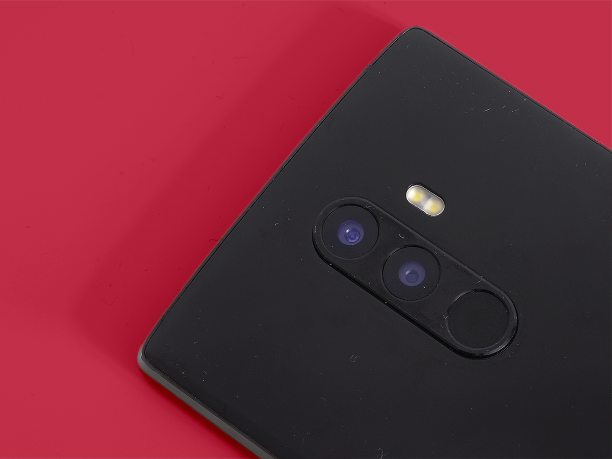
The Mix 2 might not seem to be dripping with new tech if you focus on the core hardware, but it certainly makes an impression with its cameras. There are four of ’em: two on the back, and two on the front.
The dual rear cameras add 2x zoom without using a software cheat, and the front ones do the same. Doogee says the selfie array lets you take selfies and group selfies, but unless you’re after a passport photo-style face crop, the zoomed-out lens is the one to use.
It’s a shame, then, that they are so frustrating to use. The hardware is clearly capable of some great results, and when you’re already focused there’s almost no shutter lag. This is important, as it makes shooting more fun. However, the software and optimisation doesn’t nearly bring the best out of the hardware.
Even in daylight shots have a haze of fine noise over them, a sure sign that limited processing is happening. There’s also nothing like the auto HDR optimisation you’ll find on more costly phones.
Focusing is also pretty poor when your subject isn’t miles away. You can watch it “focus seek” right in the camera app, and sometimes it misses the mark completely. It’s as if Doogee just stuck the hardware in and hoped for the best.
This is one of the issues when you buy a super-aggressive Chinese phone like a Doogee: it may have the specs, but not all the finishing touches. That said, if you’re shooting in fair conditions the Mix2 can match its price rivals. Colours are natural enough, there’s plenty of detail.
There’s even a blur mode, letting you isolate subjects as if shooting with a DSLR. Don’t expect too much from this, though. It’s miles off what the latest Huawei and Apple takes on this, closer to a photoshop filter than something that relies on two cameras depth-mapping a scene.
And selfies? Other than the second camera having a way too zoomed-in view to be useful much of the time, selfies can actually look great. There is some shutter lag here, but you also get plenty of fine facial detail. And if it ends up too much, you can smudge out those fine lines with the beauty mode. Phew.
Doogee Mix 2 Verdict
The Mix 2 is big. It’s heavy. And its camera and software don’t have the optimised feel of a phone from one of the big names.
This will easily be enough to put a large chunk of you off buying one.
However, you also get a lot of screen and storage for the cash – and the battery life is great if you’re tired of a phone that runs out of charge before bedtime. The Honor 9 Lite is still the better phone overall, though – and it’s a lot easier to come by here in the UK.
READ MORE › The 10 best smartphones in the world right now
Tech specs
| SCREEN | 5.99in, 2160×1080 IPS LCD |
| CPU | Mediatek Helio P25 octa-core |
| MEMORY | 6GB RAM |
| CAMERA | 16MP+13MP rear w/ PDAF, LED flash. 8MP + 8MP front |
| STORAGE | 64GB on-board, microSD expansion |
| OPERATING SYSTEM | Android 7.1.1 Nougat |
| BATTERY | 4060mAh non-removable |
| DIMENSIONS | 159x75x8.6mm, 210g |
Stuff Says…
It doesn’t have the polish of its big-name rivals, but this mammoth phone lasts an age between charges
Good Stuff
Great battery life
A lot of hardware for your cash
Bad Stuff
Not as bezel-less as it claims
Poor display auto brightness
Slow camera autofocus
Heavy
