Nokia 8 Sirocco hands-on review
Finally, Nokia delivers a true blue flagship phone
Phone fans are a fickle bunch.
Nokia learned that the hard way last year. A retro-inspired reboot of the much-loved 3310? “Where’s your flagship?” One of the best value sub-£200 phones you could buy in 2017? “Where’s your flagship?”
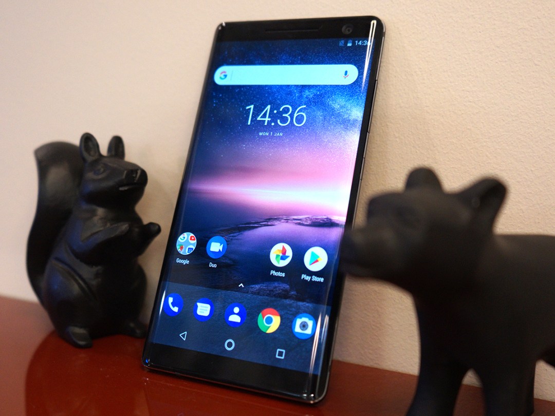
Well maybe this will keep the bleaters quiet. The Nokia 8 Sirocco is every bit the top-end phone, with curvy glass sides and a frame carved out of a single block of stainless steel. Because aluminium is so six months ago, you guys.
An OLED screen, Zeiss cameras, and a near-stock version of Android should make it your new object of desire – right? Well, after trying one out ahead of launch, things are a little more complicated.
DESIGN & BUILD
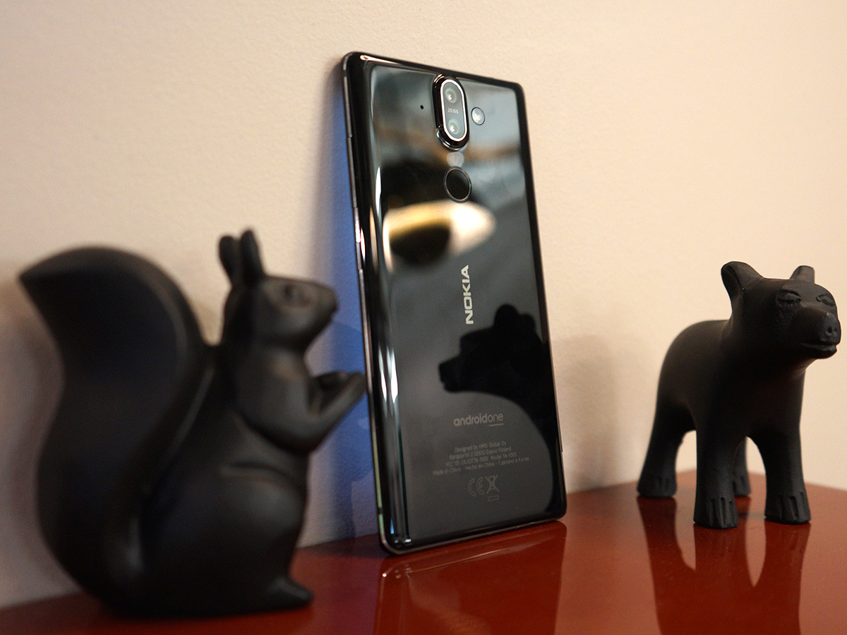
The Sirocco is everything a flagship phone should be in 2018: a desirable metal and glass sandwich with seriously slim proportions.
The stainless steel frame has no seams, seals or joins – just a polished single piece of metal that feels every bit as luxurious as you’d expect from a top-end blower. It’s apparently 2.5x stronger than the aluminium you’d find in other phones, meaning it shouldn’t show up scrapes and scratches quite so easily.
You get curved Gorilla Glass 5 wrapping around the front and back panels, with gloss black colours underneath. It looks like it means business.
It’s super thin at the sides, where the glass curves inwards, and the whole thing is rather svelte in general. You’ll have no trouble slipping this into the skinniest of skinny jeans.
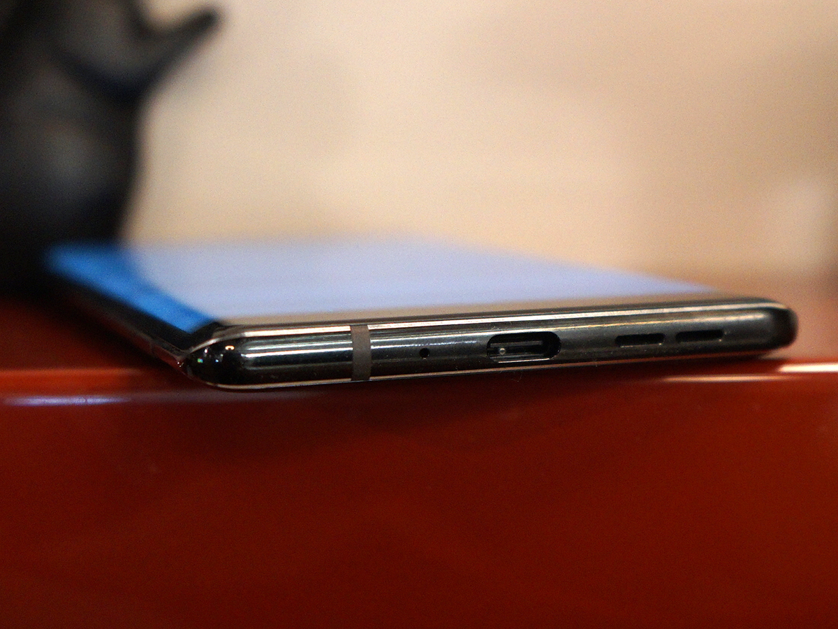
Quite why Nokia decided it was time to ditch the headphone jack remains to be seen, though. A rep couldn’t even confirm if a pair of USB-C earbuds would be included in the box, and if you’ve got a pair of cans you just can’t say goodbye to, you’ll have to be ready to live the dongle life.
SCREEN & SOUND
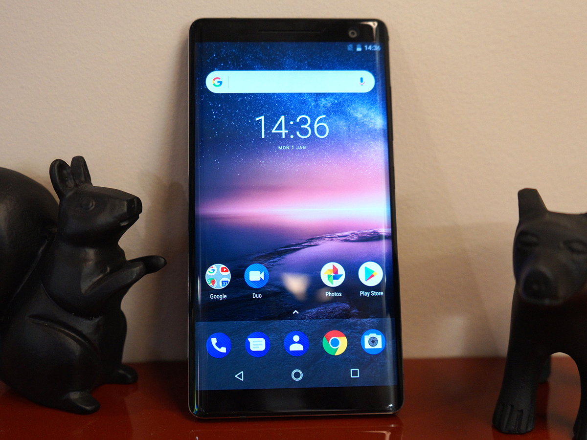
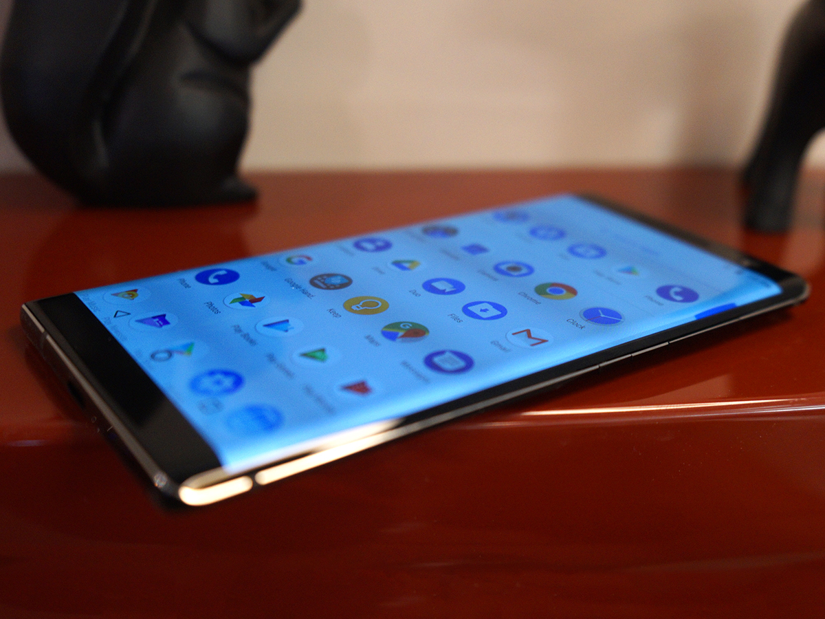
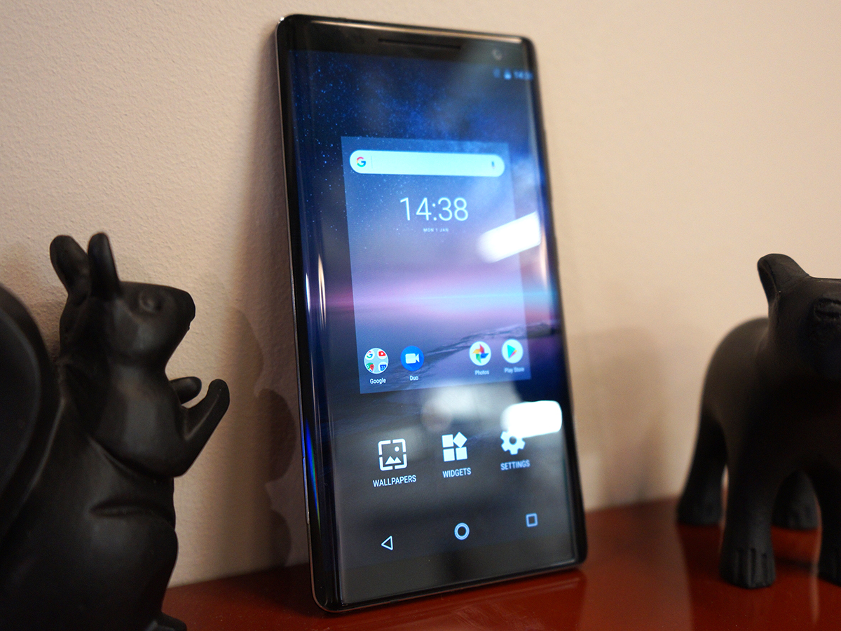
Nokia has gone the whole hog here with an OLED panel, meaning you get fantastic contrast, deep, inky blacks and properly vibrant colours. The 2K resolution is on par with any other top-spec phone, too – meaning each photo and video you play back is packed with detail. So far, so good.
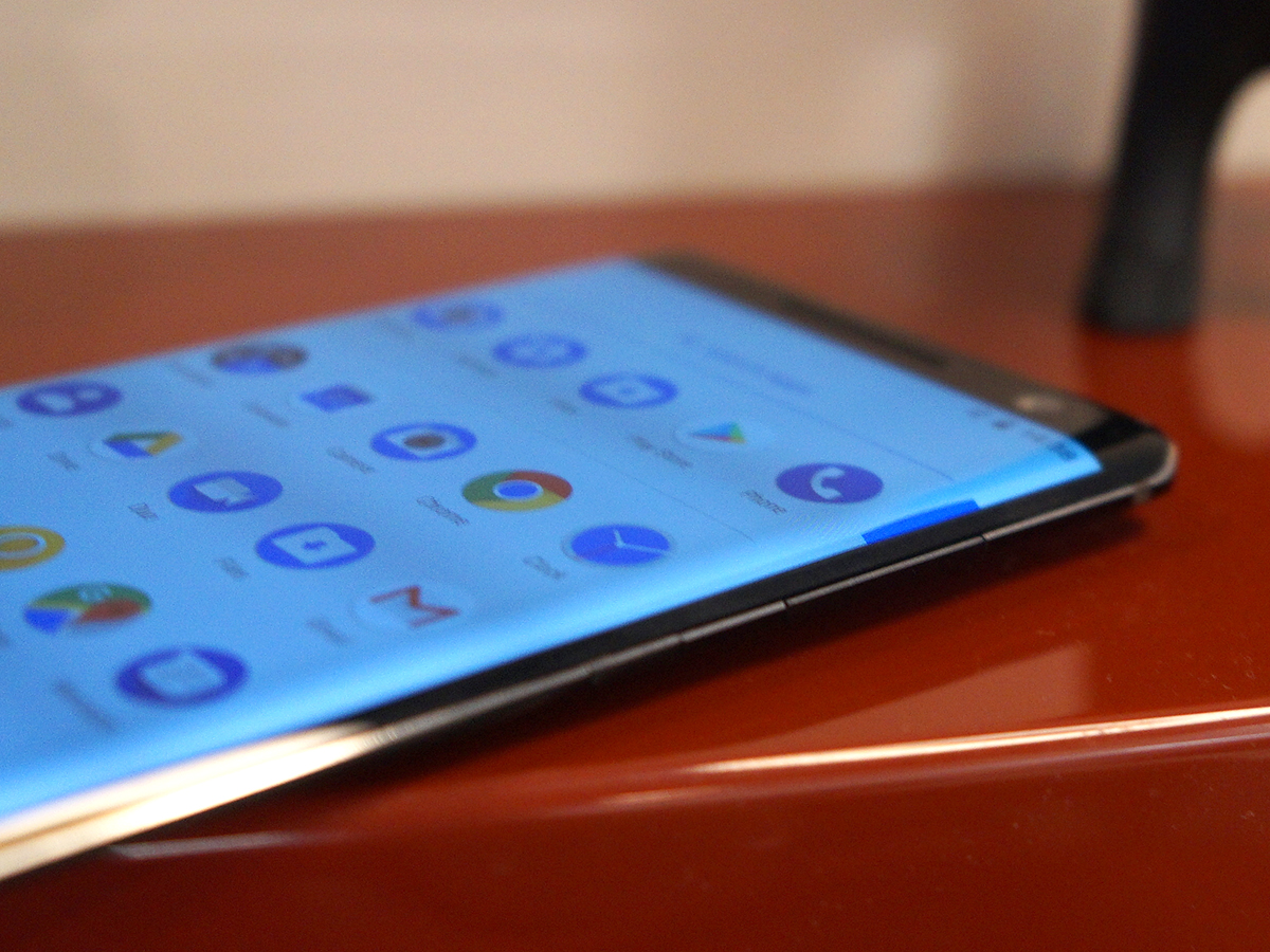
The way the glass curves around the edges of the phone (not just at the sides, but at the top and bottom too) is very slick indeed, mimicking the design Samsung has been making its own for the past few years. However, it tapers down to a point that actually feels quite sharp in your hand. It’s not exactly uncomfortable, but it’s hardly a pleasure to squeeze, either.
Nokia has done a good job thinning down the top and bottom bezels, too. They’re not iPhone X or Galaxy S9 skinny, but they’re close. The big issue is the aspect ratio, which sticks to a tried-and-tested 16:9 instead of the longer 18:9 aspect that’s all the rage right now.
It makes the whole thing look a little old hat, especially when you put it side-by-side with a Galaxy S9. And that’s not the feeling you want when you’ve just dropped €750 on a phone.
CAMERAS
Here’s hoping the Sirocco can deliver when it comes to camera quality – it’s something the vanilla Nokia 8 never quite managed.
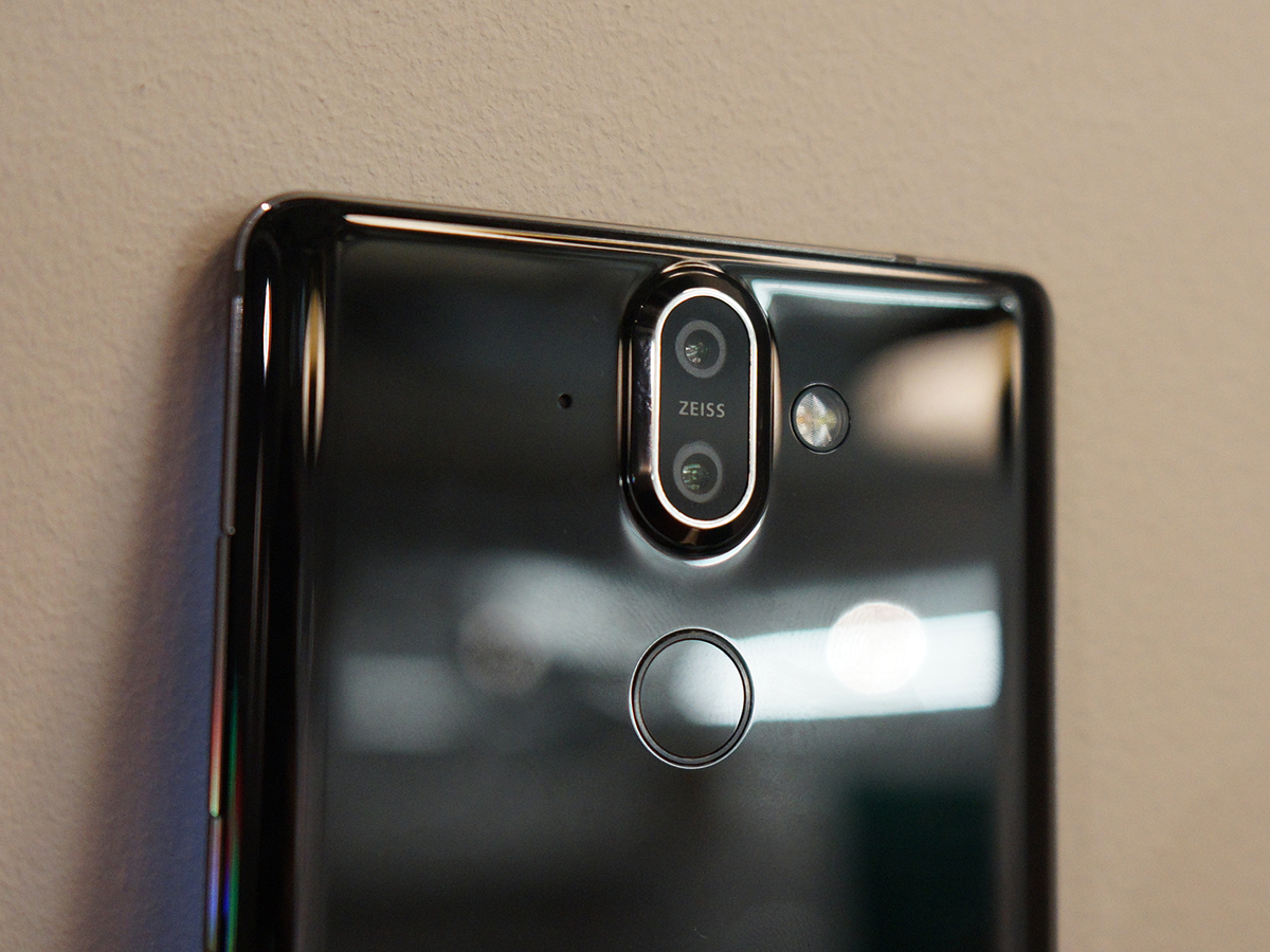
The hardware has changed slightly this time around, with a 12MP + 13MP dual camera setup around back, paired to a single 16MP sensor up front (not a twim-cam setup, as the rumours had predicted). They all sit behind Zeiss-branded glass, with the usual extras like a quad-LED flash for low-light shooting.
Those two cameras should let you get closer to your subjects with a 2x "optical zoom", and will add convincing depth blur to portrait and macro shots. The Pro Camera mode makes a return, giving you more control over your photos with white balance, shutter speed and ISO dials.
We were only able to take a few quick snaps during our hands-on demo: things looked pretty sharp and detailed on the phone’s display, but we’ll have to wait until a full review to deliver a final verdict on image quality. There’s plenty of competition out there, with the Pixel 2 XL delivering some of the best photos we’ve ever seen from a phone, and the iPhone X not far behind.
PERFORMANCE & SOFTWARE
With essentially the same internals as last year’s Nokia 8, the Sirocco should be plenty fast enough – but just in case you were thirsty for more grunt, Nokia has bumped the RAM up to 6GB and the storage to 128GB.
That should be right on the money for a flagship phone, but of course the Sirocco is sticking with a Snapdraong 835. It’s a mighty fast chip, but now the competition is starting to launch phones with the newer 845. On paper, this should put Nokia at a disadvantage, but without one to test, that kind of benchmark comparision will have to wait for a full review.
Right now, the Sirocco feels genuinely fast, with apps and games loading quickly and delivering smooth frame rates.
This is partly down to Nokia’s stripped back version of Android 8.0 Oreo, which is part of Google’s Android One initiative. That means you don’t get any bloatware, unwanted custom skins or annoying icons to contend with. It’s easily one of the biggest reasons to pick up a Nokia phone right now, no matter what CPU is doing all the heavy lifting behind the scenes.
How well battery life will hold up to this kind of use is a bit of a mystery right now, though. At least you get Qi wireless charging if you want to go cable-free, and fast charging if you want to stay wired.
NOKIA 8 SIROCCO INITIAL VERDICT
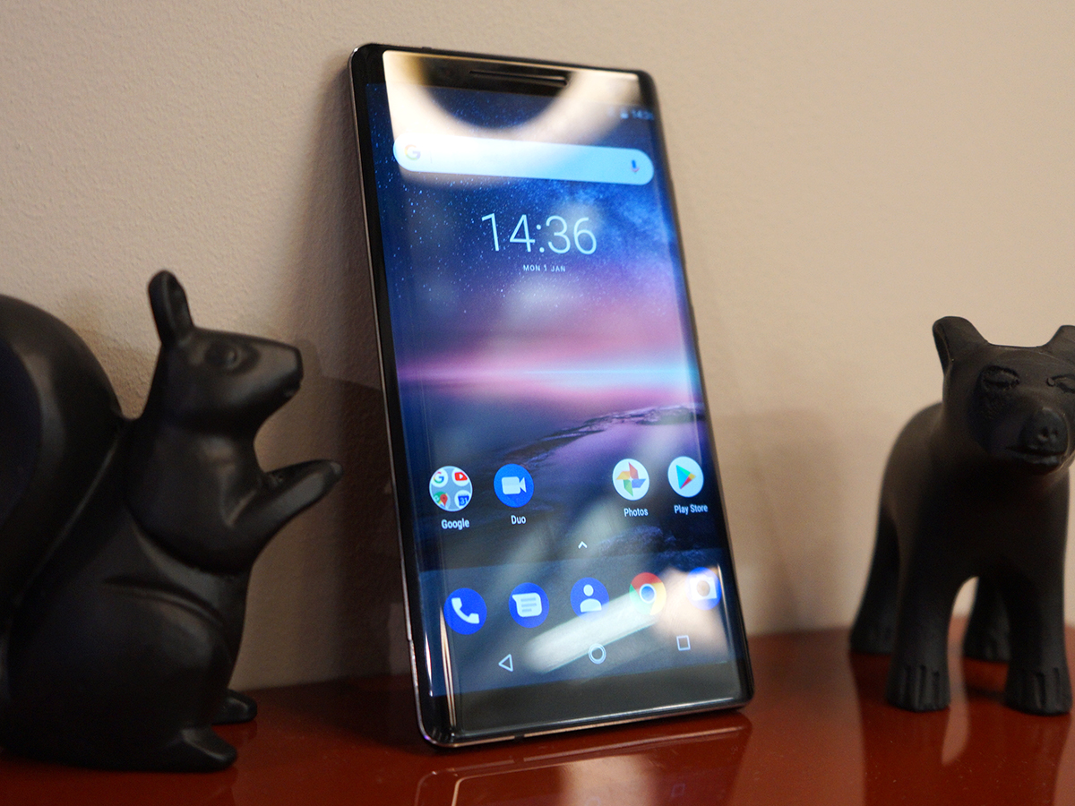
There’s lot to like about the Sirocco: its more manageable size; the Zeiss cameras that are loaded with potential; nifty extras like wireless charging and IP67 water resistance.
Nokia clearly hoped those curved screen sides would elevate it to the same lofty heights as Samsung’s Galaxy S8, but based on a short first impression, we’re not sure it quite got there. A traditional 16:9 aspect ratio and sizeable bezels hold it back, as do the uncomfortably pointy sides. The missing headphone jack is an unexpected kick in the crotch, too.
At €749, it’s also looking seriously expensive. It will need to take excellent photos, and manage some impressive battery longevity for it to make a good impression when it comes to a full review.
