Nokia X, X+, XL: hands-on review of Nokia’s first Android smartphones
Nokia's first Android smartphones are a curious combo of killer looks and lacklustre innards
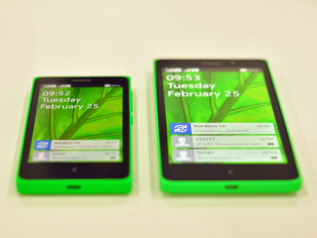
Most people don’t get what Nokia’s up to with the X series.
Its first Android smartphones, the 4in X and X+ and 5in XL, aren’t flagships. They’re not even close. If you get turned on by specifications, you’re sure to be turned off by all three models.
Nokia’s playing a cannier game, though. The X is actually ruthlessly focused: according to Nokia, people in emerging markets want dual-SIM devices, and they want to be able to sideload apps and media, and they want to be able to expand memory and swap cases. Windows phones don’t do this stuff – and so Nokia went to Android.
At the same time, Nokia wanted to hook people into Microsoft’s and Nokia’s apps and services, so they’re present and correct in place of the usual Google fare. The X series is also connected to Microsoft’s cloud rather than Google’s. In short, Nokia’s devised a product line for smartphone first-timers that allows it to have its cake and eat it.
But is that product line any good? Short answer: yes, but on first impressions, it’s far from the best.
Design and build: the most beautiful budget phones money can buy
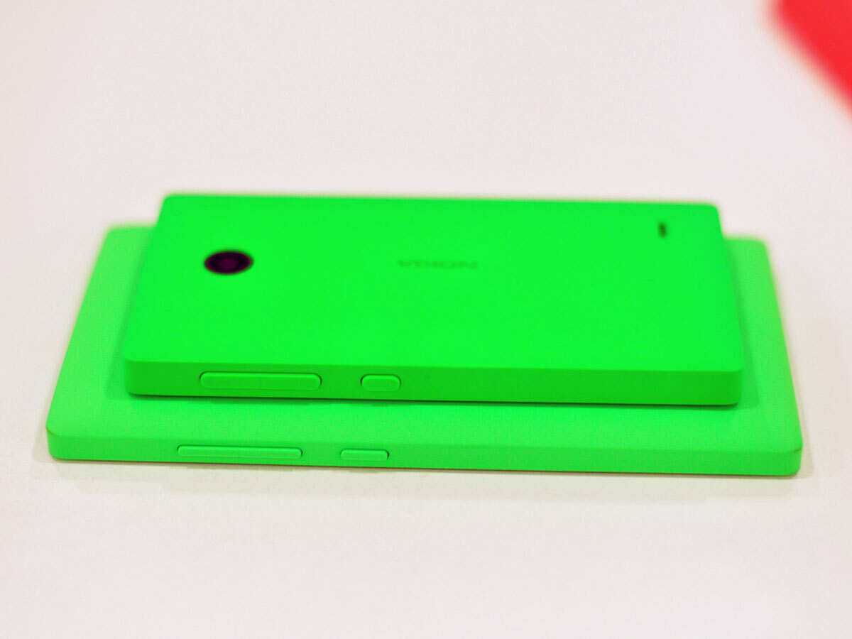
When it comes to build quality and aesthetics, the X and XL are untouchable. The monocoque polycarbonate shells are so colourful they almost glow. They feel solid and are immaculately finished, and they pop off to reveal a pair of SIM slots and microSD expansion port.
They feel as solid as a top-end Lumia, but without the finest details (no micro-drilled holes here) or metal buttons. Also, they’re more angular – pleasingly so. In the hand, they feel different, but the sharpness isn’t uncomfortable. These are phones that’ll make their owners proud.
OS: A bit Android, a bit Windows Phone, a bit disappointing
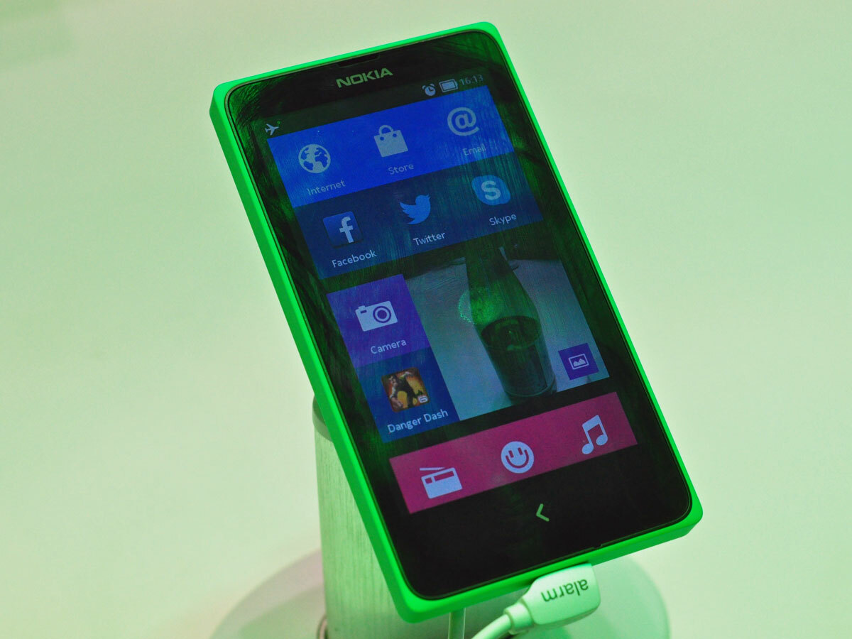
The Nokia X runs a heavily skinned version of Android that looks suspiciously like Windows Phone, minus much of the eye candy. Those little progress dots that dart across the screen? You get none of them, and the general feel of the experience is somewhat stuttery and simple (see below). The signature resizable live tiles are present and correct, and Nokia has replaced all of the stock Android apps for messaging, browsing and the like with its own designs.
The operating system’s core is Android 4.1.2 (Jelly Bean), which lacks many of the optimisations of KitKat which have vastly improved Android’s performance on lacklustre hardware. It’s a shame – we can’t help but feel that the X series would function better on a new OS.
The usual gestures bring up the usual screens (including an app list that looks a lot like WinPhone’s) but the single back button will take a little getting used to. It works with a single tap or a long press, so you can quickly skip back to the home screen if you need to.
Nokia’s aim with the X is to introduce a new audience to Microsoft’s services, so you’ll use your Microsoft account rather than your Google one. You can also use Nokia’s excellent Here Maps in place of GMaps, and download apps from the Nokia-curated store rather than Google Play. Indeed, Google’s own apps – Chrome, Maps, etc – won’t be available for the X, and all apps will need to be slightly altered to function on the hardware. A bold, and dangerous, move.
Power: flagships they ain’t
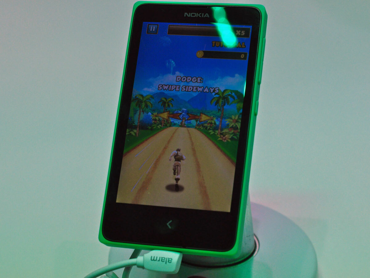
The X, with it’s dual-core 1GHz Snapdragon processor and 512MB RAM, is noticeably underpowered. The heavily skinned version of Android moves in fits and starts as you pull it around. Relatively unchallenging apps like Danger Dash are also slow to load. It’s not unbearable – Nokia’s too canny to put out a horror show – but we’re accustomed to better.
The X+ and XL have slightly boosted specifications (768MB RAM) and are a somewhat different kettle of fish – they’re a lot smoother in operation, although apps still take a while to get going. Judged against similarly priced Android phones like the Moto G, all are a bit sluggish.
Screen: welcome to 2011
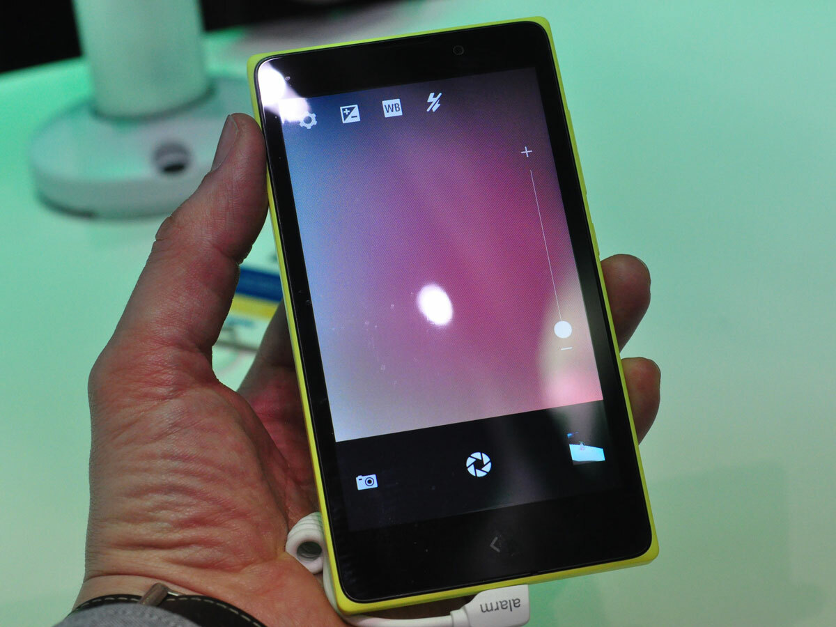
Nokia was showing the X under the Worst Possible Light™ so we couldn’t judge the 4in screen’s quality, but the image is obviously pixellated – at 800×480, this is a low-res panel by today’s standards. Passable, yes, but you’re not going to want to watch The Wolf of Wall Street (or any other three-hour opus) on this.
The XL’s stretched 5in screen shares the resolution of the X and X+ so suffers from greater image pixellation, but also seemed brighter and more colourful.
Camera: not a focus
Unsurprisingly, the X and X+ have what most modern phones would begrudgingly accept as a front camera on their behinds. It’s a 3MP fixed-focus affair (no UltraPixel tech here), and its complemented by an app that’s equally cut-down. The light was too poor to test the camera out.
The XL is more modern in its spec, with a 5MP cam round the back and a 2MP one up front. The rear camera focused and shot quite nippily, and with Nokia’s imaging chops, there’s reason to suspect it’ll do a fine job for the handset’s price.
Initial verdict
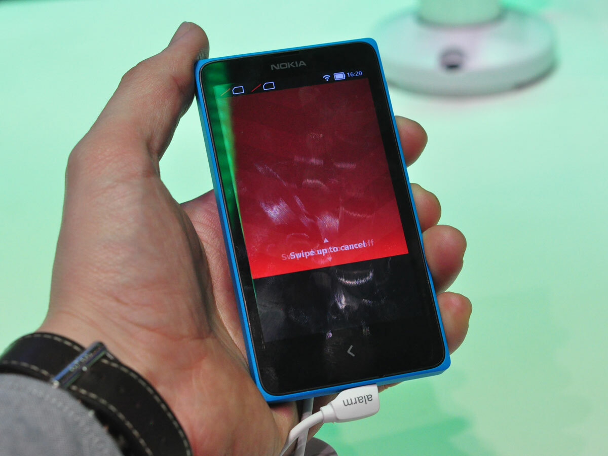
The sub-€90 X, sub-€100 X+ and sub-€110 XL are very competitively priced, which makes them compelling devices almost regardless of how they perform. And in terms of how they look and feel, no other entry-level device can touch them.
Two worries. The first is that Nokia are unnecessarily restricting the Android experience by controlling which apps will and won’t work. Apps are a major selling point for Android devices over Windows Phone ones, so putting obstacles in the way to accessing them feels unwise.
The second is that they’re up against seriously stiff, not-too-much-more-expensive competition – the Motorola Moto G, for example, which lets you taste superphone performance for less than £100 on PAYG. The Xs may have sexier bodies, but the Moto G feels like a phone out of 2014, while they’re stuck watching the London Olympics.
Sure, the X range isn’t aimed at spec-obsessed gadget addicts (indeed, none have been confirmed for sale in Western Europe), but we can’t help but feel that a device like the Moto G will offer better value for smartphone newbies than the X, regardless of whether their market is emerging or in full bloom.
We’ll reserve full judgement until we have samples to try out in our laboratory conditions. Stay tuned.
READ MORE: Nokia X preview

