iOS 7: bold new direction or flat fashion victim?
We ask a gaggle of experts whether the design of Apple’s mobile OS really is rotten
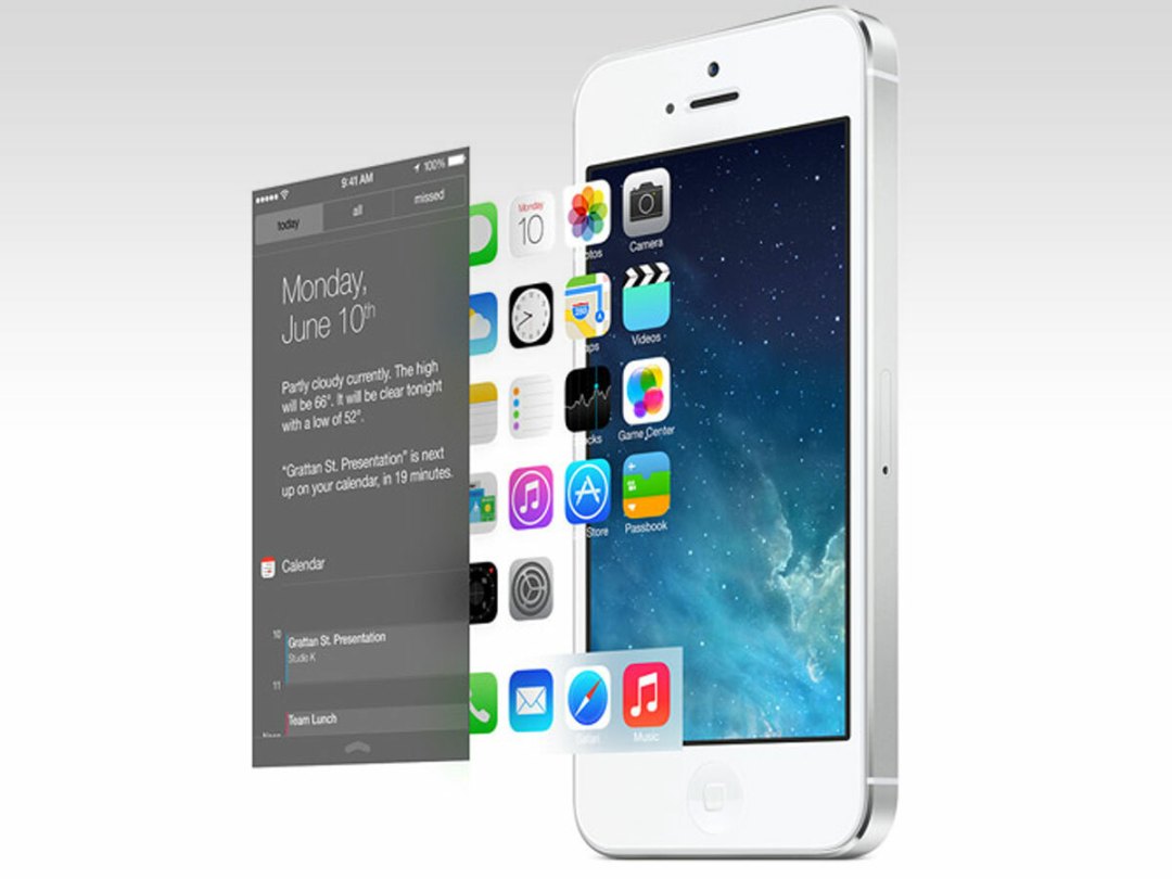
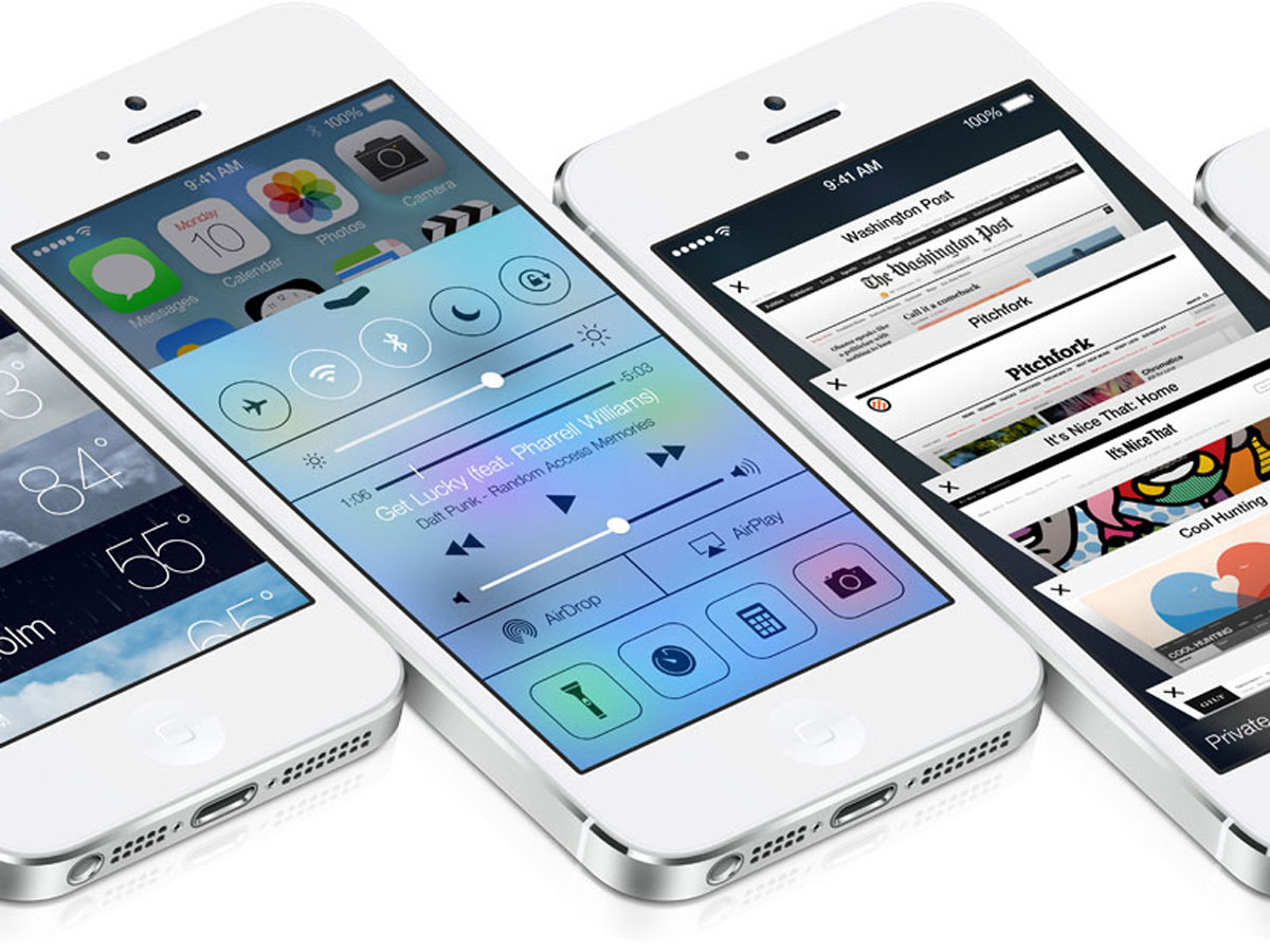
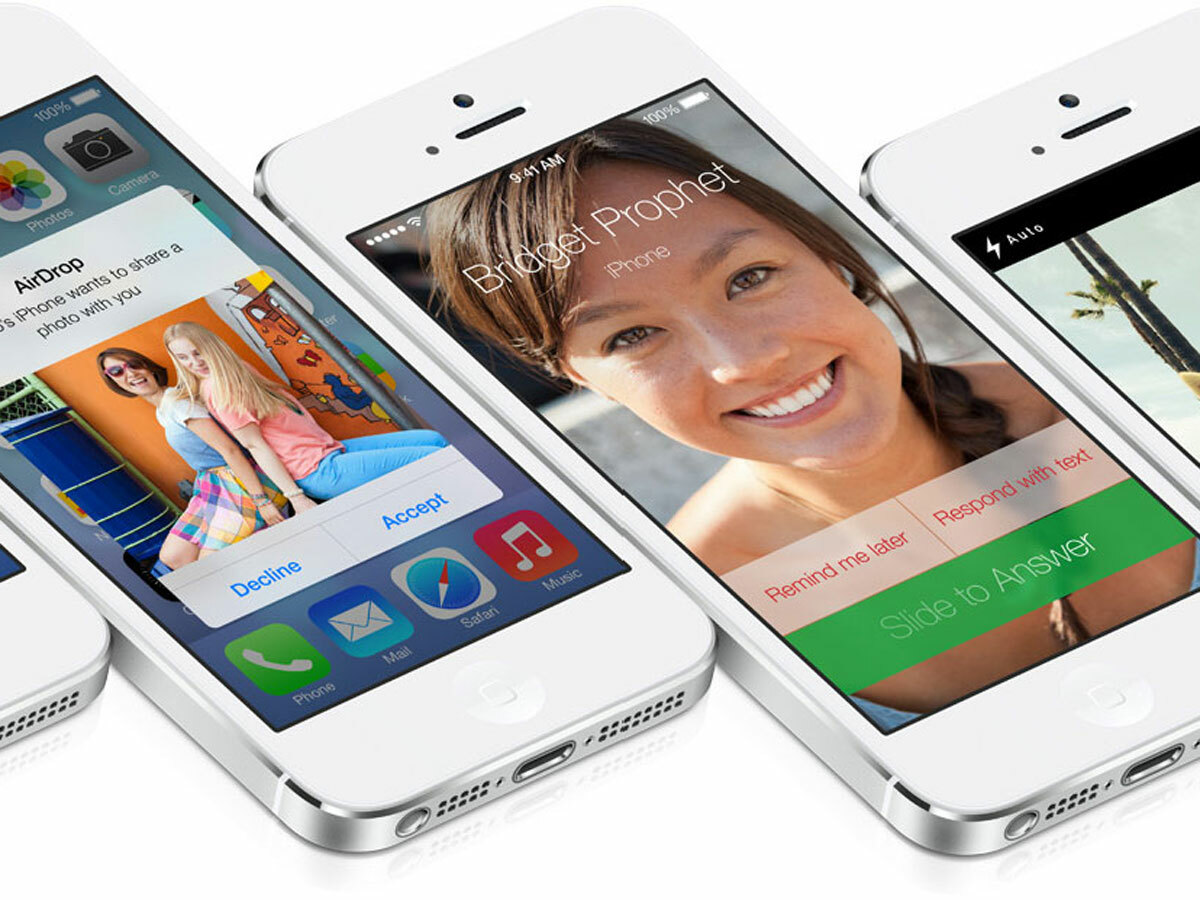
Apple’s radical new direction for iOS amazed, confounded and annoyed the tech community in almost equal measure.
Every detail of the six-year-old OS’ aesthetics and interaction has been overhauled. Initial responses have been mixed and frequently subjective, but people often react poorly to change. So, what’s the truth? Are the major criticisms just knee-jerk noise, or is Apple about to release a mobile dud? Stuff goes in search of expert opinion to find out…
Criticism #1: Apple stole from Windows Phone and Android!
Microsoft and Google both championed flat design, so it’s natural to assume that Apple’s newly simplified, skeuomorphism-free interface ripped them off. On Twitter, technology industry analyst and consultant Matt Baxter-Reynolds counters: “Metro always looks basically amateur—like its appeal is to strip away a requirement to design beautifully. iOS 7 is not that.” Among others, developer Matt Gemmell argues that “iOS 7 isn’t flat,” instead offering subtle depth that becomes apparent during use.
Nonetheless, Adobe Senior product manager Alex Morris tells Stuff that “Apple has reacted to competitors, which is odd for a company that leads from the front”. He wonders if the company had lacked clear design goals to identify problems it was going to solve.
Criticism #2: The iOS 7 icons are awful!
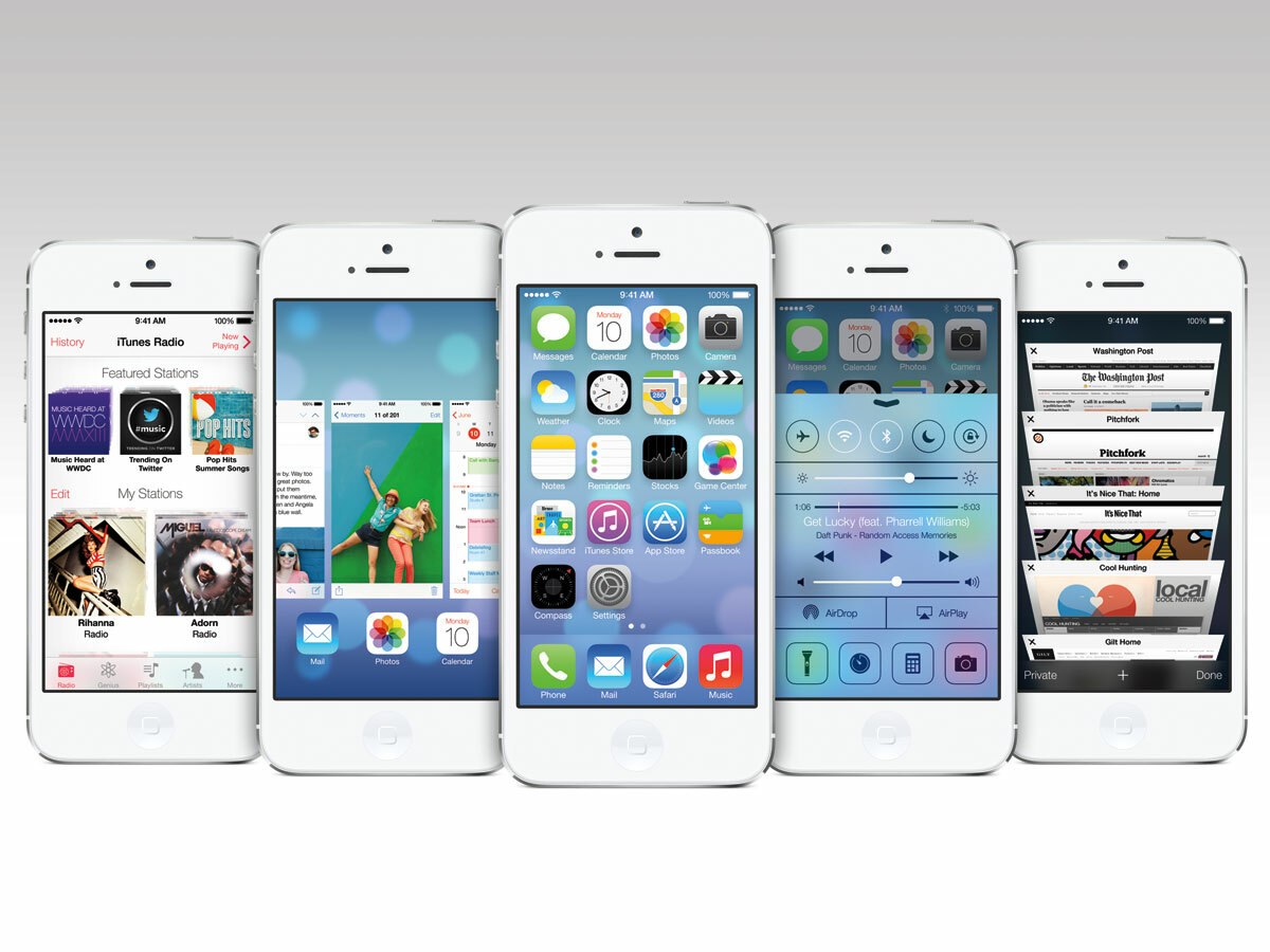
Apple’s app icons in iOS 7 have been widely dismissed as gaudy and amateurish. Morris asks why “no arbiter of taste had taken a step back”, although the colours aren’t a concern: “It’s great to have a strong visual identity for a button, because that’s how you scan around and process things on your Home screen”.
Ramotion CEO Denis Pakhaliuk thinks that execution is the bigger problem: “The icons need to be vastly improved. Even an icon with a simple metaphor must be executed cleanly to be easily recognisable. Newsstand doesn’t achieve this, and Game Center doesn’t even share the ‘flat’ style of the other icons.” However, in a comment to Network World, creator of the original (and superb) Mac icons Susan Kare says that iOS 7’s show “a good direction” that was “more iconic, less illustrative”.
Criticism #3: The colours are gaudy!
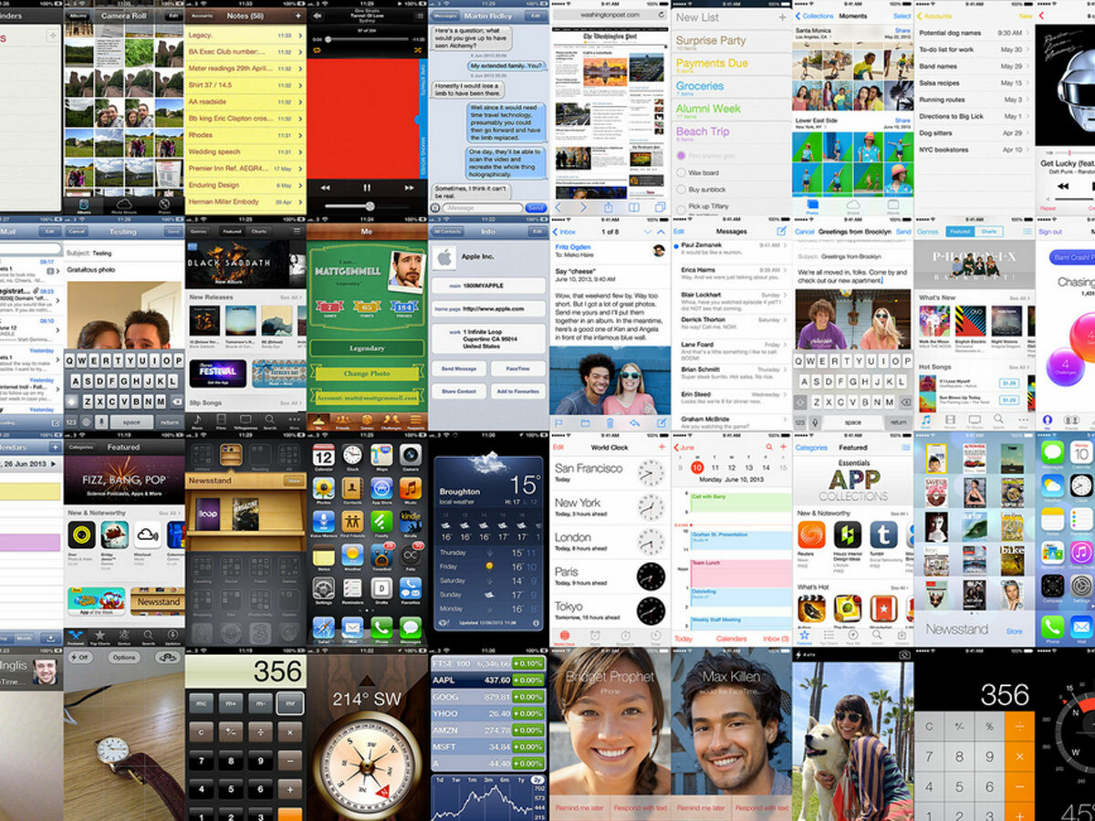
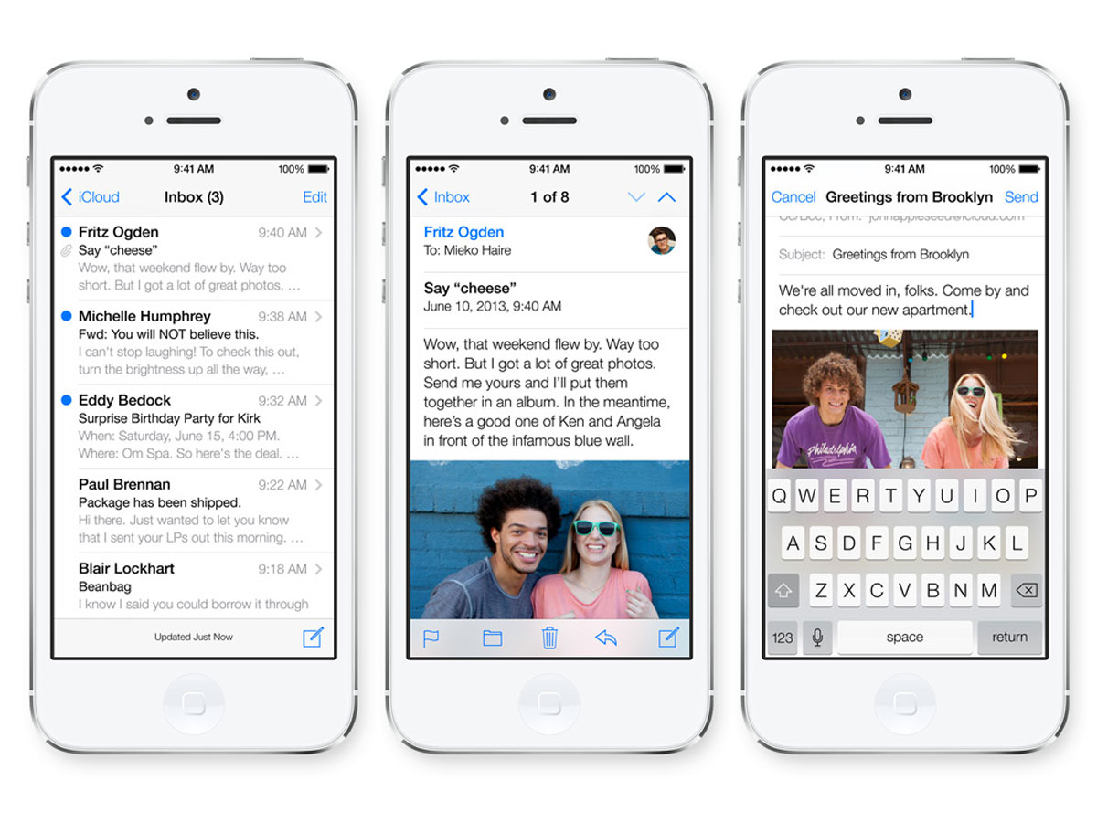
In a post on iOS 7, Gemmell dismisses concern about the iOS 7 colour palette. He argues that coverage has been “disproportionally focusing on the Home screen […] but the reality of day-to-day usage is that you’ll spend time in apps”. There, he argues, iOS succeeds, with a lighter colour scheme and great use of white space. He’s fashioned a grid of iOS grabs and pixelated them; iOS 6 appears a murky mess, but the “paper-like, bright style” of iOS 7 has no such problem.
Criticism #4: Text is used for buttons, so you can’t tell what to tap!
Apple’s eradication of interface chrome is, according to Morris, flawed: “Android and Windows Phone use background colours to give you a frame of reference, but Apple’s using bare text. This is problematic, because separating actionable buttons from content is difficult visually.” Apple using one typeface and relying on colour was a poor decision, he adds, but also padding isn’t often considered – making it tough to trigger actions.
Speaking to Stuff, Gemmell counters: “This topic is a subset of the over-cautious response to change. Almost no popular iOS apps use stock UI in the first place, and we’ve been doing without explicit button borders for quite some time.” He also dismisses our query regarding colour-only action buttons potentially affecting colour-blind users: “To remain accessible, an interface using colour to indicate interactive areas must ensure visual contrast is preserved, even if the user can’t properly distinguish between shades. iOS 7 uses a single ‘active colour’ per app, against a white background. Text tends to be monochromatic black or grey, and tappable areas use a unified highlight colour. The key point isn’t specific shades of colour, but rather contrast from inactive elements, which is retained.”
Criticism #5: The typography is terrible!
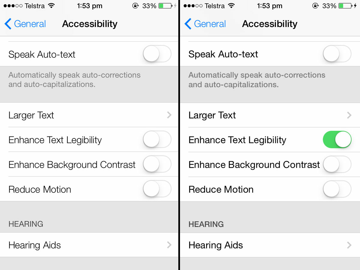
Throughout iOS 7, Helvetica Neue Light is king, and designers aren’t thrilled. Khoi Vinh says it should only really be a ‘display’ typeface, for headings. On Twitter, typographer and designer Erik Spiekermann wishes that someone at Apple “knew that very light fonts are too contrasty to read on displays” and “how difficult Helvetica Light is to read”. Apple provides a means to ‘enhance legibility’ in Settings, but Spiekermann thinks that merely proves his point.
Criticism #6: Removing shadows makes iOS harder to use!
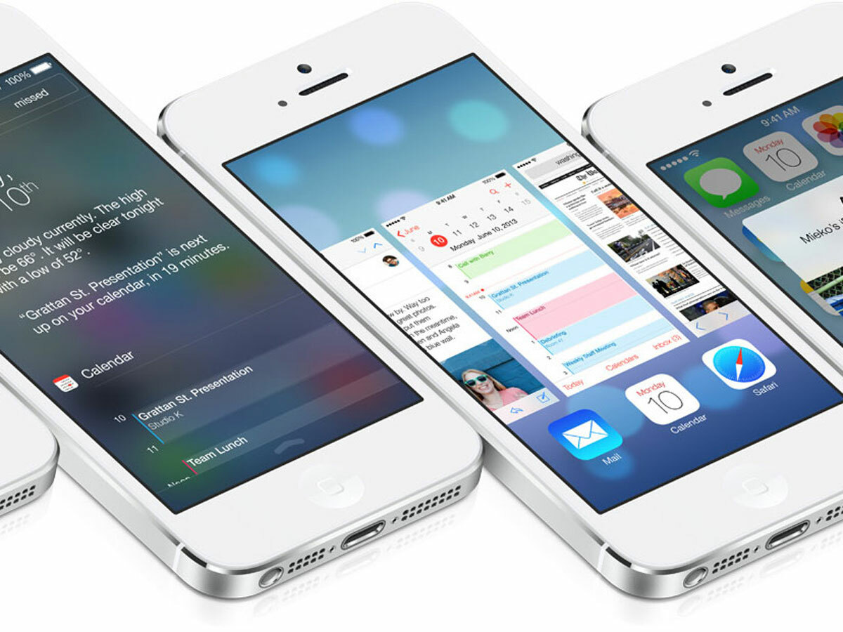
Home screen icon text in iOS 7 lacks shadows, and shadows are broadly missing elsewhere. Senior digital creative Daniel Bruce says that he isn’t concerned: “You can solve the problem of details not standing out enough in many other ways than solely with shadows, and so the lack of them isn’t a problem in itself.” He adds that Apple just needs to ensure it retains the “right interplay between the elements of design,” such as colours, contrast and white space.
Criticism #7: Translucency makes the system more opaque!
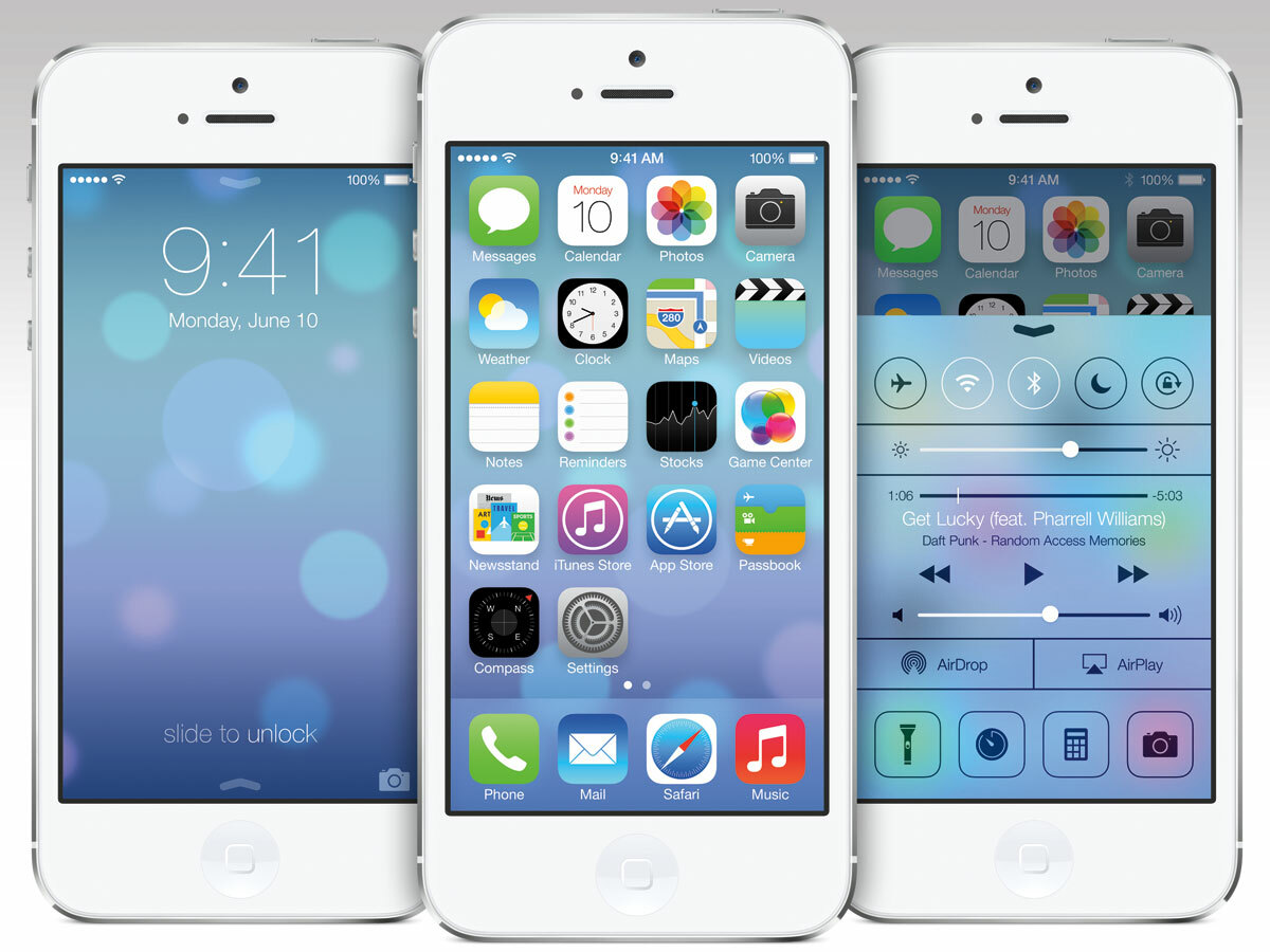
Wags are happily noting that Windows Vista was heavily criticised for its translucent elements, and now iOS 7 has plenty, including dialogs. But Quora product designer David Cole has argued that this aspect of iOS 7 is “pretty significant,” due to “underscoring the fact that your app is right there waiting for you behind whatever it is you’re doing” – thereby ensuring people don’t lose their sense of place. However, there are issues of clarity and usability that certainly do need addressing, not least when the blur effect makes items on the layer above impossible to discern.
Criticism #8: iOS 7 is counterintuitive!
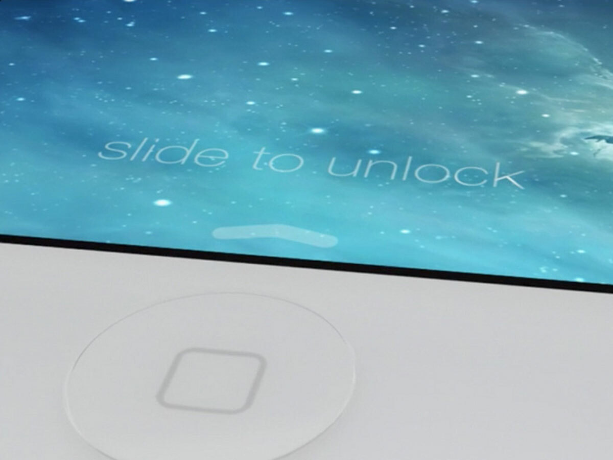
Sebastian Kacperski, Creative Lead at Airnauts, wonders whether Apple’s followed the rule of ‘social proof’ — that people in an uncertain situation “are more likely to follow well-known patterns”. He criticised the iOS 7 lock screen, which retains the old swipe-to-unlock gesture but has an upwards arrow nearby (for the new Control Center): “Who put that arrow so nearby? It’s a well-known law of proximity that people group objects near to each other. This and similar changes will make the learning curve in iOS 7 much longer.”
Morris agrees: “My little girl’s grown up with iOS devices, but got stuck swiping upwards on the lock screen, and when she finally got through that she didn’t recognise anything. I’ve also had issues with actions like the now-reversed delete-to-swipe in Mail. But no-one’s talking about why Apple felt the need to napalm the legacy of the previous OS. Looking at it from a user’s perspective, it doesn’t feel like Apple’s solving many problems, but has just thrown out the baby with the bathwater.”
Where does Apple go from here?
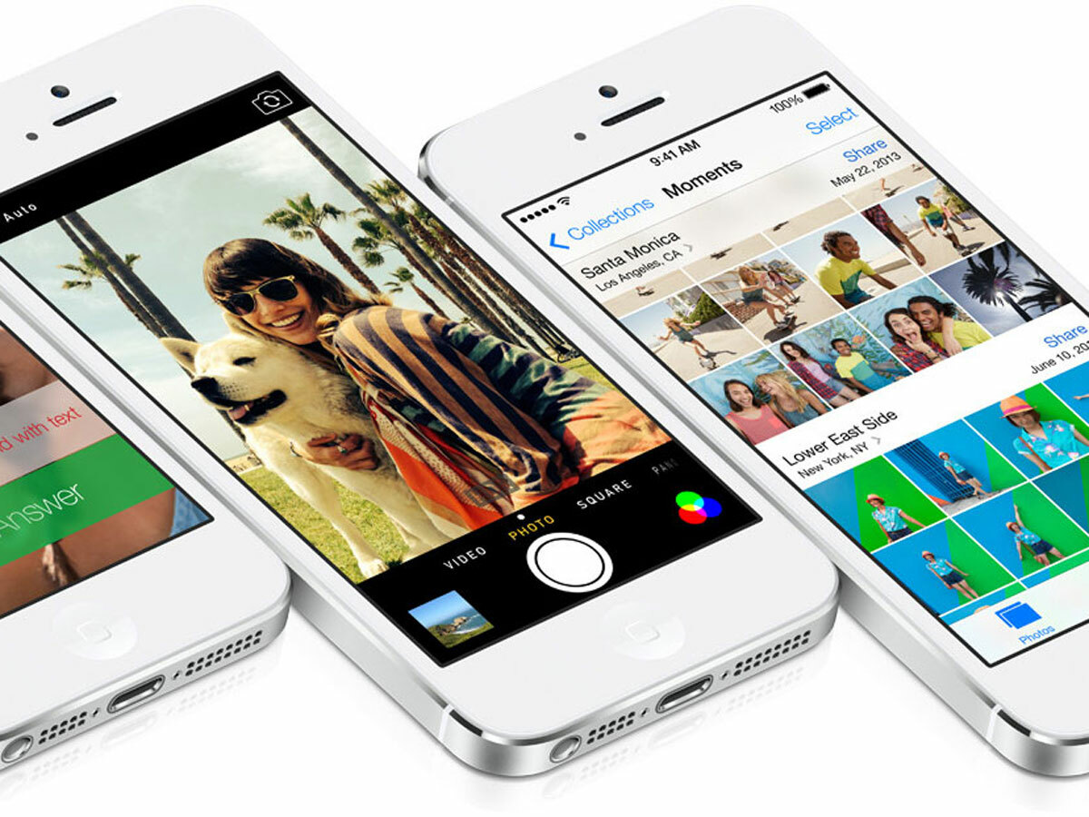
Not everyone is unhappy with Apple’s drastic changes. Developer Marco Arment says that Apple ‘setting fire’ to iOS will benefit a platform that’s become dependent on stale players, and Mule Design’s Mike Monteiro, talking to GigaOM, notes that the new OS “opens up all manner of possibilities” and is a “fresh start” that could “grow and extend”.
But what of the problems outlined above? As per their responses to iOS 7, designers are divided. “It’s fashionable these days to say we should push out stuff early and iterate, but you need to start from a good place, and Apple doesn’t seem to have done that,” says Morris, adding that he’d be disappointed if iOS 7 doesn’t see big changes before release. But Pakhaliuk has a different take: “I know it’s extremely difficult to redesign everything in mere months and I believe Apple will improve everything over time. As Jony Ive said, Apple sees iOS 7 as defining an important new direction and in many ways a beginning.”

