What is the Dynamic Island? Apple’s iPhone notch replacement explained
It turns out someone had already trademarked Expand-O-Lozenge. Here's what you need to know about Apple's Dynamic Island
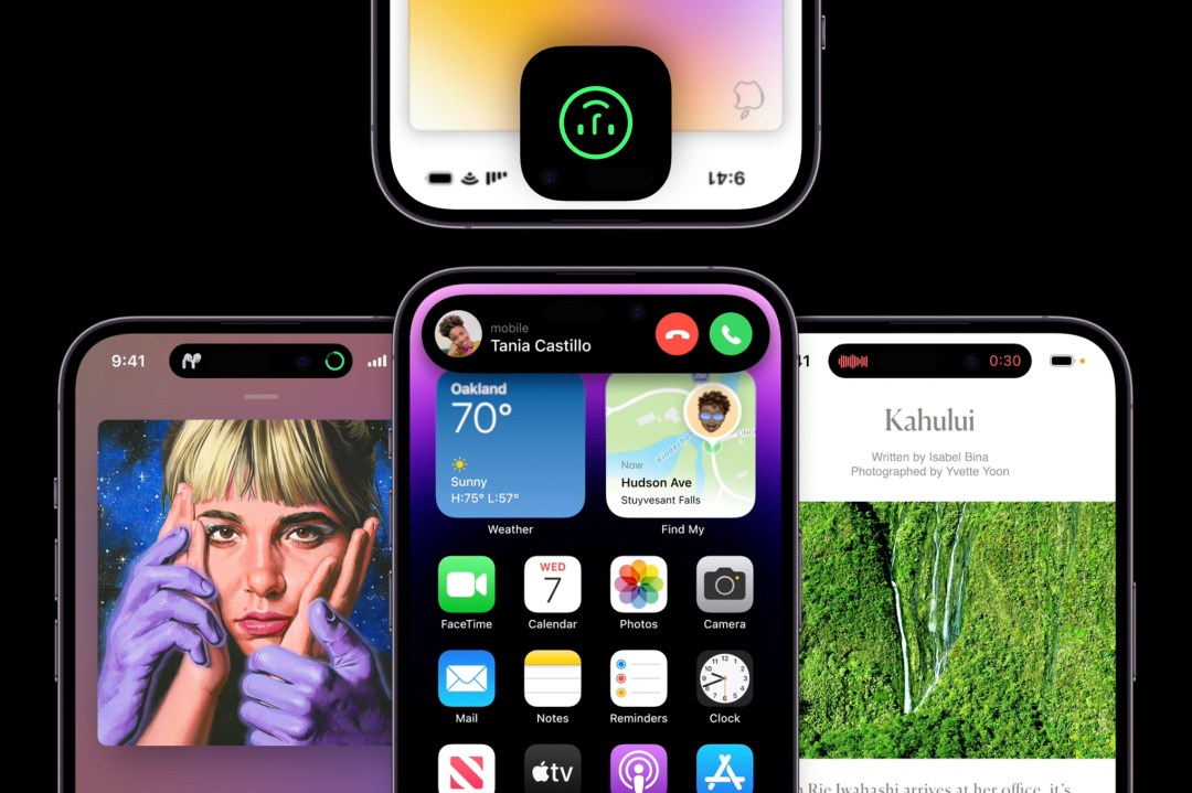
You know the iPhone notch? It’s history! At least it is on the iPhone 15 (and older 14 Pro). As rumours correctly predicted before the iPhone 14 launch in 2022, a pill-shaped cut-out now sits at the top of the display of Apple’s flagship phones.
It’s called the Dynamic Island – and it’s unlike any pill-shaped cut-out you’ve seen before.
Sorry, did you say the Dynamic Island?
Look, it’s Apple. It chose to name a new interface feature in a manner that’s reminiscent of a yoga pose or a particularly go-getter nation surrounded by sea. But, to be fair to Apple, the Dynamic Island is dynamic.
Rather than pretend the screen cut-out doesn’t exist, the company doubled down and made it a central part of the iPhone user experience. Notifications burst out of it, alerting you to Very Important Things. Apps are sucked into it, when they busily start doing stuff in the background.
And it’s now brought it to the entire iPhone 15 lineup, having been an iPhone 14 Pro and Pro Max exclusive feature in 2022.
Will Dynamic Island come to the iPhone 16 in 2024?
In a word, yes. We expect the Dynamic Island to disappear either in iPhone 16, iPhone 17 or iPhone 18 but it won’t be yet. As we say in our iPhone 16 rumors piece, it’s suggested that under-display Face ID could appear in 2025 with iPhone 17 Pro instead.
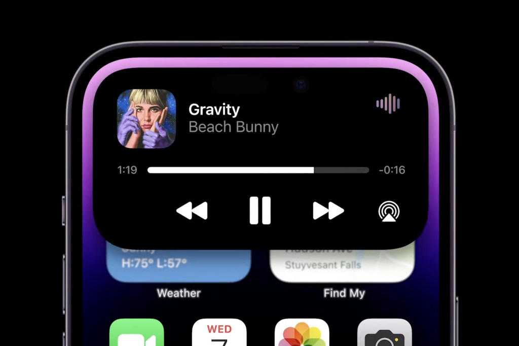
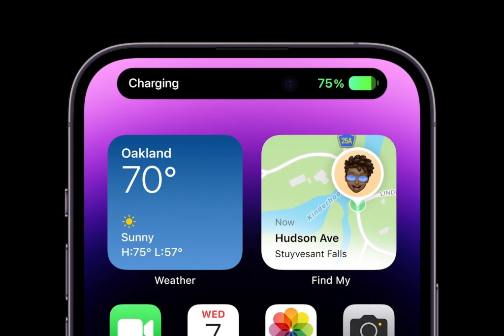
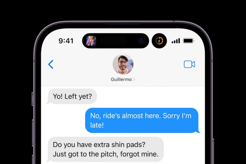
And what if your iPhone’s doing two background things, eh?
Then the Dynamic Island splits in two. You get a pill and a dot, judging by Apple’s demo. It’s all very flexible.
In fact, all sorts of things can live inside the Dynamic Island, including cover art and icons. And because it’s dynamic, it uses as much space as it needs, whether that’s more width to helpfully nudge you about an important notification (a timer, say, or travel directions), or more height to provide you with controls to prod.
The system as a whole was designed to “clearly convey information and present content and controls without distracting from the app you’re in”. Apart from all those distracting animations, obviously.
So what happened to all the stuff behind the notch, then?
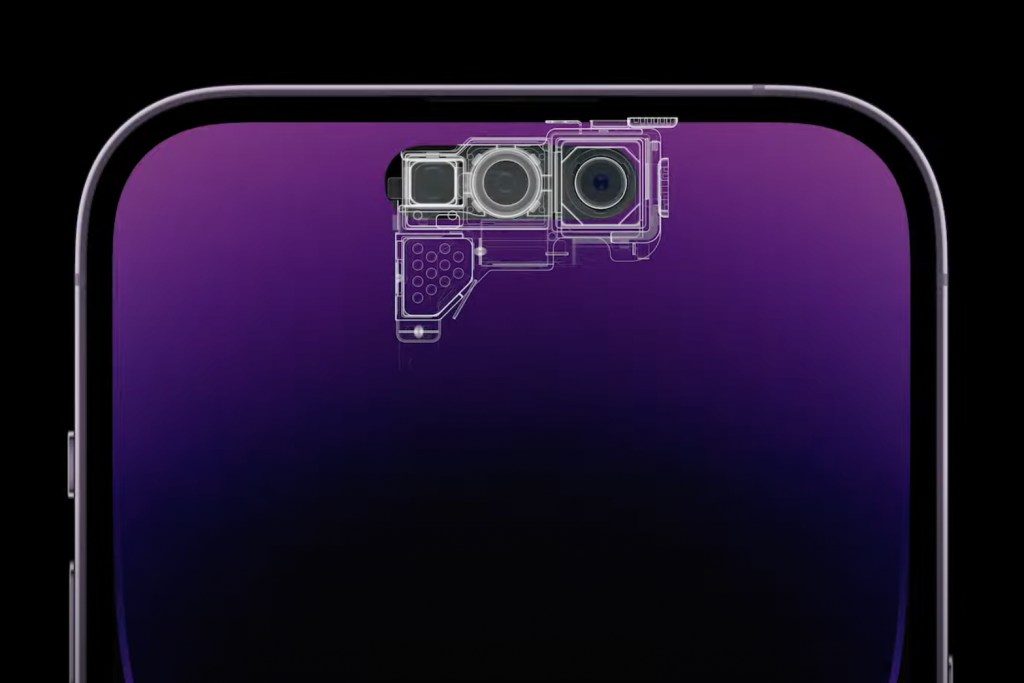
Some of it’s now behind the Dynamic Island, and the rest is behind the display. The redesigned TrueDepth camera now takes up less space and the proximity sensor is the bit behind the screen.
Presumably, after some wizard design sessions involving far too much sugar, the Dynamic Island in part arrived as a solution to further Apple’s goals at blurring the line between hardware and software – and then use the word ‘magical’ approximately four million times to describe the feature during a keynote.
Yes, but I’m a grump and now want to vote myself off this island. Or something.
Too bad. This is the future for iPhones. Presumably, the Dynamic Island will slowly work its way down the range until, eventually, even the iPhone SE has one, though the iPhone 15 is as low as it’s going to go for now. Although by then, perhaps the TrueDepth camera will have shrunk to a tiny barely perceptible dot from which notifications can explode with even more dynamism, like a Xenomorph erupting from John Hurt.
I’m already scared of technology. I didn’t need that image.
It’s OK. They mostly come at night. Mostly. So, er, use the Dynamic Island to keep an eye on sunset times. See? We said it was useful.
