Apple cannot rely on goodwill if the company does bad things
With more ads and questionable design, Apple risks alienating its biggest fans

People used to tell me I was a massive idiot for buying Apple kit. They still do. The main argument is it’s overpriced. For far less, I could buy rival hardware and with the savings secure enough Haribo to give a rhinoceros a sugar high.
I (mostly) favour Apple computers, phones and tablets, due to prioritising value over cost. Bar the odd wobble, Apple devices offer quality design, considered interfaces, cruft-free experiences, and taste.
But things change. Not with hardware. Recent Apple hardware is the best it’s ever been. It’s the broader experience that’s shifting. Not to the degree long-time detractors will bellow “TOLD YOU SO!” before hurling Android phones at my face. But the wobbles are getting… wobblier.
This year’s Apple betas have been an education. I’ve written about problems with Stage Manager, but that’s just a feature that hasn’t been thought through. A bigger concern are issues that are baked deep.
We’ve in recent years seen Apple eradicate colour from interfaces and become obsessed with hiding controls, making things harder for users. There’s a desire for everything to be the same, to theoretically ease transition between devices, rather than tailoring interfaces for specific hardware.
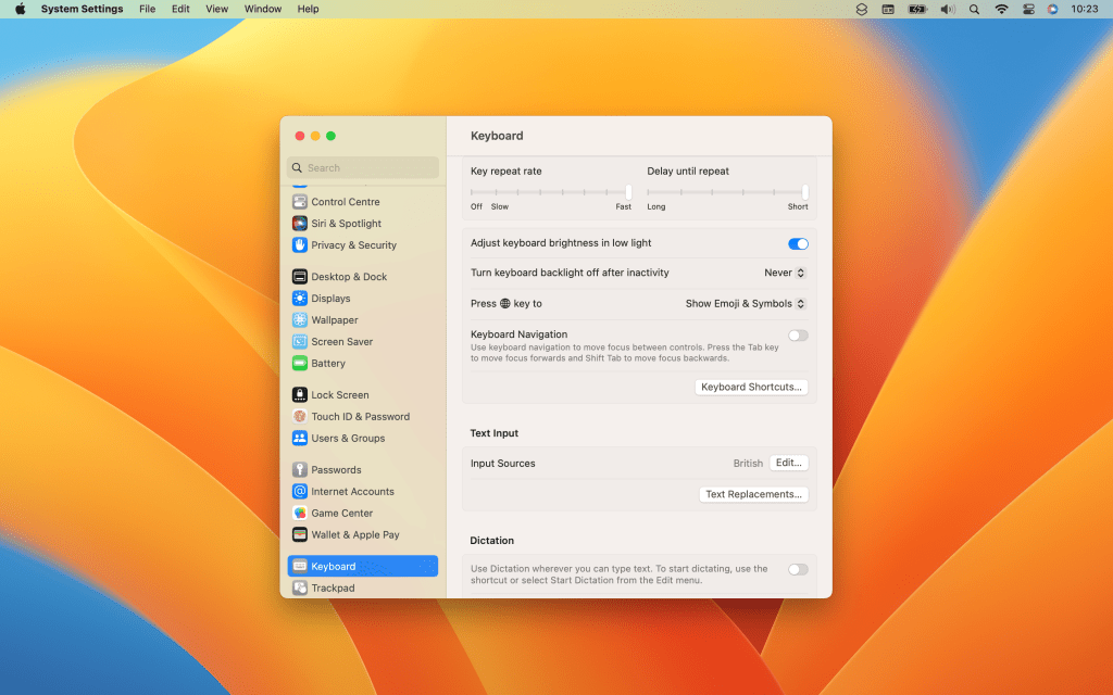
Apple’s System Preferences redesign in Ventura shows how all this can go wrong. Mac and iOS developer Jeff Johnson goes into the details on his blog, as does coder Niki Tonsky over on Twitter. Customisation options are missing. Layouts are a messy. Controls don’t act as expected. Options are harder to find. Keyboard navigation ranges from buggy to non-existent.

You might not care. After all, this is the Mac version of Settings. But it showcases an inability to get the finer details right – and Apple was always about that extra step. We’re now a long way from Steve Jobs saying “Design is not just what it looks like and feels like. Design is how it works.”
Why? In part, due to Apple’s desire to iPadify macOS. But maybe Apple lacks enough people who’ve spent years immersed in interface design, or powerful taste arbiters on its exec team. Or it could be something else.
Developer Steve Troughton-Smith thinks this blunder arrives from Apple’s shift to universal interface toolkit SwiftUI. He says the company’s unforgiving schedules leave it unable to pull off the transition without lowering app quality, and that the tech is “coming from the wrong place, and being pushed for all the wrong reasons”.
His key conclusion is SwiftUI is not product-first. So what is it? Money-first? If Apple can unify software, that lowers development time, which increases profits. But that’s starting with profit as a motive and working backwards, rather than doing something great that becomes profitable.
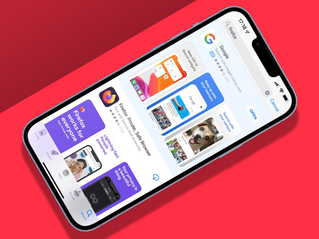
That might sound tinfoil-hat, but we see similar vibes in ads. Devices already have nags in Settings for Apple services, dev-hostile App Store ads that place rivals above directly matching search results, and display ads in News and Stocks. Apple is reportedly poised to expand App Store ads to Today view and – egregiously – single-app download pages. Rumours suggest Apple’s been testing ads in Maps, and media-oriented apps will soon allow publishers and creators to boost listings placement in return for payment.
“So what?” you might say – this is what others do. Google Maps has ads. Search engines put paid placements above organic results. But Apple is not supposed to be like them – that’s the point. It once invited people to ‘think different’; and although that was always in part veneer, that layer is eroding.
Regardless of questionable design decisions and aggressive advertising, Apple retains advantages: an unparalleled ecosystem; consistently premium hardware; unrivalled mobile apps. But the company’s position is precarious if it becomes more like its rivals – especially if rivals then shift towards the position Apple once occupied.
Apple should take stock, before paying a premium for its products looks like a bad deal rather than a justified cost.
