Apple MacBook Pro 13in with M1 (2020) review
We go Mac to the future with the M1 chip – but not this notebook’s design
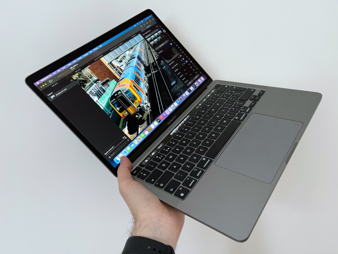
Like Apple’s other revamped late-2020 Macs, the 13in MacBook Pro looks identical to its predecessor. But there’s no longer ‘Intel inside’ – instead, you get the Apple-designed M1 chip.
This means the same ageing design and webcam. There’s no touchscreen, with Apple instead retaining its skinny Touch Bar above the keyboard. However, the M1’s said to make for a MacBook Pro that’s like a notebook gulping rocket fuel. Worth the upgrade, then?
Case and display: Design of the times
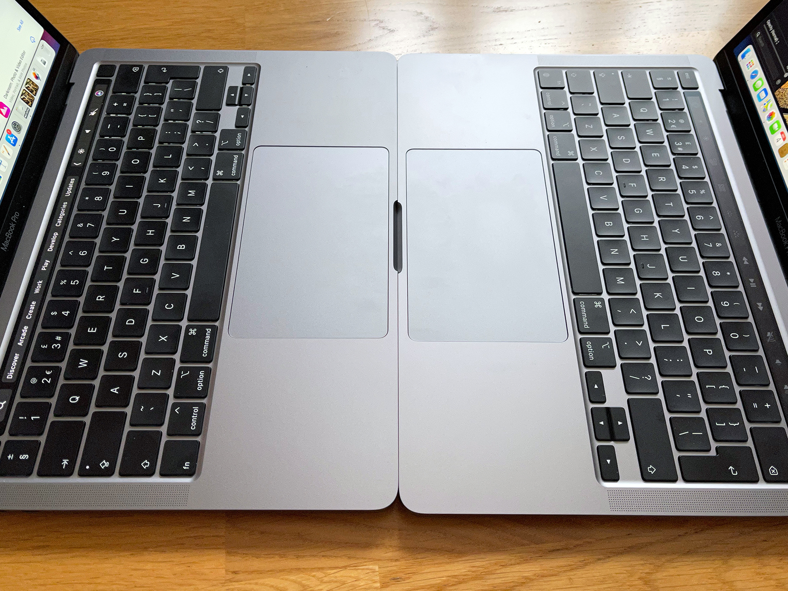
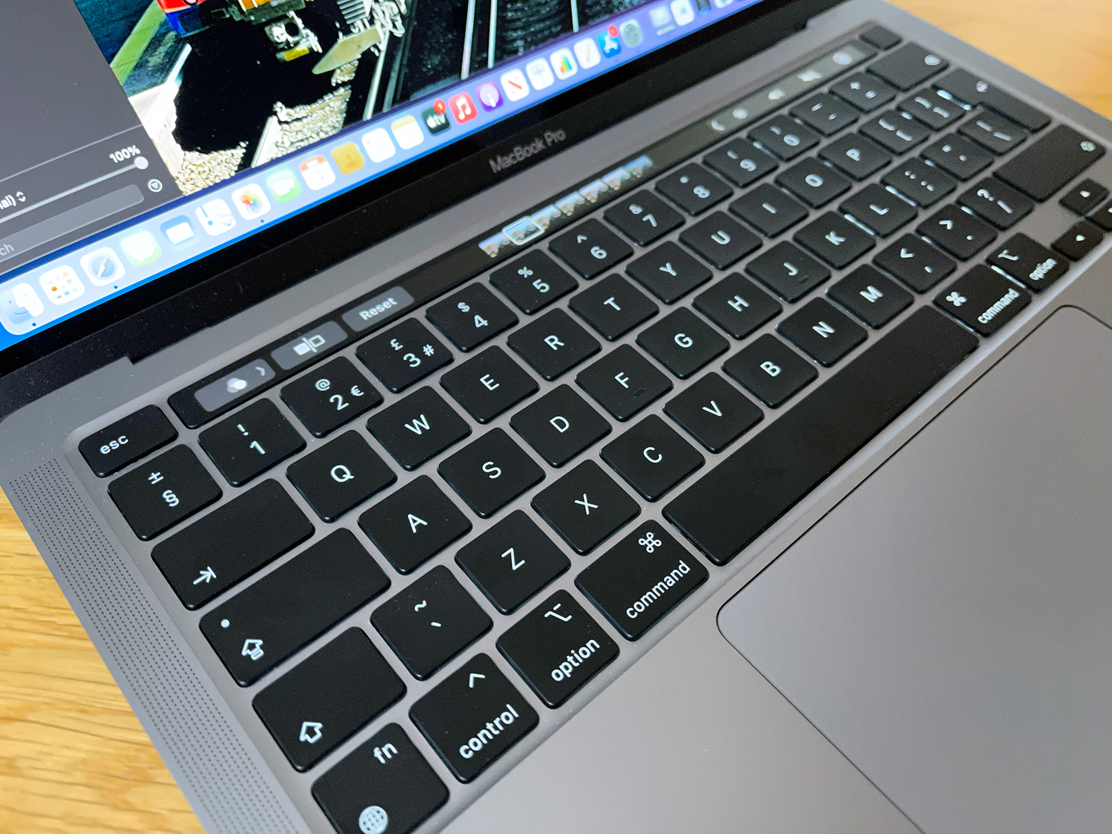
You won’t come to this Mac for anything new on the outside – although, fortunately, the design is more Porsche 911 than old rope. It’s sturdy and smart. The keyboard’s great. The trackpad’s the size of a smartphone. Could we do with smaller bezels? Sure – but the screen is pin-sharp, bright (more than the MacBook Air’s) and colour-accurate.
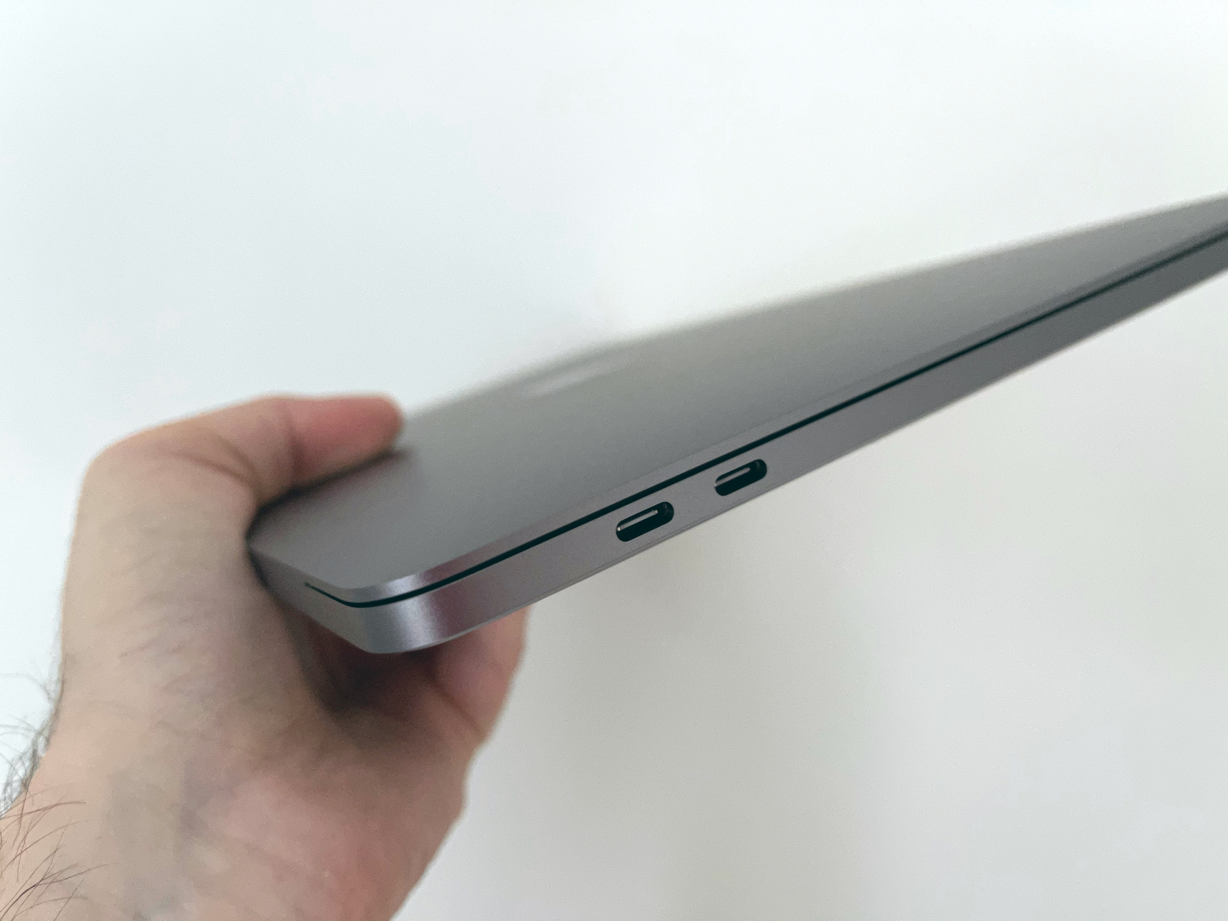
Apple reckons the mics and speakers are improved. Sound pumping from this notebook impresses regarding clarity and soundstage – although our review unit’s maximum output seemed quieter than that of our 2020 Intel MacBook Pro. The webcam is a bit ropey and getting only two Thunderbolt/USB 4 ports is a pity. Still, that matches the Mac this one replaces, and throughput has been boosted due to each port providing full bandwidth rather than the pair sharing a bus.
The Touch Bar remains divisive, sometimes usefully surfacing shortcuts (Logic Pro), but elsewhere getting in the way (changing volume; accessing Mission Control). And as we’ll outline later, it’s time Apple added a touchscreen.
OS and apps: mostly ’appy
M1 Macs run three different types of app: Universal, Intel and iOS. Universal apps can be blazingly responsive, but Intel apps are the big surprise. They require the (swift) installation of Rosetta 2. Thereafter, the experience is mostly seamless – largely because Rosetta 2 isn’t emulation. Instead it’s a translation layer that does a lot of translation ahead of time.
There are exceptions. Notorious laggard Avid hasn’t yet updated ProTools for Big Sur, and so it won’t run on M1 Macs. Parallels Desktop and other VM apps aren’t ready either. Adobe’s creative apps remain in beta. It’s therefore worth perusing M1-ready app lists to sanity check anything vital you rely on.
As for iOS apps, they’re a mess. Developers can opt-in; many haven’t. Given how they run, that’s fair enough. Games are often unplayable and apps handle poorly in terms of display (many have a fixed window size) and controls. Using the trackpad is sub-optimal; Apple’s Touch Alternatives keyboard shortcuts are worse. For simple interfaces (podcast player Overcast, say), the experience is OK, but if Apple is keen to get more touchscreen apps on to Macs, said Macs need a touchscreen.
Performance: blasting up the M1
We ran a lot of numbers, comparing our entry-level MacBook Pro with 8GB of RAM against a 2020 Intel i5 unit with twice as much memory. The results were surprising. In basic use – launching apps; browsing the web; typing; listening to music – both Macs were responsive and quiet. But under tougher conditions, the gulf between the M1 architecture and Intel’s became clear.
Geekbench, Cinebench and Ungine Heaven benchmarks embarrassed the Intel Mac, with the M1 blasting ahead. The newer Mac was quieter, its fan rarely firing, while the earlier Intel model sounded like a vacuum cleaner as its case heated up. With apps optimised for the M1, the contrast was stark. We tried Pixelmator Pro’s ML Super Resolution, which uses machine learning to enlarge photos. A iPhone 12 Pro Max snap was reduced to 1000px across and then upped to 5000px. The M1 was done in 15 seconds; the Intel Mac took over 100.
That was admittedly an outlier, but the i5 rarely won out elsewhere. Even Intel apps tended to be more performant on the M1. Korg Gadget played a complex composition with a slew of virtual instruments that brings our late 2015 iMac stuffed with RAM to its knees – but also troubles the 2020 i5 MacBook Pro. Compressing massive ZIPs on the M1 was faster, and video encoding found the i5 lagging.
Throughout, battery life impressed – around ten hours under general use, up a couple of hours on the older Mac. And the fan rarely came on, but it’s there when you need sustained power – something the M1 MacBook Air isn’t as capable of.
Intel? Decide!
Verdict: Apple MacBook Pro 13in with M1 (2020)
Apple’s November Mac event was packed full of Bezos graphs, vague comparisons and hyperbole. But the M1 really is a massive step forwards. However, is this new entry-level MacBook Pro right for you – and should you splash out 200 quid to bump up the RAM to 16GB?
That upgrade will give you headroom, which you should consider if you hang on to Macs for years or work a lot with video or complex multi-layered high-res imagery. If not – and this isn’t something we thought we’d say in this review – you’ll be fine with 8GB, due to the M1’s smart architecture.
But should you go for this Mac or the MacBook Air? That’s a tougher choice and again depends on how you use Macs. If you spend your time in Safari, Music and Mail, you won’t see much benefit for the extra £300. If you need high-level sustained performance, this entry-level MacBook Pro is a solid buy – and staggering when you think this will be the least powerful M1 MacBook Pro Apple will ever release.
Tech specs
| Screen | 13.3in Retina 2560×1600 with P3 and True Tone |
| Processor | Apple M1 |
| RAM | 8GB–16GB |
| Storage | 256GB–2TB SSD |
| OS | macOS Big Sur |
| Connectivity | 802.11ax Wi-Fi 6; Bluetooth 5.0; 3.5mm headphone; 2×Thunderbolt 3 (USB 4) |
| Dimensions | 30.41×21.24×1.56cm; 1.4kg |
Stuff Says…
We’d love two more Thunderbolt ports and a redesign, but colour us surprised the entry level MacBook Pro has this much to offer.
Good Stuff
Speedy and responsive
Display remains first-class
Battery lasts for ages
Mostly whisper quiet
Bad Stuff
Design starting to age
Limited connectivity
Webcam isn’t that great
Dare we say it: no touchscreen


