Nothing Phone 2a review: back to basics
The Nothing experience, distilled down and as appealing as ever
Stuff Verdict
Strips the Nothing experience back in the name of affordability, while keeping everything that made previous efforts so distinctive. Phone 2a is fun, fully featured, and phenomenal value.
Pros
- Distictive new take on Nothing’s signature styling
- Solid performance and consistently great battery life
- Very capable cameras for an affordable phone
Cons
- A few features haven’t carried across from Phone 1
- Simplified Glyph lights don’t have quite the same impact
Introduction
The brand behind some of the most distinctive affordable smartphones of recent years couldn’t really play safe with its latest effort, could it? The Nothing Phone 2a is dramatically different from it’s predecessors, and is all change on the inside as well.
Polycarbonate takes the place of metal and glass, MediaTek provides the power now, and those glorious Glyph lights have been streamlined to keep the price in check. The result is a handset which, at £319/€349, majorly undercuts value champs like the Google Pixel 7a and Samsung Galaxy A54. A OnePlus 12R costs twice the price. It neatly replaces Phone 1 as the baby of the Nothing line-up, with Phone 2 carrying on as the affordable flagship.
Good design may be subjective, but after a few weeks of testing, I can’t deny Phone 2a is an absolute banger of a bargain blower.
How we test smartphones
Every phone reviewed on Stuff is used as our main device throughout the testing process. We use industry standard benchmarks and tests, as well as our own years of experience, to judge general performance, battery life, display, sound and camera image quality. Manufacturers have no visibility on reviews before they appear online, and we never accept payment to feature products.
Find out more about how we test and rate products.
Design & build: the new Nothing
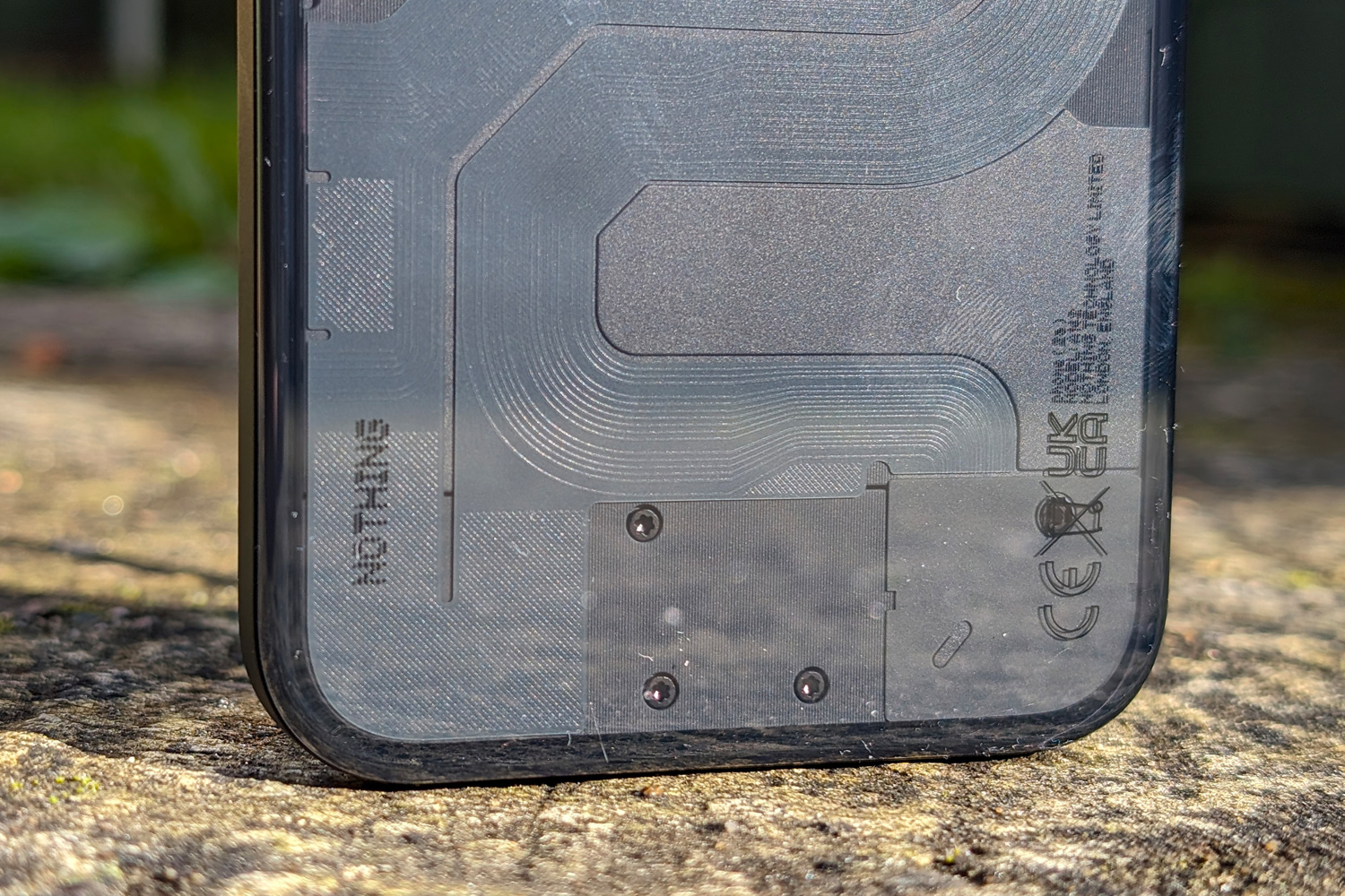
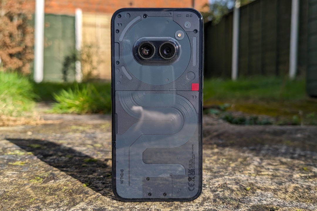
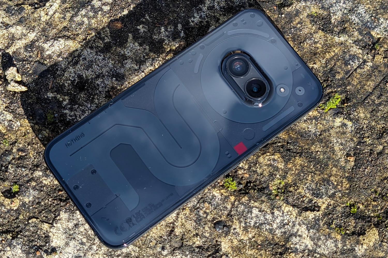
The see-through styling remains, but Phone 2a is quite the design departure from Nothing’s previous efforts. Apparently the new look is closer to the firm’s original design sketches for Phone 1, with snaking circuit boards inspired by the New York subway map and twin camera lenses that sit in the middle, like a staring pair of eyes.
Part of the clear polycarbonate bulges out to meet them, helping keep the phone steady when laid face up – although doing that means missing out on the simplified Glyph lights. There are just three sections now, which I think lessens the overall impact, but functionality is largely the same: as well as flashing for incoming calls and app notifications, the LEDs can act as countdown timers, indicate phone volume, and even show how long until your Uber driver arrives. Nothing has opened up its dev kit to third-party apps, too, so I’m expecting wider support later down the line.
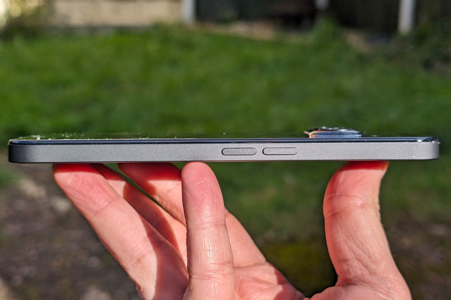
I’m a big fan of the way the rear panel wraps into the central frame; it lets the phone sit comfortably in your hand with no sharp edges. The frame itself is matte polycarbonate, which is wonderfully grippy. There’s aluminium underneath for rigidity – fully recycled, of course – and some some welcome extra heft. Anyone who says a phone needs glass and metal to feel premium needs to try one of these.
There’ll be three colour options at launch: black, white, and a cream-like middle ground. Like Phone 2 and Phone 1 before it, I think Phone 2a looks best in lighter colours, as the internal components are easier to see.
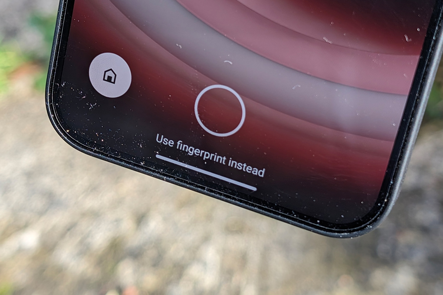
The whole thing is IP54 splash resistant, which is a decent showing for an affordable phone. It’s also packing an under-display fingerprint sensor, which was speedy enough to recognise my prints. Face unlock is also on board, but isn’t secure enough to use for biometric security in banking apps and the like.
Screen & sound: one size fits all
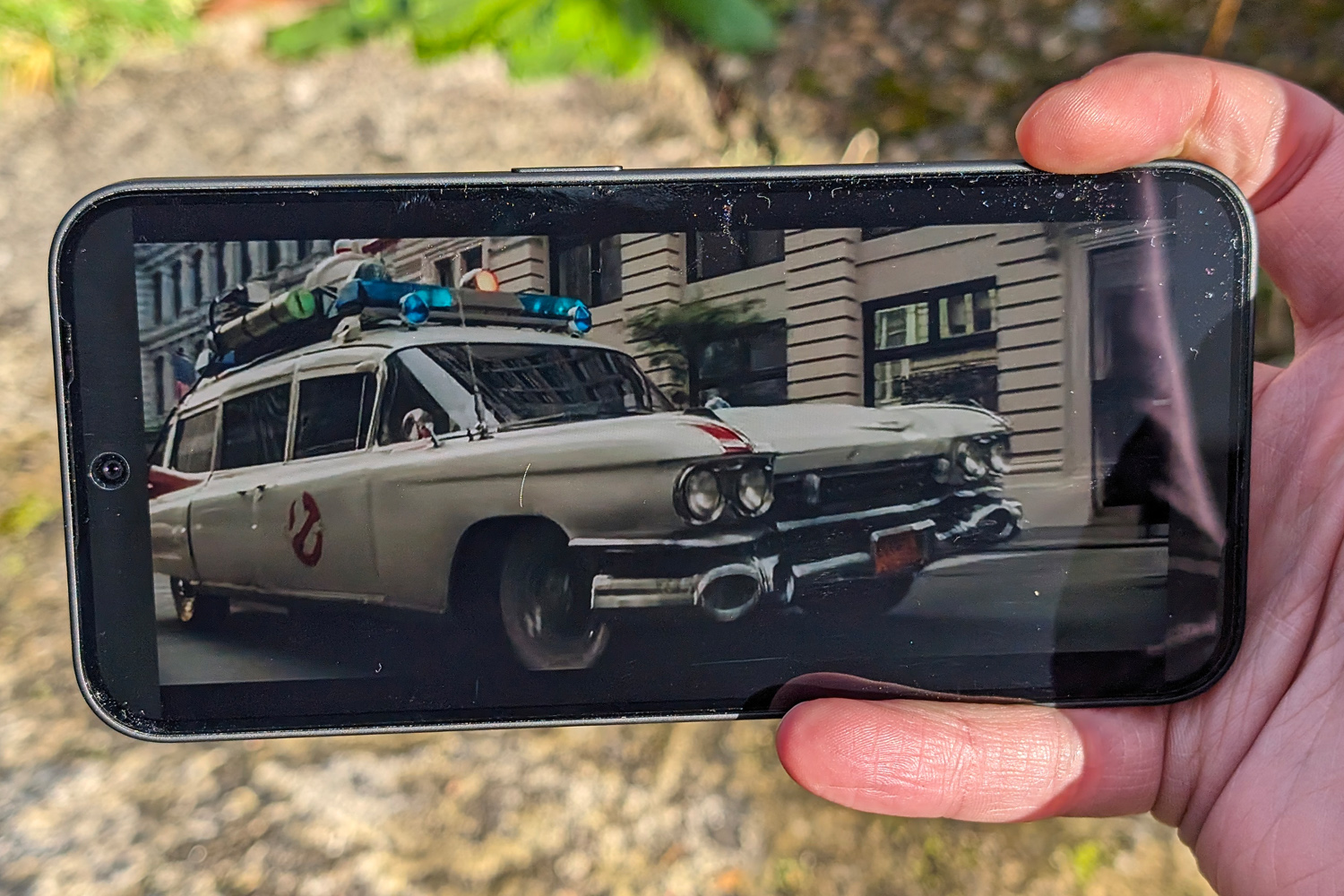
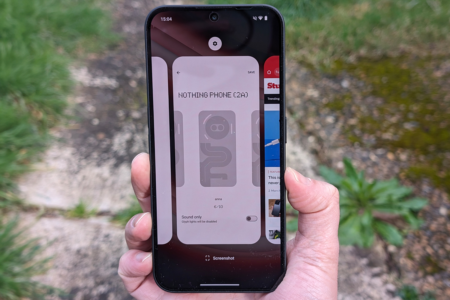
Phone 2a’s 6.7in display is of the flexible AMOLED variety, in order to get those bezels so skinny on all four sides. At just 2.1mm each, it makes for an expansive screen-to-body ratio of over 90%. The panel itself is flat with smoothed-off corners, in line with current flagships from Apple, Samsung and the rest.
It matches Phone 2 for screen space, but the panels are slightly different. There’s no LTPO tech here; the adaptive refresh rate only gets as low as 30Hz when showing static images. It still cranks up to 120Hz for smooth motion, and can be locked there if you don’t mind the minor hit to battery life.
Resolution is essentially the same (there are just a few vertical pixels in it), so even up close everything looks nice and sharp. Contrast is epic, as is the AMOLED way, and colours are wonderfully impactful. Perhaps too impactful in places? A quick trip into the Settings menu lets you swap to a more lifelike saturation, or tweak the colour temperature to your personal tastes.
Peak brightness is a smidge lower at 1300 nits, although it’ll only manage that in certain circumstances, like when watching HDR videos. It can’t match top-tier phones for light output, but I still thought Phone 2a was bright enough for outdoor use on particularly sunny days. For the asking price, there’s very little to grumble over.
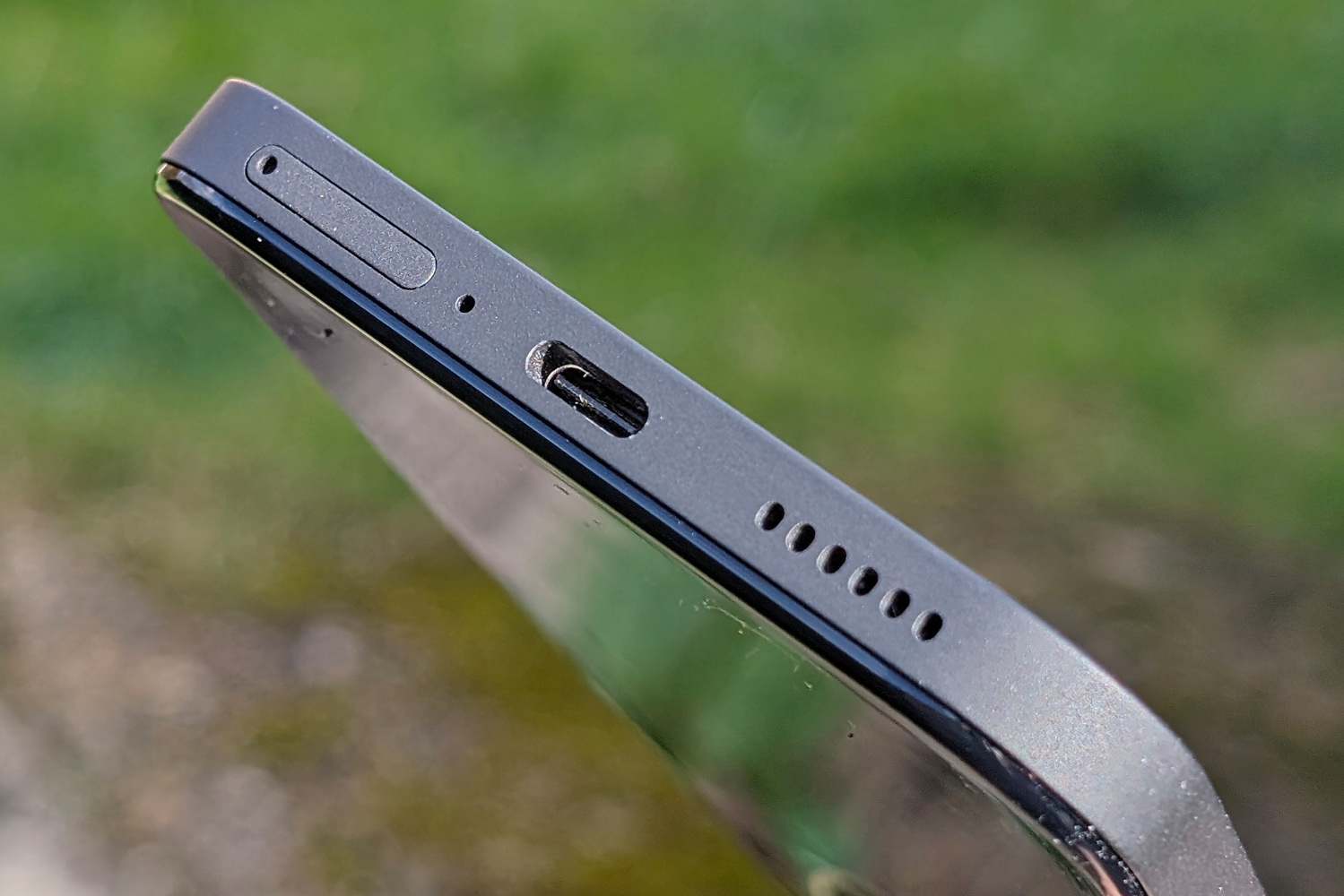
It’s a similar story with the speakers, which go for the familiar down-firing main driver and earpiece tweeter combo. There’s decent volume here, with a clean mid-range that works well for podcasts and spoken word videos. Things are a little tinny if you properly crank the dial, and there’s very little in the way of bass, but that’s also true of phones costing three times the price.
Cameras: dynamic duo
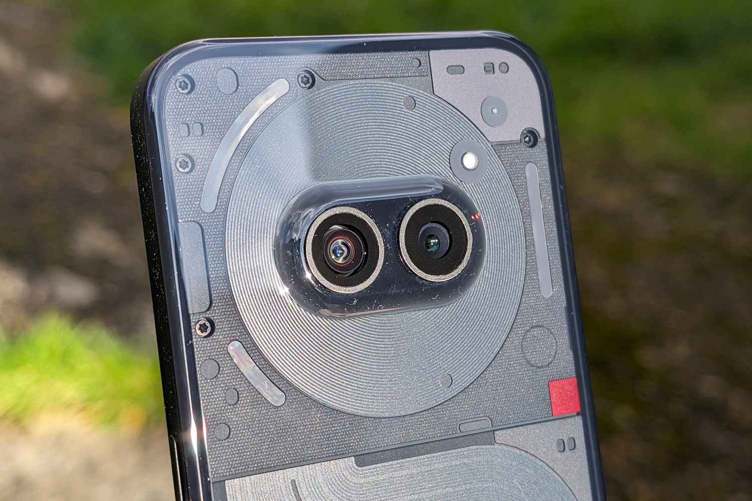
Stop me if you’ve heard this one before: a pair of rear cameras, each with a 50MP pixel count. Optical image stabilisation for the main snapper, a 114-degree field of view for the ultrawide. A 32MP selfie cam on the flip side. On paper, Phone 2 and Phone 2a have a lot in common.
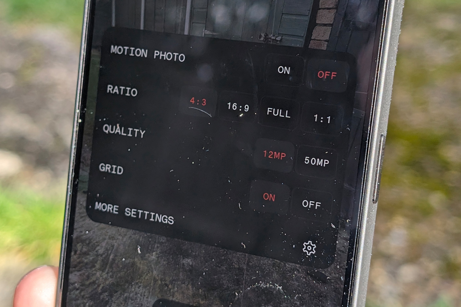
Only the front webcam uses an identical sensor, though. The other two are new for Phone 2a. They default to 12MP, with pixel binning using the extra info to boost fine detail, or you can swap to 50MP within the camera app’s menus and use the sensor’s full surface area. A 2x toggle uses sensor cropping for digital zoom that’s pretty effective during the day, and less so at night. Video recording maxes out at 4K/30fps, or 60fps at 1080p, and Google’s new Ultra HDR tech brings some extra dynamic range to your image gallery.
I’ve long thought Nothing’s image processing punches above its weight, and that feels true again here. The Phone 2a takes detailed, vivid and visually pleasing pictures, with very little in the way of image noise for a cut-price phone. Colours lean closer to Samsung’s saturated treatment than Google’s more neutral approach, while still largely staying true to life. Ultra HDR does wonders for dynamic range, although I thought it overcooked the highlights a little in places, most notably indoors. That was true of Phone 2’s HDR implementation, too. It’s nowhere near strong enough to ruin your shots, though.

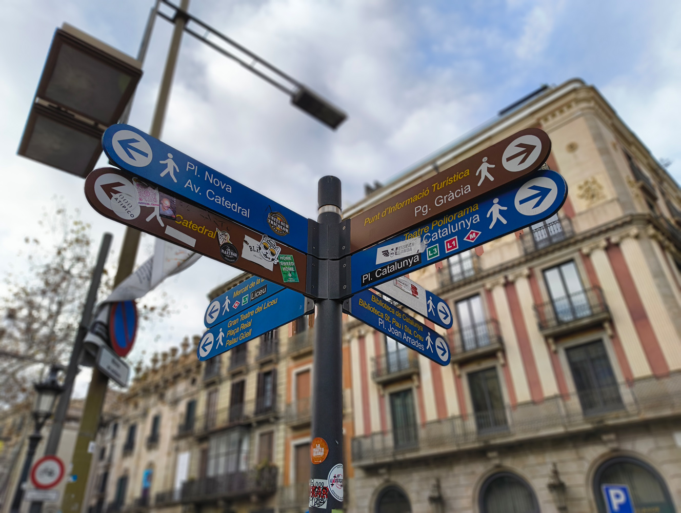

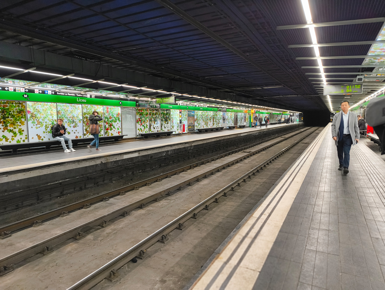
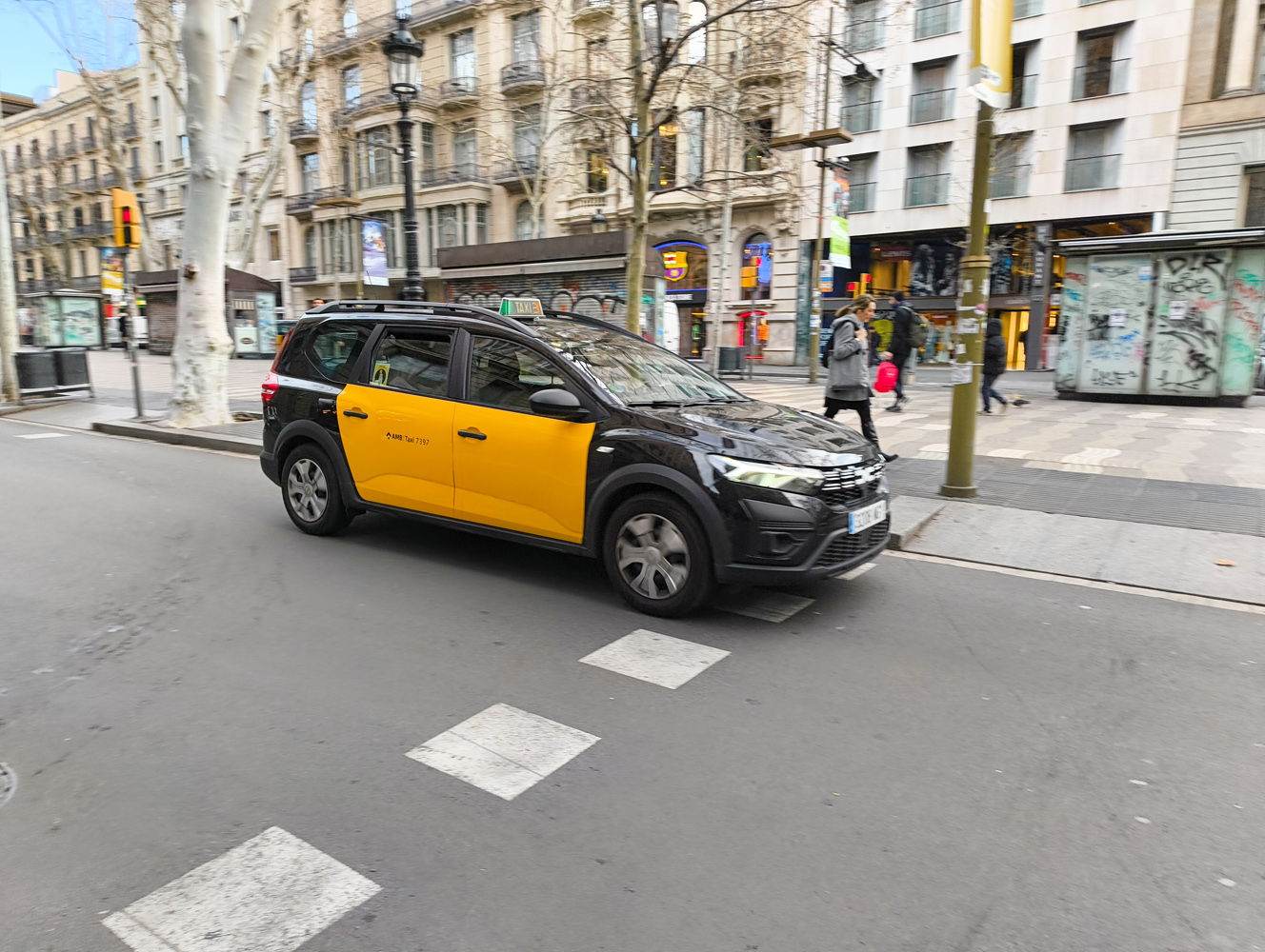


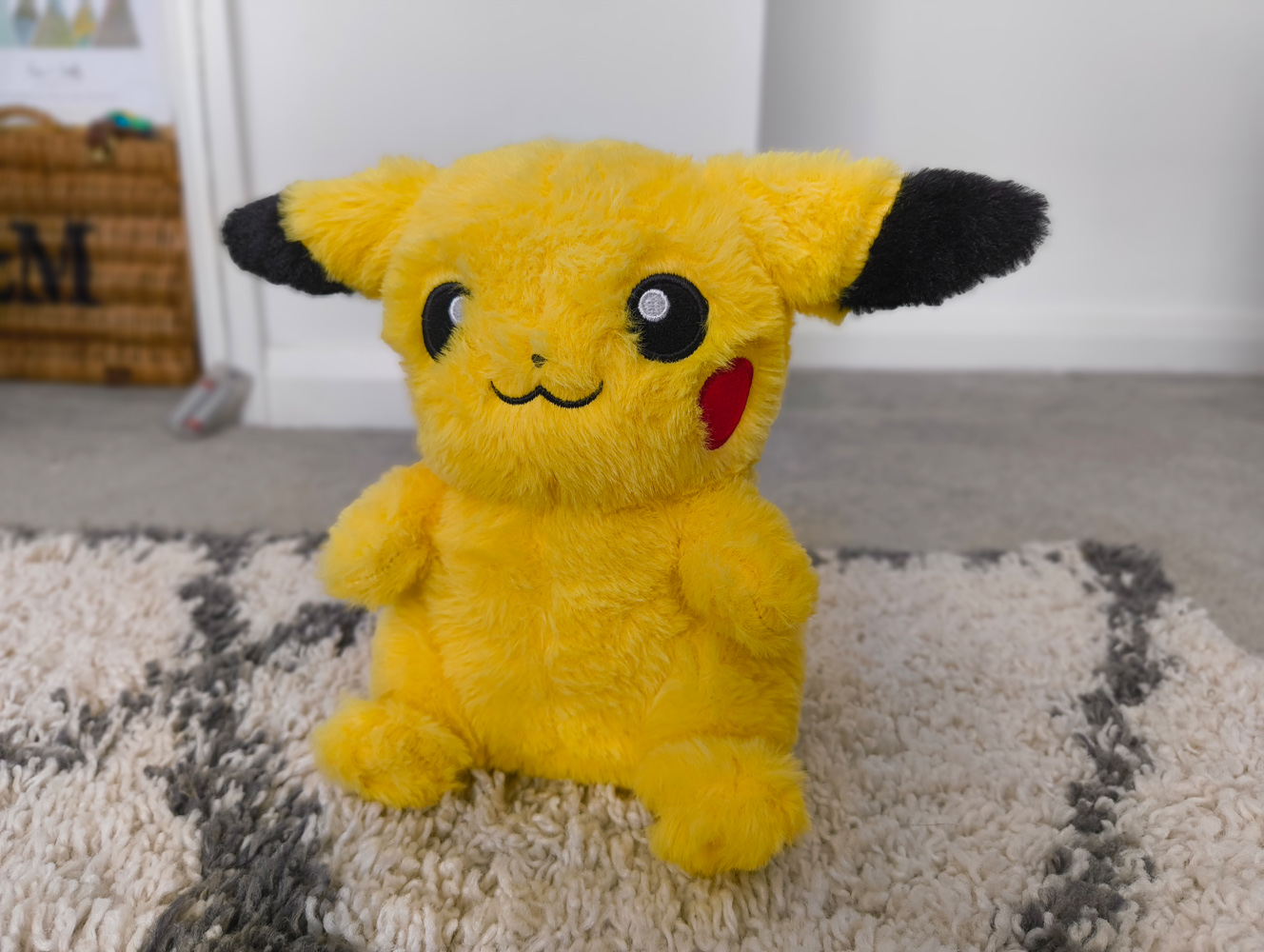
Low light performance is generally very good, as long as you stick to the lead lens; optical image stabilisation helps keep shots sharp, whereas the ultrawide has to rely on your hands being steady. It also goes overboard on the artificial brightening at times, making twilight snaps look like they were taken during daylight hours. Bright artificial lights can cause exposure clipping, too. Nothing remains a step behind the best cameraphones here, even among affordable models.

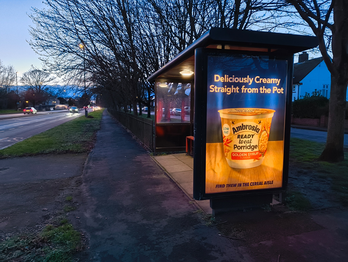
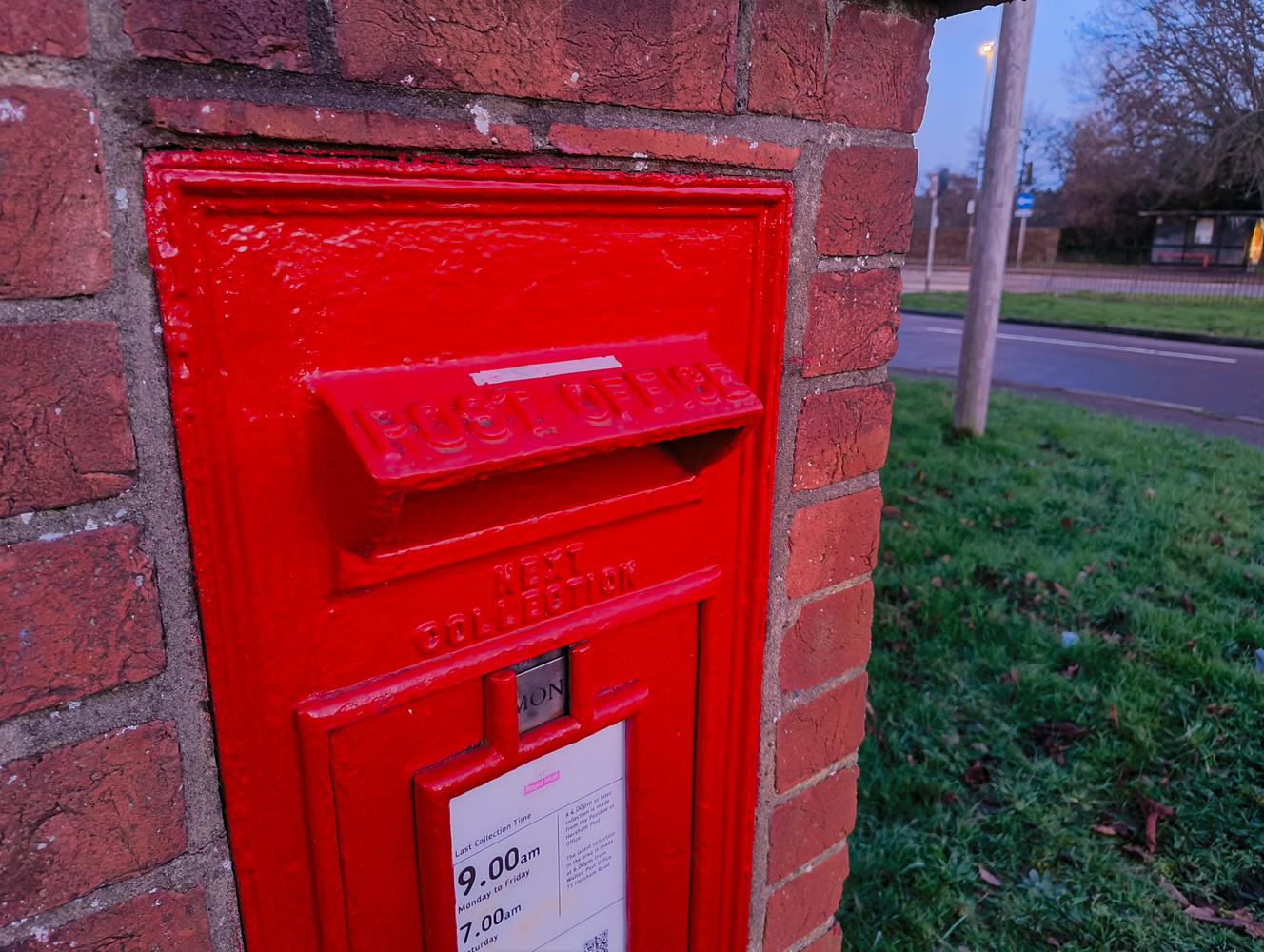
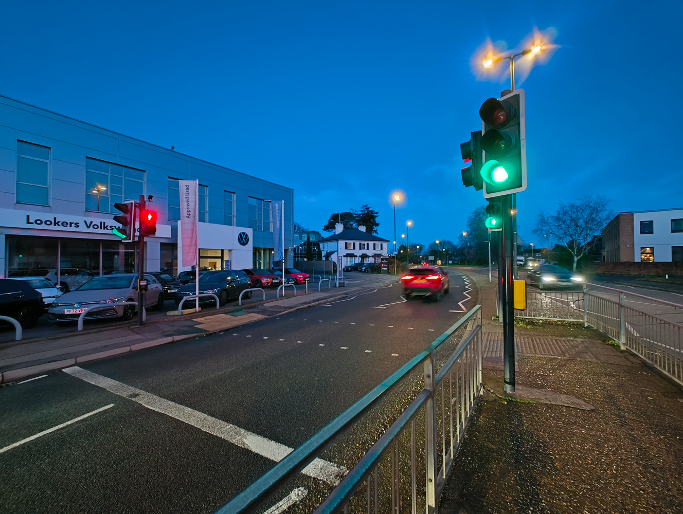
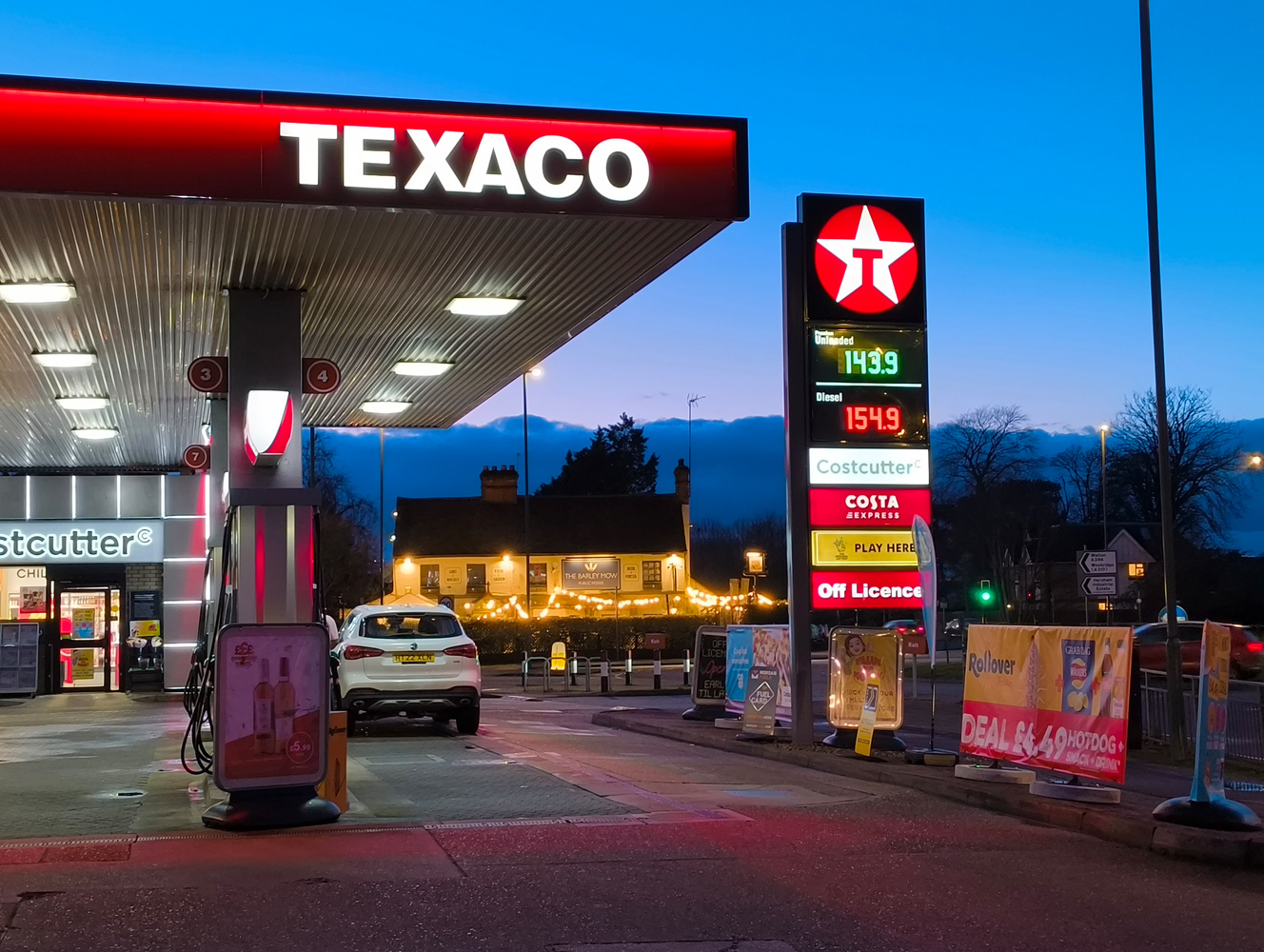
A Google Pixel 7a maybe has it beaten for overall clarity at 1x, regardless of lighting, and for sure takes the lead once digital cropping comes into the mix. But given the price gap, performance here is very good indeed. It’s great to see the ultrawide lens largely match the main camera for colour, exposure and dynamic range, too.
Keep in mind this is a modestly-priced phone and you’ll be pleased with its pics. Just don’t expect it to keep pace with alternatives that cost double the amount (or even more).
Software experience: wanting for nothing
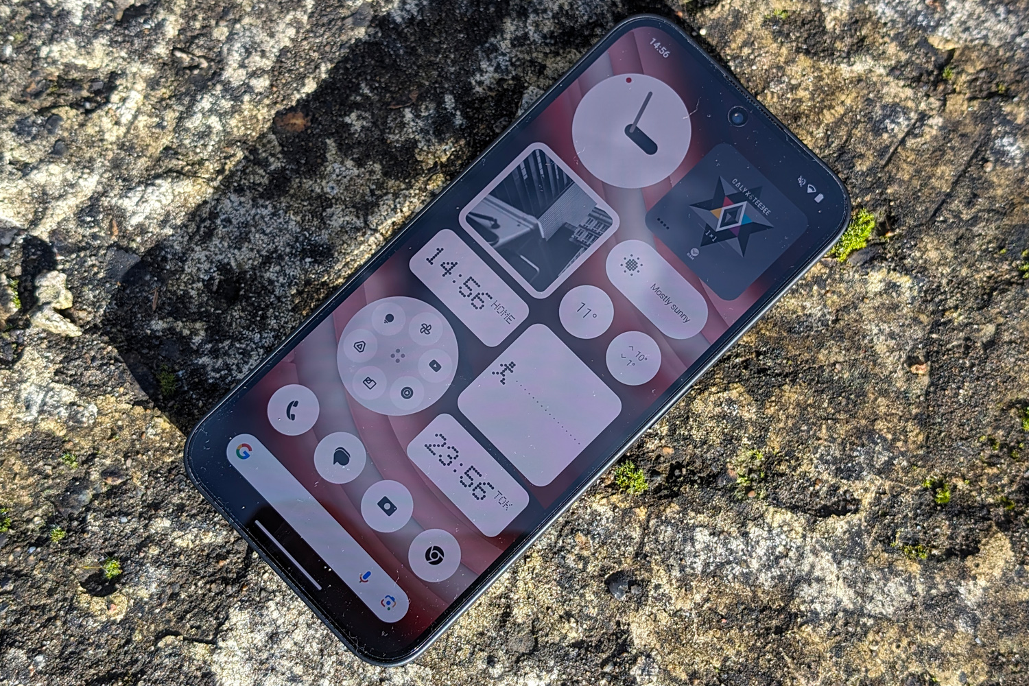
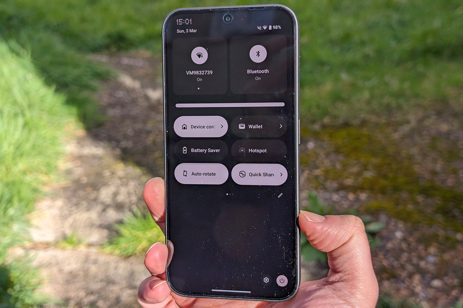
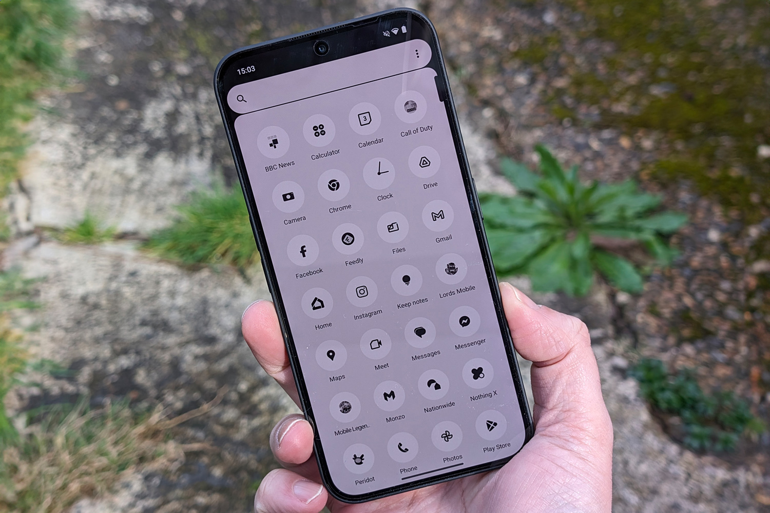
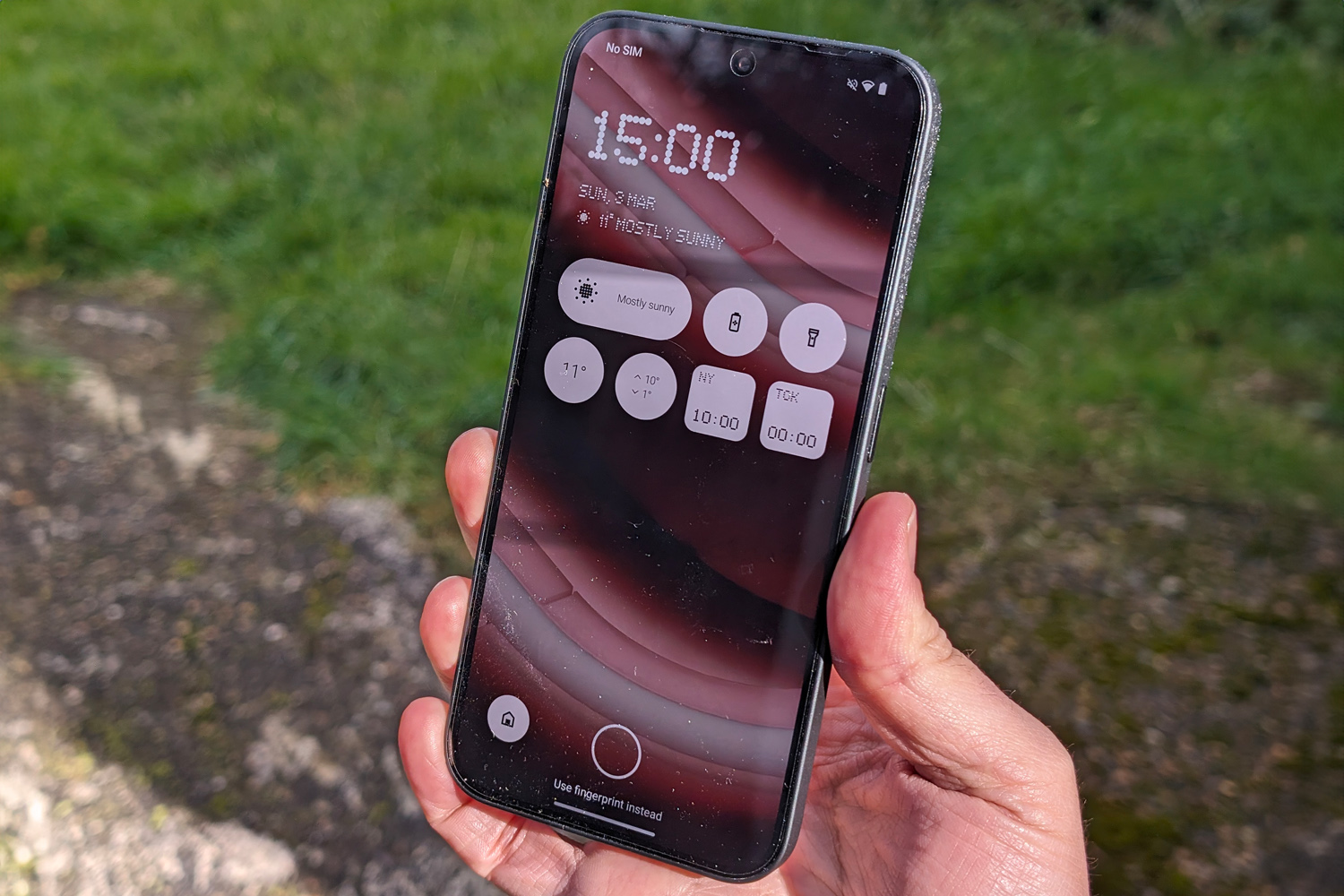
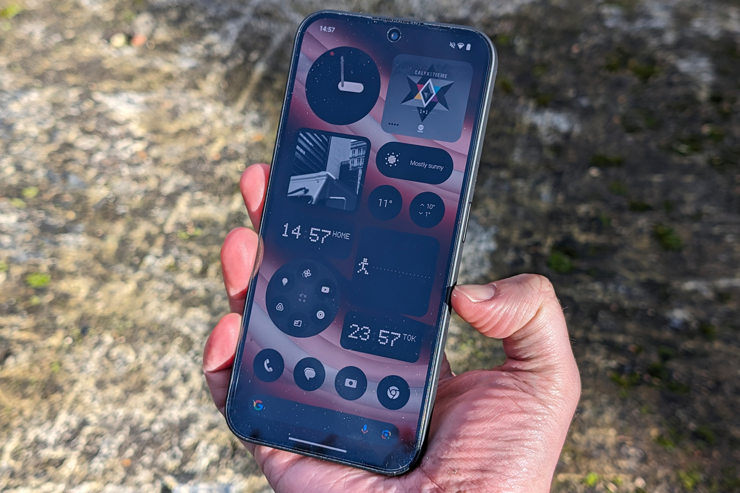
I used to hate custom Android skins; they massively overhauled Google’s stock UI but often overlooked the little things, like mismatched homescreen widgets or third-party app icons. Nothing OS 2.5 on last year’s Phone 2 convinced me otherwise, and it has only gotten better for Phone 2a.
There’s a design consistency here that you simply won’t find in any rival Android phone. Just downloaded an app that isn’t part of Nothing’s icon pack? No sweat, it can turn the icon monochrome to match. The lack of colour (and app labels) can make finding specific apps tricky if you fill your home screens with apps iOS-style, but the heavily customisable folders easily make up for it.
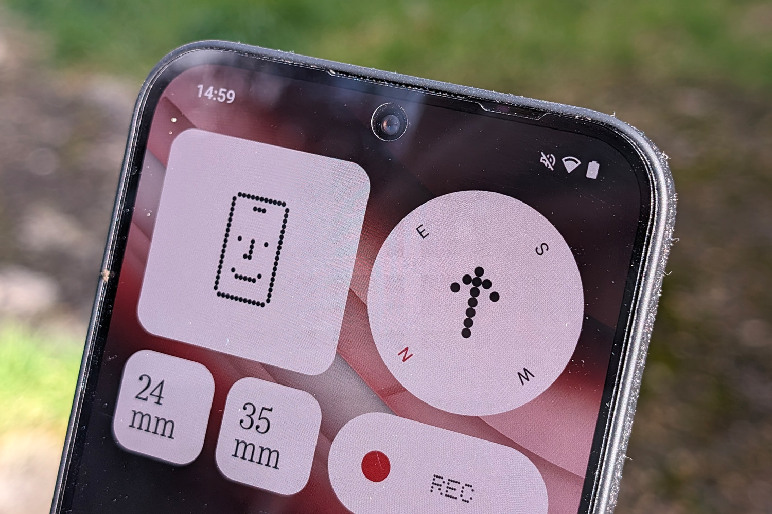
Every custom widget is consistent in its size, shape and styling – and there’s loads of ’em to choose from. Beyond the usual suspects, like the clock, photo album and weather forecast, there’s also a pedometer, screen time widget and compass. The camera shortcut lets you load specific aspect ratios, photo filters and zoom levels with a tap. The music widget is one of the slickest I’ve seen. For a fledgling phone maker, that’s damn impressive.
It’s still Android 14 underneath, with zero bloatware out of the box and Google providing the bulk of the preinstalled apps. The few Nothing-built apps include a voice recorder and the Nothing X companion app, for pairing Ear 2 and Ear Stick headphones. There’s also a bespoke take on Android’s new AI wallpaper generator, which can produce rather pleasing pics from very simple prompts.
Three years of Android version updates is generous for a phone this affordable; you’d have to step up to a Google Pixel 7a to get extended software support.
Performance: no slouch
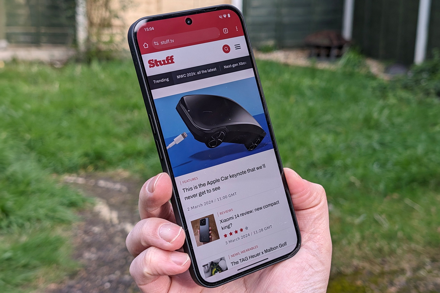
Phone fans are a fickle bunch. Nothing’s decision to use MediaTek silicon instead of a Qualcomm chip ignited the internet – but after weeks of testing, I can safely say Phone 2a won’t leave you wanting on the performance front. The Dimensity 7200 Pro at its heart outmuscles the equivalent Snapdragon in CPU benchmarks, and Android feels very smooth for such an affordable phone.
The “Pro” part of the chip name signifies Nothing has worked with MediaTek to fine-tune its power draw and optimise Phone 2a’s low-level software for solid, stutter-free performance. There’s also a Smart Clean function that’s meant to run every couple of days to keep things feeling snappy, but because it happens silently behind-the-scenes it’s tricky to verify.
OK, a pricier flagship is going to win in a drag race, but I had no problems using two apps in split view, or quickly swapping between multiple apps in full screen. There’s either 8GB of 12GB of RAM depending on the model (I had the 12GB version), and you can set up to 8GB of storage aside for virtual memory. Apps rarely needed to reload as a result.
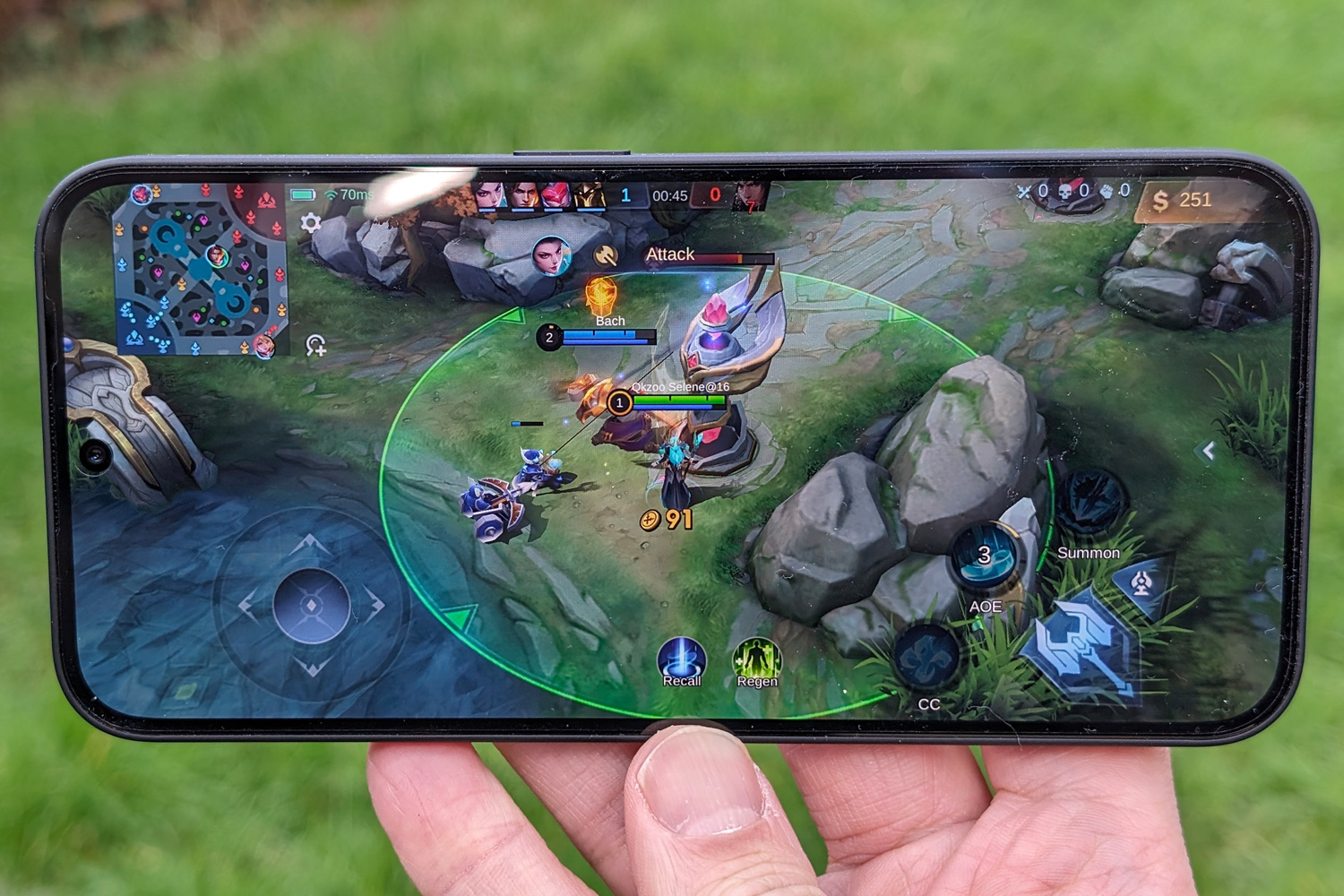
On the gaming side, most 3D titles defaulted to medium settings and were perfectly playable. I could bump Call of Duty Mobile up to high details without any obvious slowdown, even during hectic firefights, although it couldn’t reach the screen’s maximum 120Hz refresh rate. Still, simpler 2D games play perfectly. Serious gamers will want to consider spending more, but casual players will be right at home here.
Battery & charging: bigger and better
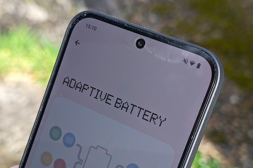
Nothing has squeezed a 5000mAh battery inside Phone 2a. That’s a great showing for an affordable phone, but especially impressive given the pricier Phone 2 makes do with a smaller capacity cell. It’s also powering a more mainstream CPU here, which translates to a very respectable time away from the mains.
I could last entire days of moderate to heavy use without dipping into the red, with only long gaming sessions and video recording putting major dents in my remaining juice. If you’re sparing with use, two days isn’t out of the question. I preferred not to cut back on my screen-on time, enable the always-on display, and force the screen to 120Hz for a smoother experience – which simply meant plugging in every night.
It charges at the same 45W as Phone 2, although you’ll need to provide the power brick yourself. That’s faster than anything Google, Samsung or Apple offers for the money. Only rivals from Redmi, Motorola and other brands out of China can deliver more volts in less time. I saw a 50% top-up in just 20 minutes, which is excellent.
I’m a little sad Nothing has ditched wireless charging. Its inclusion really set Phone 1 apart, at a time you’d otherwise have to spend flagship-level money to go cable-free. That said, this handset is a fair bit cheaper than Phone 1 was at launch; I’d rather have to reach for a wire when recharging than make do with a sub-par screen or crappy cameras.
Nothing Phone 2a verdict


Making a compelling phone is one thing, but selling it for an equally compelling price? That’s much harder – and yet Nothing seems to have a knack for it. Phone 2a is as fully featured as they come for this kind of cash, just as Phone 2 and Phone 1 were before it.
You’re getting a minimalist take on Android that has rival brands licked in the style stakes, on top of punchy performance, dependable battery life, and a capable set of cameras – if not ones that punch above their weight. Plus it comes wrapped in a distinctive shell that puts a simpler spin on Glyph lighting, and is even cheaper than Phone 1 was at launch.
I’m sure one or two hardware decisions will irk Nothing’s more dedicated fans, but the majority won’t even notice – especially when Google and Samsung’s ‘affordable’ alternatives now cost north of $450/£450. Anyone looking to spend less on their next phone will be pleased as punch with one of these in their pocket.
Stuff Says…
Strips the Nothing experience back in the name of affordability, while keeping everything that made previous efforts so distinctive. Phone 2a is fun, fully featured, and phenomenal value.
Pros
Distictive new take on Nothing’s signature styling
Solid performance and consistently great battery life
Very capable cameras for an affordable phone
Cons
A few features haven’t carried across from Phone 1
Simplified Glyph lights don’t have quite the same impact
Nothing Phone 2a technical specifications
| Screen | 6.7in, 2412×1084 AMOLED w/ 120Hz |
| CPU | MediaTek Dimensity 7200 Pro |
| Memory | 8/12GB |
| Cameras | 50MP, f/1.8 main w/ OIS + 50MP, f/2.2 ultrawide rear 32MP, f/2.2 front |
| Storage | 128/256GB |
| Operating system | Android 14 w/ NothingOS 2.5 |
| Battery | 5000mAh w/ 45W wired charging |
| Dimensions | 162x76x8.5mm, 199g |
