Apple iOS 11 review
They’ve turned it all the way up to 11 – at least on iPad
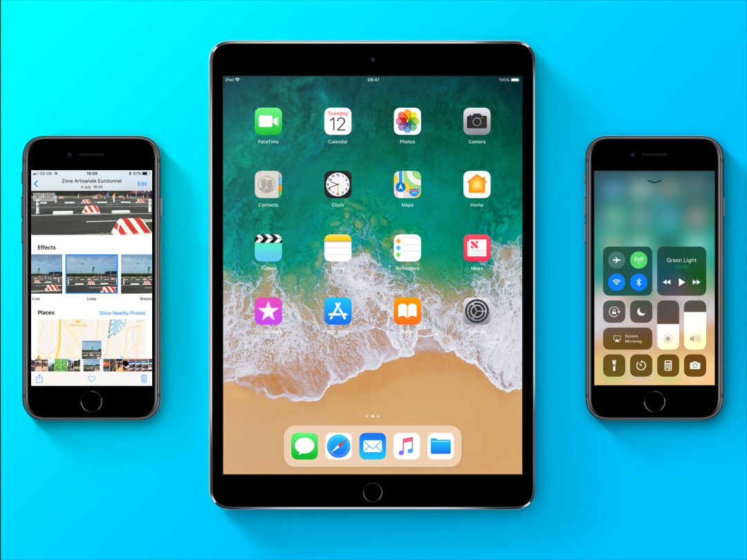
A giant step. A monumental leap. Apple’s not holding back in bigging up its latest mobile OS. And, as ever, there’s a list of new features as long as your arm – even if you had a super-stretchy arm you could dangle out of a third-storey window.
To pick some highlights, the iPad finally becomes a real boy (computer) with the new Dock, Files app, and drag-and-drop; and the iPhone gets into augmented reality – ideal when actual reality turns out to be rubbish.
Chances are many Stuff readers have already dived in. But if you’ve resisted temptation – or are terrified that installing iOS 11 will catapult your device into the heart of the sun – here are the most important bits of Apple’s latest and greatest, so you can come to a more rational decision…
iOS 11: Make it work
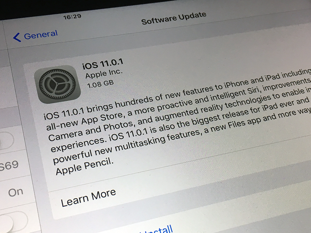
Apple’s good at supporting older hardware, but every year some devices don’t make the cut. Scroll to the bottom of Apple’s iOS 11 page and you’ll discover if it’s the end of the line for your pride and joy. (In short: sorry, iPhone 5 users, anyone with an iPod touch older than the 6th-gen, and iPads released before the original Air or mini 2.)
Even if your device is supported, plain sailing isn’t guaranteed. On an iPhone 6s, battery life feels like it’s been kicked in the face. It’s particularly terrifying to watch the percentage indicator plummet when using ARKit apps. That’s not to say you shouldn’t upgrade – avoiding doing so is a security risk; just know what you’re in for. On an iPhone 7 or 8, or any flavour of iPad from the Air 2 onwards, though, there are no such issues.
The upgrade process is nicely straightforward, whether done over-the-air, or when pretending the last decade never happened and plugging your device into iTunes. Do back-up before updating, though.
iOS 11: Design for the big screen
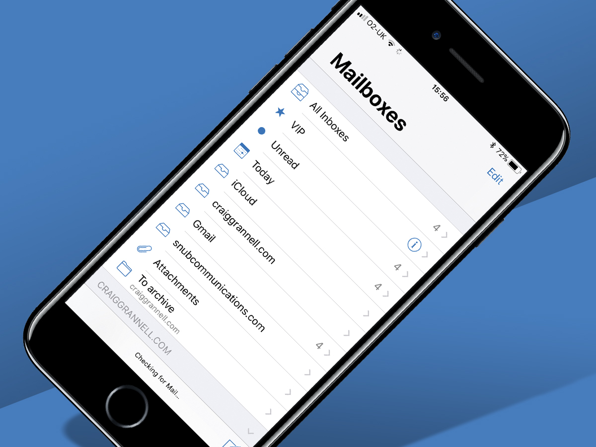
In design terms, you still get a grid of Home screen icons, although you’ll see changes in some apps once they’re launched. There’s a welcome shift towards more obvious affordances (textures/buttons), further distancing iOS from version 7’s over-the-top minimalism. And someone at Apple’s decided apps should have obnoxiously large headers you can see from across the street.
On iPad, you’ll also notice the Dock has changed. You can now fill it with over a dozen items, and it automatically stashes recent apps. More importantly, it can be accessed from any app by swiping up from the bottom of the screen. This is vital for iOS 11’s reworked multitasking.
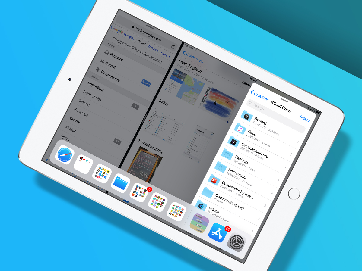
Now, instead of the dreadful Split Screen app picker, you drag an app from the Dock to set it in Slide Over; another drag plonks it in Split View. In theory, you can have three apps on the go at once – two in Split View and one in Slide Over – but setting that up is fiddly.
The app switcher has been overhauled as well. App thumbnails (including Split View pairings) sit alongside Control Centre. You can switch to any app/pairing with a tap.
iOS 11: Drag and drop
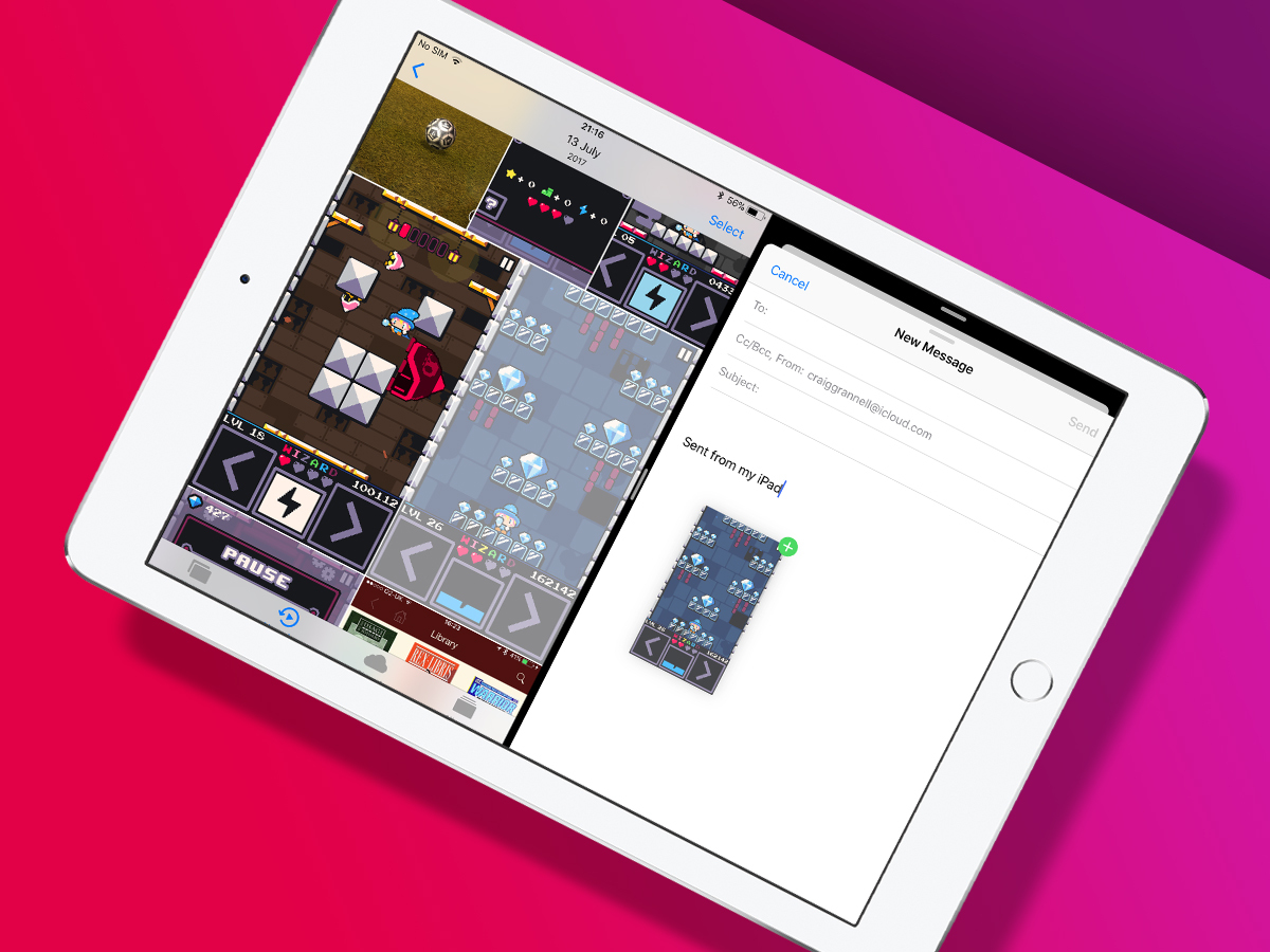
Drag and drop on iOS manages to help and hinder – but mostly the former. Tap-hold on most content (images; selected text; URLs) and you can drag it between apps in Split View, or on a less direct journey by way of the app switcher.
There’s even a stab at bettering desktop drag and drop, through adding items to an existing held ‘stack’ by tapping them – superb when grabbing a virtual pile of photos or files.
The flip side is drag and drop affects some other tasks. Opening a contextual menu from a link in Safari is an exercise in patience, because iOS 11 must wait and see if you want to drag the link somewhere else. And managing Home screen app icons has become weirdly fiddly. Also, iPhone owners get the short straw, with drag-and-drop only supported on the Home screen and in Files.
iOS 11: File management
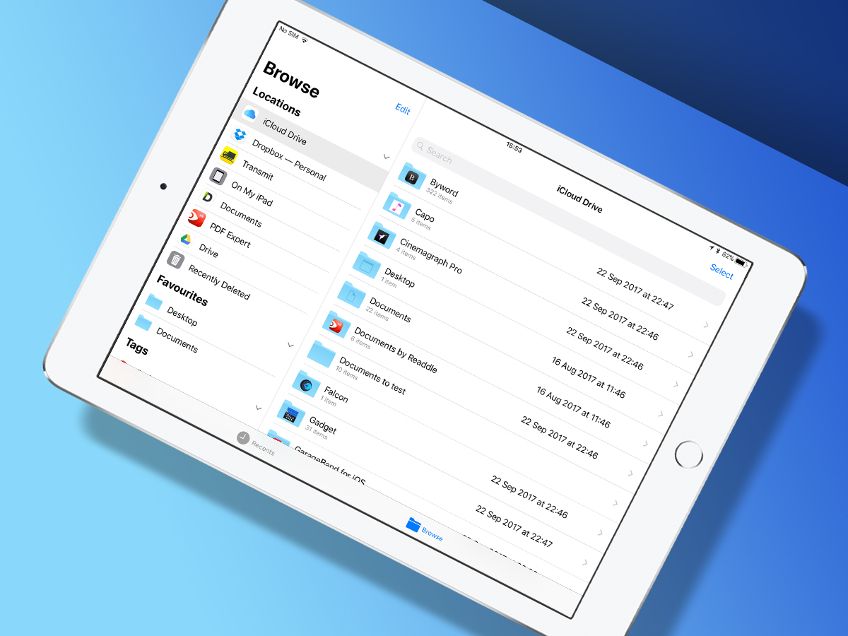
Ah, yes, the new Files app. This bit of iOS 11 feels distinctly ‘not Apple’ – and in a good way. That’s not because Apple’s recognised a file system is necessary (unlike in the iPad’s early days) – that ship sailed long ago. It’s because Apple’s decided other services can exist within Files on equal footing. Imagine!
On iPad, Files resembles a modern take on Finder. On the left are locations, tags and favourites, and on the right are your documents. On iPhone, you get a single-pane view, but the same functionality. Default locations include iCloud Drive and ‘On My iPad’ (individual app iCloud folders); but Files encourages you to add more.
Not every app’s ready – Transmit merely loads a pop-up window. But if you’ve a Dropbox, Box or Google Drive install, you’ll find those work seamlessly within Files. Add in drag-and-drop, tagging, and the means to set favourites, and Files means you’re now running low on excuses if someone suggests you do some actual work on your iPad.
iOS 11: Augment your reality
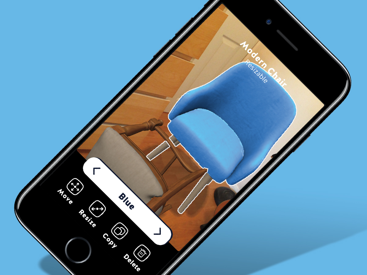
Augmented reality is Apple’s other flagship feature. This crack at merging the real and the virtual is all about reshaping your world – within the confines of your device’s screen. It needs an A9 chip or above to run, and is therefore restricted to the iPhone 6s/7/8/X families, any iPad Pro, and 2017’s iPad. It’s power-hungry, too, and so on older hardware will tear through your battery.
The tech, though, is impressive. Flat surfaces that apps can ‘project’ on to are rapidly discovered, and interacted with accurately. During testing, I had Carrot Weather‘s human-hating weatherbot hover menacingly in the corner, walked around platform game Flat Pack, hurled chairs about in Housecraft, and lobbed anti-gravity bananas in PCalc‘s bonkers About screen.
But these do come across like experiments, positioning augmented reality on iOS 11 as fun rather than essential. Perhaps it’s not meant to be the latter, but I get the feeling augmented reality’s waiting for a ‘killer’ app.
iOS 11: Finer details
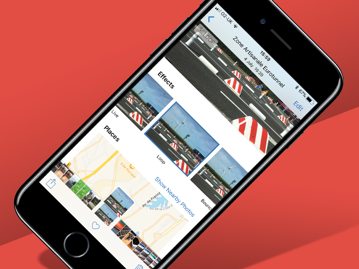
Smaller features throughout iOS 11 are a mite more practical, with a dash of creativity. You can now loop Live Photos and fake long exposures from such shots – although iOS sadly doesn’t get the big improvements Photos enjoys on macOS.
You can scribble over screen grabs when getting angry on Twitter about news articles, scan documents into Notes, and record your screen. (The last of those rather annoyingly whacks a red bar across the top of the screen, screaming THIS IS A RECORDING in your shared or uploaded videos. A pity.)
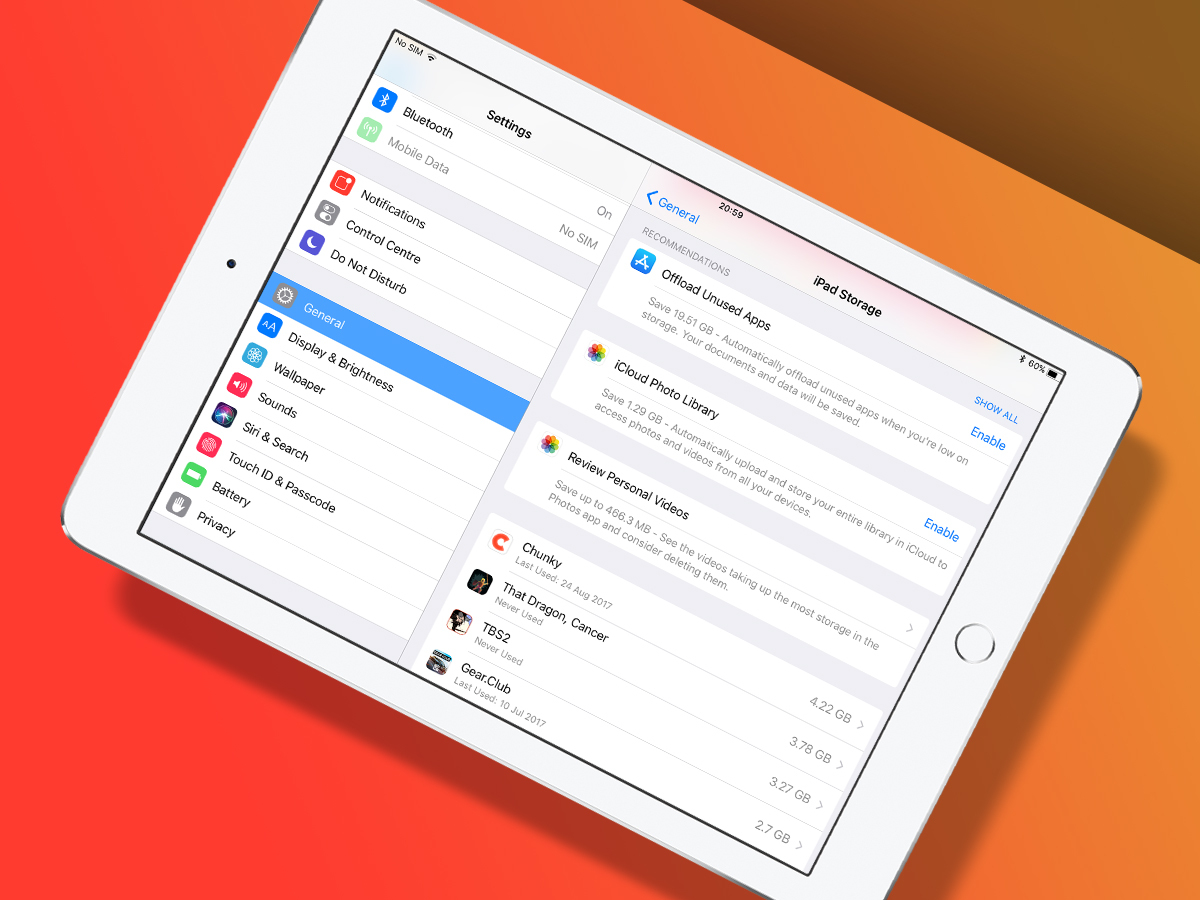
iCloud has a couple of very handy changes, in enabling you to share extra storage with families, and to offload entire apps. In the latter case, if you’re halfway through a 2 GB game but need space, you can bin the app but retain the data. As long as the game’s still on sale, you can later reinstall it and pick up where you left off.
Elsewhere: Control Centre can be customised; Siri lets you manually edit queries by when it inevitably mishears ‘Brighton’ as ‘banana’; there’s a proper ‘invert colour’ mode; and the iPad keyboard lets you get at extended characters with a downwards swipe over a key.
iOS 11 verdict: 11/10?
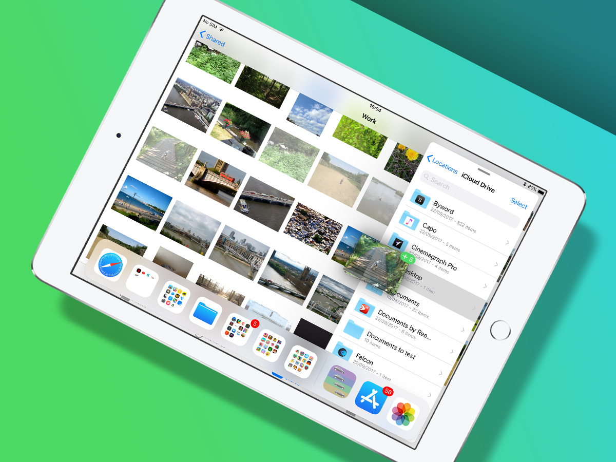
iOS 11 continues transforming iPad into a device recognisably suitable for productivity, and mostly without miring it in the complexity that drags down decades of desktop computing. Multitasking is greatly improved, the Files app is excellent, and although drag and drop impacts negatively on some areas of the OS, there’s no doubting its utility. In short, iOS 11 feels like a properly important and vital next step for iPad.
On iPhone, the pickings are slimmer. iOS 11 is certainly nice in many ways, but it doesn’t feel transformative. Perhaps that might change if AR becomes more than a way to play games that force you to get off of the sofa; but today it feels like a gimmick – albeit an entertaining one.
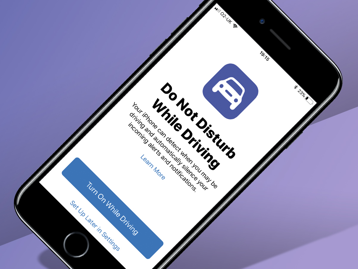
There are also areas in which iOS 11 doesn’t quite come off. Do Not Disturb While Driving aims to shut off your iPhone when you should be looking at the road. It’s a great idea, but the implementation sometimes attempts to stop you using your iPhone when you’re a passenger – even on a train. One Stuff writer remarked her iPhone turned the feature on when in a lift. I don’t have access to the Stuff legal team, but am pretty sure it’s legal to use an iPhone in a lift.
Still, there’s ambition here, notably in the tablet space, and the Stuff rating reflects that. Pretend you didn’t see the fifth star if you’re only rocking an iPhone though.
READ MORE › 11 things you need to know about the iPhone X
Stuff Says…
One small step for iPhone, but one giant leap for iPad. If you still don’t think the latter can be used for productivity, seek help.
Good Stuff
iPad changes are transformative
Files integrates with third-party apps
AR implementation is impressive
Bad Stuff
Drag and drop can slow other UI
Do Not Disturb While Driving can be a troll
iPhone very much comes off as second best


