Nextbit Robin review
A cloud-based phone to solve your storage woes?

Think establishing a big new name in the phone world would be impossible? Nextbit has something to say about that. Coming fresh of a gigantic crowdfunding wave, this is a company with a bit of a OnePlus vibe to it.
Hype plus great features and a good price is a powerful combo. Its USP is that this is a phone obsessed with backing-up to the cloud.
Selling for around £320, though, there are a few too many teething troubles to deal with right now.
Head in the clouds
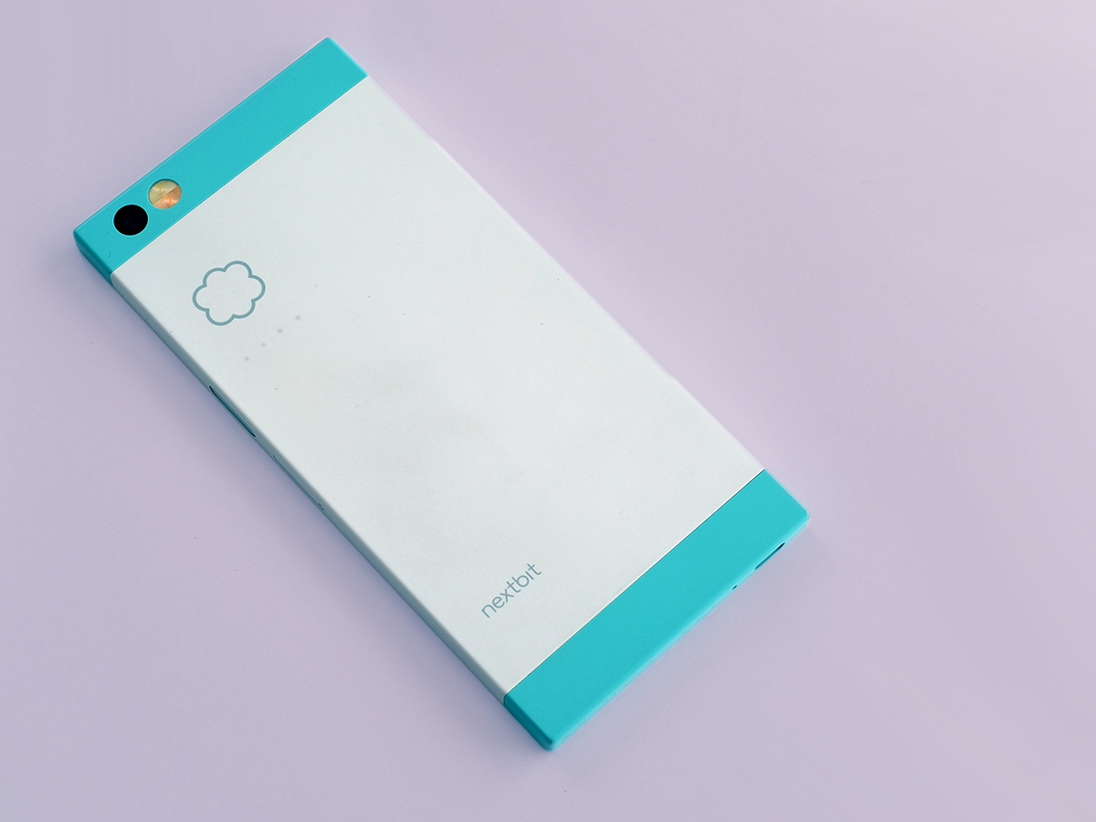
Read the blurb about the Nextbit Robin phone and you’ll see its USP is to offer a real cloud-led approach. What this basically means is that it backs up all your data to Nextbit Robin servers. Even though Google offers an awful lot of that anyway.
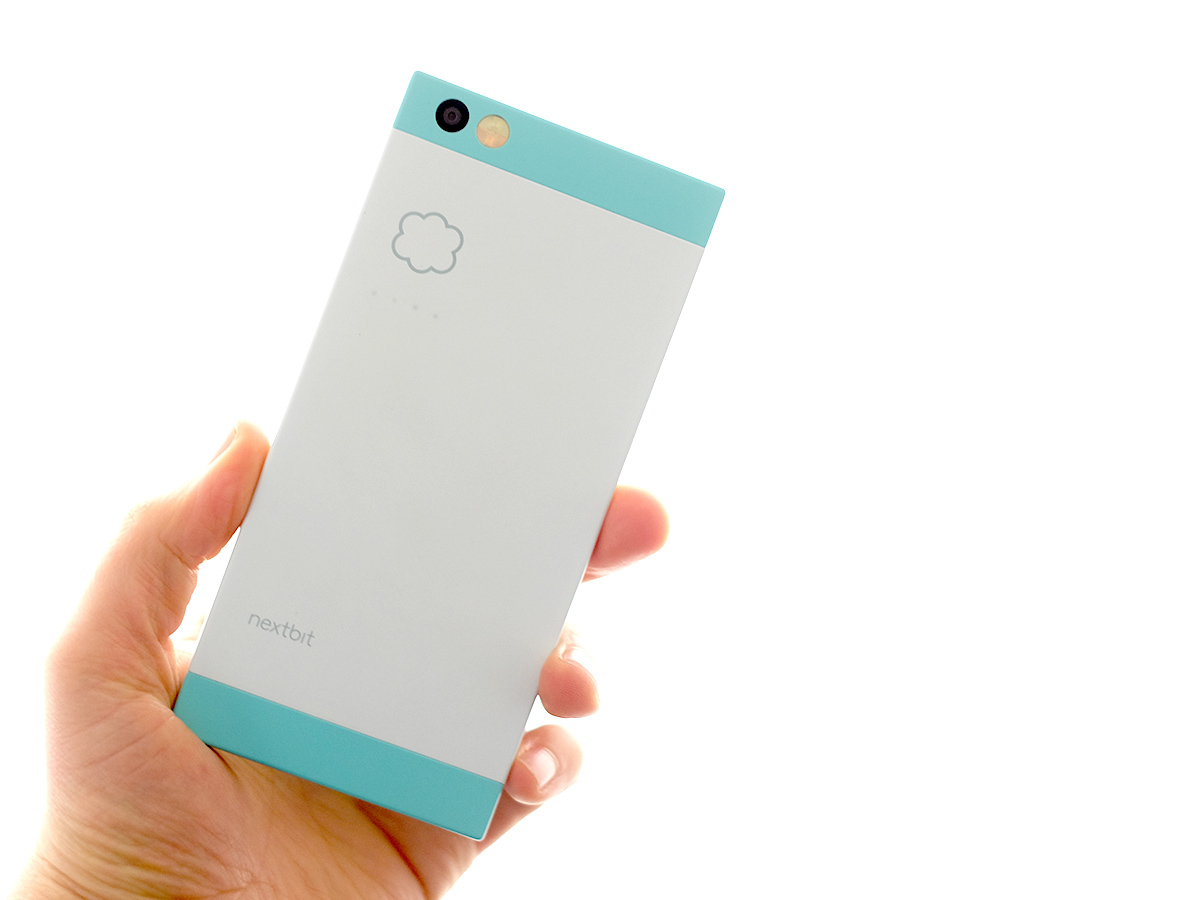
What seems to get more people who meet the Nextbit Robin excited is its design. Unusual colours and a cute look are sure to spark off some sort of reaction. And probably a good one.
I’ve been using the white/teal version, and its colours manage to use a pastel tone that seems cool. Rather than the phone equivalent of one of those house redesign shows where a couple of smug estate agent types fill homes with ‘feature walls’ to get some poor sap to pay an extra £50k for them.
The Robin also manages to feel expensive while being made of plastic, using tough-feeling soft touch polycarbonate. It’s a pretty-looking phone.
Super snapper › LG G4 review
Brick
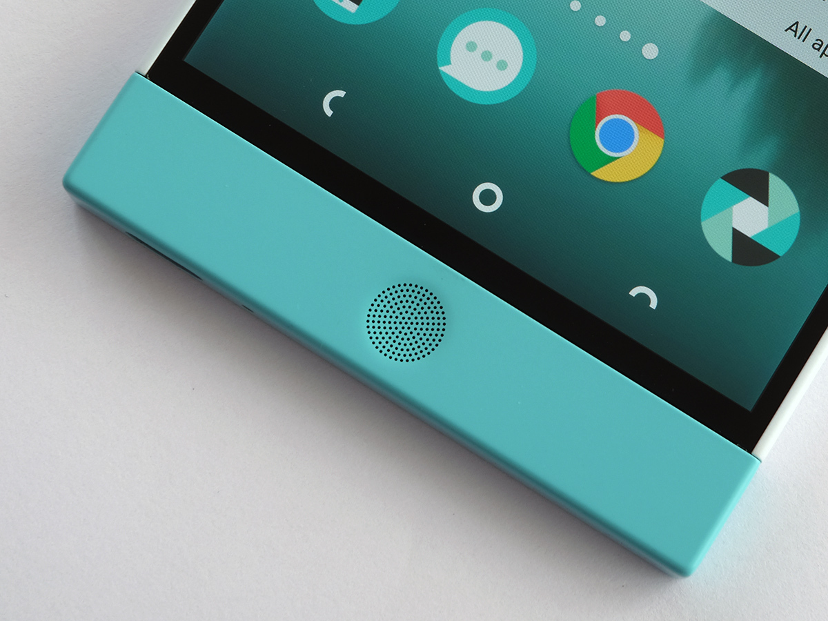
Not every part of the design is a smash, though. The Nextbit Robin is a 5.2-inch screen phone but seems much larger. It strikes me as more of a chunkster than the 5.5in Samsung Galaxy S6 Edge+.
This is down to two main things. First, the Nextbit Robin has a dead boxy shape. Square edges always make a phone feel relatively thick, where tapered ones can trick your hands into only really appreciating the thinnest point. This is the reason why I don’t love the larger Sony Xperia Z designs.
Then there are those big speaker outcrops above and below the screen. The large size is a design choice, not some odd drawing board mistake. It’s just not one I like that much.
Maybe the trade-off is worth it for some, because the Nextbit Robin does have some of the best phone speakers going. As well as being very loud, they have more mid-range muscle than most other phones out there. I have issues with this phone, but I have enjoyed its speakers a lot.
Special moves
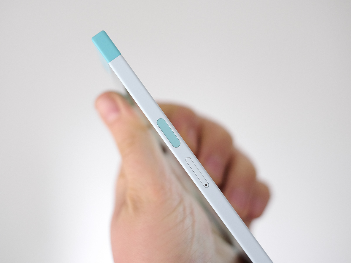
It also has hardware bits and bobs some phones at the price lack. I’m talking about a fingerprint scanner. It’s fast, accurate and sits on the side of the phone a bit like the one on the Sony Xperia Z5 Premium.
I find bunging a scanner on the side feels less intuitive and quick than one on the front or the back. Much like the design shape, I can appreciate what Nextbit Robin has done without being totally enamoured with it.
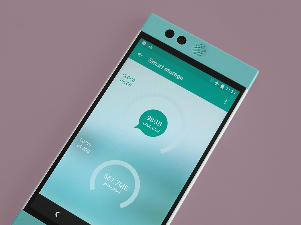
It has 32GB memory, which as someone who uses Spotify and Netflix rather than loading music and video files onto a phone, I would find more than adequate even without any of Nextbit Robin’s cloud shenanigans. You get just under 25GB to actually use, although for most of this test I’ve been using it with the several metric tonnes of content loaded onto the phone to show how it’ll work when fully loaded.
King of smartphones › Samsung Galaxy S6 review
Colours so bold
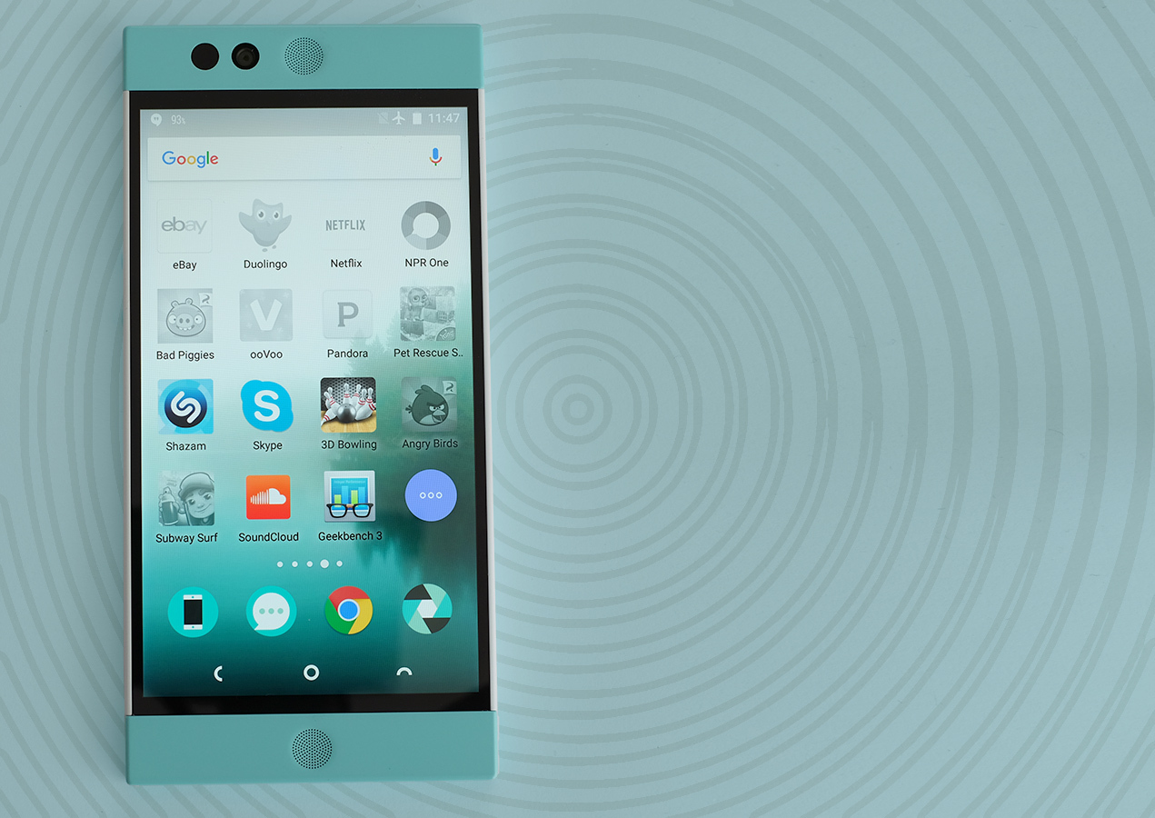
The screen doesn’t suffer from any eyebrow-raising tech elements. It’s 5.2in across, has an IPS LCD panel and is Full HD, not QHD. But it’s still sharp, bright and bold.
Colours are punchy without looking toxic and contrast is very good for an LCD. Sure, the very best Samsung screens are better, but it’s a top quality display in its own right.
There are also a couple of modes too, standard and dynamic. I haven’t been able to work exactly what these are up to other than changing the colour and contrast a bit, as its effects seem to vary depending on light conditions, but either mode looks good.
This is one of the few parts of the phone that doesn’t seem to be making some sort of statement. It’s just good, no messing around.
The emperor’s new clouds
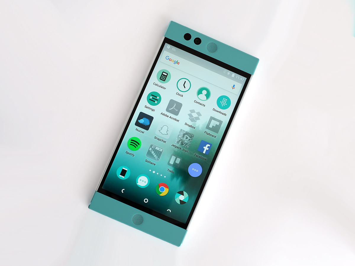
We’re back to the more difficult, provocative style with the Nextbit Robin’s software. It runs Android 6.0 Marshmallow, but is far from the norm. You get 100GB of cloud data onto which the Robin auto-stores your stuff, photos being the obvious things to save. However, it’s also used to ‘park’ apps you don’t use.
The Robin monitors the apps you use and those you never touch, and after a while the unused ones end up greyed-out. Literally, their app icons go monochrome. This means their data is removed from the internal storage and evaporated into the cloud. There is a benefit over just uninstalling the apps too, as any cached data, game saves and so on, should return too if you restore them by tapping on the app’s icon.
Several people I’ve talked to while using the Robin have commented this sounds like a great idea. However, in practice it means your Robin ends up looking like the app version of an elephant’s graveyard, with perhaps several full pages of greyed-out apps icons.
This obsessive app spring cleaning makes the phone seem like it isn’t really your own. The Nextbit Robin’s data cleansing is a bit like returning home only to find your mum has ‘tidied away’ everything in your room that wasn’t neatly stowed.
So yes, maybe I install a load of crap on my phone and gradually learn to sort-of dance around the 20 apps I used once and then didn’t bother to uninstall. I get maybe this isn’t the best way to run a phone. But the Nextbit solution isn’t really a solution.
And more to the point, the root of the problem for the lot of the app jugglers I know isn’t apps, but photos. To generalise horribly: I find photos are the problem on phones, while appsand games end up being the storage hogs on tablets.
Arriving in May › LG G5 preview
Photo library

The Nextbit Robin will also backup your photos automatically, and is set to do so when plugged-in to avoid eating too much battery. Let’s not pretend it’s anything special, though. Not only does Google Photos do this rather well (at original quality if you like), several phones have also come with extra storage for that particular cloud.
While I wouldn’t trust Google not to sell all our cloud data to Rupert Murdoch for story-sieving if it could get away with it, I do trust its servers will probably hang around longer than Nextbit’s ones. Caveat: who knows, right? Google Photos’s archive also seems much easier to access from other devices.
I buy into the idea of a cloud phone. My issue is that the cloud elements I really want are already served perfectly well by other Android phones. All phones are cloud phones, aside from the ones Argos sells for £15. Even WhatsApp happily backs-up all your inane chats these days. And the bits Nextbit has added just get on my nerves. It’s far too ‘active’, where this sort of thing should be as invisible as possible. The Robin gives it an unnecessary, harsh spotlight.
And back to the apps issue: what happens when the Robin ‘parks’ that offline Wales map app you downloaded six months ago, but you only notice when you’re lost up a hill surrounded by sheep droppings and zero data signal?
Stop the bus, I want off. Just let me use an SD card instead. The Robin doesn’t have one of these, of course, but I’d be fairly happy with the 32GB storage anyway.
And yes, you can ‘pin’ apps to stop them being whisked away by the data police. But I don’t want to have to. It just complicates things.
Brilliant on a budget › OnePlus 2 review
Different strokes for imaginary folks
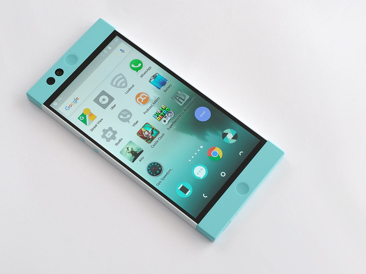
Nextbit is also clearly wants to be different with the look of its software. It’s not bad, and shares a lot of basic design style elements with the latest Android M interface. Like the hardware, it’s cute. But is buggy and can’t resist messing with things.
The way it deviates from normal Android centres around the blue 3-pip icon you’ll see just above the icon dock. It looks like an app icon, but isn’t. This is what gets you between the standard homescreens and the apps menu.
The apps drawer is like the Windows 10 or CyanogenMod apps menu, writing out each app’s full name and letting this app scroll run on for miles. There’s nothing wrong with that, and it scrolls by quickly. However, in its current state it takes up to five seconds for the menu itself to load. Insta-fail.
It’ll be fixed at some point, hopefully before any normal people get their hands on one of these phones, but Nextbit is clearly foaming-at-the-mouth keen to get the phone out on time. Arriving just before the Samsung Galaxy S7, we can’t blame it. Pity the phone isn’t really ready yet.
None of this has anything to do with the phone’s hardware either, which includes the same Snapdragon 808 CPU used by the LG G4, and 3GB of RAM. Plenty of CPU power, plenty of RAM, not enough software optimisation.
Wait for the click
Software issues also completely ruin the camera right now, with the worst shutter lag I’ve seen in a £300 phone. Possibly ever.
You can be left waiting three seconds or more for the Robin to actually take a picture, focusing can take a small age, and this extends to using the camera in apps like WhatsApp. I can accept this isn’t performing as intended, but right now it’s flat-out broken. The performance is even worse if you use HDR.
Once Nextbit sorts the software out, this will be a perfectly nice camera with a particularly punchy HDR mode. The HDR results won’t always look totally natural, but it doesn’t half go for it. You can shoot right into the sun and still get decent foreground detail.
The sensor is a Samsung ISOCELL with 13-megapixel resolution. It sounds similar to ones used in Chinese phones like the Oppo R7 and OnePlus X. In good lighting it can get you great shots. And at night time photos don’t get totally insta-soft, which was the downfall of the OnePlus X. Instead, the Nextbit uses almost watercolour-like noise reduction to stop shots becoming too gritty-looking.
The Robin’s camera software is pretty much universally horrible aside from that parts of the UI look cute. It’s slow in every part, kinda confusing and makes switching HDR on/off take too long. But when, or if, Nextbit gets around to fixing the most major issues, it’ll be a perfectly reasonable camera.
Will it be as good as that of the Samsung Galaxy S6 or LG G4, which at this stage don’t cost masses more if you’re willing to shop around and wait for a bargain? No.
The camera side dishes include a neat two-tone flash on the back and a decent but also-slow 5-megapixel selfie camera.
Will the reign continue? › Samsung Galaxy S7 preview
Whimper power
As far as I can tell, the many software issues of the premature Nextbit Robin don’t radically affect the stamina of the phone. On occasion, generally when searching for signal or gaming, the top-right of the phone’s back gets hot. But pretty much all of Snapdragon’s top CPUs of 2015 weren’t exactly renowned for the ability to keep super-cool under pressure. It doesn’t seem like the phone is revving when it shouldn’t.
Its staying power is totally pedestrian, requiring a top-up on any days when I use the phone a decent amount. For example, as I write this it’s 6:12pm, and the phone’s at 23 per cent. Sure I’ve streamed a podcast and listened to Spotify for 30 mins through headphones, but that’s not great stamina, is it?
It lasts for nine hours of looped video playback using a 720p movie, which is around five hours less than the longer-lasting Samsung Galaxy phones can provide.
The Robin has a 2680mAh battery, which is fairly small for a 1080p phone, particularly one that feels flat-out large. And while Nextbit says the phone has quick-charge abilities, our phone didn’t come with a charger, and recharged almost painfully slowly with most of the regular ones I tried. That’s with the sort of 5V, 2A charger you get with a high-capacity phone too.
Why? No idea. It almost seemed to work better with lower-amp plugs, taking around 2.5 hours. Maybe it’s yet another bug.
This phone, like most higher-end phones of 2016, probably, uses a USB-C charging socket rather than a microUSB one. However, it’s less annoying than some in that the included cable ends in a USB socket rather than a USB-C one. Last complaint, I promise: the bloody thing seems to fall out of some chargers as soon as you breathe on it.
Maybe by the time the first Nextbit Robins are delivered to buyers, 99 per cent of problems will have been fixed. But I get the feeling the road might be a little longer than that.
Nextbit Robin verdict
The Nextbit Robin has a lot of interesting ideas that might make you go ‘ooh’ when you read about them (granted, probably not here). It sells itself as a next-gen phone, but through services rather than hardware. And it has a pretty sweet look to go with it.
Having lived with the phone for a while now, I can only conclude the whole notion is overinflated. Do you want a phone whose apps uninstall themselves when they start to feel lonely. Really? The thing has 32GB storage, not 4GB.
And while the cloud features go beyond this, Nextbit really seems to be capitalising on people not realising quite how many cloud options are out there, rather than a real gap in the market. Either way, you might be best off waiting a few months for more bugs to be fixed before investing.
Super smartphones › The top 10 smartphones in the world right now
Stuff Says…
Backing up your photos is always a good idea, but this buggy phone’s app-archiving is more annoying than useful
Good Stuff
Looks nice, feels nice (but big)
Includes plenty of cloud storage
Respectable camera hardware
Good speakers
Bad Stuff
Incredibly slow camera (bug)
Buggy software
Core app-zapping feature annoys
Bigger than its screen inch count suggests
Mediocre battery life
