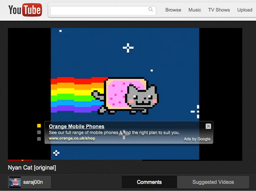
YouTube redesign: follow the Cosmic Panda
YouTube goes over to the dark side with slick new design

YouTube’s new redesign experiment follows last week’s Gmail and Calendar makeover but Cosmic Panda (for that is what it has been dubbed) is more than just an easy-to-navigate design. It’s a darker and more polished YouTube than the one we’ve come to waste hours of our lives on. If you’re browsing with Google Chrome, you can watch videos while searching for the next one and Google has also revamped both the Channel and Playlist pages of its video-sharing site. No Google Plus just yet, but it we bet it won’t be long.
Also
Google spruces up Gmail and Calendar
YouTube Disco – the new Genius


