Nokia Lumia 2520 review
Nokia's first ever tablet is a polycarbonate slice of tech history – but is it good enough to compete with the iPads and Androids when it's hobbled with Windows RT?
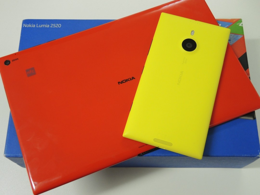
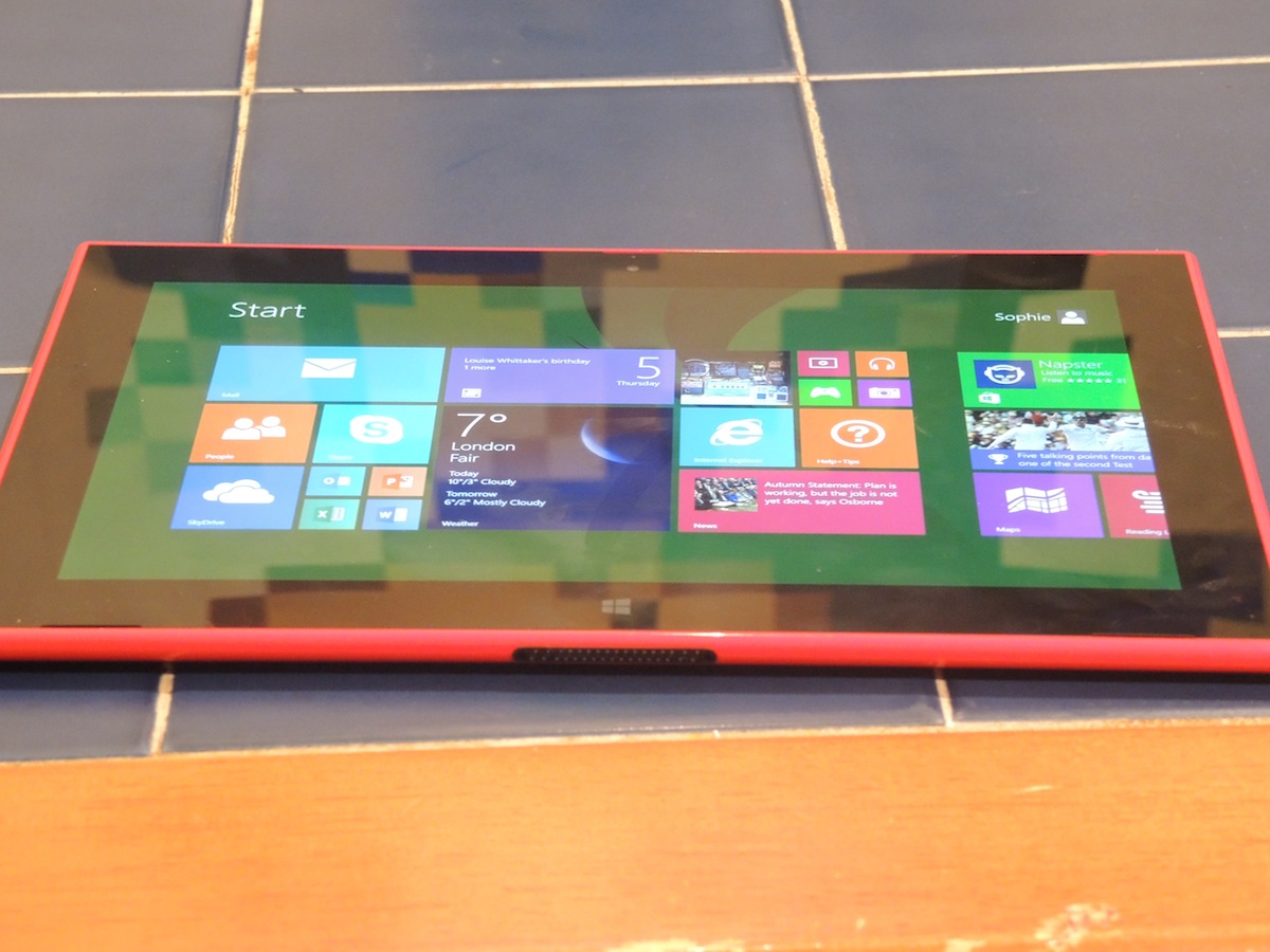
We can’t say we ever thought we’d be reviewing a Nokia tablet. But here we are. And the Lumia 2520 isn’t just Nokia’s first ever tablet, it’s a polycarbonate slice of tech history in glossy red (and glossy white, matte cyan and black).
It’s the first Nokia to run Windows 8 rather than Windows Phone 8 and it comes with 4G capabilities to set it apart from run-of-the-mill Wi-Fi-only Androids. The 10.1in tab is also one of the only new Windows RT tablets on the block – practically everyone has abandoned this version of the latest Microsoft OS, except for Microsoft itself. And it will no doubt be one of the last Lumia devices launched before Nokia is swallowed up by Microsoft. So this isn’t just any old tablet.
Does an oversized Lumia work?
Let’s start with a brain-tickler. The 2520 is probably the most conspicuous device we’ve ever used in a South West Trains carriage. This could be a plus or a minus depending on how you treat your tech, but seriously – we haven’t turned this many heads since we rode a Burmese sneezing monkey home from work.
It’s bright red and glossy (in our case), not to mention the loud pop-pop keyboard sounds that it makes on the default settings and the fact that its slightly awkward 16:9 widescreen ratio and 615g weight mean you’re constantly adjusting how you hold it, even though the 2520 is lighter and a little more compact that Microsoft’s own Surface 2.
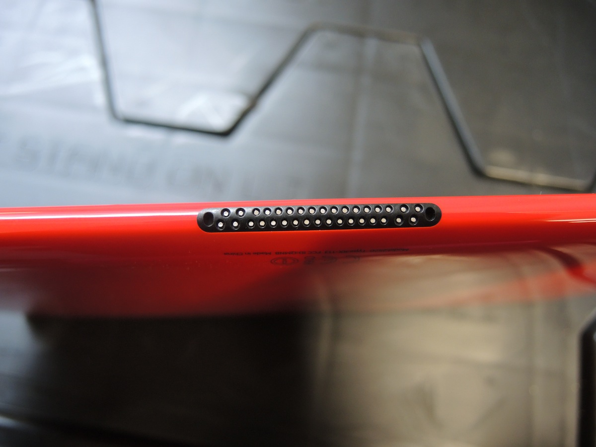
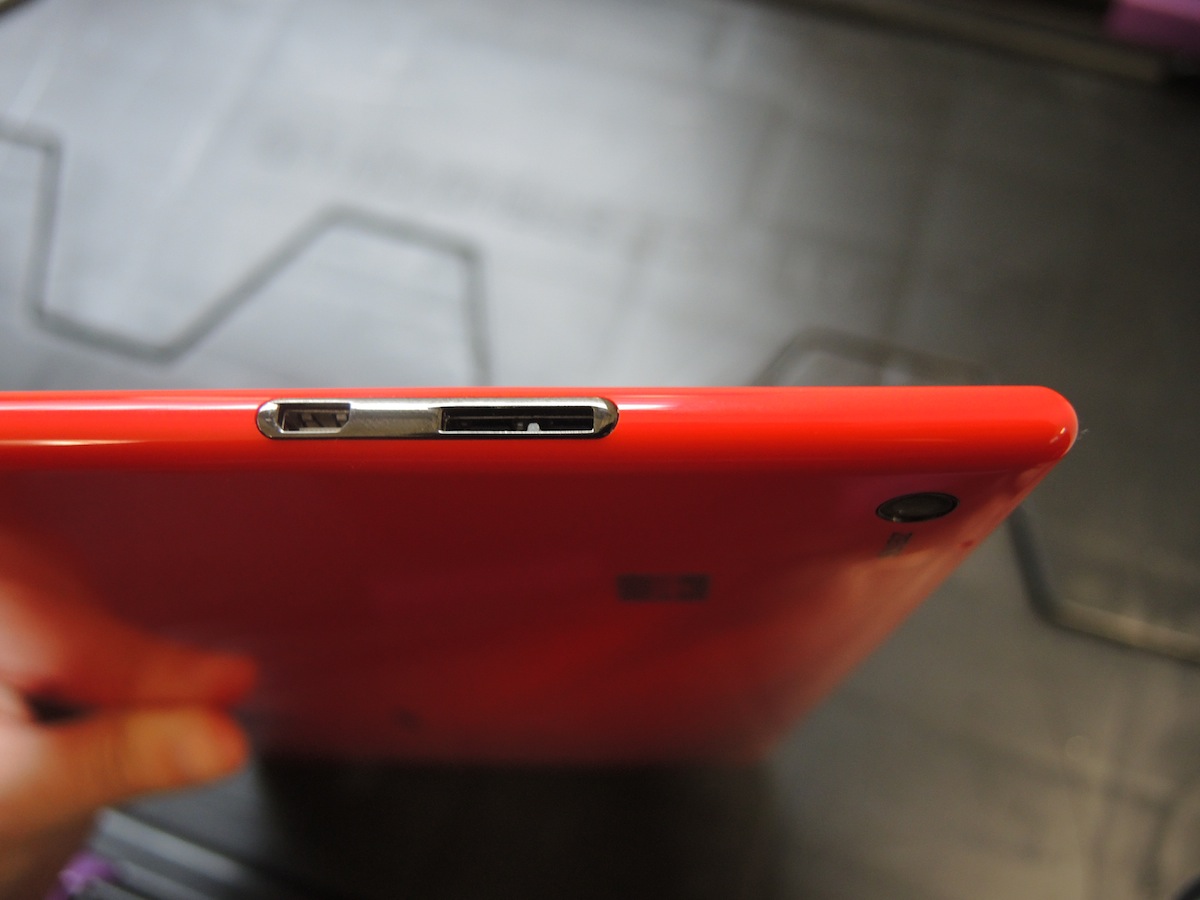
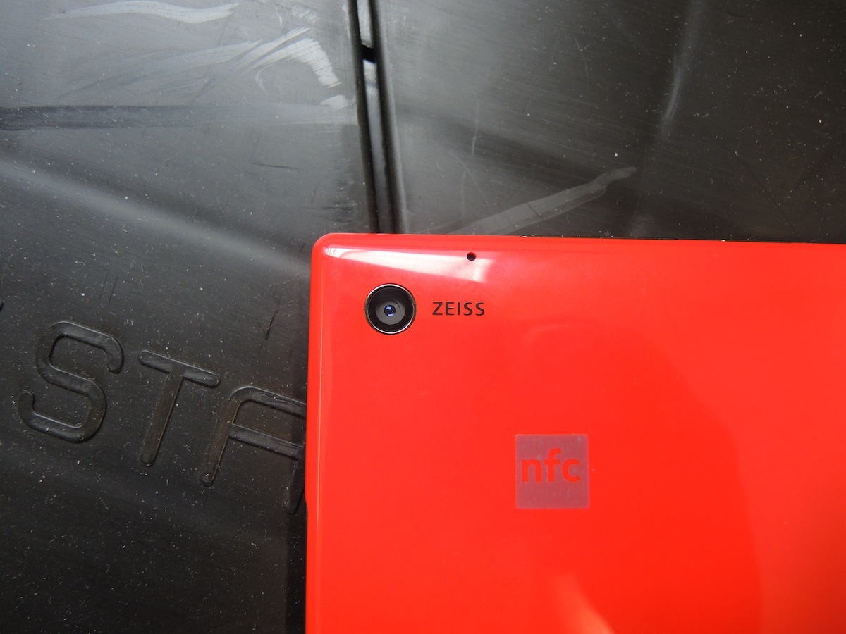
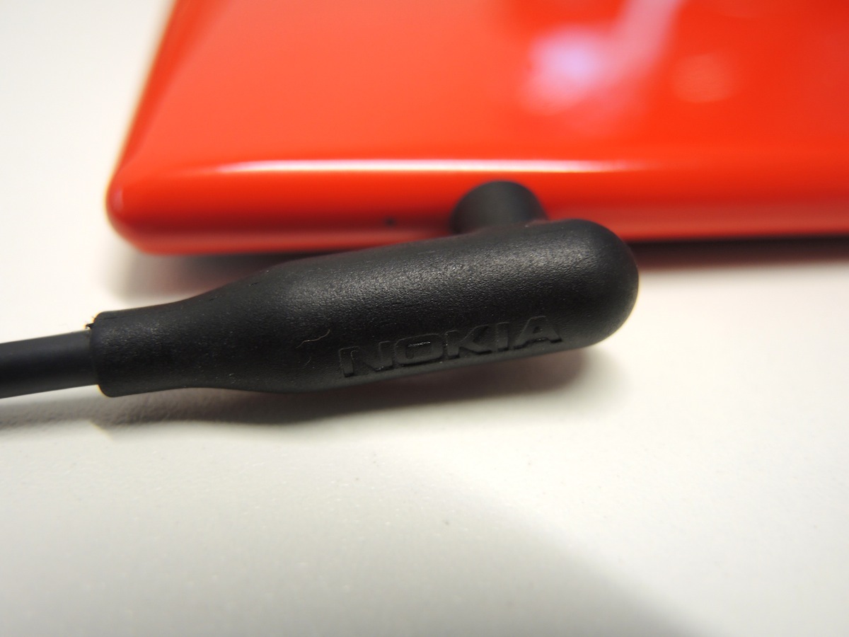
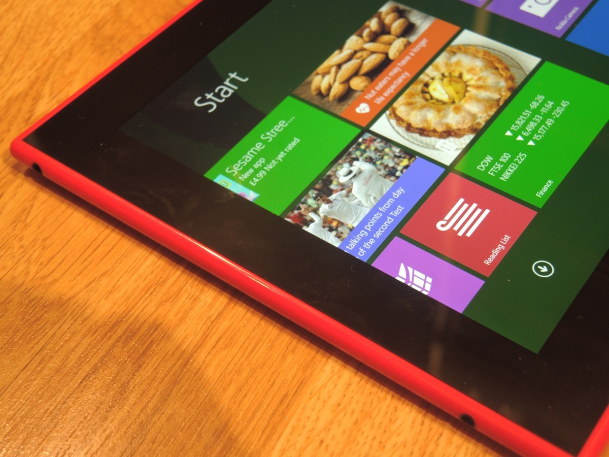
It’s a solid enough build with some flexing and creaking (your fingers will push through the back of the tab to the display like those sub-£100 nasties do) and there’s quite a lot going on. For a start there’s a microSIM (yes, microSIM not nanoSIM as with the 1520 phablet), plus a welcome microSD card slot to expand the 2520’s 32GB of memory – that’s open on the right-hand edge alongside a microUSB port and microHDMI. Then there’s the headphone jack and the port for the Nokia charger – which confusingly look exactly the same – not to mention shallow power and volume buttons, Zeiss, Nokia and NFC logos (the latter’s a sticker) and the Windows Start logo front and centre along the bottom of the screen.
That’s before you even get to the proprietary connection running along the bottom, which is for the £150 Nokia Power Keyboard – an essential-seeming (not to mention battery-boosting) accessory that Nokia is yet to supply for testing.
As a standalone tablet, the 2520’s physical design is far from perfect – the corners can dig in when rested in your palms, there’s no Surface 2-like kickstand, the glossy back is a bit slippy and it scratches fairly easily. Yet it is a good-looking slab of Lumia that, depending on what you want out of a tablet, might justify the extra weight over, say, an Android tablet.
Can Nokia do big screens?
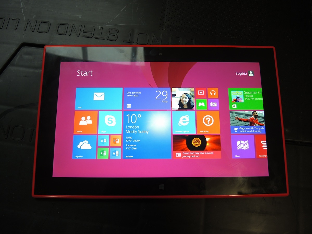
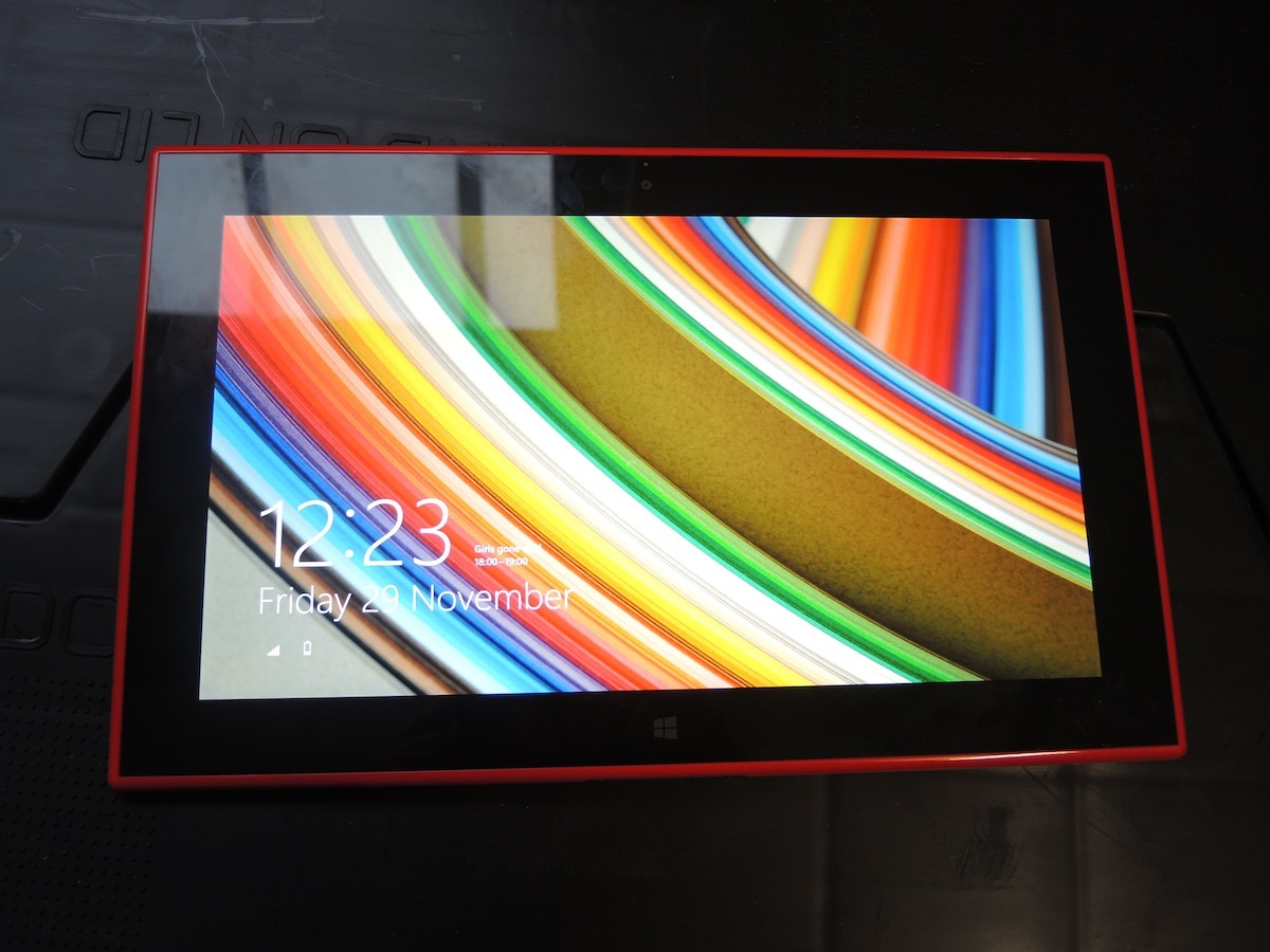
A resounding “yes!” from the Stuff camp. The 2520’s screen really is a beauty and it’s the main reason for the 2520’s strong score. Wow, it goes bright, up to 650 nits if you want to get precise about it, and in a normally lit room a white webpage is positively blinding. You will genuinely close your unadjusted eyes for a second.
Then there are the viewing angles, which are just ridiculous – tilt the 2520’s screen to the side or lay it flat and the picture is just as nice at any angle. It’s the kind of tablet that will make you do a double-take if you see the screen from across the room. Witchcraft.
It’s a real eye-catcher. The pixels look as though they’re sat right on top of the glass and it’s a great tablet for movie fans – skintones look natural, blacks are inky and colours are vivid. That said, the Surface 2-matching 1920 x 1080 resolution results in 218ppi, so it doesn’t match the likes of the iPad Air’s 264ppi Retina display for sharpness . You can spot the pixels if you’re hunting for them, and text can occasionally look a little jagged even at a normal reading distance. Whites can be a touch smeary, too, a sure sign that contrast isn’t quite up to scratch with the best tablet displays.
And we’d like to think our fingers aren’t any greasier than the average gadgeteer, yet the 2520’s screen seems to be coated in grease every time we glance back at it. So unless that’s how it cries at night (over a lack of incredible, optimised apps, no doubt), it’s us.
Nokia Lumia 2520 Tech Specs
Operating System – Windows RT 8.1
Processor – 2.2 GHz quad-core Snapdragon 800
RAM – 2GB
Screen – 10.1 ClearBlack IPS LCD with 1920×1080 resolution (218ppi)
Camera – 6.7MP rear, 1.2MP front
Storage – 32GB (expanadable by up to 32GB via microSD)
Connectivity – Bluetooth 3.0, USB 3.0, HDMI, NFC, 3G/4G, 802.11n
Battery – 8120mAh
Dimensions – 168 x 267 x 8.9mm
Weight – 615g
Are Nokia’s awesome apps enough to rescue it from Windows RT?
As glorious as the 2520’s screen is, there’s the question of what to do with it. And there’s no way of getting around the fact that the Lumia 2520 runs on the woefully underserved Windows 8.1 RT OS. All this means is that the Nokia tab is restricted to pre-installed programmes such as the full Office suite and app purchases from the recently spruced up Store. Unlike tablets such as the Microsoft Surface Pro 2 and Lenovo ThinkPad Tablet 2, you can’t run full programs and PC games.
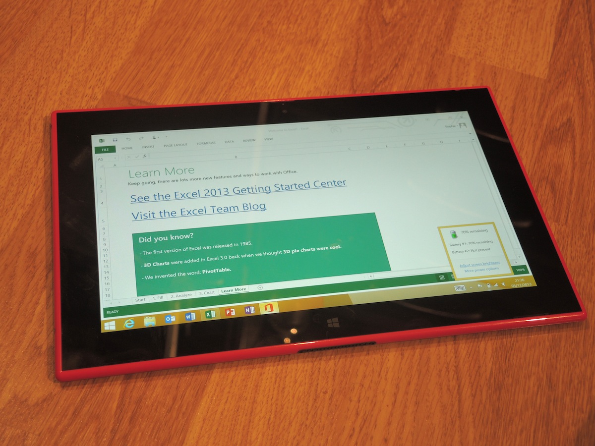
There’s still a standard desktop mode to complement Windows 8’s touchscreen-friendly Live Tiles, but without a keyboard to make it useful we largely ignored it in our testing. The only thing you’re likely to use Excel for on a 16:9 screen and without mechanical keys is discovering that Microsoft invented the word PivotTable. Exactly. With a Nokia Power Keyboard in place, the 2520 will be an ad-hoc laptop that bests the Surface 2 in many ways but that, of course, costs £150 extra.
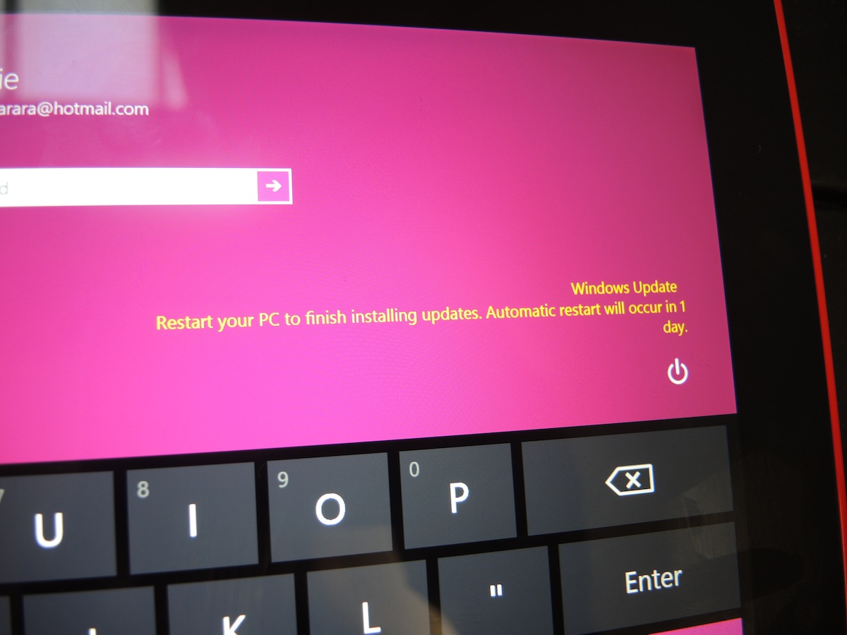
A lot of our frustrations with the 2520 come from Windows 8.1 itself – yes Instagram and Facebook are there but there’s still a lack of new and exciting tablet apps, the OS creaks to a halt when hitting the Settings button, plus the set-up and configuration is Post Office-queue slow. On the plus side, snapping apps side by side works well and they can be resized according to how you want to use them – that’s still missing from the likes of the iPad Air and Nexii.
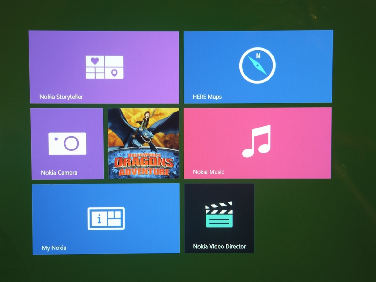
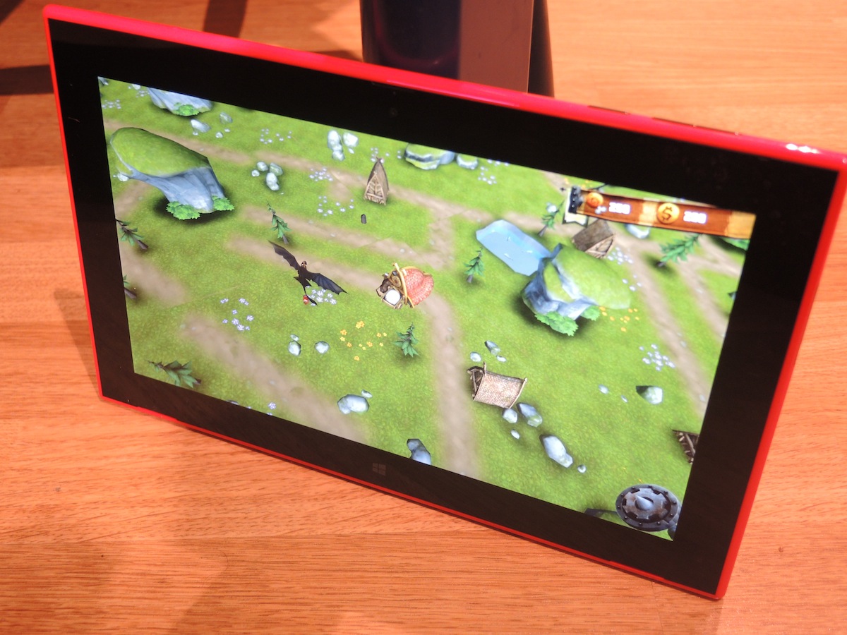
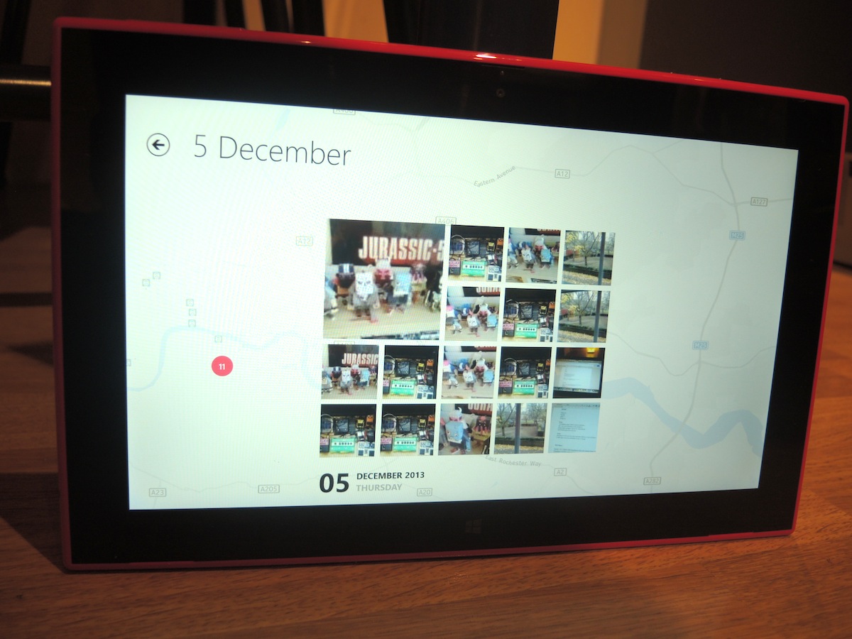
But the Lumia’s real saving grace comes in the form of added extras that you won’t find on the Surface 2: from free playlists via Nokia Music to the interesting ways it’s been using Nokia’s own HERE maps service. That includes Storyteller, a neat app that budding travel photographers will love – it places sets of photos in timelines and onto world maps, handily syncing photos taken with Lumia 1520s and not just the 2520 itself. And the pre-installed AR game Dragon’s Adventure builds a medieval map based on the roads around your location. None of these are deal-breakers in the sense that’s there are hundreds, if not thousands, of equally wonderful third-party apps on Apple’s App Store. But if you’re swaying between the Surface 2 and 2520, Nokia’s own well-designed software could swing it.
Is it as quick as an iPad or Android tablet?
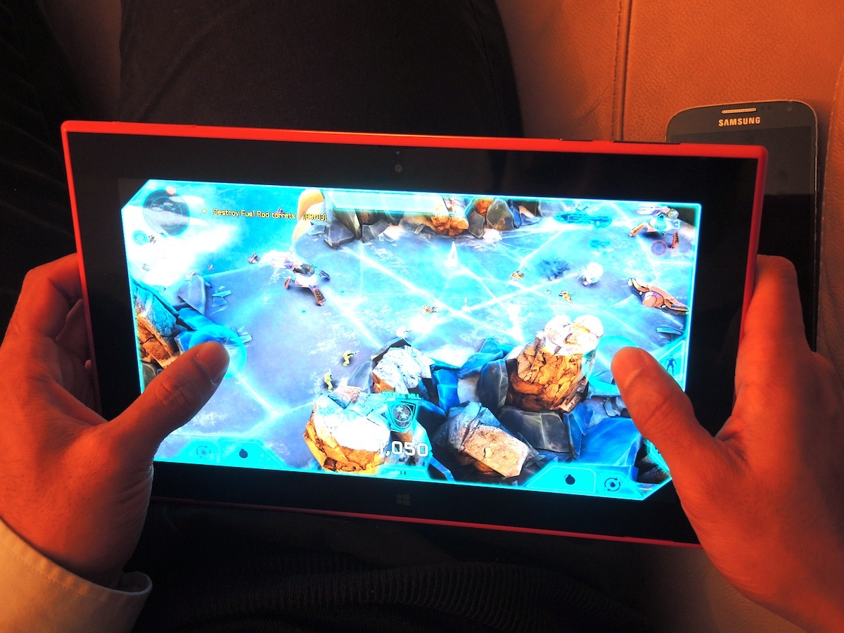
Running on a beastly 2.2GHz Snapdragon 800 processor, rather than the Tegra 4 chosen by the Surface 2, and with a quad-core Adreno 330 GPU joining the fun and games it’s no surprise that browsing Internet Explorer, emailing and Halo: Spartan Assault sessions on the 2520 are all smoother than the posh chicken liver pâté your mum gets out on special occasions.
App downloads are fairly breezy, over Wi-Fi or with a 3G/4G microSIM in, and the 2520 performs well on the Sunspider 1.0.2 web browsing benchmark, scoring a very fast 505.5ms, which is almost on par with the iPad Air at 383.9ms (lower is better). Again, it’s Windows that trips it up – the Windows Store can be unresponsive, having to click on apps more than once and moving around the apps menus and settings resulted in a couple of crashes during testing.
It’s worth noting that the 2520 only comes in an expandable 32GB model (up to another 32GB extra) – there’s no cheaper 16GB model to please the budget-savvy masses. For the same memory, the Surface 2 is £40 cheaper, albeit without 4G, Nokia apps and the like.
Do you need Zeiss optics on a tablet camera?
With a capable 2MP wide-angle camera on the front and a 6.7MP f/1.9 show-off around the back, Nokia’s keeping its mobile camera heritage intact with (an admittedly barely there) Nokia Camera app thrown in, too. But does it need to? Probably not, but if you can manage to keep your elbows steady long enough to take a shot with the 2520 it does at least perform well indoors thanks to that bright lens.
Focussing is a little slow, so much so that we weren’t sure it was working at first, but colours are accurate and detail is as good as you’ll need from a snapper atop a 10in tablet. 1080p video is smooth, too, with the rear cam doing an impressive job of quickly altering exposures to match the scene as you move. Still, you’ll (hopefully) spend around 0.01% of your time with the 2520 taking photos with it so let’s move on to something much more important: battery life.
How fast is fast charging?
Fast charging on the Lumia 2520 really does mean you can plug it in and an hour or so later, the massive 8,120mAh battery will be fully charged and raring to go for the whole day. Nokia quotes 80% in one hour, which compares rather nicely to the Surface 2’s two-to-three hour estimate.
But how long does that 650 nits Full HD screen keep beaming out pixels? Just under ten hours of normal use, running down 10% an hour on a half-brightness, Wi-Fi HD video test and with excellent standby stamina. Again, it trumps the Surface 2, which struggles to reach eight hours.
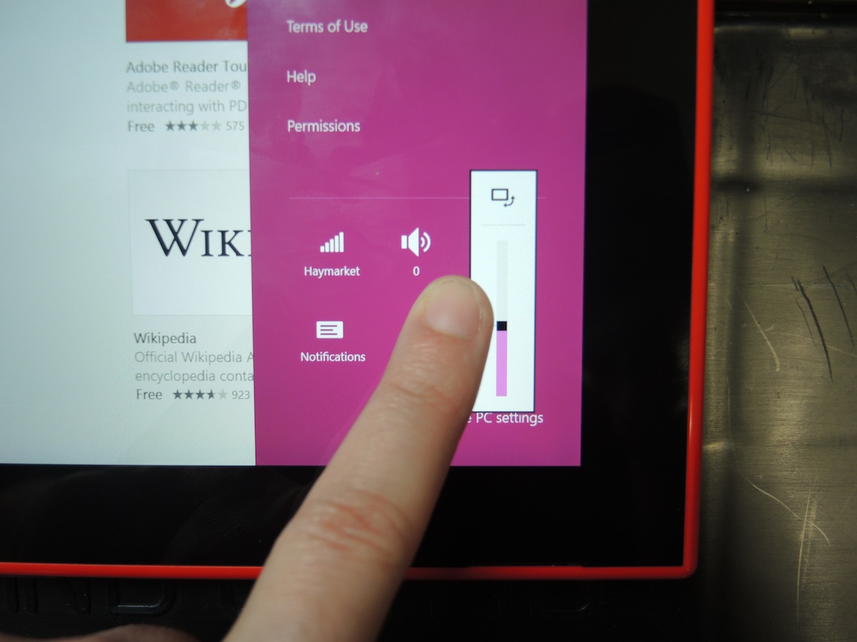
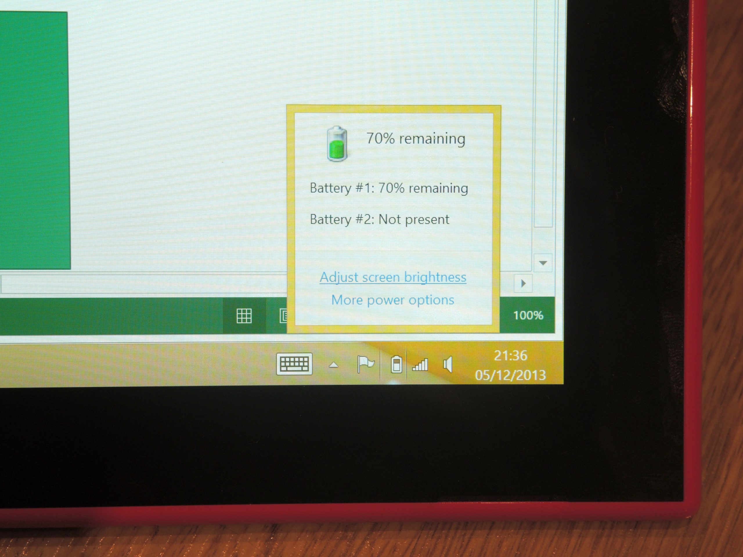
The only problem we have with the Nokia’s battery? We’ve been tearing our hair out keeping an eye on it – there’s an icon on the Windows 8.1 lockscreen but a good, old fashioned percentage isn’t available in a notifications sidebar or the main settings toggles – you’ll hate hunting it down in the desktop taskbar.
Verdict
If you’re happy with the Lumia body, there’s lot to love about the 2520, which injects some much needed fun into Windows tablets. It’s lighter and more compact than the Surface 2 with a punchier Full HD screen, better battery life, 4G and excellent Nokia apps.
The flawed Windows RT OS is just too much for us to live with but if you can trade creative apps for the Office suite and plump for the Power Keyboard, it could just work. Then again, full-fat Windows 8 tablets that aren’t limited to the Store, such as the Lenovo ThinkPad Tablet 2, offer full-fat Windows 8 and can be picked up from £450.
