Motorola Moto 360 (2015) review
Another go on the Android Wear roundabout

The original Motorola Moto 360 was one of our favourite early Android Wear watches. It looks great, feels great and was one of the few smartwatches that didn’t make you look like a total nerd. Motorola has updated the original design with a second-generation version.
The idea of the Moto 360 (2015) is to keep all the parts people loved, while snipping-out a couple of bits that were actually dated when the first model arrived. Oops.
After living with the new Moto 360 we’re torn. The look and feel are both spot-on. This is a watch you can be proud to wear. But 24-hour battery life and a screen that isn’t too hot on bright days are pretty serious downers. We want more substance in our upgrades please, Motorola.
You got the look
When the first Motorola Moto 360 arrived, our jaws dropped. It was easily the coolest-looking smartwatch around, the sort of thing that could feature in a movie. And I’m not talking about George Lazenby’s Bond flick.
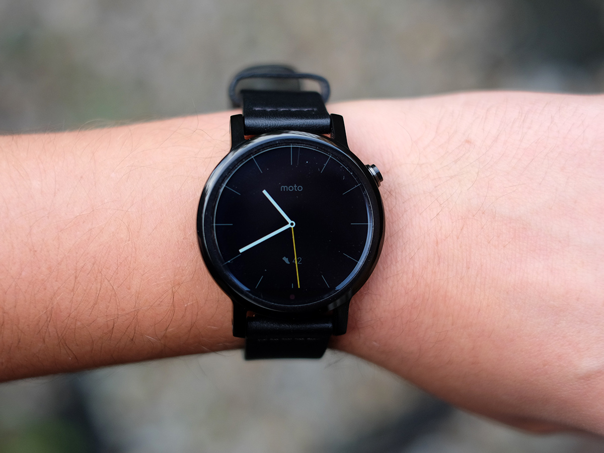
The Moto 360 (2015) keeps the basics of the design and tweaks it just a little bit to make it look a little more normal. A bit more watch-like. In practice what this means is that the watch has little struts that poke out of the face’s top and bottom, holding the strap.
As a result, the look is less sci-fi, but that’s probably a good thing if Android Wear wants to appeal to normal people rather than just the early gadget adopter crowd. I’ve been using the black version, which is just the right level of shiny. Enough to look slick, not enough to look showy. However it also comes in silver and gold.
Gender gap
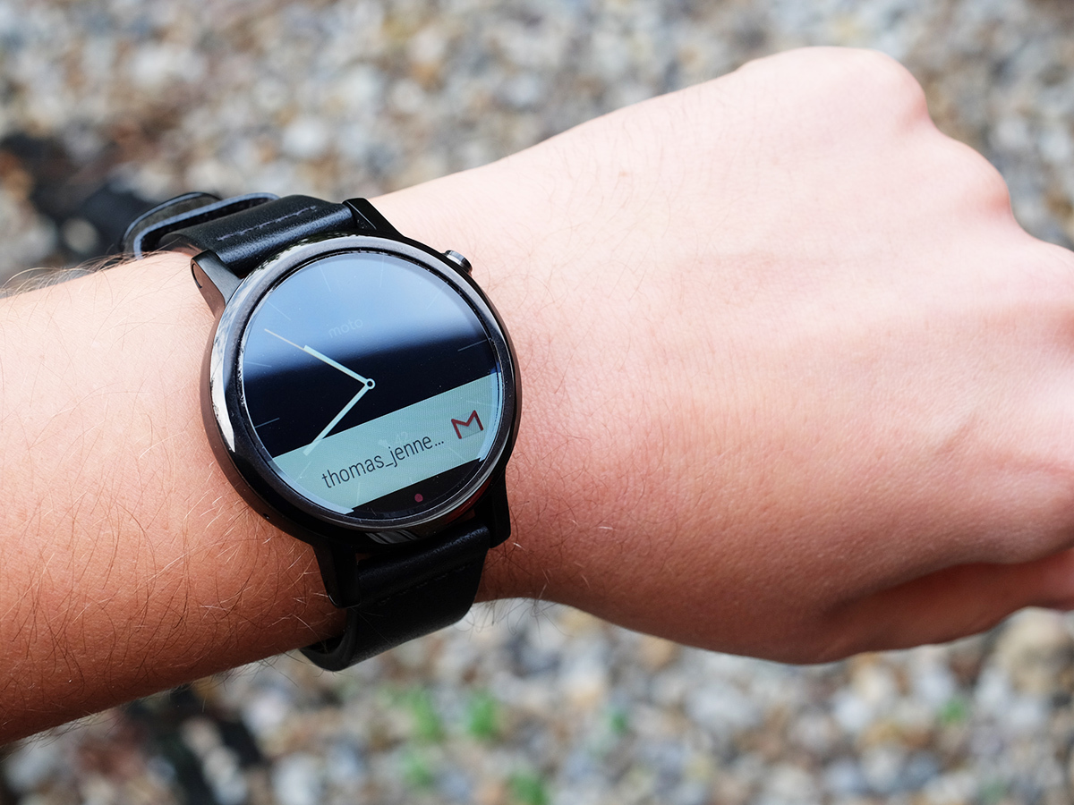
There are actually two versions of the Moto 360 (2015) as well. A ‘man-size’ one with a 1.56in screen and 22mm strap, and a smaller one “for women” with a 1.37in screen and a skinnier strap. We say get whichever looks better on your wrist, but the retailers are definitely going with the men/women angle. Oh well.
I’ve been using the manly man’s 42mm diameter, 22mm strap edition. But compared to the Brietling-wannabe LG Urbane, it’s relatively svelte.
While a bit thick like all Android Wear watches, it doesn’t seem too bulky. The watch’s lines and the bevelling to the display’s top glass layer also make it seem that bit slighter than the Huawei Watch, which otherwise looks dead similar.
While the latest Moto 360’s sides are made of 316L stainless steel like the non-Sport Apple Watch, the back is actually glass just like the front. It feels perfectly nice, and the Moto is an all-round very comfortable watch. But why glass? We imagine it may be a good substance for the Qi wireless charging to work with.
A watch needs its beauty sleep
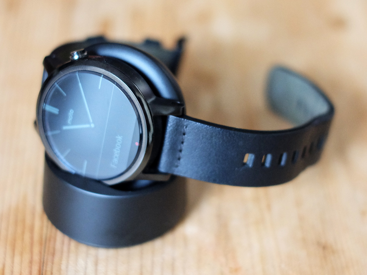
A show-off-ready feature of the Moto 360 (2015) is that, like the old version, it uses a wireless charge dock you can just rest the watch in to make it charge. I’ve taken to keeping it on the bedside table. It’s a little bed for your smartwatch friend, should you not want to track your sleep.
You do need to be pretty strategic when you charge if you want to wear the Moto 360 (2015) 24/7, though, as the battery lasts for 24-26 hours of light use in my experience. This is when the watch is set to its always-on mode, where the screen dims when not in use but doesn’t turn of entirely. It’s the only way to use the watch, if you ask me.
So why is the battery life so rubbish when it has a 400mAh battery like the longer-lasting LG Urbane? It probably has an awful lot to do with the kind of screen the Moto 360 (2015) uses.
Where most higher-end smartwatches, even the Apple Watch, use OLED screens, this one has a good old LCD. The difference? Where OLED have light-up pixels, LCDs use a screen-wide backlight. So when some part of the screen is ‘on’, the whole screen is lit.
In the first Moto G this also resulted in so-so black level, but here it’s very good. At one point during testing while the watch was sitting on the beside table displaying the basic clock view, I had to look online to check it didn’t have an OLED panel. That’s how deep the blacks can go when the screen is dimmed.
Mr contender › Huawei Watch review
Return of the flat tire
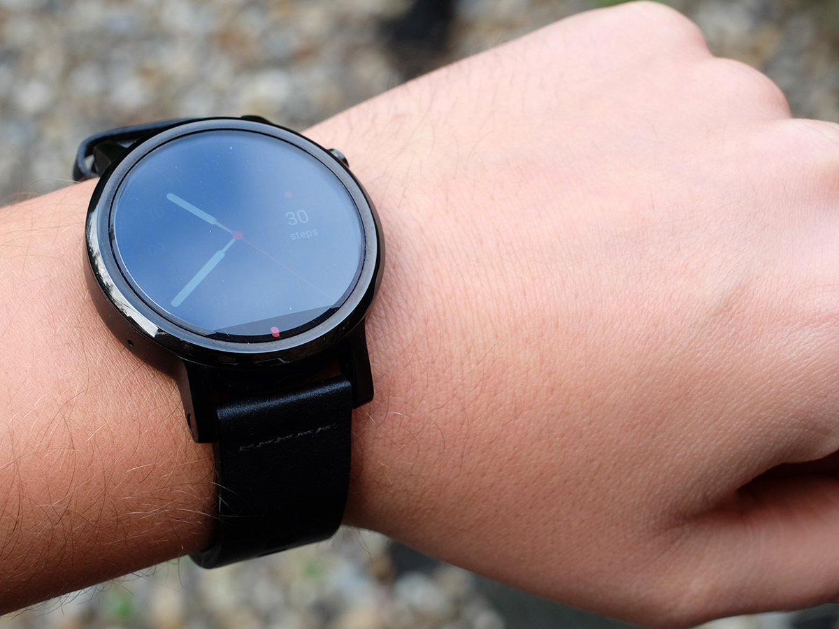
Of course, when the screen is brighter you can definitely tell it’s not an OLED, raising the black level to well above the actual black of the cut-out at the bottom. That’s right, Moto 360 veterans, the infamous ‘flat tire’ screen cut-out is still here.
The very bottom-most bit of the Moto 360’s face is not screen at all, but a blank space where the display driver and ambient light sensor live. It doesn’t look great but means this is one of the few smartwatches to have a screen that can alter its brightness on the fly to suit dark rooms and the bright outdoors.
Soon enough this’ll be the norm, but I was kinda disappointed at how it works in the Moto 360 (2015). I took the watch out on a bright day in October (they do happen) and found that it’s generally very slow to jack-up the brightness to the required level, taking up to 20 seconds. Furthermore, it always nips back down to a much lower level as soon as possible.
The result is that the watch is going to look almost-invisible out in the sun even when you use the always-on screen mode unless you activate it manually. I’m not surprised by this, though. It just shows that LCD is really a crappy screen technology to use for a smartwatch, because displaying a bright watch face is going to use a lot of power, when the OLED LG Urbane and co. crowd can display a basic watch face bright enough to see outdoors without killing the battery too much.
Screen resolution has increased a bit to 360 x 330, but ultimately the display isn’t the shift I was after.
New brains
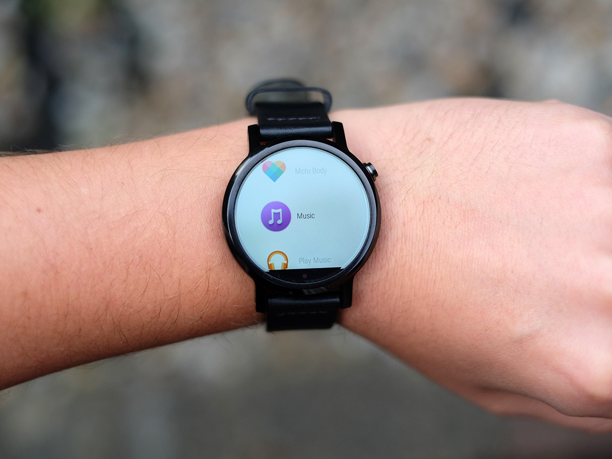
What has changed for the second generation 360 is the processor. Where the first model had an ultra-dated OMAP CPU, this one has the same Snapdragon 400 as the LG Urbane and Huawei Watch.
Performance is fine too. It feels responsive, without some of the surface-level lag I noticed in the Huawei Watch.
The Motorola Moto 360 (2015) otherwise doesn’t really alter rest of the ‘meat’ inside the smartwatch sausage much, though. You get Wi-FI and Bluetooth, and there’s also a heart rate sensor on the back.
Runners out there can still complain about the lack of GPS, and as with the first-gem Moto 360, the heart rate sensor is only really good for measuring your pulse while you’re not moving too much. Trying it out at the gym, the results just aren’t accurate when you’re moving your arms.
This is despite a subtle tweak to the design. From using an array of tiny little pinprick green LEDs, the Moto 360 (2015) has a little diffuser ring that spreads out the green light a bit. It’s still not in the same class as the Apple Watch’s sensor, though.
Related › Motorola Moto 360 review
Another year, same problems
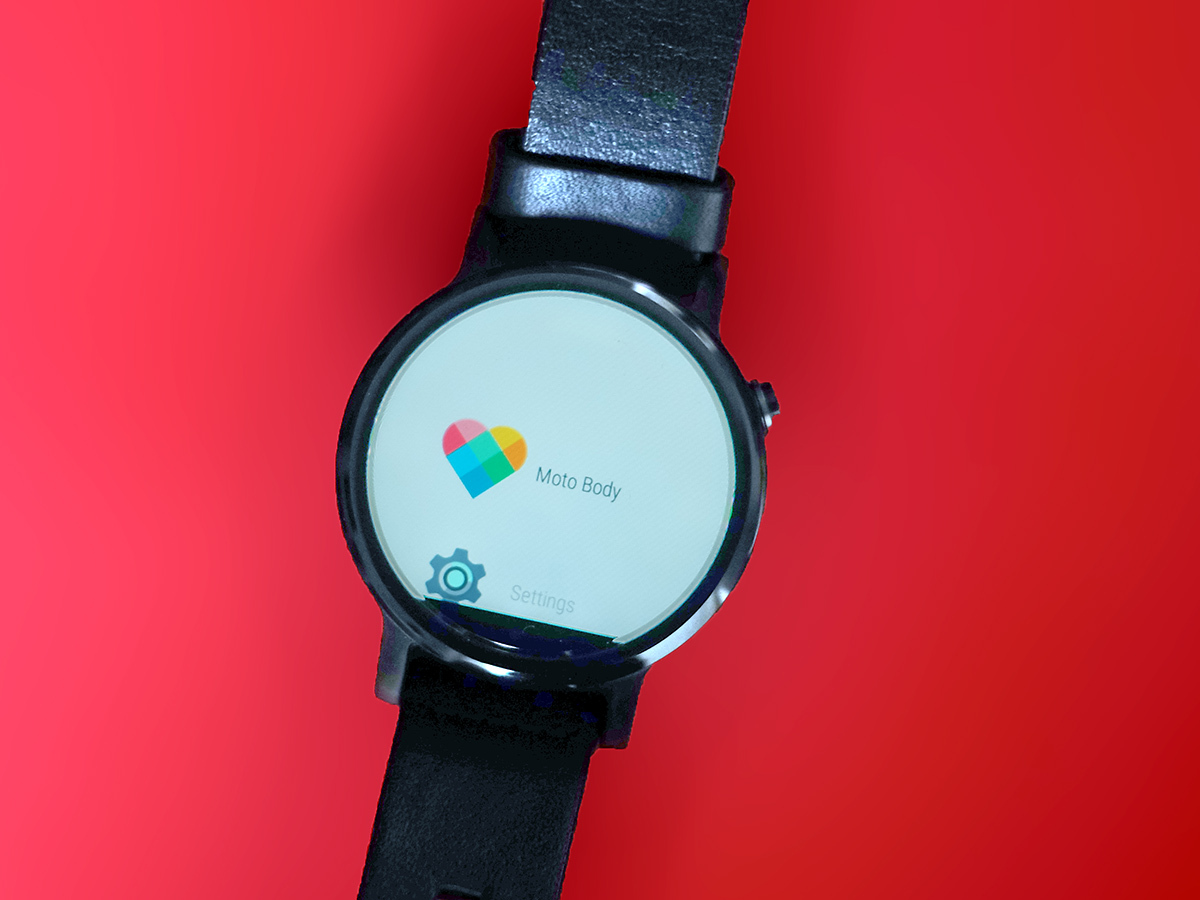
The problem with the Moto 360 (2015) is that while its look and comfort make a great first impression, after a week’s use you get the feeling that the most serious problems with the first watch haven’t really been addressed. The battery life is still pants, the screen struggles out on bright days even with the ambient light sensor on-board and with the heart rate sensor only designed to offer accuracy while you’re still, it hasn’t really upped the fitness game either.
The funny bit about that last point is that the new Moto 360 still tries. Like the Apple Watch, the heart rate sensor takes intermittent readings to keep a tally of how long you’ve done heart-rate-elevating exercise each day. However, I found it to be very generous thanks to the sensor’s struggle to really nail down your heart rate while your arms are moving about. It’s all a bit silly, really.
Some of you will also hate that the Moto 360 (2015) still has the little screen cut-out at the bottom. While I don’t like the idea that Motorola still hasn’t managed to sort this out, I’ll admit It stopped bothering me after the first day or so’s use. Some watch faces make it far more obvious than others, though, and if you’re after a natural-ish watch look the LG Urbane and Huawei Watch are better picks.
Motorola Moto 360 (2015) verdict
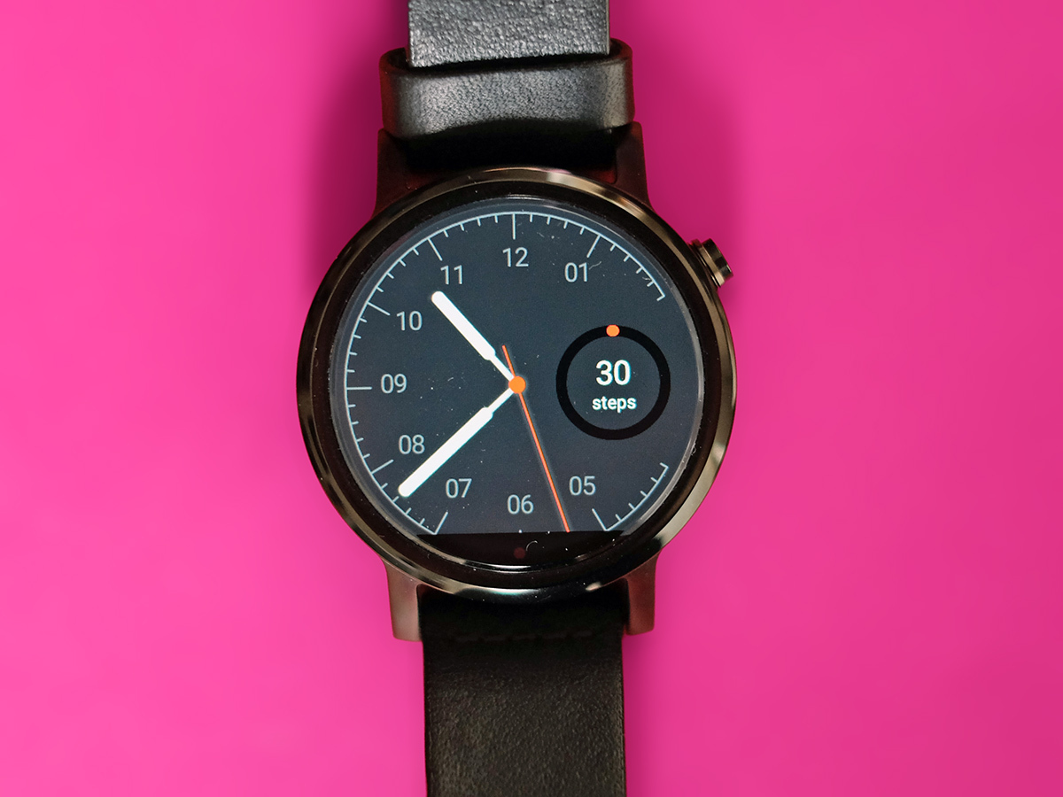
Look and feel were never big issues with the Moto 360, but Motorola has done its best to make them even better in this second-generation smartwatch. This watch is a stunner, and its default leather strap feels great too.
It’s just a shame that Motorola hasn’t really improved the screen or battery life enough. With an LCD display rather than an OLED, one issue feeds into the other, too.
The design may make it appear more natural on your wrist than an Apple Watch, but it still feels as though we’re trudging through an awkward ‘growing pains’ period for smartwatches. One where they haven’t yet figured out what they’re best at. The new Moto 360 delivers on a surface level, but it’s found wanting once you begin to live with it.
Wrist assessment › The top 10 smartwatches
Tech specs
| Screen | 1.56in 360 x 330 IPS LCD (or 1.37in) |
| CPU | Snapdragon 400 1.2GHz |
| RAM | 512MB |
| Storage | 4GB |
| Software | Android Wear |
| Battery Life | 400mAh (300mAh in small version) |
Stuff Says…
Great looks get even better, but the screen and battery life haven’t improved enough.
Good Stuff
Looks and feels great
Large and small versions available
Wireless charge dock is neat
Bad Stuff
24-hour battery life gets old quick
Screen visibility issues outdoors
Limited HR sensor accuracy

