Microsoft Windows 10 review
What do you do when the world hates your last OS? You create a bloody good one, that’s what
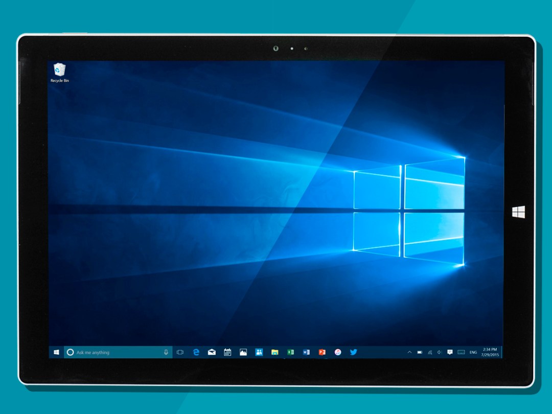
Windows 10 is the least Microsoft product ever.
For the best part of a year, 10 has been evolving in a floodlit petri dish. For once, this was Microsoft without secrets, gnarly sales bluster or baseless boasting.
Instead, 10’s development has been marked by a kind of even-handed, quietly confident humility.
If you read between the lines, you can almost hear Microsoft tacitly apologising for Windows 8. The company knows that Windows 10 must be right.
And from today, the large chunk of the world that didn’t take part in the Windows 10 Technical Preview gets the chance to find out if Microsoft has succeeded.
You’ve probably already seen the teaser ads – like the Preview, they’re free of hard-sell, preferring to talk about the new operating system’s actual capabilities.
And let’s be clear – Windows 10 will not transform your love life. It will not instantly win you a crowd of fawning admirers. But it will do some quite clever stuff that makes your life easier.
I’ve lived with the Windows 10 from its earliest Preview days. I’ve accidentally killed a few laptops with it, been daft enough to use it for actual work (that didn’t go well…), and tried just about every iteration of every Microsoft app along the way.
So now that the big day has finally come, I’m (hopefully) well positioned to answer the big question – is Windows 10 worth the wait?
WINDOWS 10 PERFORMANCE – FAST, FLUID AND STABLE
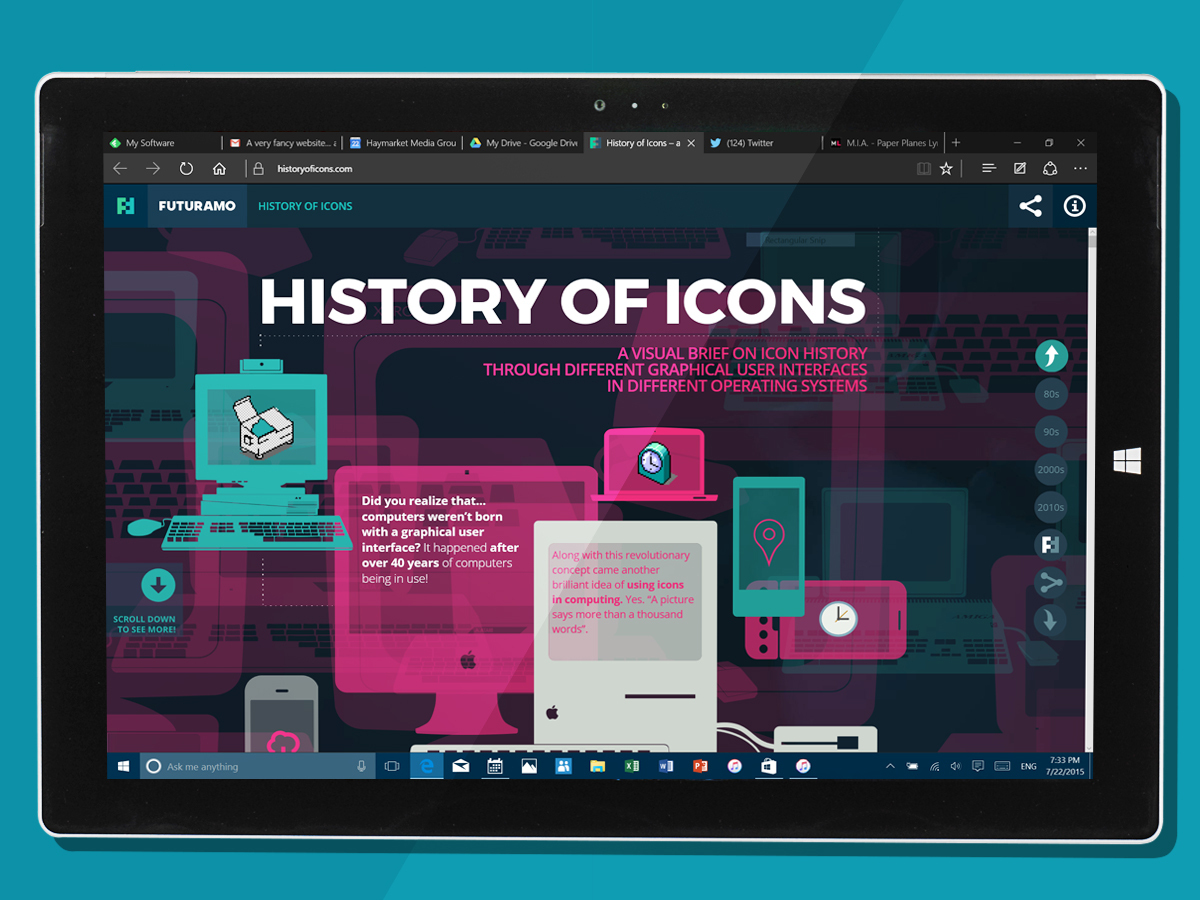
If its pace on my Core i5 Surface Pro 3 is anything to go by, the final release of Windows 10 is as snappy as you could ever wish for.
Everything from searching from the Start Menu to multi-desktop switching is instantaneous, with absolutely no lag from any elements of the interface. Things happen as soon as you click, tap or swipe.
That said, there are still a few apps in the Microsoft armoury that could do with some optimisation in the coming weeks and months. The new Xbox app, for example, has a niggly delay before loading its content, and we’ve experienced the odd crash from the People app. But that’s about it; in general, the software runs as smooth as butter.
I haven’t had the chance to run the final W10 on a PC with under 4GB of RAM or on one packing a Celeron processor, but I get the distinct impression that the same hardware rules apply to W10 as applied to Windows 8 – as long as you stick with a Core i3 and above and pack at least 4GB of RAM, you should be very happy indeed.
But before Microsoft pops every champagne cork, keep in mind that El Capitan – the next iteration of Mac OS X – is only a short walk away. From my experience of the OS X 10.11 betas to date, it’s easily as smooth as Windows 10. In which case, your choice of weapon then comes down to the respective operating system’s feature sets.
RELATED › Microsoft Surface Pro 3 review
CORTANA – WHY ARE YOU TALKING TO YOUR LAPTOP?
And so we come to the Windows 10 desktop feature for which Apple has no answer. Cortana made its debut on Windows Phone, evolving over time into a quick, very capable speech-activated personal assistant.
With Windows 10, it has been tightly bound into the Start Menu – click the little microphone icon at the end of the task bar’s search box, and up pops the Cortana assistant and its pulsing blue circle, ready to take instructions.
Cortana is responsive and accurate in use. But that can’t stop those of us in the Stuff office wondering how useful voice activation will be in the real world.
Voice assistants such as that built into Google Now should be a life-saver, especially when typing lengthy queries on a mobile device can be so time-consuming.
The same advantages should apply to Cortana. But let’s be honest – how often are you in situations where speaking out loud to a piece of hardware is considered acceptable? You can’t help but feel ever so slightly daft saying "Hey Cortana" in the middle of a packed office. And is Cortana really vital on a laptop, where typing a query is considerably faster than it is on a mobile?
If you are happy to push through the embarrassment barrier, Cortana is reassuringly accurate. Queries are either returned in the Cortana assistant pop-up (especially pre-sets cards such as weather or time), or shown as a Bing-powered search result in the new Edge browser.
All credit to Microsoft: the Cortana experience is accurate and rewarding enough to take the edge off the embarrassment of yelling at your laptop.
MICROSOFT EDGE – SHALL WE JUST FORGET ABOUT THAT WHOLE EXPLORER EPISODE?
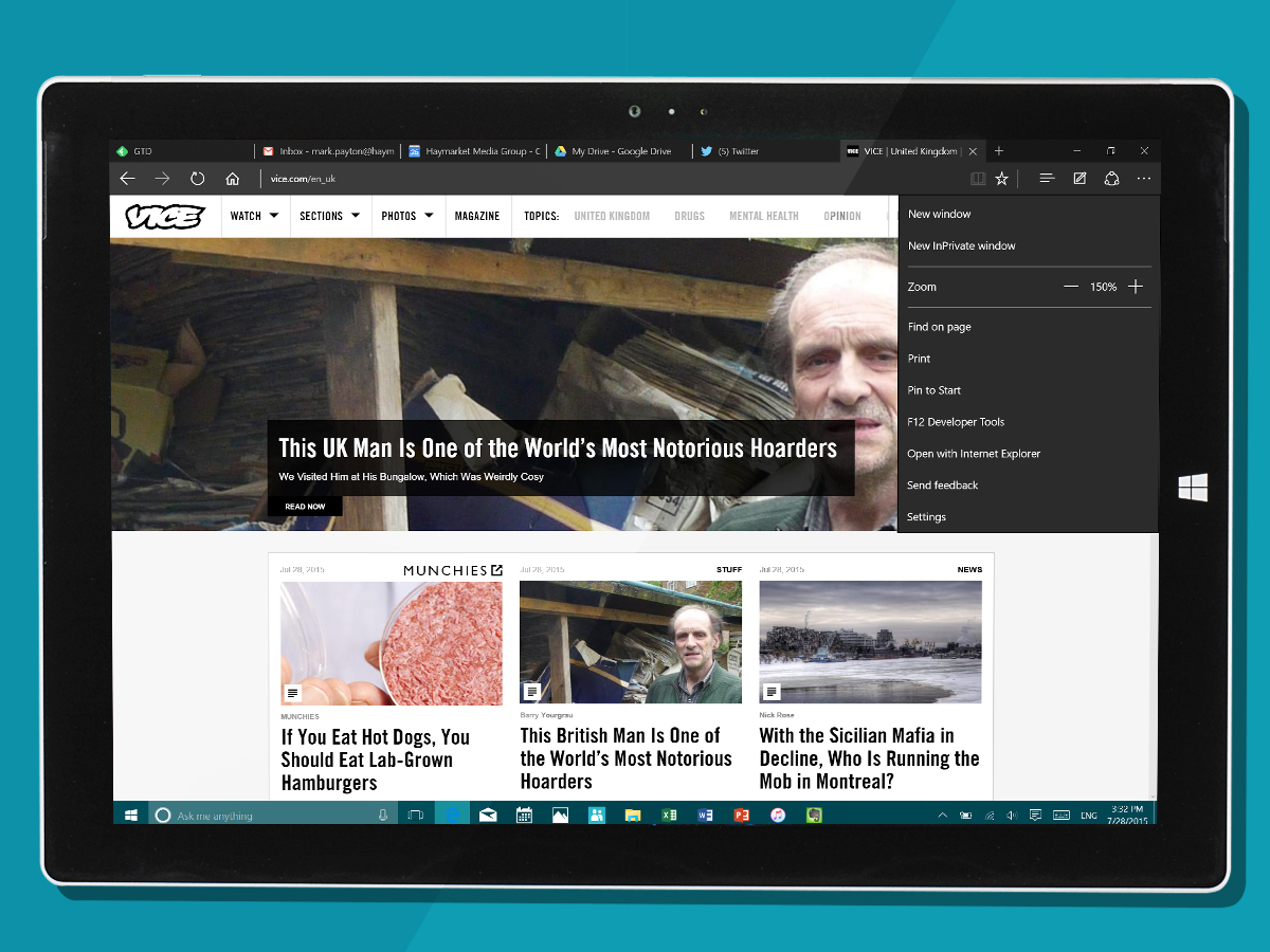
Windows 10 introduces an entirely new browser to the world – namely, Microsoft Edge. This is a big jump for Microsoft – recognition that for all its fame (and infamy), Explorer was tired and had aged badly.
The good news? Edge is great. It’s fast, it seems to work with just about every site under the sun, and it has new features that bring it much closer to competing with Chrome and Safari.
You can switch Edge themes from light to dark (and it can also be set to switch automatically, based on the lighting around you). There’s a Reader Mode, for those who like their web pages without distractions. And the new bookmarking set-up is a considerable improvement over Explorer.
The only things missing are extensions and pinned tabs. Microsoft promises that extensions are coming before the end of the year. Although I wish they’d been there from launch, at least I know that they’re a stone’s throw away. But for the life of me, I don’t understand Microsoft’s reluctance to enable pinned tabs: surely the world is at a point where just about everyone has too many tabs open – at which point, pinning switches from nice-to-have to absolutely essential.
WINDOWS 10 TABLET – TRY IT, BEFORE YOU BUY THAT iPAD
Windows 10 on a Surface Pro 3 in tablet guise is excellent.
That’s thanks in no small part to the death of horizontal scrolling. It was the one feature of Windows 8 that drove us insane – not because swiping from left to right is unnatural in any way, but because it’s a really, really inefficient way to present content.
So it’s a relief to find that Windows 10 returns to conventional up-and-down scrolling (the only horizontal scrolls are between tabs in the likes of the new News app, where it’s entirely appropriate to the job at hand).
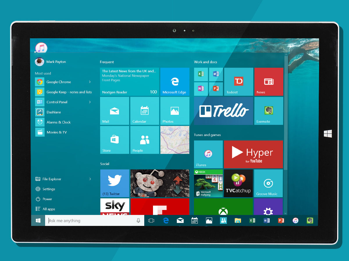
The new tablet interface is a natural expansion of the new desktop Start Menu. Apps can be clustered into groups, all of which you can name. Long-press an app, and you’re given the option to delete it, or change its size.
Although the app icons and accompanying furniture are smaller than they were with Windows 8, Microsoft’s taken care to ensure that they’re big enough hit if you’re fingers are larger than average. If you want to want to add an app, tap the hamburger menu bottom left of the Start screen (easily done with your thumb). Long press an app in that menu, and you get the option to add it to the main Start screen – simple as that.
Multi-tasking on a Windows 10 tablet is a delight, although there will be a small band of diehards that may miss Windows 8’s left-hand menu (which was, on reflection, the best feature of the OS).
Swipe in with your finger from the left, and open apps appear in an OS X Expose-style grid – just tap an app to bring it to full screen. And to close that app, you just swipe down from the top to the bottom of the screen – precisely the same action from Windows 8. In case you’re wondering, the windowed app previews shrink as you open more apps: I got to 12 and gave in.
You can call up notifications in the new Action Center by swiping in from the right, where you also get easy access to quick settings (everything from airplane mode to bluetooth to rotation lock). Curiously, you can’t swipe the Action Centre away from the left – to get rid of it, you either swipe again from the right, or tap the desktop. Odd.
You’ve probably guessed by now that I really like the Windows 10 tablet experience. It’s immeasurably more mature than Windows 8, which always felt wasteful, overblown and child- like. But before you cancel that iPad order, here’s a word of warning: do not expect the new Windows Store to come within a thousand miles of Apple’s App Store.
How much this bothers you will depend on your habits. Microsoft has done an excellent job of redesigning its core apps, to the point where you’ll be able to do 90% of the things you want to do by using its suite of built-in tools. And there’s undoubtedly enough third-party apps in the Windows Store to extend the system.
But just don’t expect real choice, or incredible quality – for that, you’ll need an iPad.
Related › Microsoft Surface 3 review
WINDOWS 10 DESKTOP – IT’S OK… YOU CAN COME BACK NOW
If you’re moving up from Windows 8 or 8.1, the first few minutes with your freshly upgraded Windows 10 are going to be absolute delight.
I’ve been living for so long with the Technical Preview that I’ve come to take the changes in W10 for granted. But sit an 8.1 laptop alongside a machine running 10, and the difference in desktops is pretty astonishing.
Windows 10 is polished, sharp and clean. Gone are the mid-’90s skeuomorphisms that haunted the W8 desktop experience. The result is that you concentrate more on the content, and less on the fuss surrounding it, which has to be a good thing.
Some of the more hyper-critical souls in the Stuff office reckon the new Windows 10 desktop looks slightly bland, and I can see their point. But what would you prefer: ultra-usable and minimalist, or cluttered and clashing?
And the improvement in form carries through to function.
The Start Menu is back, and while it will be familiar enough to anyone still living with Windows 7, it has been completely weaponised for Windows 10. There’s the aforementioned Cortana, transforming the Menu into a fully-fledged, voice-activated PA.
And then there’s the new Tiles menu, effectively a boil-washed version of the tablet Start screen that lets you organise apps in groupings to your heart’s content. It adds up to a computing Swiss Army Knife – a tool that’s idiotically simple to use when you need it to be, but that extends with your needs. It’s the star of Windows 10, and lives up to the billing.
But while the new Start Menu and Cortana on the desktop are innovations that Apple needs to watch, the addition of multiple desktops to Windows 10 is a blatant case of playing catch up – Mac OS X has had these for years.
As it happens, the way that Microsoft has chosen to deploy them is perfectly sensible. You can add desktops at a click, and drag and drop apps between them – simple and useful, but hardly ground-breaking.
And while I’m in the niggling mood, I do have a few other picky criticisms of the new desktop.
The revamped Microsoft apps (Mail, Calendar, Photos etc) have their own icon style, which doesn’t sit particularly comfortably with existing third-party software (or even, for that matter, with the new style of Microsoft’s own Office 2016 suite). No doubt the third-party software guys will catch up in short order, but for now, your new desktop has a join you can still see.
I also wish that more work had gone into Windows File Explorer.
Yes, I know that there are millions out there who swear that it’s infinitely more capable than the OS X Finder – but I disagree. There’s so much to Windows 10 that is demonstrably smarter; File Explorer looks as though it was given the re-skin to bring it in line with its new environment, but no more.
Lastly, moving app Tiles around within the Menu is still slightly hit and miss. Microsoft was laudable in aiming for flexibility, but that has translated into allowing tiles to be dropped at virtually any point on the Menu’s grid, with the result that you regularly find yourself dropping a Tile, only to then need to reposition it. If you’re particular about desktop tidiness, this will drive you bonkers.
Do those niggles ruin the 10 experience? No. The new desktop is head, neck and shoulders above Windows 8, and gives OS X a very serious run for its money.
CONTINUUM – AN ANSWER TO THE HYBRID PROBLEM
So the Windows 10 tablet experience is miles better than that on Windows 8, as is the new desktop. But what about a world where hardware can do both jobs?
Continuum is Microsoft’s answer to that challenge. Remove the keyboard on your Surface Pro 3 or flip your Lenovo Yoga Pro 3, and the desktop will switch to tablet mode (you’re asked whether you want to be prompted to switch or for it to happen automatically).
Continuum was erratic and rough-edged in the early builds on W10, but it’s now smooth and instantaneous.
The only glitch I could find was in the positioning of the transition prompt pop-up on my Surface Pro 3, which still sits slightly low on the task bar. Otherwise, Continuum is a brilliant answer to bridging the tablet and desktop worlds.
RELATED › The best hybrid and convertible laptops
WINDOWS 10 APPS – WHO NEEDS AN APP STORE?
If you have a weakness, it’s best to face up to it. And in Microsoft’s case, that weakness is an app store that lags horribly behind those of Apple and Google.
Oh, don’t get me wrong. The Windows Store isn’t a complete disaster. You’ll find an app to get most jobs done. But there’s not the same depth and breadth of quality that you’ll find in swathes on iTunes and even the Play Store. Plus, there’s an enormous amount of rubbish, leaving you to sift through the mud to find the little gems.
So… what do you do about it? You start by transforming your own apps into a free suite of tools that will do the job well for 95% of your users. And that’s exactly what Microsoft has done with Windows 10.
The Mail and Calendar apps in Windows 8 were short on features, and limited in usefulness. The revamped pairing for Windows 10 are powerful enough to live with every day, and as useable on the desktop as they are on a tablet. And they work out of the box with Google Apps (is that a quiet cheer I hear in the distance?), along – of course – with Office365.
The new Photos app is fast, nicely designed and very capable, while the Maps app gives Google Maps a respectable sparring partner. The all-new News app, meanwhile, may not give Feedly or NextGen a bruising – it offers almost nothing by way of customisations, for starters – but I can imagine a lot of people not needing any more than that.
There’s also the new Groove Music, which integrates with tunes you’ve bought or subscribed to through the new Windows Store and, lastly, the new Xbox app – which lets you stream games directly from your Xbox One to your PC, and capture and share your exploits.
Does this collection of apps solve Microsoft’s problem? No. That will only happen when the world’s best app developers start seeing Windows 10 as a Must Have, something that simply isn’t the case today.
But the revamped Microsoft apps are more than the sum of their parts: they’re well-designed, capable and – in the case of the Xbox app – bring a whole new facet to the desktop experience.
RELATED › Microsoft Lumia 640 XL review
WINDOWS 10 VERDICT
You’d be a fool not to upgrade to Windows 10.
It’s a huge improvement on Windows 7, and massively easier to use than Windows 8. In places, it plays catch up with OS X. But in others, it introduces clever tricks that should have Apple worried: Cortana has beaten Siri to the desktop, Continuum is a brilliant answer to the tough problem of how to work across multiple devices, and the Xbox app will delight One owers.
Is W10 good enough to tempt Mac loyalists to climb the fence? Maybe.
That in itself is a massive credit to the Microsoft team – the same question posed of Windows 8 would have resulted in an unequivocal ‘no’. Windows 8 was ill-considered innovation; Windows 10 is thoughtful and well finished.
YOU MIGHT ALSO LIKE › 7 things that got us excited about Microsoft’s Build 2015 event
Stuff Says…
Slick, simple and innovative with it, Windows 10 is Microsoft’s best OS in years
Good Stuff
Works brilliantly across devices
Slick and simple to use
Built-in apps are excellent
It’s not Windows 8
Bad Stuff
Windows Store still needs more apps


