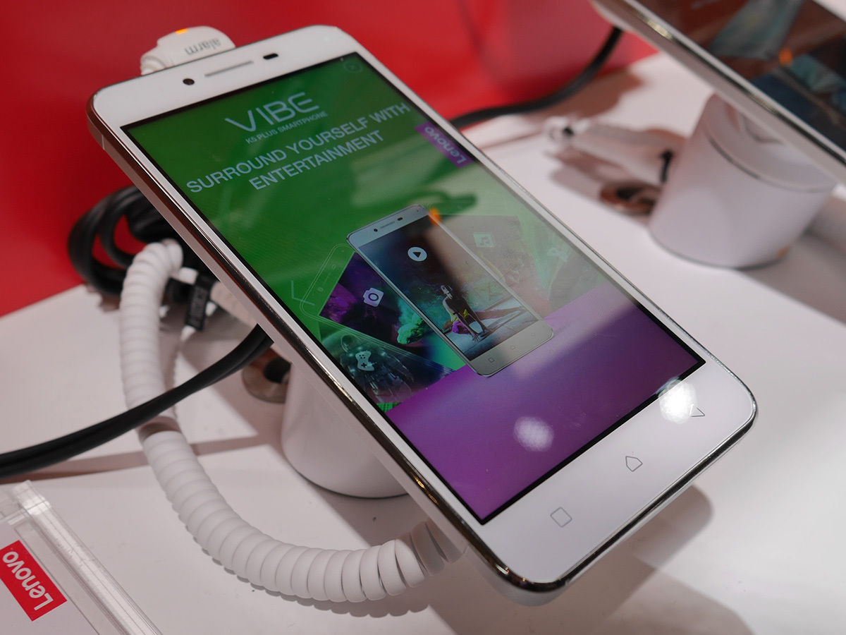
Lenovo Vibe K5 Plus hands-on review
Premium styling and a price that undercuts the Moto G sounds tempting

We’re getting plenty of good vibes from Lenovo’s latest mid-range phone. With a metal body and a price that’s even lower than the Moto G, what’s not to like?
With the Motorola name being folded into Lenovo and the Moto team concentrating on the Moto G and Moto X, Lenovo’s got a good thing going on at the entry-level. There’s still room for something a little further up the chain without stepping on Moto’s toes though – that’s where the K5 Vibe Plus fits in.
We got to try it out on Lenovo’s booth at MWC, to see if there’s any substance underneath the cool metal body.
Style icon
That’s right, it’s another iPhone look-a-like. Right down to the choice of colours, the K5 Plus does its best to ape Apple’s handset.
There are hints of the 5S, mixed with more modern touches from the 6S, and Android’s familiar touch-sensitive buttons, so it does look fairly attractive in the flesh.
The power and volume keys don’t quite feel up to the same standard as the rest of the phone, but at least they sit in a sensible position for your fingers and thumb.
Don’t believe the hype over the Dolby Atmos stereo speakers on the back, though. We couldn’t give them a full test on the crowded show floor, but there’s no way they’ll be able to match an actual Atmos home cinema system.
Sleeper cell

You might not expect a mid-ranger like this to have killer specs, but the K5 Plus is surprisingly potent.
You’ve got a 5in, 1080p screen on the front, a 13MP camera sensor on the back, and a Snapdragon 615 running the show with 2GB of RAM. 16GB of storage is fairly standard for a phone so cheap, but at least you can slap in a microSD card for extra capacity when you need it.
That screen isn’t half bad, either. The pixels are jammed in tight enough that everything looks sharp, it’s bright enough to see clearly even under strong lights, and the colours look reasonably accurate.
The bad news is that the K5 Plus runs Android 5.1, rather than Marshmallow. For a phone that’s not going to launch for a while (Lenovo won’t even set a vague date yet) it really should have the latest version of Android.
You have to put up with Lenovo’s custom skin, too. It’s admittedly been toned down slightly from previous years, but you still lose out on an app drawer in favour of iPhone-style multiple homescreens for all your apps. Pretty much everything has a custom icon, too, so it can be tricky to find the one you want on the first try.
Baby brother
The K5 Plus isn’t going to cost the earth at $150, but Lenovo’s still found a way to squeeze every penny and reduce that price down even further.
The result is the K5, a virtually identical phone that swaps the 1080p display for a 720p panel and the Snapdragon 616 for a slower 415.
Don’t need speed or pixels, but want style and a camera that won’t crap out on you? The K5 fits the bill.
Early verdict

Like a lot of so-called premium mid-range phones, the Vibe K5 Plus is built to a price. That means the metal doesn’t feel quite as nice as on a real flagship phone, the screen isn’t as sharp and it’s not quite as snappy as we’d like.
It’s still got good looks, though, and that 13MP camera could be quite potent in the daylight.
The big question is whether the K5 Plus will actually make it around the world, or if it’ll stay in Asia. There’s no official word on an expanded release, but if the crowd reception here at MWC is positive, Lenovo could decide to roll it out globally later in the year.
MWC 2016 › All the news from Mobile World Congress


