Google Nexus 9 review
We get our first lick of the Lollipop with the Nexus tablet
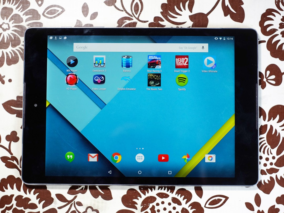
If there’s an Android contender to rival an iPad Air 2, this is it. The Nexus 9 has the same screen shape, the same resolution and – like the Apple tablet – launches with the very best its platform has to offer.
You get the brand new Android 5.0 Lollipop software, bags of power and a super-sharp display: all for £80 less than an iPad Air 2. It’s sure to lure thousands away from the Apple Store.
Just as important, though, is what the Nexus 9 does for Android. It sets the bar for future Android tablets, and sees Google finally embrace non-widescreen tablets. It’s been a long time coming.
The tupperware of tablets
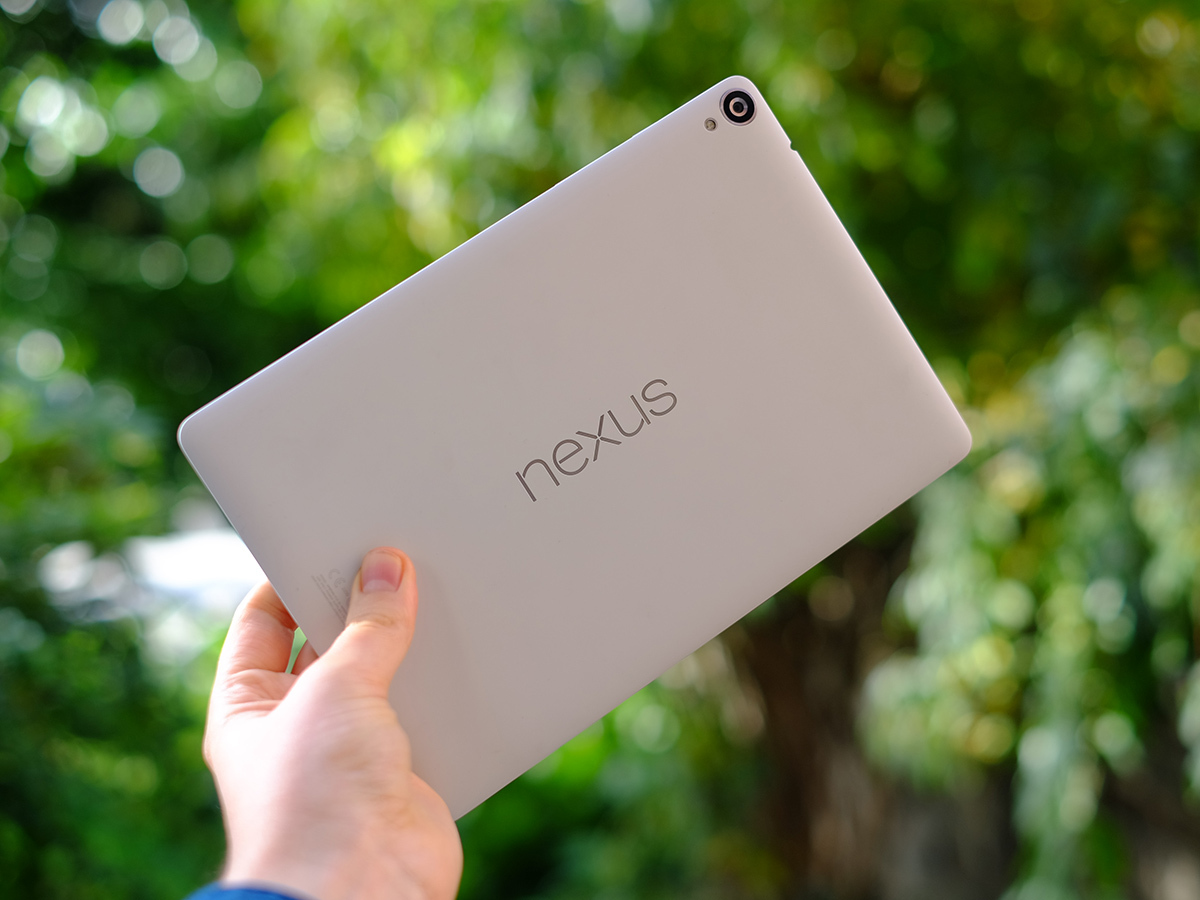
There’s plenty of praise to come for the Nexus 9, but it’s not a tablet that sets out to wow you with its hardware design. Like the good old Nexus 7, it’s more practical than luxurious.
The back is plastic, and has the sort of minimalist design a swedish furniture maker might come up with. Good-looking? Sure, but it doesn’t give the hard, expensive impression of the iPad Air 2, or offer the jaw-dropping thin-n-lightness of the Samsung Galaxy Tab S 8.4.
You get the feeling Google cares a little more about what happens when you switch the screen on than what it feels like.
That we can be so blasé about a tablet this thin and light tells you about how far we’ve come, though. The Nexus 9 is 7.9mm thick and weighs just 425g in its Wi-Fi only incarnation. It is thin and it is light, it just doesn’t showcase it in the same way the 6.1mm-thick iPad Air 2 does.
That slight lack of initial impact is quickly forgotten when you start using the Nexus 9, though. The 4:3 aspect is so much better suited to an 8in-plus tablet than the widescreen styles that used to be the Android norm.
Switch between this and the Nexus 10 and the older tablet just seems a bit, well, silly. It’s not just about the looks either, but how its weighting sits in your mitt. The Nexus 9 feels right, and is just about light enough to use one-handed while reading an article on the train on the way to work.
In short, the Nexus 9 makes it pretty obvious why 10in widescreen tablets were never all that popular.
READ MORE: Apple iPad Air 2 review
Google Nexus 9 tech specs
Operating System – Android 5.0 Lollipop
Processor – 64-bit Nvidia Tegra K1 @ 2.5GHz, Kepler GPU
RAM – 2GB
Screen – 8.9in IPS LCD with 2048×1536 resolution (281ppi)
Cameras – 8MP rear with 1080p video, 1.6MP front
Storage – 16/32GB (not expandable)
Connectivity – Dual-band Wi-Fi a/b/g/n/ac, Bluetooth 4.1, optional 3G/4G
Battery – 6700mAh
Dimensions – 228 x 154 x 7.9mm
Weight – 425g (436g with 3G/4G)
Build me up, break me down
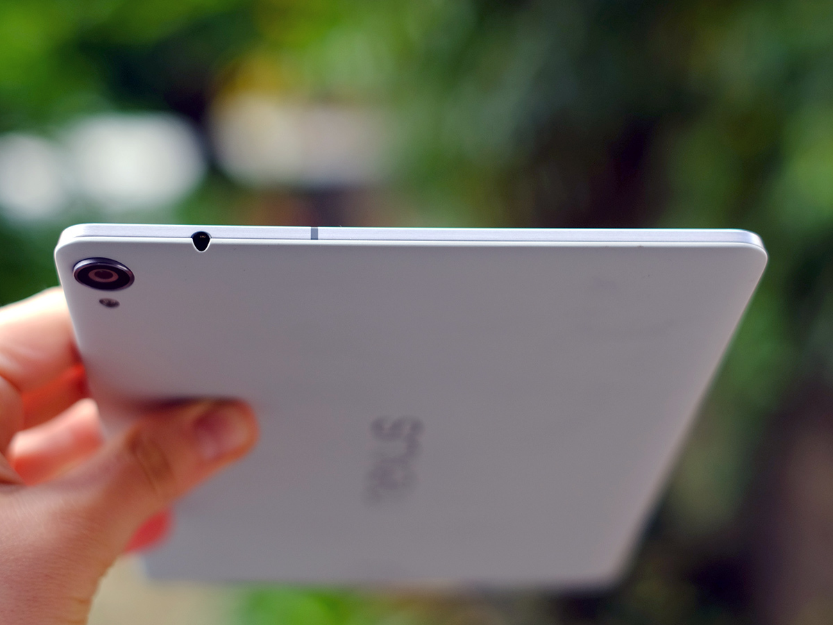
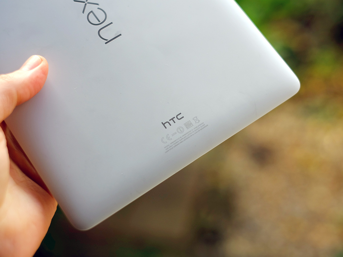
The Nexus might lack some of the gloss of an iPad Air 2 but build quality is more than reasonable. The plastic (in black, white or sandy beige) flexes a little in parts, and the volume controls feel a bit, well, naff. But the front is Gorilla Glass 3 and the band of metal around the sides gives you some confidence that HTC – this tablet’s maker – hasn’t scrimped entirely on the essentials.
The size, the shape, the handling: we have no serious complaints. However, Google has deliberately limited you in one quite annoying way. There’s no memory card slot.
Of course, iPads have never had memory card slots, either – but the iPad Air 2 is available in 64GB and 128GB versions if you’re the type that values on-board storage. The Nexus 9, on the other hand, maxes out at 32GB.
Casual users may well get by with the standard 16GB, but with only 10GB of it actually available to use once you factor in the OS, it’s soon gone if you load up a few games and movies. You can obviously bolster this with cloud storage from Google Drive or Dropbox, but it’s not really the same thing. Don’t say we didn’t warn you.
LCD starlet
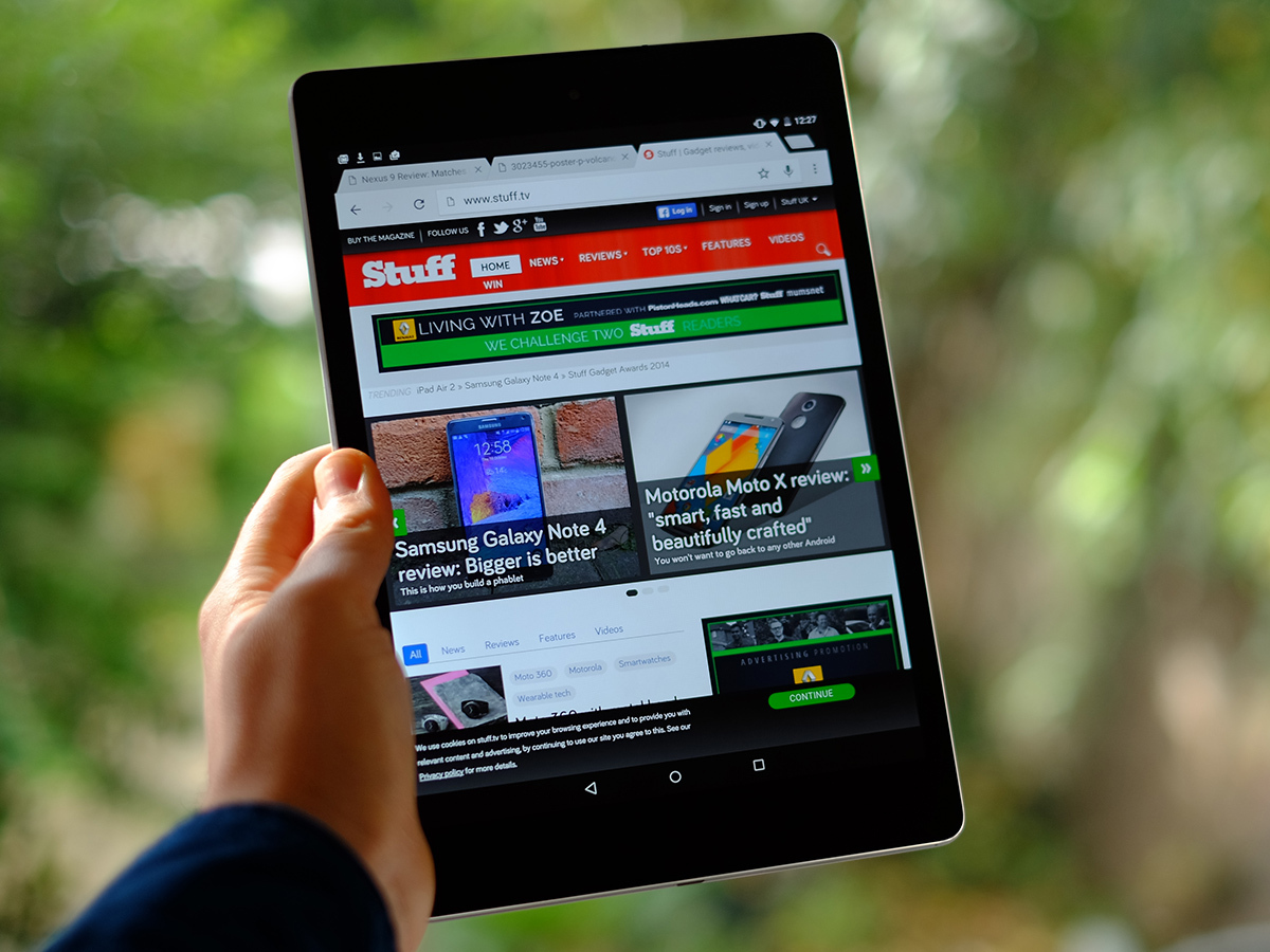
The Nexus 9 screen just begs for games and films, too. It offers oodles of pixels, 2048 x 1536 to be exact (just like the Samsung Galaxy Tab S 10.5), and it’s enough to make everything on the 8.9in screen look as sharp as any rival.
Get your eyeball up to the display and you can see a teeny bit of fizziness, but we’re calling it: this resolution is enough.
Just like the Nexus 7 before it, the Nexus 9 uses an IPS LCD screen, the same tech found in the iPad Air 2. The strong colour reproduction melded with the high resolution, bright backlight and very immediate image give the display plenty of pop.
However, purists will notice a few little issues. First, this is an LCD and its black levels aren’t close to what you get from an OLED tablet such as the Samsung Galaxy Tab S 8.4.
There’s also some pretty clear leakage from the backlight, particularly clear at the top of the Nexus 9. It exhibits as a tiny strip of brightness at the top of the screen. You should get used to it, but those with display OCD may find it distracting. It is fairly minor, but is another little negative to jot down if you’re after the ultimate Android tablet.
READ MORE: Samsung Galaxy Tab S 10.5 review
What flavour is that Lollipop?
So far, so ordinary: we‘ve seen better screen performance from both the iPad Air 2 and the Samsung Galaxy Tab S tablets. It’s the software the Nexus 9 is really here to show off.
This is the first tablet to run Android 5.0 Lollipop, the version the rest of the Android-using world is going to be clamouring after for weeks or, more likely, months. So what’s it all about?
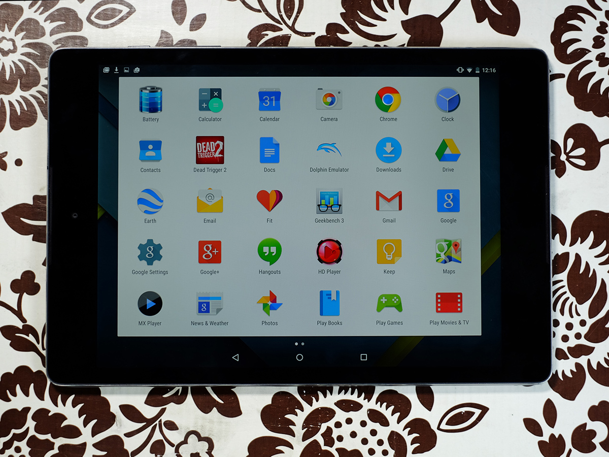
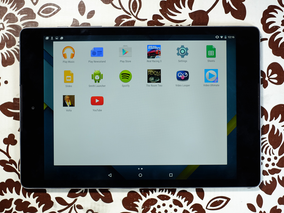
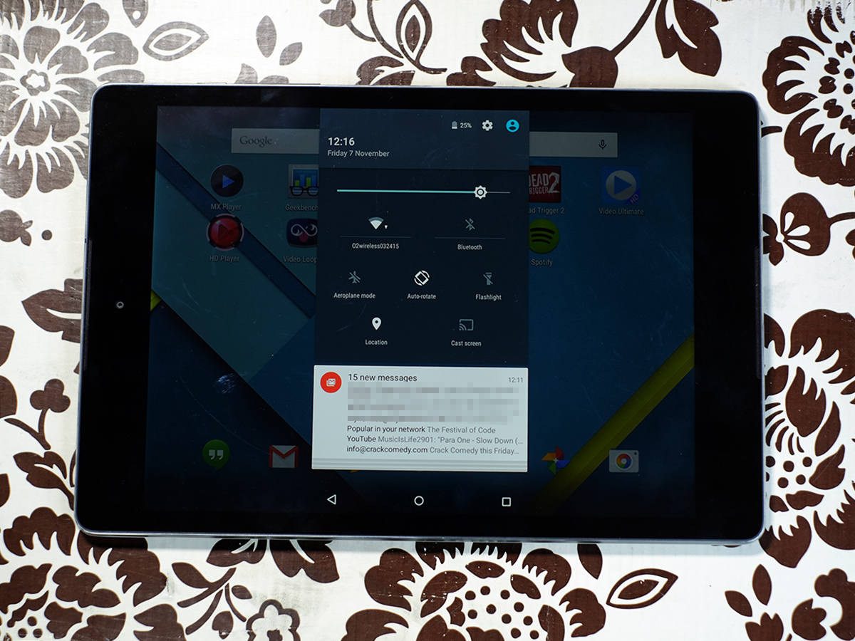
Android 5.0 Lollipop has a new look. It appears and feels familiar, but everything has been given a subtle facelift. The soft keys are new. The apps menu now looks like a series of white pages and you double-swipe down from the top of the screen to access quick settings toggles and screen brightness.
The lock screen is new, too, giving you notifications without having to take the tablet out of sleep mode. Very handy and about time. These are all things that we’ve seen before in other custom interfaces. It’s mostly just a neat, simple, quite cute UI – not a revolution.
Google has also reworked a bunch of the standard Android apps in the Nexus 9’s Android 5.0. Gmail, the Contacts book, Calendar and even the Play Store have all been given a spring clean.
But speaking of apps, it’s also worth noting that many still aren’t optimised for larger Android screens. Developers seem happy to produce different versions of their apps for iPhone and iPad, but many seem content to release just one for Android, which is then simply blown-up to fit tablet screens. That can have some ugly results.
But Lollipop is pretty elsewhere, with a colour palette that now has that extra hint of pastel to it. And everything moves with that extra bit of pep. Google seems to want the Nexus 9 to be something that would slide gracefully into an IKEA show home in its software as well as its hardware design.
Is it flat-out better than what you get with the Google Now interface available for just about any Android device these days? Maybe, but not by a huge margin.
What really matters is the stuff in the background – those turning cogs you can’t see on the surface. Android 5.0 now supports 64-bit processors and is better primed for connections to other devices than ever before. Our guess is that this means deeper integration with Android Wear watches, co-operation that we don’t even know about yet. For now, it means you can take up where you left off with media and apps in Lollipop goodies.
A lot of that promise is about the future, not right now. For example, while the Tegra K1 CPU used in the Nexus 9 is 64-bit, there’s nothing that specifically makes use of that more advanced architecture at present.
It’s not noticeably faster than previous top Android tablets, either. There’s the odd hint of lag here and there, undoubtedly because Android 5.0 Lollipop is a baby chick still brushing off those remaining bits of eggshell.
We imagine it’ll soon be improved in an update before too long, and it’s hardly bad at present anyway. Just the occasional stutter, and some apps not loading as fast as we’d like, especially given Android 5.0 uses a special ART runtime that’s meant to speed this whole process up. We‘ll have a full review of Android 5.0 Lollipop up on Stuff.tv very soon.
The numbers of the beast
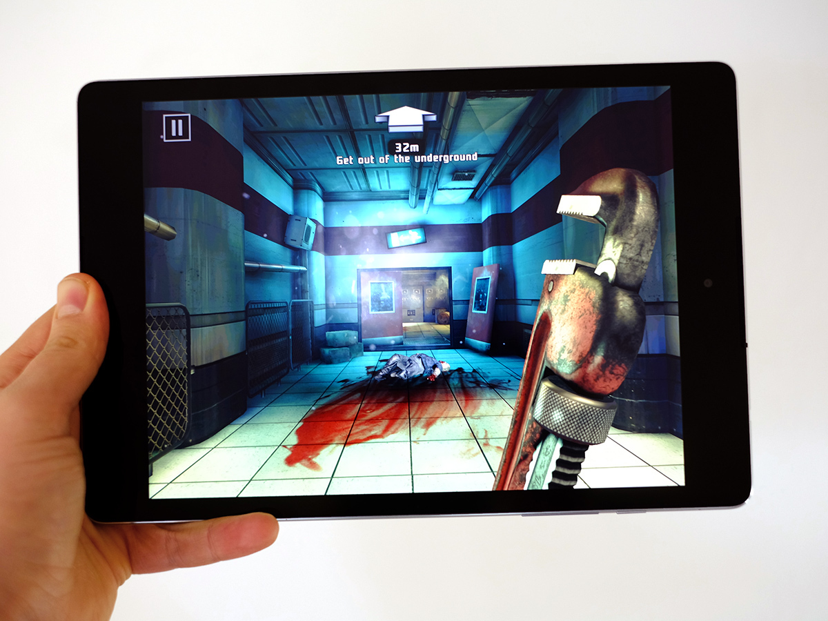
Hardware-wise, the Nexus 9 is one of the most powerful Android devices ever made.
Its Tegra K1 CPU is a dual-core 2.5GHz chipset – it may have just two cores, but they don’t half pack a punch. In the Geekbench 3 benchmark, it scores roughly the same points per core as you get out of all of the Nexus 7’s four cores. For the spec-heads out there, it scores 1970 points per core, 3332 total in Geekbench 3.
However, the real meat of the K1 processor is in the graphics side. It uses a Kepler DX1, which has 192 cores – sounds ridiculous and it sorta is.
We thought all this power might end up being squirted into oblivion, but there are already some games that make terrific use of it. For example, Dead Trigger 2 offers a special graphics mode not available on other devices that adds gorgeous water effects, the kind you’d only normally see in console or PC games. Yes, that does mean the game is now jammed full of puddles, but they aren’t half pretty.
These optimisations are already in place because this isn’t the first time a Tegra K1 has been jammed into an Android device: the Nvidia Shield Tablet has one, too (a slightly different version). Nvidia went as far as to bring over classics such as Portal and Half-life 2 to the Shield Tablet, but they don’t seem to be available for the Nexus 9 yet.
Fingers crossed they will be at some point, though. If only for show-off points.
READ MORE: Nvidia Shield Tablet review
Front-loaded Bieber blasters
Another nice little extra for gamers is the Nexus 9’s front facing speakers. They’re not too obvious, and sit to the extreme ends of each side of the tablet (when held in landscape).
This sort of setup is top-notch in terms of positioning. You get that immersive stereo effect and they’re virtually impossible to block to the extent that the sound becomes muffled. Even if you put a finger over each port, the sound isn’t choked. We managed to ruin the sound by squishing a palm against each outlet, but you do have to try pretty hard.
The Nexus 9’s actual sound quality is a bit more of a mixed affair.
With music in particular, the Nexus 9 can sound a bit strained, the mids unnatural. And treble lacks finesse and the clarity of some rivals. These are similar, or the same, BoomSound speakers used in phones like the HTC One (M8). But what is great in a phone doesn't seem quite so hot in this larger tablet.
Still, sound quality remains better than average. It’s just slightly disappointing that HTC hasn’t done for tablet audio what it did for phones in the HTC One. The iPad Air 2 actually offers greater volume, more power and greater clarity, even though its speakers are in the 'wrong' place.
Milli-amped up
Battery life is pretty good. Off a full charge we got just under 12 hours of video playback from the Nexus 9, with the screen set to middling brightness – which is actually probably a bit brighter than you’d use indoors. In normal everyday use it’ll last a few days.
If you’re a real power user you might be disappointed to find that hot-swapping is off the table. In fact, swapping of any kind seems unlikely – battery isn’t just non-removable, it’s glued in place behind a back cover you can’t rip off.
Papp-a-razzie
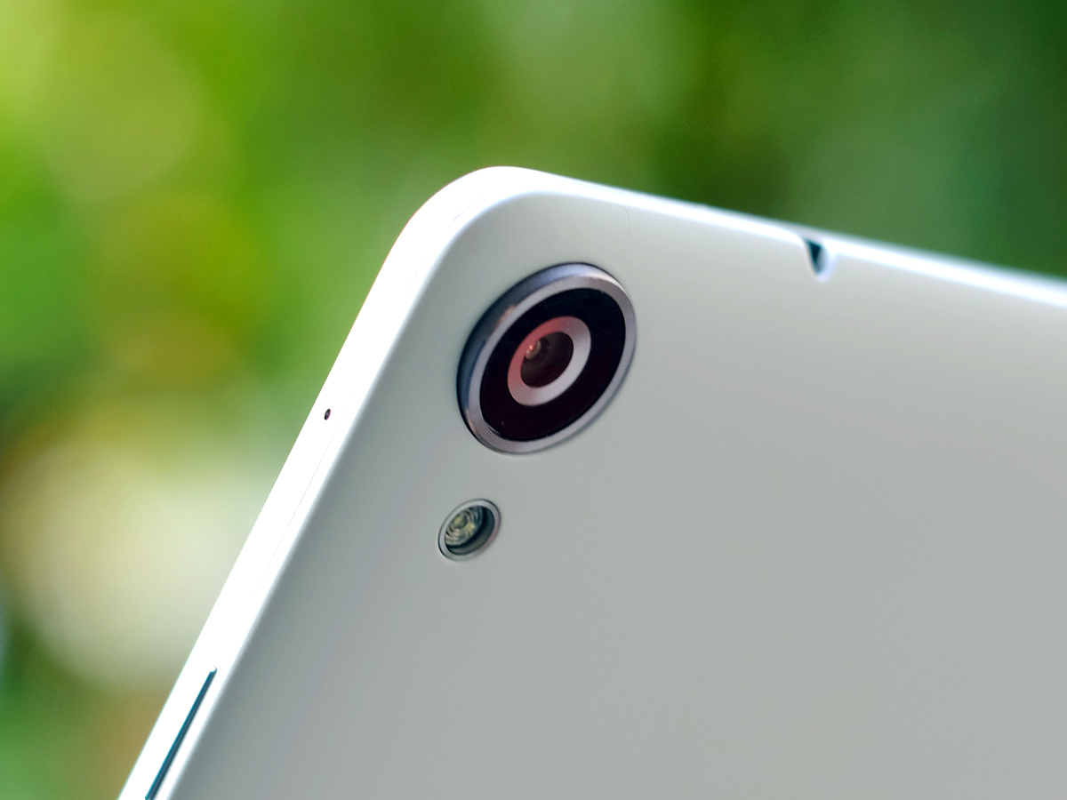
The cameras are a slight weak point. On the back of the Nexus 9 sits an 8MP camera while the front uses a rather unusual 1.6MP sensor.
Walk around a major city and you’re sure to see loads of tourists taking loads of pictures with their tablet – probably iPads. But HTC and Google still seem to be working under the assumption tablet cameras aren’t too important.
We wouldn’t necesarily argue with that, but if you are a tablet snapper you’ll likely find that your greatest annoyance isn’t image quality but autofocus speed. It feels sluggish, not the sort of camera to whip out to capture your dog as it bounds across a park, flinging 360 degree drool. You’d probably end up with a photo of some grass. Maybe a tree if you’re lucky. The Nexus 9 is also prone to overexposing just about every cloud in the sky, too.
Approach the camera with patience and you can get some reasonable results with pretty decent colour saturation, but we’d recommend sticking to your phone camera unless you simply must let absolutely everyone see that you’re rocking the new Nexus.
READ MORE: Using your iPad as a camera is fine, and here’s why
Google Nexus 9 Verdict
The Nexus 9 shows where Android tablets of the future should be headed — a little less geek locked in their bedroom, a bit more ‘ordinary person’ relaxing in the lounge. However, it also has the raw power underneath to satisfy enthusiasts so it’ll come up with the hardcore goods once more devs gets their heads around its 64-bit Kepler engine.
But there are still some niggling flaws – the build isn’t up there with the likes of the iPad Air 2, storage is limited and at this early stage Lollipop is just a little stuttery.
Our other lingering regret is that the Nexus 9 and Nexus 6 show that the Google Nexus line isn’t the bargain-hunter’s paradise it used to be. Good value overall? Sure, but perhaps the real bargain right now is the £240 iPad Mini 2. Now there’s a turn up for the books.
READ MORE: The 10 Best Tablets in the World right now
Buying one? › Order your Google Nexus 9 from Currys here
Stuff Says…
Power, stamina and that great Nexus simplicity, but Google’s new tab isn’t flawless
Good Stuff
Big, sharp screen
Powerful CPU
Pretty and new Android software
Bad Stuff
Screen has some small issues
Android 5.0 still needs some tweaks
Only available in 16GB and 32GB versions
