Apple watchOS 2 review
You’re going to upgrade your Apple Watch anyway, so here’s what you’re in for
According to Apple, watchOS 2 is about refinements, enhancements and “innovative new ways to make Apple Watch your own”.
That’s fine by us, because with the original Apple Watch, it sometimes felt like we’d paid hundreds of pounds to be beta testers for the world’s slowest apps. With watchOS 2, apps can now run natively on the Watch – offering much improved load speeds.
Plug your own Watch into its tiny white puck, set it to upgrade and, after five minutes or so, you should be greeted by a much improved product. We gave watchOS 2 and all its new features a spin to find out if it’s worth the time of day.
New faces
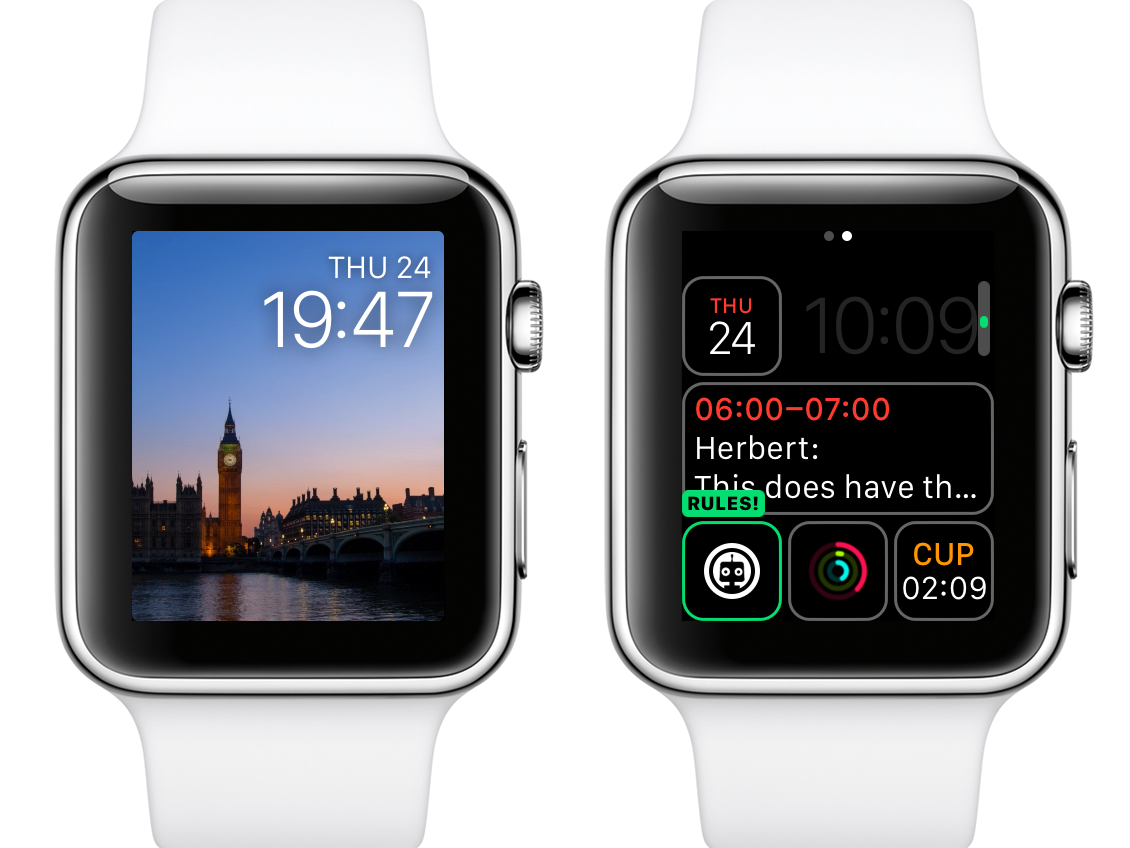
With watchOS 2, there are big changes to watch faces. You can use photos, although this can sometimes make it hard to see the overlaid clock. Apple offers time-lapse faces, too, if an animation of Big Ben is your thing.
Rather more exciting are changes to complications. There are new colour options, making for much prettier watch faces, and third-party complications are now a thing. This means you can add to compatible faces a Citymapper ETA or your Rules! progress, the latter providing the added bonus of a little robot face peering at you whenever you check the time. Complications are also buttons to quickly get at parent apps, and so we’re awaiting Fantastical’s complication with bated breath.
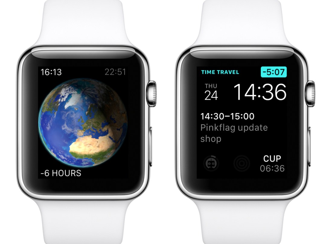
Beyond complications, Time Travel enables you to twiddle the Digital Crown to zoom through the day and update your watch face’s information accordingly — in the Modular face, complications will show relevant appointments, and the Astronomy face will move through the day/night cycle.
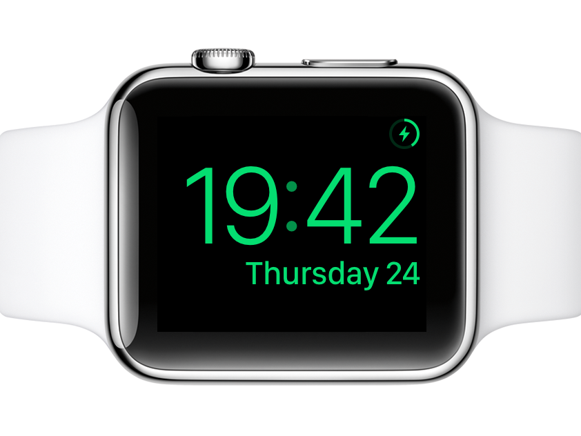
Apple’s also added a Nightstand mode, which feels like it’s trolling stand manufacturers. It requires the watch to be on its side, whereupon everything goes green and you can use the side and Digital Crown buttons, respectively, for silencing and snoozing an alarm. It’s a bit fiddly. You won’t be smacking it like an alarm clock.
Apple’s new contender › Apple iPhone 6s review
Going native
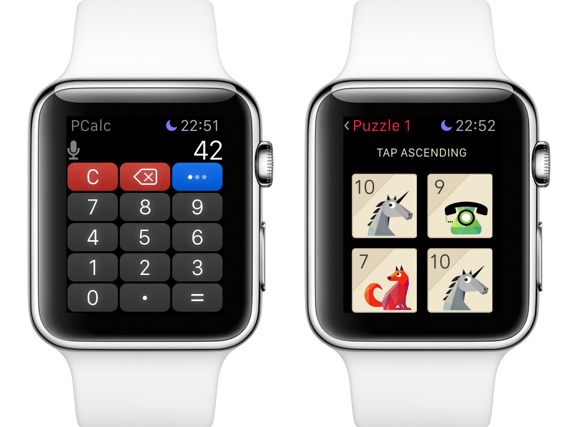
Apps still require an iOS counterpart, so you can’t install directly to Apple Watch and declutter your iPhone. But apps can now be native, running logic on the watch rather than performing a to-and-fro with your iPhone.
During testing, launches were faster, but sometimes still lengthy. Glance loading remained annoyingly sluggish. But on firing up PCalc, the benefits of native apps immediately became clear. Previously, this calculator was best-in-class but nonetheless had irritating delays between key presses. Now, it was like using an actual calculator. Or at least a calculator watch. Other apps followed suit, even making some Apple Watch games almost worth playing.
We suspect interesting things will happen over the coming weeks as devs get to grips with being allowed access to more Apple Watch hardware. What won’t change is the Home screen housing app icons, which remains a mess, annoying to manage, and doesn’t scale. If you’ve loads of apps, you’ll still be reliant on Siri to find and launch anything. Still, at least one irritant has been banished: a Digital Crown click now switches between the apps and watch screens, rather than centring the apps screen on the first click.
Core apps
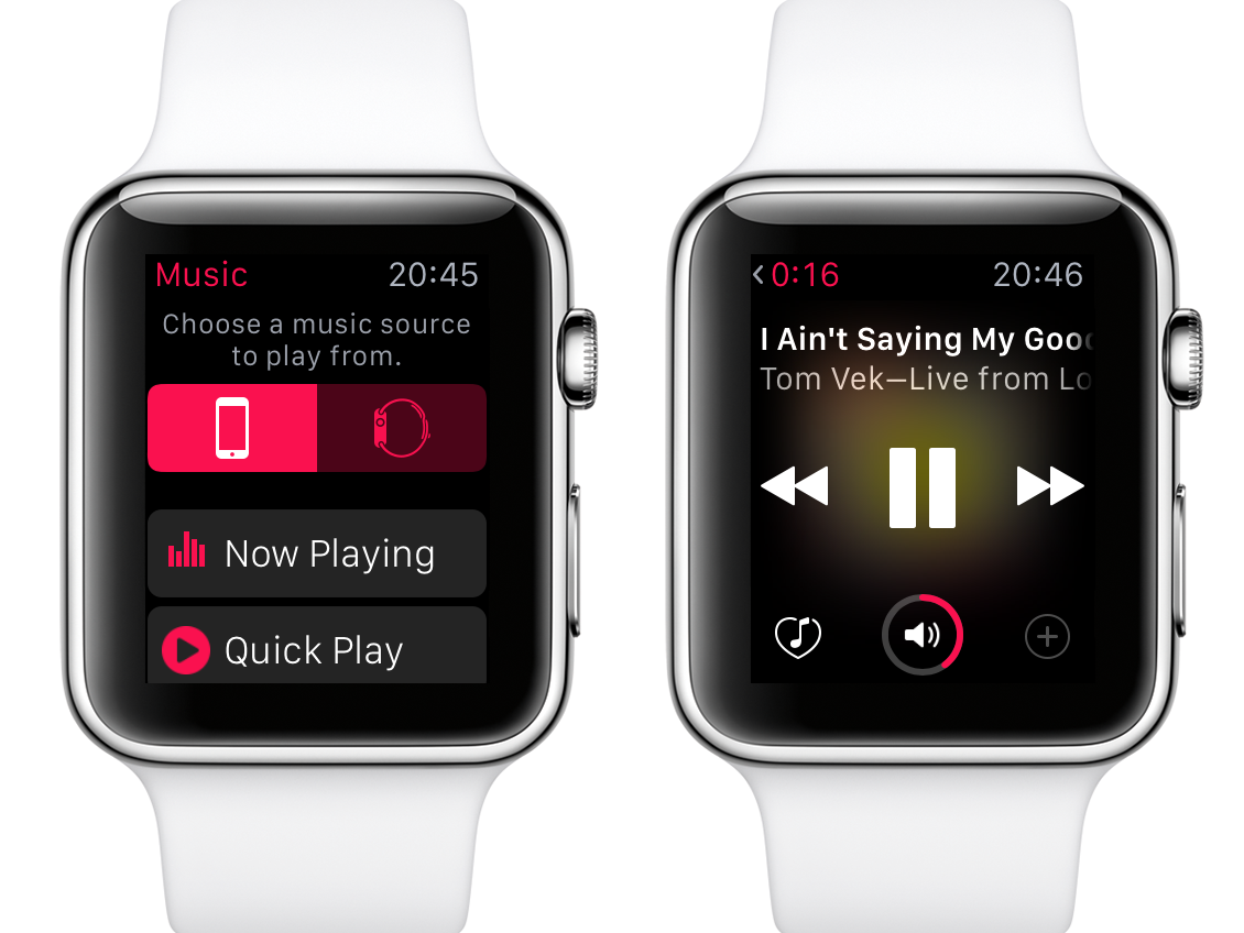
Apple’s made adjustments to some of its own apps. In Mail, you can reply using dictation or canned responses, although Calendar bafflingly still omits any means to add new events, because Apple hates you. Fortunately, Fantastical exists and doesn’t. Music is improved, enabling speedy access to something random, your entire library, or Beats 1.
The side button remains a missed opportunity, still lacking options, but if you’re a fan of the Friends dial and have more than 12 friends, you can add multiple pages. Transit, too, is a missed opportunity, primarily because so few cities are covered. In the UK, forget it if you’re outside of London, although you can still switch between ‘transit’ and ‘standard’ routing. Comically, our watch decided for the former we should walk from Basingstoke to Brighton, wasting 19 hours of our life. Presumably, Siri would giggle the entire way: “No, really, you’ll be at the bus stop any time now!”
Wrist assessment › Apple Watch review
Lingering glances
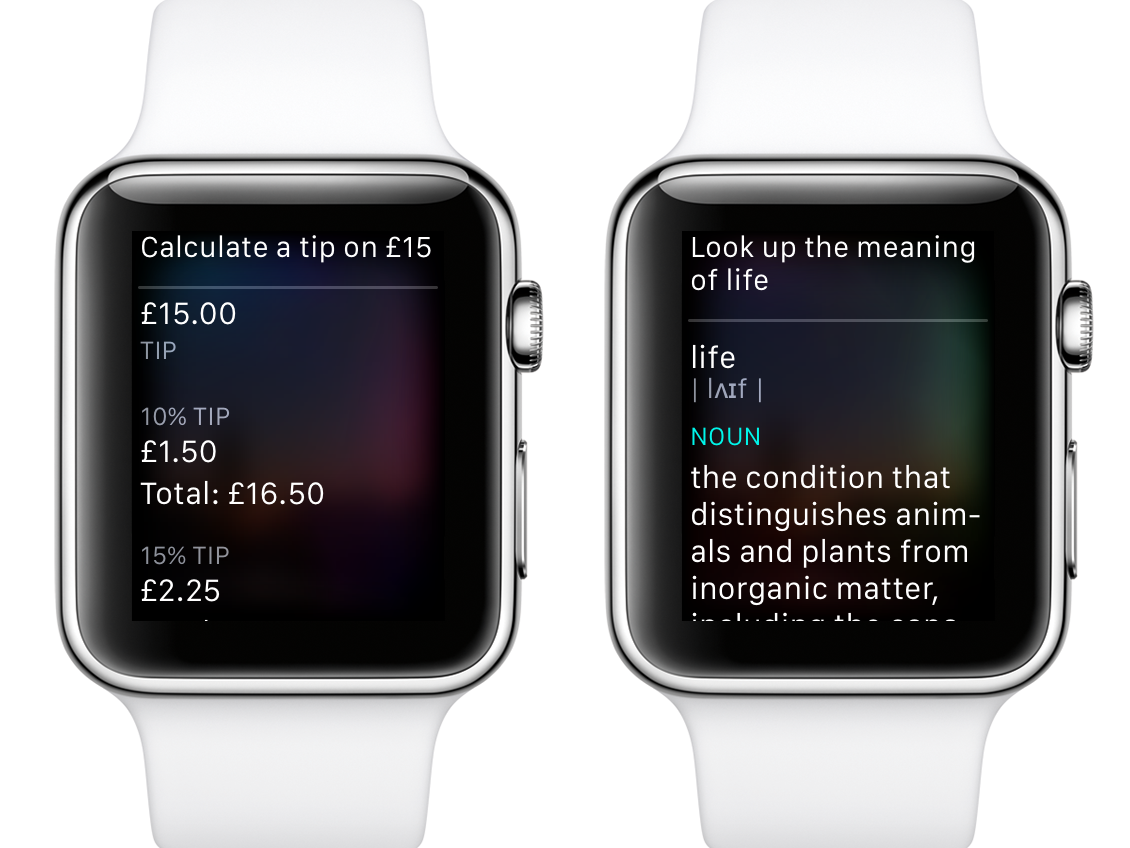
Siri can now find out more info (such as tips and definitions) and open glances, although it takes so long on the latter that you may as well open them manually. Better: you can have the watch screen stay on for 70 seconds rather than 15. This won’t stop you having to fashion a jaunty wrist flick (and hopefully avoid punching someone while doing so) to get the screen on in the first place, but it will mean you’ll no longer check something, then seconds later look back at a blank screen like an idiot.
The rest of the watchOS 2 grab-bag of lovely includes Activation Lock for Apple Watch, Wallet storing reward cards, and FaceTime audio calls (and Wi-Fi calling if your network supports it).
Apple watchOS 2 verdict
In many ways, Apple’s watchOS 2 is what we should have had when Apple Watch launched. This free upgrade improves lots of stuff and is unlikely to launch your watch into orbit. Most importantly, new native apps mean you won’t be staring at your Watch for ages waiting for directions around town, or just to check an email. All in all, there’s no good reason not to update to watchOS 2.
The best techy time tellers › The top 10 smartwatches
Stuff Says…
New native apps and some neat refinements mean watchOS 2 is a worthy upgrade
Good Stuff
Third-party complications
Native apps
Loads of small improvements
Bad Stuff
Apps screen still a mess
No alternate side button options
Siri remains sluggish


