5 minimalist interfaces that iOS 7 needs to beat
Apple's iPhone and iPad OS is set to ditch skeuomorphism for minimalism – but its rivals are already stripping things back to basics
Now that Sir Jonathan Ive has taken over Apple’s interface design for iPhone and iPad, it looks likely he will abandon the skeuomorphism that defines iOS in favour of a more minimalist interface. But Apple has some catching up to do – as these stripped-back smartphones demonstrate.
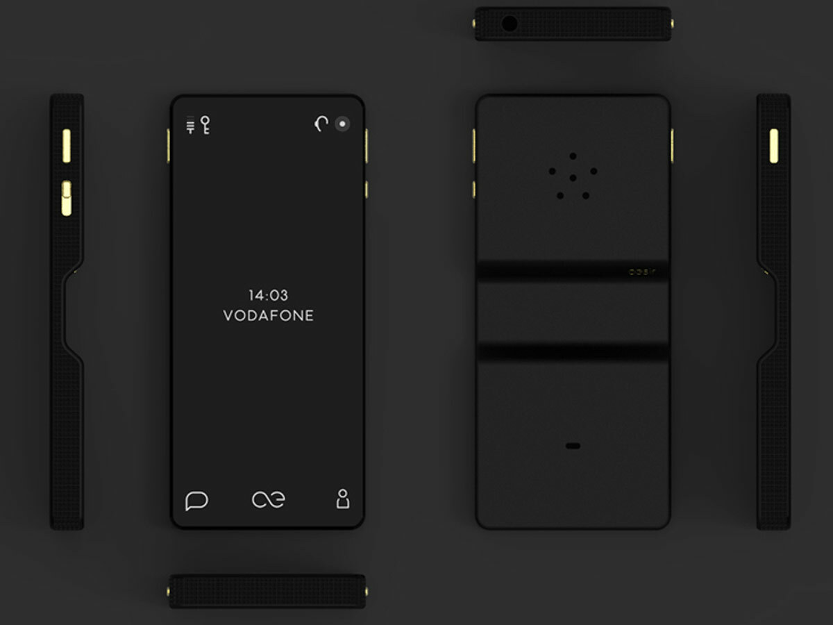
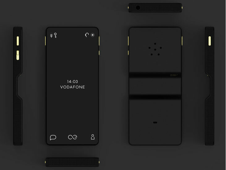
Aesir Copenhagen KiBiSi
Android was once a bit of a mess – fortunately, Google has simplified its mobile operating system over the years. Now Danish luxury phone maker Aesir Copenhagen has taken things a stage further, stripping Android back to this minimalist black and white interface created by design studio KiBiSi – and packing it into a hand-crafted smartphone that you can’t afford. The result is eye-catching, stylish and much less daunting to newcomers.
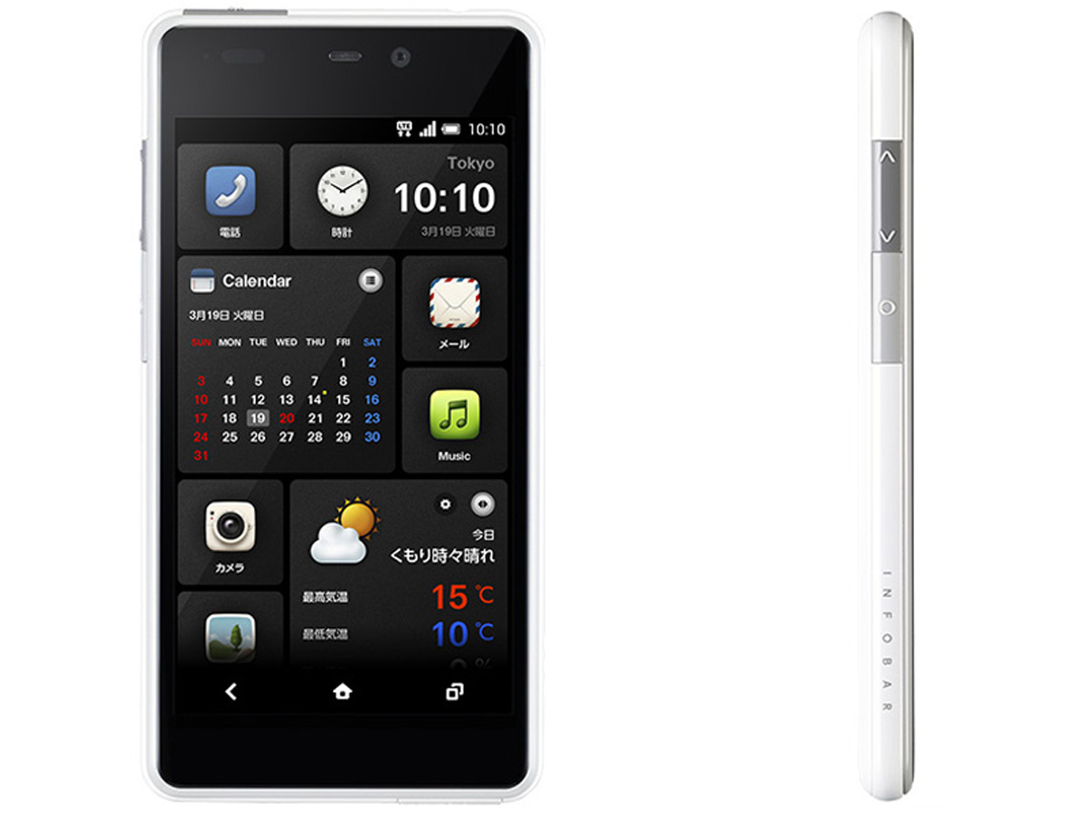
KDDI Infobar A02
The KDDI Infobar A02 by Naoto Fukasawa smartphone and its operating system were designed in conjunction with HTC – combining the look and feel of Android with the dynamic and easily visible tiles of Windows Phone 8. Everything you need is a beautifully smooth and fluid swoosh away, delivering all the customisation you could ever want in a friendly format – what’s not to like? Apart from the fact that you can only get it in Japan.
Mozilla Firefox OS
Considering that social networking is becoming an underlying part of our daily smartphone use, it’s no wonder manufacturers are building it directly into the operating system. Mozilla is doing exactly that with its HTML 5-based offering, as seen on the Keon and Peak smartphones. It features deep Twitter and Facebook integration, a stripped-down design and runs like a charm even on low-specced smartphones.
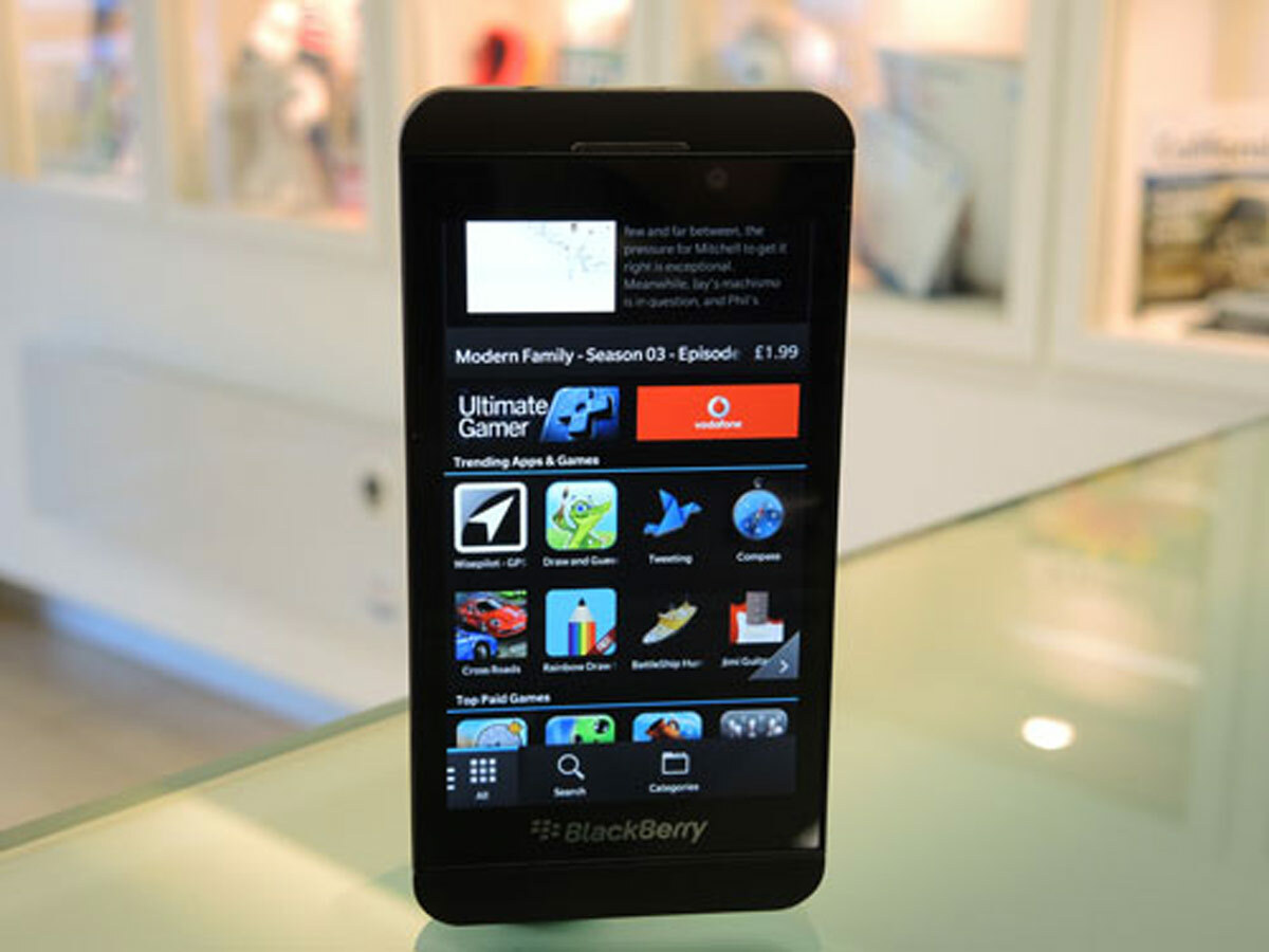
BlackBerry 10
BlackBerry is back with the Z10 handset – and with it comes a newly designed operating system known as BlackBerry 10. Apart from looking fresh, the design is intended to streamline your phone usage. So, for instance, messaging is aggregated into one place, whether it’s an email, a BBM, or a social network update. Throw in the use of fluid gestures and swipes in place of screen presses, and you have the recipe for a simple and intuitive interface.
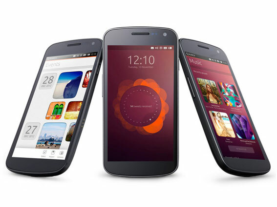
Ubuntu Mobile
This Linux-based OS borrows from its desktop cousin – and does away with the need for buttons altogether. Instead, you use gestures to bring up app menus from different parts of the screen – swiping to bring up an app launcher from the left of the screen, sharing controls from the bottom and settings from the top of the display. Want to try it out? It’ll be available on the Galaxy Nexus from late February.
You might also like
Rumour – HTC M7 coming in black and silver
Raspberry Pi Model A launches for £16
5 upcoming PS3 games you need to buy
